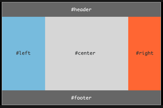
과제 1. Flexbox 활용하여 하단 이미지 만들기
HTML
<!DOCTYPE html>
<html lang="en">
<head>
    <meta charset="UTF-8">
    <meta name="viewport" content="width=device-width, initial-scale=1.0">
    <title>flexbox_practice1</title>

    <link rel="stylesheet" href="css/flexbox_practice1.css">
</head>
<body>
    <div class="main">
        <div class="header">#header</div>
        <div class="content">
            <div class="left">#left</div>
            <div class="center">#center</div>
            <div class="right">#right</div>
        </div>
        <div class="footer">#footer</div>
    </div>
</body>
</html>
CSS
* {
box-sizing: border-box;
}
.main {
border: 1px solid gray;
width: 700px;
height: 500px;
}
.header {
width: 100%;
height: 10%;
background-color: gray;
color: white;
font-weight: bold;
font-size: large;
display: flex;
justify-content: center;
align-items: center;
}
.content {
width: 100%;
height: 80%;
display: flex;
}
.left {
width: 30%;
height: 100%;
background-color: skyblue;
font-weight: bold;
font-size: large;
display: flex;
justify-content: center;
align-items: center;
}
.center {
width: 50%;
height: 100%;
background-color: darkgrey;
font-weight: bold;
font-size: large;
display: flex;
justify-content: center;
align-items: center;
}
.right {
width: 20%;
height: 100%;
background-color: orangered;
font-weight: bold;
font-size: large;
display: flex;
justify-content: center;
align-items: center;
}
.footer {
width: 100%;
height: 10%;
background-color: gray;
color: white;
font-weight: bold;
font-size: large;
display: flex;
justify-content: center;
align-items: center;
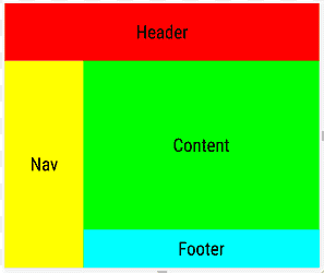
}과제 2. Flexbox 활용하여 하단 이미지 만들기
HTML
<!DOCTYPE html>
<html lang="en">
<head>
    <meta charset="UTF-8">
    <meta name="viewport" content="width='device-width', initial-scale=1.0">
    <title>flexbox_practice2</title>

    <link rel="stylesheet" href="css/flexbox_practice2.css">
</head>
<body>
    <div class="main">
        <div class="header">Header</div>
        <div class="content">
            <div class="nav">Nav</div>
            <div class="content2">
                <div class="item1">Content</div>
                <div class="item2">Footer</div>
            </div>
        </div>
    </div>
</body>
</html>
CSS
* {
    box-sizing: border-box;
}

.main {
    border: 5px solid whitesmoke;

    width: 400px;
    height: 400px;
}

.header {
    background-color: red;

    width: 100%;
    height: 20%;

    display: flex;
    justify-content: center;
    align-items: center;

    font-weight: bold;
}

.content {
    width: 100%;
    height: 80%;

    display: flex;
}

.nav {
    background-color: yellow;

    width: 20%;
    height: 100%;

    display: flex;
    justify-content: center;
    align-items: center;

    font-weight: bold;
}

.content2 {

    width: 80%;
    height: 100%;
}

.item1 {

    width: 100%;
    height: 80%;

    background-color: yellowgreen;

    display: flex;
    justify-content: center;
    align-items: center;

    font-weight: bold;
}

.item2 {

    width: 100%;
    height: 20%;

    background-color: aqua;

    display: flex;
    justify-content: center;
    align-items: center;

    font-weight: bold;
}