리액트 네이티브 기본 구조
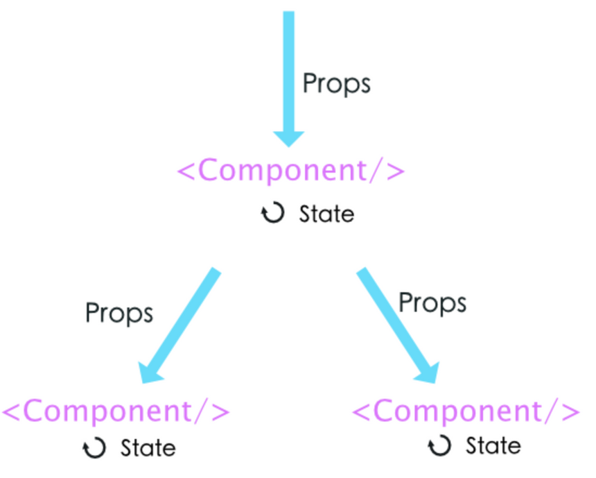
1) 컴포넌트(Component) --> 정해진 엘리먼트들을 사용하여 만든 화면의 일부분
2) 상태(State) --> 컴포넌트에서 데이터를 유지하고 관리하기 위한 방법(== 사용할 데이터)
3) 속성(Props) --> 상위 컴포넌트에서 하위 컴포넌트로 데이터를 전달하는 방식(== 데이터 전달)
--> style을 보면 (JavaScript언어로 쓰여진) 딕셔너리들로 이루어진 styles리스트(Json형태)를
(JSX로 쓰여진) 컴포넌트(Text, View 등)의 style속성에 할당하는 것
==> Json데이터를 컴포넌트에 전달하는 행위임
4)useEffect --> 화면에 컴포넌트가 그려지면서 처음 실행해야하는 함수들을 모아두는 곳
--> 앱이 화면에 그려지면 가장면서 실행되야 할 함수들이 모여있음
예) 로그인이 되어있나 확인, (API)외부 함수가 쓰일 때 미리 가져오기 등등
컴포넌트
컴포넌트 --> 화면의 모든 부분
--> 각각을 따로따로 관리하기 때문에 유지보수가 편하다.
--> 일부분을 변경하려고 할 때 편하다.
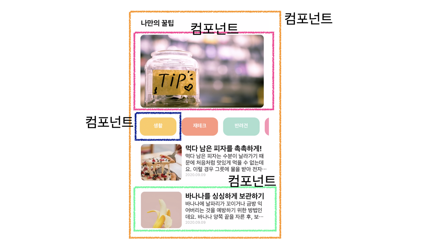
컴포넌트와 속성(데이터 전달) 예시
위 그림의 연두색 컴포넌트를 Card라는 컴포넌트로 나눔
Card컴포넌트
--> Card함수의 매개변수 content ==> 다른 컴포넌트가 Card를 컴포넌트로 사용할 때(태그로써 사용할 때) content는 속성으로써 사용되어 데이터를 전달 받음
--> 즉 매개변수처럼 사용된 content가 props 라고 볼 수 있음
import React from "react"
import {View,Text,Image,StyleSheet} from "react-native";

//비구조 할당 방식으로 넘긴 속성 데이터를 꺼내 사용함
export default function Card({content}) {
    return (<View style={styles.card}>
        <Image style={styles.cardImage} source={{uri:content.image}}/>
        <View style={styles.cardText}>
          <Text style={styles.cardTitle} numberOfLines={1}>{content.title}</Text>
          <Text style={styles.cardDesc} numberOfLines={3}>{content.desc}</Text>
          <Text style={styles.cardDate}>{content.date}</Text>
        </View>
      </View>)
}

const styles = StyleSheet.create({

  card:{
    flex:1,
    //컨텐츠들을 가로로 나열
    //세로로 나열은 column <- 디폴트 값임
    flexDirection:"row",
    margin:10,
    borderBottomWidth:0.5,
    borderBottomColor:"#eee",
    paddingBottom:10

  },
  cardImage: {
    flex:1,
    width:100,
    height:100,
    borderRadius:10,
  },
  cardText: {
    flex:2,
    flexDirection:"column",
    marginLeft:10,
  },
  cardTitle: {
    fontSize:20,
    fontWeight:"700"
  },
  cardDesc: {
    fontSize:15
  },
  cardDate: {
    fontSize:10,
    color:"#A6A6A6",
  }
  })
Card를 컴포넌트로 사용하는 MainPage컴포넌트
import React from 'react';
import main from '../assets/main.png';
import { StyleSheet, Text, View, Image, TouchableOpacity, ScrollView} from 'react-native';
import data from '../data.json';
import Card from '../components/Card';


export default function MainPage() {
  console.disableYellowBox = true;
  //return 구문 밖에서는 슬래시 두개 방식으로 주석

  let tip = data.tip;
    let todayWeather = 10 + 17;
  let todayCondition = "흐림"
  return (
    /*
      return 구문 안에서는 {슬래시 + * 방식으로 주석
    */
    <ScrollView style={styles.container}>
      <Text style={styles.title}>나만의 꿀팁</Text>
             <Text style={styles.weather}>오늘의 날씨: {todayWeather + '°C ' + todayCondition} </Text>
      <Image style={styles.mainImage} source={main}/>
      <ScrollView style={styles.middleContainer} horizontal indicatorStyle={"white"}>
        <TouchableOpacity style={styles.middleButton01}><Text style={styles.middleButtonText}>생활</Text></TouchableOpacity>
        <TouchableOpacity style={styles.middleButton02}><Text style={styles.middleButtonText}>재테크</Text></TouchableOpacity>
        <TouchableOpacity style={styles.middleButton03}><Text style={styles.middleButtonText}>반려견</Text></TouchableOpacity>
        <TouchableOpacity style={styles.middleButton04}><Text style={styles.middleButtonText}>꿀팁 찜</Text></TouchableOpacity>
      </ScrollView>
      <View style={styles.cardContainer}>
         {/* 하나의 카드 영역을 나타내는 View */}
         {
          tip.map((content,i)=>{
            return (<Card content={content} key={i}/>)
          })
        }

      </View>

    </ScrollView>
  );
}

const styles = StyleSheet.create({
  container: {
    //앱의 배경 색
    backgroundColor: '#fff',
  },
  title: {
    //폰트 사이즈
    fontSize: 20,
    //폰트 두께
    fontWeight: '700',
    //위 공간으로 부터 이격
    marginTop:50,
    //왼쪽 공간으로 부터 이격
    marginLeft:20
  },
 weather:{
    alignSelf:"flex-end",
    paddingRight:20
  },
  mainImage: {
    //컨텐츠의 넓이 값
    width:'90%',
    //컨텐츠의 높이 값
    height:200,
    //컨텐츠의 모서리 구부리기
    borderRadius:10,
    marginTop:20,
    //컨텐츠 자체가 앱에서 어떤 곳에 위치시킬지 결정(정렬기능)
    //각 속성의 값들은 공식문서에 고대로~ 나와 있음
    alignSelf:"center"
  },
  middleContainer:{
    marginTop:20,
    marginLeft:10,
    height:60
  },
  middleButton01: {
    width:100,
    height:50,
    padding:15,
    backgroundColor:"#fdc453",
    borderColor:"deeppink",
    borderRadius:15,
    margin:7
  },
  middleButton02: {
    width:100,
    height:50,
    padding:15,
    backgroundColor:"#fe8d6f",
    borderRadius:15,
    margin:7
  },
  middleButton03: {
    width:100,
    height:50,
    padding:15,
    backgroundColor:"#9adbc5",
    borderRadius:15,
    margin:7
  },
  middleButtonText: {
    color:"#fff",
    fontWeight:"700",
    //텍스트의 현재 위치에서의 정렬
    textAlign:"center"
  },
  middleButton04: {
    width:100,
    height:50,
    padding:15,
    backgroundColor:"#f886a8",
    borderRadius:15,
    margin:7
  },
  cardContainer: {
    marginTop:10,
    marginLeft:10
  },


});
---> 위 코드에서 아래에 해당하는 코드가 Card 컴포넌트를 삽입하는 부분(태그 형태)
--> 위위의 코드에 Card 컴포넌트에 매개변수로 설정한 content를 여기서 태그의 속성으로서 인식하여 데이터를 할당하는 것으로, Card 컴포넌트에 데이터를 전달하여 Card 컴포넌트가 그리는 화면에 데이터를 입힘
  <View style={styles.cardContainer}>
     {/* 하나의 카드 영역을 나타내는 View */}
     {
      tip.map((content,i)=>{
        return (<Card content={content} key={i}/>)
      })
    }

  </View>