
캐글 첫 필사 (DieTanic)!
[1]
import numpy as np
import pandas as pd
import matplotlib.pyplot as plt
import seaborn as sns
plt.style.use('fivethirtyeight')
import warnings
warnings.filterwarnings('ignore')
%matplotlib inline
plt.style.use(’fivethirtyeight’) : matplotlib의 스타일시트 바꾸는 법
<기본>
<fivethirtyeight 스타일시트>
import warnings
warnings.filterwarnings('ignore')
👉 : 경고 메세지 무시하고 숨기기 (가독성 ↑)
[3]
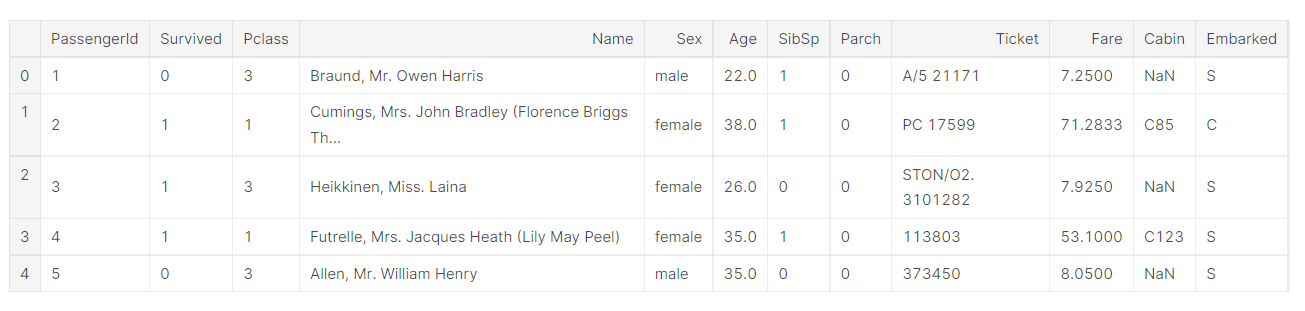
data.head() : 대략적인 데이터 파악
[4]
data.isnull().sum() : 결측치 파악 0보다 크면 결측치
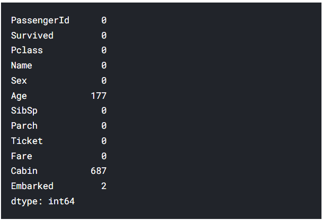
👉 : Age에 결측치 177개 / Cabin에 결측치 687개 / Embarked에 결측치 2개
[5] Survived 데이터 자세히 보기?
f,ax=plt.subplots(1,2,figsize=(18,8))
data['Survived'].value_counts().plot.pie(explode=[0,0.1],autopct='%1.1f%%',ax=ax[0],shadow=True)
ax[0].set_title('Survived')
ax[0].set_ylabel('')
sns.countplot('Survived',data=data,ax=ax[1])
ax[1].set_title('Survived')
plt.show()- f, ax = plt.subplots(1, 2, figsize = (18, 8))
plt.subplots(nrow, ncols)
- data.plot.pie : data를 사용하여 파이 그래프 그리기
→data['Survived'].value_counts().plot.pie(explode[0,0.1],autopct='%1.1f%%',ax=ax[0],shadow=True)
data의 Surviced 열의 값들을 카운트한 값을 파이 그래프로 그린다.
(explode : 부채꼴이 파이 차트 중심에서 벗어나는 정도 0.1 = 10%)
(autopct : 부채꼴 안에 표시될 숫자의 형식 %1.1f%% : X.x%)
(ax : figure 내에서 하나의 그래프 ax = ax[0] : 첫번째 그래프에 그리겠다)
(shadow : 그림자 표시)
- ax[0].set_title(’Survived’) : 첫 번째 ax에 Survived 제목 주기
- ax[0].set_ylabel('') : 첫 번째 ax의 y축 이름 지우기
- sns.countplot('Survived',data=data,ax=ax[1]) : data에서 x축을 Survived로 하고 두 번째 ax에 그리겠다.
- ax[1].set_title('Survived') : 두 번째 ax에 Survived 제목 주기
- plt.show() : 화면에 호출
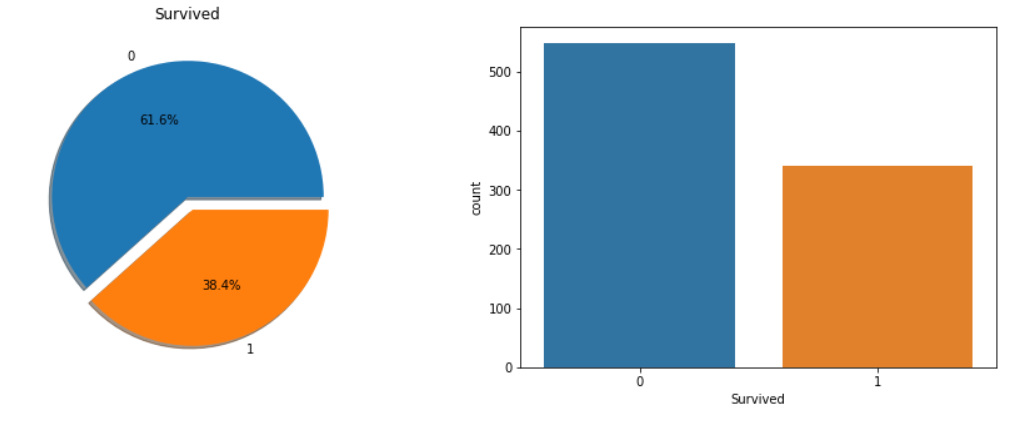
→ 총 891명의 승객중에서 350명, 38.4%의 승객만 생존했다.
대략적으로 파악했으므로, 데이터를 더 분석해서 어느 카테고리의 승객이 생존했는지, 생존하지 못 했는지 알 필요가 있다.
우리는 다른 변수의 데이터셋을 이용해서 생존률을 체크해야한다.
먼저 변수의 종류를 알아보자.
- 변수의 종류
- 범주형 변수(Categorical Features) : 두 개나 두 개 이상의 범주로 묶일 수 있는 변수를 범주형 변수라고 한다. 예를 들면, 성별은 남성, 여성 이렇게 두 개의 범주로 묶인다. 우리는 이러한 변수의 순서를 정할 수 없다. Nominal 변수라고 불리기도 한다.
현재 데이터셋의 범주형 변수 : Sex, Embarked
- Ordinal Features : 범주형 변수와 비슷하지만 이들은 변수 간에 순서를 정하여 분류할 수 있다. 예를 들면, 우리가 키라는 변수에 값을 크다, 중간, 작다로 가진다면 키라는 변수는 Ordinal variable이다.
현재 데이터 셋의 Ordinal Features : PClass
- Continous Feature : 두 지점 사이나 최소, 최댓 값 사이에 값을 가질 수 있으면 Continous Feature이다.
현재 데이터 셋의 Continous Features : Age
- 변수 분석
- Sex : 범주형 변수
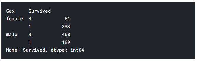
[6] data.groupby(['Sex','Survived'])['Survived'].count()
: Sex, Survived로 그룹화하고 그룹화된 것 중에서 Survived를 집계하여 보여준다.
[7] plot 그리기
data[['Sex','Survived']].groupby(['Sex']).mean().plot.bar(ax=ax[0])
Sex로 그룹화하면 남성 Survived / 여성 Survived가 나오는데 여기서 평균을 mean으로 내면 생존율이 나온다.
왜냐하면 생존이 1이고 사망이 0이기 때문에 평균 = 합계 / 개수에서
개수는 총 승객수가 되고 합계는 생존자만 더해지기 때문에 생존자 / 총 승객수가 돼서 생존율이 되는 것이다!!...
pandas를 사용하여 첫 번째 ax에 bar plot을 그린다.
ax[0].set_title('Survived vs Sex') : 첫 번째 ax 제목
sns.countplot('Sex',hue='Survived',data=data,ax=ax[1])
: Survived별로 색상을 나누고 Sex별로분류하여 두 번째 ax에 countplot을 그린다.
ax[1].set_title('Sex:Survived vs Dead') : 두 번째 ax 제목
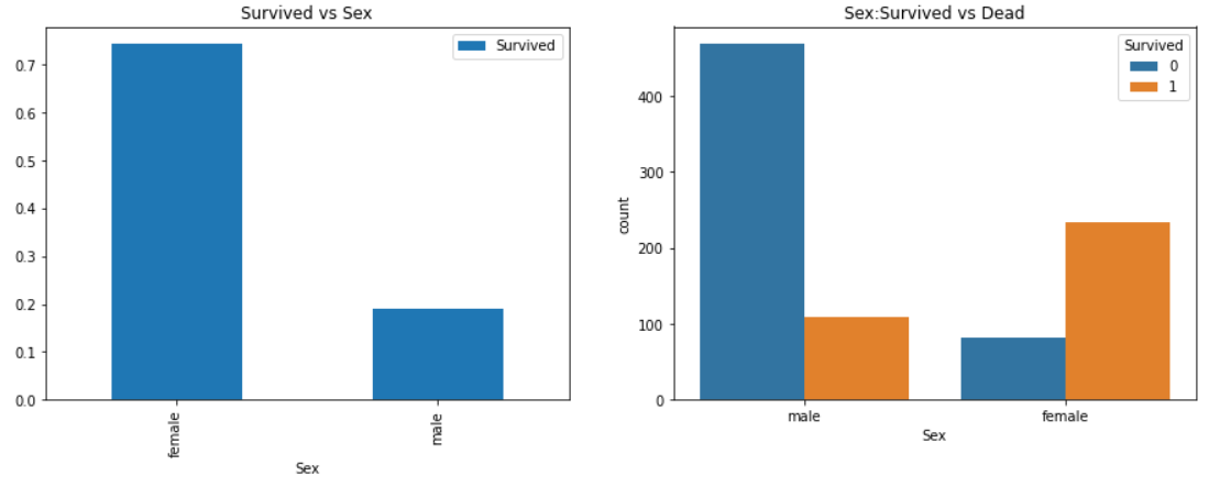
: 남성 탑승객이 여성보다 많지만 남성 생존율보다 여성 생존율이 2배 넘게 많다. 남성 생존율 : 19% / 여성 생존율 : 75%
이것은 모델링을 위해 매우 중요한 변수처럼 보인다. 하지만 가장 중요할까?
다른 변수를 체크해보자.
- Pclass → Ordinal Feature
[8] pd.crosstab(data.Pclass,data.Survived,margins=True).style.background_gradient(cmap='summer_r')
summer_r 테마를 사용하여 data의 Pclass을 행으로, Survived를 열로 하는 crosstab 생성
[9]
f,ax=plt.subplots(1,2,figsize=(18,8)) : subplot 생성
data['Pclass'].value_counts().plot.bar(color=['#CD7F32','#FFDF00','#D3D3D3'],ax=ax[0]): Pclass 값들의 개수를 서로 다른 색상의 barplot으로 첫 번째 ax에 그린다.
ax[0].set_title('Number Of Passengers By Pclass')
ax[0].set_ylabel('Count')
: 첫 번째 ax 제목 / 첫 번째 ax의 y축 이름 설정
sns.countplot('Pclass',hue='Survived',data=data,ax=ax[1])
: Survived별로 색상을 나누고 Pclass별로 분류하여 두 번째 ax에 그린다.
ax[1].set_title('Sex:Survived vs Dead') : 두 번째 ax 제목 설정
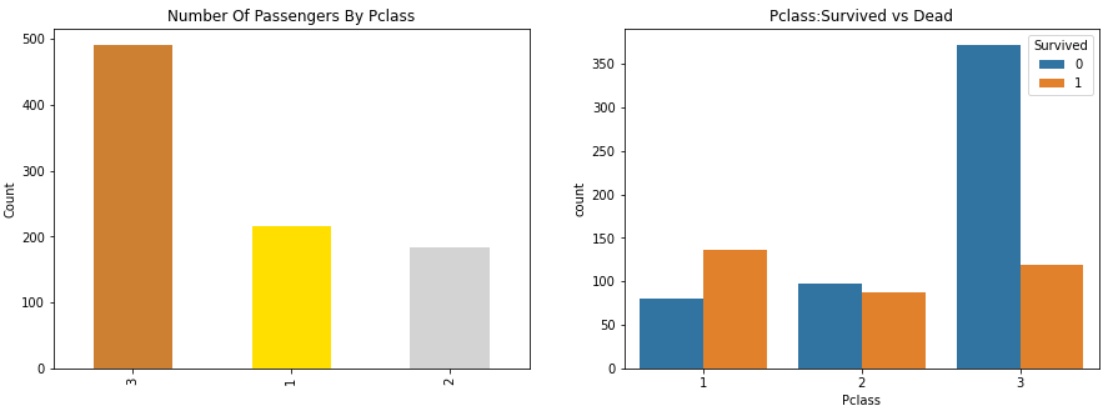
사람들은 돈은 모든 것을 사지 못한다고 한다. 하지만 Pclass 1이 높은 우선순위로 구조된 것을 명확히 알 수 있다. Pclass 3의 수가 많지만 생존율은 약 25%로 매우 낮았다.
P class 2의 생존율이 48%인 것에 비해 Pclass 1의 생존율은 63%이다. 따라서 돈과 명성은 상관이 있다. 이것이 물질주의의 현실이다.
Sex와 Pclass의 생존율에 관해 함께 체크해보자.
[10]
pd.crosstab([data.Sex,data.Survived],data.Pclass,margins=True).style.background_gradient(cmap='summer_r')
: summer_r을 테마로하여 Sex, Survived를 행으로, Pclass를 열으로하는 Crosstab을 작성
[11]
sns.factorplot('Pclass','Survived',hue='Sex',data=data)
: Pclass를 행으로, Survived를 열으로 하고 Sex로 색상을 나누어 factorplot 작성
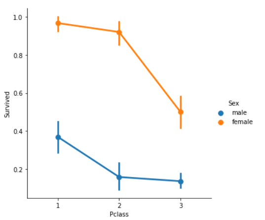
y축 : 생존률 / x축 : Pclass / blue : male / orange : female
범주형 데이터의 분포를 쉽게 보여주기 때문에 factorplot을 사용한다.
CrossTab과 Factorplot을 보아, 우리는 쉽게 Pclass1의 여성의 생존율이 95~96%이고, 94명 중의 3명만 사망한 것을 쉽게 추론할 수 있다.
Pclass를 제외하고도, 여성은 가장 높은 구조 우선순위를 가진 것을 알 수 있다. Pclass 1의 남성조차 매우 낮은 생존율을 가진다.
Pclass 역시 중요한 변수처럼 보인다. 다른 변수를 분석해보자.
- Age : Continous Feature
[12]
print('Oldest Passenger was of:',data['Age'].max(),'Years')
print('Youngest Passenger was of:',data['Age'].min(),'Years')
print('Average Age on the ship:',data['Age'].mean(),'Years')
① 가장 최고령자의 나이 출력
② 가장 최연소 나이 출력
③ 평균 나이 출력

[13]
sns.violinplot("Pclass","Age", hue="Survived", data=data,split=True,ax=ax[0])
: X축 - Pclass / Y축 - Age / Survived별로 색상을 다르게 하여 첫 번째 ax에 violinplot 작성
split=True해서 Survived 별로 나눠져 있는 것을 합쳐서 그리기
ax[0].set_title('Pclass and Age vs Survived')
ax[0].set_yticks(range(0,110,10))
첫 번째 ax의 제목 설정 / y축 값의 범위를 0~110까지 10 간격으로 설정
sns.violinplot("Sex","Age", hue="Survived", data=data,split=True,ax=ax[1])
: X축 : Sex / Y축 : Age / Survived별로 색상을 나누어서 두 번째 ax에 violinplot 작성. split=True로 Survived로 2개로 나뉜 것을 합쳐서 그린다.
ax[1].set_title('Sex and Age vs Survived')
ax[1].set_yticks(range(0,110,10))
두 번째 ax의 제목 설정 / y축 값의 범위를 0~110까지 10 간격으로 설정
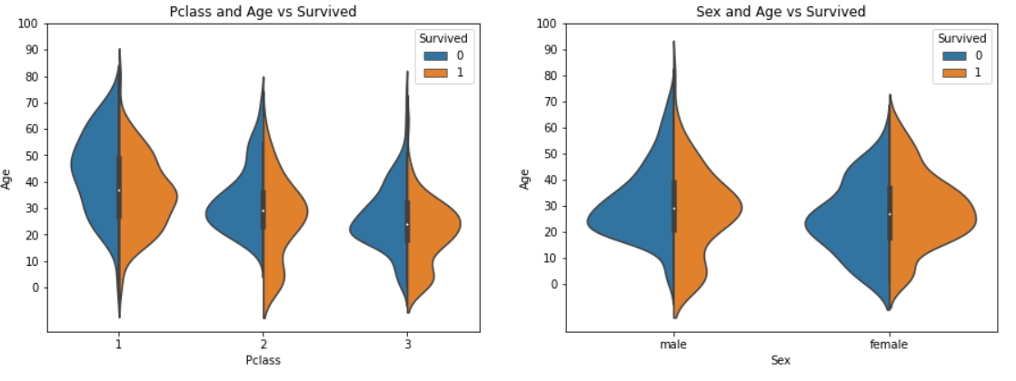
분석:
① 10세 이하 아이들의 생존율은 Pclass가 증가할수록 증가하는 것을 알 수 있는데, 이는 Pclass를 무시하는 좋은 예이다.
② Pclass 1의 20~50세 탑승객들의 생존율은 높고, 특히 여성이 더 높다.
③ 남자는 나이가 증가할수록 생존율이 작아진다.
우리는 전에 Age 데이터에 177개의 결측치가 존재하는 것을 알 수 있었다. 데이터셋의 평균 나이를 결측치에 대체한다.
그러나 문제는, 다른 나이를 가진 많은 사람들이 있다는 것이다. 우리는 4살의 아이를 29살의 평균나이로 배정할 수 없다. 이러한 오차를 줄일 방법이 있을까?
빙고! 우리는 Name 변수를 체크하면 된다. 우리는 Name 변수가 Mr, Mrs로 시작하는 것을 볼 수 있다. 따라서 우리는 각 그룹에게 Mr, Mrs의 평균값을 배정하면 된다
→ ?? 이해 안감
[14]
data['Initial']=0
for i in data:
    data['Initial']=data.Name.str.extract('([A-Za-z]+)\.')#lets extract the Salutations
: 데이터 개수만큼 반복하는데 Initial열을 만들고 거기에 Mr, Mrs를 추출하여 넣는다.
[A-Za-z]+). → .앞에 나오는 모든 알파벳을 의미한다. ?
[15]
pd.crosstab(data.Initial,data.Sex).T.style.background_gradient(cmap='summer_r') *#Checking the Initials with the Sex*
Initial을 행으로, Sex를 열으로하는 crosstab을 작성하여 성별과 함께 이름을 체크한다.
여기에는 Mlle나 Mme같은 철자가 틀린 글자가 있는데 이는 Miss를 의미한다. 그들을 Miss나 다른 값으로 대체할 것이다.
[16]
data['Initial'].replace(['Mlle','Mme','Ms','Dr','Major','Lady','Countess','Jonkheer','Col','Rev','Capt','Sir','Don'],['Miss','Miss','Miss','Mr','Mr','Mrs','Mrs','Other','Other','Other','Mr','Mr','Mr'],inplace=True)
: 철자 틀린 것 다른 Miss, Mr, Mrs, Other로 대체
[17]
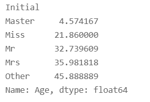
data.groupby('Initial')['Age'].mean() *#lets check the average age by Initials*
Initial에 따른 평균 나이를 체크해보자.
—잘 모르겠음..
[18] 결측치 채우기
## Assigning the NaN Values with the Ceil values of the mean ages
data.loc[(data.Age.isnull())&(data.Initial=='Mr'),'Age']=33
data.loc[(data.Age.isnull())&(data.Initial=='Mrs'),'Age']=36
data.loc[(data.Age.isnull())&(data.Initial=='Master'),'Age']=5
data.loc[(data.Age.isnull())&(data.Initial=='Miss'),'Age']=22
data.loc[(data.Age.isnull())&(data.Initial=='Other'),'Age']=46
결측치 AND Initial Name 조건을 사용하여 결측치 채워넣기
[19]
data.Age.isnull().any() *#So no null values left finally*
any : 모든 자료가 False인 경우만 False 반환
False 출력 → 결측치 없다.
[20]
data[data['Survived']==0].Age.plot.hist(ax=ax[0],bins=20,edgecolor='black',color='red')
: Survived = 0(사망자)와 Age 기준으로 첫 번째 ax에 histplot 그리기 (테두리 = 검은색, 막대 색깔 = 빨간색, 막대 개수 : 20개)
x1=list(range(0,85,5))
ax[0].set_xticks(x1)
: X축 범위 0~85, 5간격
data[data['Survived']==1].Age.plot.hist(ax=ax[1],color='green',bins=20,edgecolor='black')
: Survived = 0(생존자)와 Age 기준으로 두 번째 ax에 histplot 그리기 (테두리 = 검은색, 막대 색깔 = 초록색, 막대 개수 : 20개)
x1=list(range(0,85,5))
ax[0].set_xticks(x1)
: X축 범위 0~85, 5간격
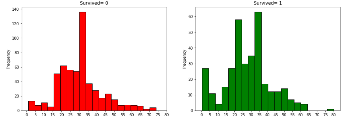
분석:
① 5세 이하 유아는 많은 수가 생존했다.
② 80세의 최고령자는 생존하였다.
③ 사망자의 최댓값은 30~40대에 분포한다.
[21]
sns.factorplot('Pclass','Survived',col='Initial',data=data)
plt.show()
Initial 별로 X축은 Pclass, Y축은 Survived(생존율)으로 설정하여 factorplot 그린다.
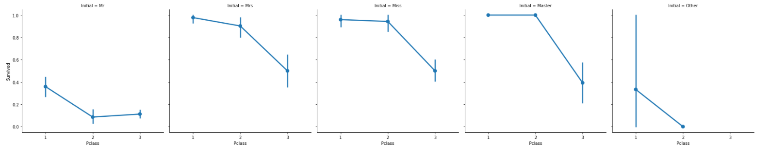
Pclass와 관계없이 여성과 아이 우선 규칙은 지켜진다.
- Embarked : 범주형 값
[22]
pd.crosstab([data.Embarked,data.Pclass],[data.Sex,data.Survived],margins=True).style.background_gradient(cmap='summer_r')
Embarked, Pclass를 행으로 Sex와 Survived를 열로하는 crosstab 작성
-승선포트에 의한 생존율
[23]
sns.factorplot('Embarked','Survived',data=data)
fig=plt.gcf()
fig.set_size_inches(5,3)
plt.show(
Embarked를 X축, Survived를 Y축으로 하는 factorplot 생성
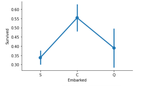
포트 S가 가장 낮은 생존율을 가진 것에 비해 포트 C의 생존율이 0.55로 가장 높다.
[24]
f,ax=plt.subplots(2,2,figsize=(20,15))
sns.countplot('Embarked',data=data,ax=ax[0,0])
ax[0,0].set_title('No. Of Passengers Boarded')
sns.countplot('Embarked',hue='Sex',data=data,ax=ax[0,1])
ax[0,1].set_title('Male-Female Split for Embarked')
sns.countplot('Embarked',hue='Survived',data=data,ax=ax[1,0])
ax[1,0].set_title('Embarked vs Survived')
sns.countplot('Embarked',hue='Pclass',data=data,ax=ax[1,1])
ax[1,1].set_title('Embarked vs Pclass')
plt.subplots_adjust(wspace=0.2,hspace=0.5)
plt.show()
ax(0,0) : Embarked 수
ax(0,1) : 성별에 따른 Embarked 수
ax(1,0) : 생존/사망에 따른 Embarked 수
ax(1,1) : Pclass에 따른 Embarked 수
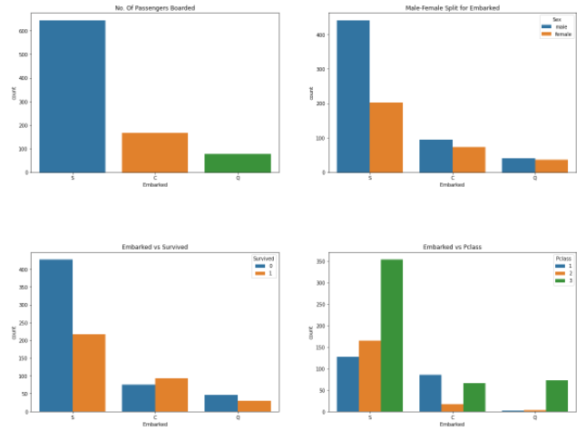
분석:
① S에서 가장 많은 탑승객이 탑승했고 대부분 Pclass 3이다.
② C의 탑승객은 생존율 비율이 좋아보인다. 그 이유는 아마 모든 Pclass1과 Pclass2 탑승객들이 구조되었기 때문일 것이다.
③ S는부유한 사람의 대부분이 탑승한 것으로 보인다. 여전히 생존율은 낮지만, 이러한 이유는 Pclass3 탑승객의 81%가 생존하지 못했기 때문으로 보인다.
④ Q는 95%가 Pclass3 탑승객이다.
[25]
sns.factorplot('Pclass','Survived',hue='Sex',col='Embarked',data=data)
: Pclass를 X축, Survived를 Y축으로 하고 Sex별로 색상을 다르게 하고 Embarked별로 서브플롯을 그린다.
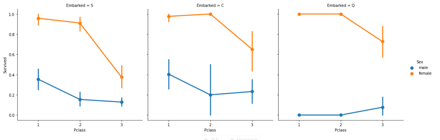
분석:
① Pclass와 관계없이 Pclass1과 Pclass2의 여성들은 생존율이 거의 1에 가깝다.(오타? : Pclass와 관계없는 게 아니고 Embarked와 관계없는 것 같다.)
② Pclass3의 S 탑승객은 여성과 남성 모두 생존율이 매우 낮기 때문에 매우 불행해보인다. (돈이 중요하다..?)
③ Q는 거의 Pclass 3이기 때문에 남자에게 매우 불행해보인다.
-Embarked 결측치 채우기
우리는 가장 많은 탑승객이 S를 통해 탄 것을 봤기 때문에 결측치를 S로 채운다.
[26]
data['Embarked'].fillna('S',inplace=True)
: inplace = True를 사용하여 원본에 바로 결측치를 S로 대체
[27]
data.Embarked.isnull().any()*# Finally No NaN values*
: False 출력 → 결측치 없다.
- SibSip → Discrete Feature (불연속적인 수치 데이터)
이 변수는 혼자 왔는지 가족과 같이 왔는지를 표현한다.
Sibling = brother, sister, stepbrother, stepsister
Spouse : husband, wife
[28]
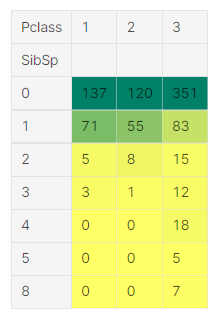
pd.crosstab([data.SibSp],data.Survived).style.background_gradient(cmap='summer_r')
: Sibsp를 행으로, Survived를 열로 하는 crosstab 작성
[29]
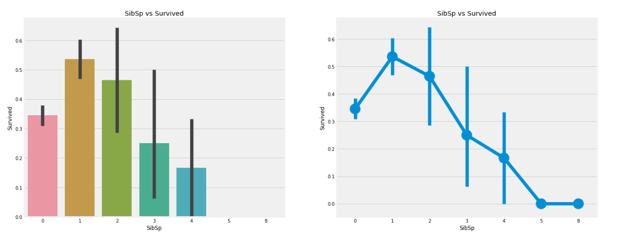
sns.barplot('SibSp','Survived',data=data,ax=ax[0])
ax[0].set_title('SibSp vs Survived')
sns.factorplot('SibSp','Survived',data=data,ax=ax[1])
ax[1].set_title('SibSp vs Survived')
ax[0] : SibSp를 X축, Survived를 Y축으로 하는 barplot 작성
ax[1] : SibSp를 X축, Survived를 Y축으로 하는 factorplot 작성
[30]
pd.crosstab(data.SibSp,data.Pclass).style.background_gradient(cmap='summer_r')
: SibSp를 X축, Pclass를 Y축으로하여 croosstab 작성
분석 :
barplot과 factorplot은 탑승객이 혼자라면 34.5% 생존율을 보인다고 말한다.
생존율 그래프는 siblings 수가 증가할수록 급격히 감소한다. 이것은 말이 된다.
요약하자면, 가족이 탑승한다면 나는 나 대신 가족을 구조하려고 할 것이다.
놀랍게도 5~8명의 가족의 생존율은 0%이다. 이러한 이유가 Pclass때문일까?
Pclass때문이다. crosstab은 SibSp가 3보다 큰 사람은 모두 Pclass 3이라고 보여준다. Pclass 3의 가족들이 모두 사망하는 것이 임박했다?
- Parch
[31]
pd.crosstab(data.Parch,data.Pclass).style.background_gradient(cmap='summer_r') : Parch를 행으로, Pcalss를 열로 하는 crosstab 작성
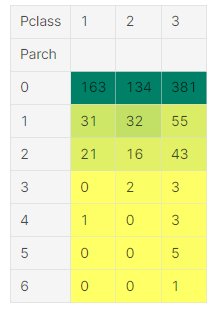
이 crosstab은 Pclass3에 대가족이 있다는 것을 또 다시 보여준다.
[32]
sns.barplot('Parch','Survived',data=data,ax=ax[0])
ax[0].set_title('Parch vs Survived')
sns.factorplot('Parch','Survived',data=data,ax=ax[1])
ax[1].set_title('Parch vs Survived')
Parch를 X축, Survived를 Y축으로 해서 첫 번째 ax에 barplot 작성
Parch를 X축, Survived를 Y축으로 해서 두 번째 ax에 factorplot 작성
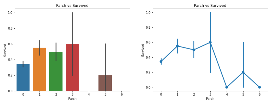
분석 :
결과는 꽤 비슷하다. 그들의 부모와 함께 탑승한 탑승객은 생존의 기회가 많다. 하지만 그 수가 증가함에 따라 기회가 줄어든다.
생존의 기회는 배의 1~3명의 부모를 가진 누군가에겐 많다. 혼자가 되는 것은 치명적이고 누군가 4명 이상의 부모가 배에 타고 있다면 생존의 기회가 줄어든다.
- Fare → Continous Feature (연속형 변수)
[33]
print('Highest Fare was:',data['Fare'].max())
print('Lowest Fare was:',data['Fare'].min())
print('Average Fare was:',data['Fare'].mean())
가장 높은 요금 / 낮은 요금 / 평균 요금 출력
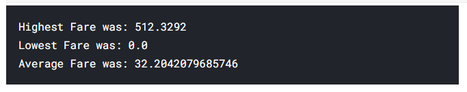
가장 낮은 금액은 0원이다. 무료!
[34]
sns.distplot(data[data['Pclass']==1].Fare,ax=ax[0])
ax[0].set_title('Fares in Pclass 1')
sns.distplot(data[data['Pclass']==2].Fare,ax=ax[1])
ax[1].set_title('Fares in Pclass 2')
sns.distplot(data[data['Pclass']==3].Fare,ax=ax[2])
ax[2].set_title('Fares in Pclass 3')
Pclass1, 2, 3에 따라 ax를 다르게하여 3개의 distplot 작성
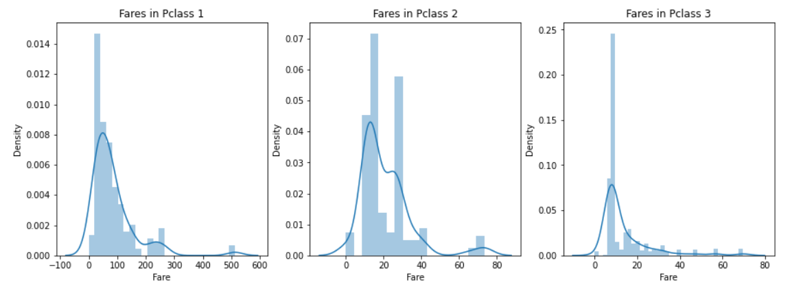
distplot의 y축 : 밀도
Pcalss1의 승객 요금이 큰 분포를 보이며 이 분포는 표준이 줄어감에따라 감소한다.???
이것은 또한 연속적이기 떄문에 우리는 구간화(binning)를 통해 이산값(0,1?) 으로 변환시킬 수 있다.
모든 변수에 대해 분석:
① Sex : 여성의 생존율이 남성과 비교해서 높다.
② Pclass : Pclass 1 탑승객이 생존의 기회가 더 높다는 것을 볼 수 있다. Pclass 3의 생존율은 매우 낮다. 여성의 경우에는, Pclass 1의 생존율이 거의 1에 가깝고 Pclass 2도 높다. 돈이 이겼..
③ Age : 5~10세 이하의 아이들은 높은 생존율을 가진다. 15~35세의 탑승객들은 많이 사망했다.
④ Embarked : 이 변수는 매우 흥미로운 변수다. 대부분의 Pclass 1 탑승객이 Port S에 있음에도 불구하고 Port C의 생존율이 더 높은 것으로 보인다. Port Q의 탑승객은 모두 Pclass 3이다.
⑤ Parch+SibSp : 1,2명의 배우자나 형제, 1~3명의 부모와 함께 탑승한 승객은 혼자왔거나 대가족의 탑승객보다 생존율이 높다.
변수 간의 상관관계
[35]
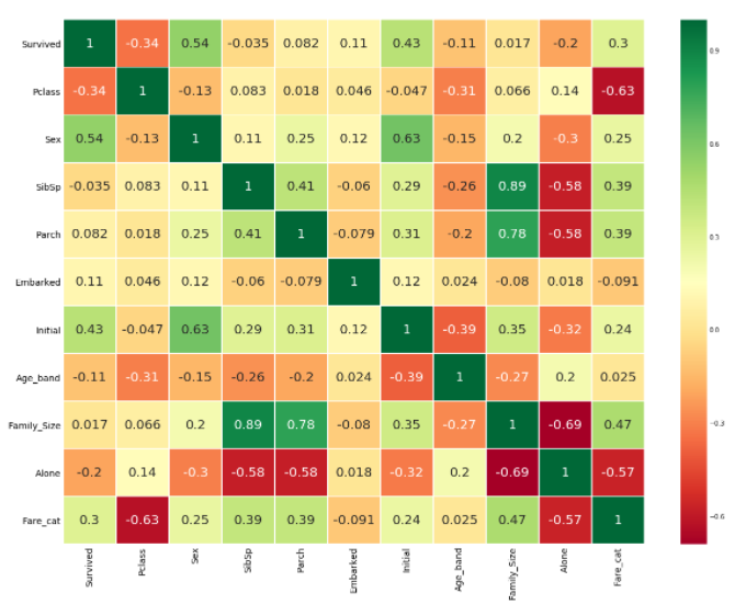
sns.heatmap(data.corr(),annot=True,cmap='RdYlGn',linewidths=0.2) *#data.corr()-->correlation matrix*
: 상관계수 표 그리기 (annot = True : 값 표시)
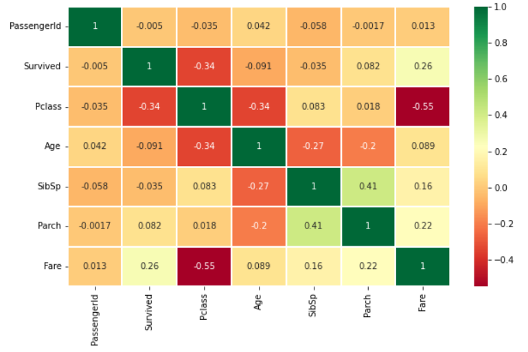
Heatmap 해석:
처음으로 알아야하는 것은 우리는 문자 사이의 상관관계는 알 수 없고 수치 변수의 상관 관계만 알 수 있다. 플롯을 이해하기 전에 상관관계가 무엇인지 보자.
양의 상관관계 (POSITIVE CORRELATION): A 변수의 증가로 인해 B 변수가 증가한다면 그들은 양의 상관관계이다. 1은 완벽한 양의 상관관계를 의미한다.
음의 상관관계 (NEGATIVE CORRELATION) : A 변수의 증가로 인해 B 변수가 감소한다면 그들은 음의 상관관계이다. -1은 완벽한 음의 상관관계를 의미한다.
이제 두 변수가 상관이 있어서 하나의 변수의 증가가 다른 변수의 증가를 유도하는지 알아보자. 이는 두 변수가 매우 비슷한 정보를 포함하고 있고 정보의 차이가 별로 없다는 것을 의미한다.
둘 중 하나가 불필요하더라도 두개를 다 사용해야 한다고 생각하시나요? 모델링을 할 때, 학습 시간을 줄여주고 많은 이점이 있기 때문에 우리는 불필요한 변수를 제거하도록 노력해야한다.
이제 히트맵을 보면, 우리는 변수들이 상관관계가 적다고 볼 수 있다. 가장 높은 상관관계는 SibSp와 Parch 사이의 0.41이다. 따라서 우리는 모든 변수를 사용할 수 있다.
Part2 : Feature Engineering and Data Cleaning
Feature Engineering은 뭘까?
데이터가 있는 데이터셋을 받아올때는 언제나 모든 데이터가 중요하지는 않다.
거기에는 아마도 제거해야할 불필요한 데이터들이 많이 있을 것이다.
또한 우리는 관찰이나 다른 데이터의 정보를 추출하여 새로운 데이터를 얻을 수 있다.
하나의 예는 Name 데이터를 사용하여 Initals 데이터를 얻은 것이다. 어느정도로 새로운 데이터를 얻고 어느정도로 데이터를 제거할지 보자. 또한 우리는 예측 모델을 위해 존재하는 관계 데이터를 알맞는 형태로 변환할 것이다.
- Age_band
Age 데이터의 문제 :
Age는 연속적인 데이터라고 언급했을 때 거기에는 머신러닝의 연속적인 변수에 관한 문제가 있다.
Ex) 만약 운동하는 사람을 Sex로 묶거나 배열한다면 우리는 쉽게 그들을 남성과 여성으로 구분할 수 있다.
이제 그들을 나이로 묶는다면, 어떻게 할까? 만약 30명의 운동하는 사람이 있다면 30개의 나이 데이터가 있을 것이다. 이것이 문제가 있다.
우리는 이러한 연속적인 데이터를 구간화나 정규화를 통해 범주형 데이터로 전환해야한다. 여기서는 구간화를 사용할 것이다. 즉, 나이의 범위를 하나의 구간으로 그룹화하거나 그들을 하나의 값으로 할당할 것이다.
최고령 탑승객의 나이는 80세이다. 따라서 나이의 범위를 0~80으로 하고 5개의 구간으로 나눠보자. 80/5 = 16이므로 구간의 크기는 16이다.
→ 이렇게 만든 데이터를 Age_band라고 하자.
[36]
data['Age_band']=0
data.loc[data['Age']<=16,'Age_band']=0
data.loc[(data['Age']>16)&(data['Age']<=32),'Age_band']=1
data.loc[(data['Age']>32)&(data['Age']<=48),'Age_band']=2
data.loc[(data['Age']>48)&(data['Age']<=64),'Age_band']=3
data.loc[data['Age']>64,'Age_band']=4
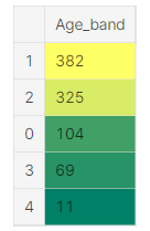
data.head(2)Age_band 열을 만들어서 구간별로 행을 0~4 까지 추가하여 상위 2개의 행만 본다.

[37]
data['Age_band'].value_counts().to_frame().style.background_gradient(cmap='summer')*#checking the number of passenegers in each band*
: Age_band 별로 값을 집계하여 Age_band별 승객 수를 확인한다.
[38]
sns.factorplot('Age_band','Survived',data=data,col='Pclass')
Age_band별 Survived를 Pclass를 기준으로 나누어 3개의 factorplot을 그린다.
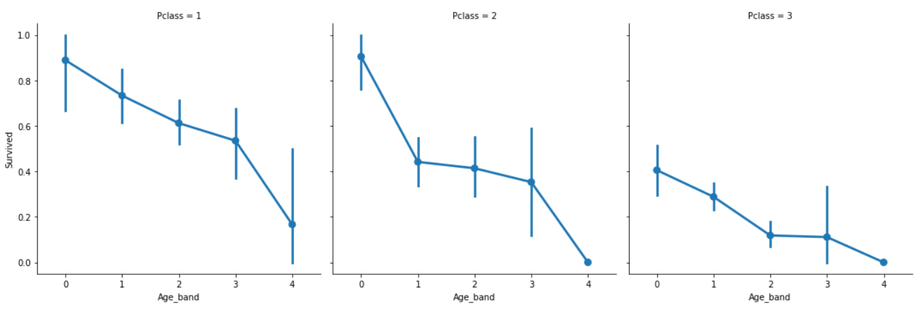
Pclass와 관계없이 나이가 증가할수록 생존율은 감소한다.
- Famliy_Size and Alone
우리는 “Famliy_Size”와 “Alone”으로 불리는 새로운 데이터를 만들고 분석할 수 있다. 이 데이터는 Parch와 SibSp를 합한 것이다. 이것은 우리에게 합해진 데이터를 줘서 탑승객의 가족 크기가 생존율과 상관이 있는지를 확인할 수 있다.
Alone으로는 승객이 혼자인지 아닌지를 알 수 있다.
[39]
data['Family_Size']=0
data['Family_Size']=data['Parch']+data['SibSp']#family size
data['Alone']=0
data.loc[data.Family_Size==0,'Alone']=1#Alone
데이터셋에 새로운 데이터 “Family_size”와 “Alone” 열 추가
Alone은 기본값 0 , Family_size=0이면 1로 변경(Alone = 1 : 혼자 온 탑승객)
sns.factorplot('Family_Size','Survived',data=data,ax=ax[0])
ax[0].set_title('Family_Size vs Survived')
sns.factorplot('Alone','Survived',data=data,ax=ax[1])
ax[1].set_title('Alone vs Survived')
첫 번째 ax에 Family_size별 Survived를 factorplot으로 작성
두 번째 ax에 Alone별 Survived를 factorplot으로 작성
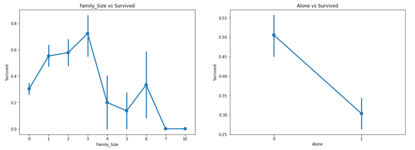
Family_size = 0은 혼자 온 탑승객을 의미한다. 명확하게, alone이거나 family_size=0이라면 생존율은 매우 낮다. Family_size가 4가 넘어가면 생존율은 마찬가지로 감소한다. 이것은 모델에서 중요한 데이터로 보인다. 더 시험해보도록 하자.
[40]
sns.factorplot('Alone','Survived',data=data,hue='Sex',col='Pclass')
Alone별 Survived를 Pclass를 기준으로 3개로 나누고 Sex로 색상을 나누어 factorplot을 3개 작성한다.
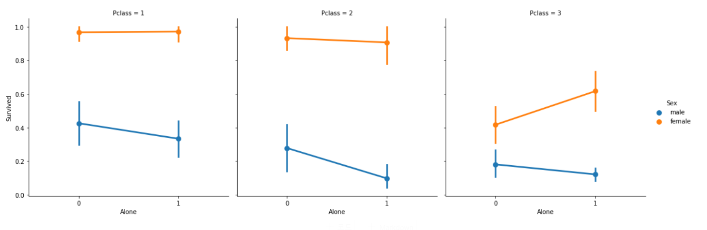
혼자 온 여성이 가족끼리 온 탑승객보다 생존율이 높은 Pclass 3의 여성을 제외하면 Pclass나 Sex에 관계없이 혼자 온 탑승객은 위험한 것으로 볼 수 있다.
- Fare_Range
fare 역시 연속적인 데이터이기때문에 우리는 Ordinal 값으로 변환해야한다. 이를 위해 우리는 pandas.qcut을 사용할 것이다.
qcut은 우리가 정한 구간에 따라서 값들을 배열하거나 나눠준다. 따라서 우리가 5개의 구간으로 나누고 싶을 때 qcut이 값을 동등하게 5개의 구간이나 5개의 범위 값으로 배열할 것이다.
→ qcut을 사용하면 구간의 개수만 입력하면 구간의 값을 자동으로 나눠준다.
[41]
data['Fare_Range']=pd.qcut(data['Fare'],4)
data.groupby(['Fare_Range'])['Survived'].mean().to_frame().style.background_gradient(cmap='summer_r')
qcut을 사용하여 “Fare_Range”열에 4개의 구간으로 값들을 자동으로 나누고
Fare_Range별 Survived의 평균을 데이터 프레임으로 표현한다(to_frame() )
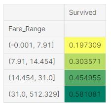
우리는 명확하게 Fare_Range가 증가할수록 생존율이 올라가는 것을 알 수 있다.
지금 상태로는 Fare_Range값을 통과시킬 수 없다. 우리는 Age_Band에서 했던 것처럼 값을 변환해야한다.
[42]
data['Fare_cat']=0
data.loc[data['Fare']<=7.91,'Fare_cat']=0
data.loc[(data['Fare']>7.91)&(data['Fare']<=14.454),'Fare_cat']=1
data.loc[(data['Fare']>14.454)&(data['Fare']<=31),'Fare_cat']=2
data.loc[(data['Fare']>31)&(data['Fare']<=513),'Fare_cat']=3
pcut으로 나눈 구간별로 Fare_cat을 0,1,2,3으로 설정한다.
[43]
sns.factorplot('Fare_cat','Survived',data=data,hue='Sex')
Fare_cat별 Survived를 Sex로 색상을 나누어 factorplot으로 그린다.
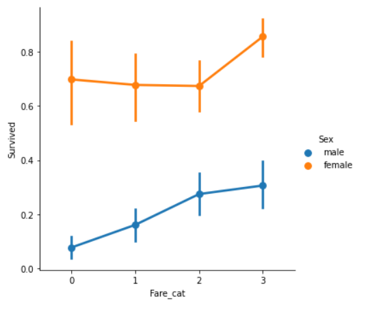
명확하게, Fare_cat이 증가할수록 생존율도 증가한다. 이러한 데이터는 성별에 따른 모델링을 하는 동안 중요한 데이터가 될 것이다.
- Converting String Values into Numeric : 문자 데이터를 수치 데이터로 변환하기
문자형 데이터는 머신 러닝 모델로 사용할 수 없기 때문에 우리는 Sex, Embarked 등 문자 데이터를 수치 값으로 변환해야한다.
[44]
data['Sex'].replace(['male','female'],[0,1],inplace=True)
data['Embarked'].replace(['S','C','Q'],[0,1,2],inplace=True)
data['Initial'].replace(['Mr','Mrs','Miss','Master','Other'],[0,1,2,3,4],inplace=True)
문자형 데이터 → 수치형 데이터(0, 1, 2, 3)로 변환
- Dropping UnNeeded Features : 불필요한 데이터 버리기
① Name : 범주형 데이터로 변환할 수 없는 Name 데이터는 불필요하다.
② Age : 우리는 Age_band 데이터가 있어서 Age 데이터는 필요가 없다.
③ Ticket : 이것은 범주화될 수 없는 랜덤 문자이다.
④ Fare : Fare_cat 데이터가 있기 때문에 필요 없다.
⑤ Cabin : 많은 결측치가 있고 많은 탑승객들이 여러 cabins을 가진다. 따라서 쓸모없는 데이터이다.
⑥ Fare_Range : Fare_cat이 있으므로 불필요하다.
⑦ Passengerld : 범주화될 수 없다.
[45]
data.drop(['Name','Age','Ticket','Fare','Cabin','Fare_Range','PassengerId'],axis=1,inplace=True)
: 필요없는 데이터 버리기
sns.heatmap(data.corr(),annot=True,cmap='RdYlGn',linewidths=0.2,annot_kws={'size':20})
fig=plt.gcf()
fig.set_size_inches(18,15)
plt.xticks(fontsize=14)
plt.yticks(fontsize=14)
: 상관관계 heatmap 작성
우리는 몇 개의 양의 상관 데이터를 볼 수 있다. SibSp와 Family_Size / Parch와 Family_Size는 양의 상관관계를 가지고 몇몇은 Alone과 Family_Size처럼 음의 상관관계를 가진다.
Part 3 : Predictive Modeling : 예측 모델링
우리는 EDA를 통해 몇가지 통찰을 얻었다. 그러나 우리는 정확하게 예측하거나 한 탑승객이 생존할 것인지 사망할 것인지 구별할 수 없다.
따라서 우리는 탑승객이 생존할 것인지 아니면 사망할 것인지 좋은 Classification Algorithms을 사용하여 예측할 것이다. 모델을 만들기 위해 사용할 알고리즘은 다음과 같다.
① Logistic Refression (회귀 분석)
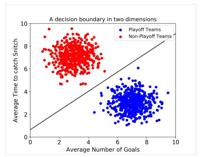
② Support Vector Machines(SVM), (Linear and radial)
: decision boundary라는 데이터 간 경계를 정의하여 classification 수행하고 unclassified된 데이터라 어느 boundary에 떨어지는지를 확인하여 데이터의 class를 예측한다.
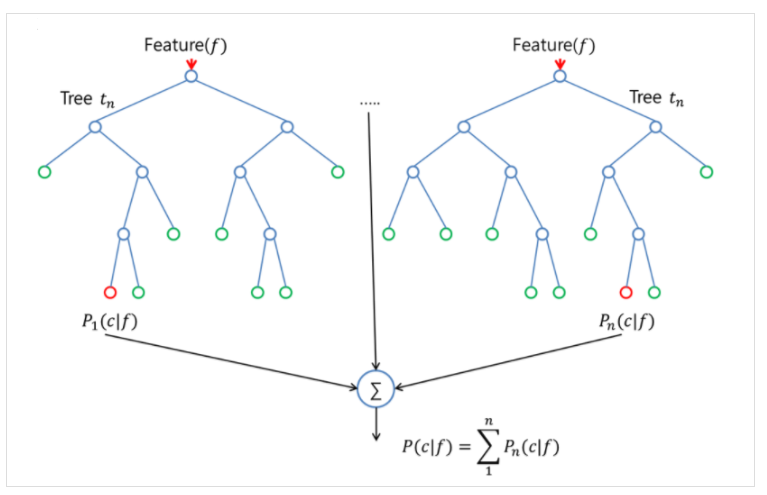
③ Random Forest
: 여러 개의 decision tree를 형성하고 새로운 데이터 포인트를 각 트리에 통과시키며, 각 트리가 분류한 결과에서 투표를 실시하여 가장 많이 득표한 결과를 최종 분류 결과로 선택한다.
④ K-Nearest Neighbours
: 최근접 이웃법으로, 가장 가까운 것이 무엇인가를 중심으로 새로운 데이터를 정의한다.
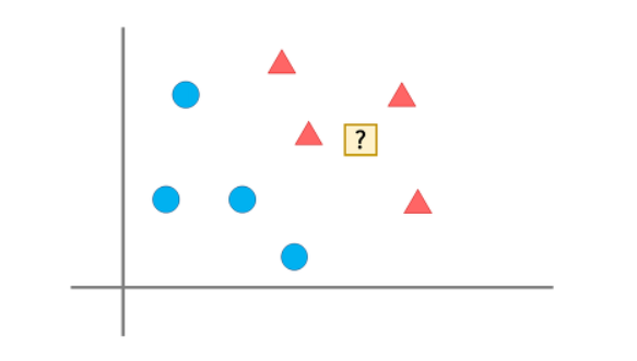
→ 가장 가까운 데이터가 세모이므로 물음표를 세모로 판단한다.
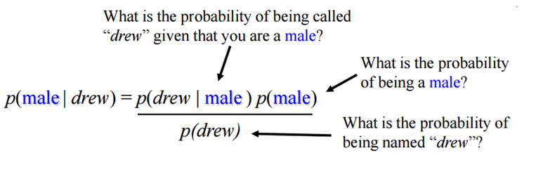
⑤ Naive Bayes : 조건부확률???
각각의 변수가 독립이라고 가정하고 Bayes의 법칙을 적용한다.
drew라는 이름을 가진 사람이 남자일 확률은 조건부 확률로 다음과 같다.
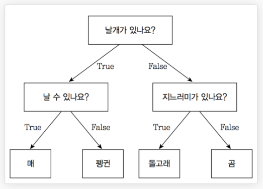
⑥ Decision Tree
: 예/아니오로 질문을 하며 학습
⑦ Logistic Regression : ?
[46]
#importing all the required ML packages
from sklearn.linear_model import LogisticRegression #logistic regression
from sklearn import svm #support vector Machine
from sklearn.ensemble import RandomForestClassifier #Random Forest
from sklearn.neighbors import KNeighborsClassifier #KNN
from sklearn.naive_bayes import GaussianNB #Naive bayes
from sklearn.tree import DecisionTreeClassifier #Decision Tree
from sklearn.model_selection import train_test_split #training and testing data split
from sklearn import metrics #accuracy measure
from sklearn.metrics import confusion_matrix #for confusion matrix
[47]
train,test=train_test_split(data,test_size=0.3,random_state=0,stratify=data['Survived'])
train_X=train[train.columns[1:]]
train_Y=train[train.columns[:1]]
test_X=test[test.columns[1:]]
test_Y=test[test.columns[:1]]
X=data[data.columns[1:]]
Y=data['Survived']
train_test_split 함수 : train set(학습 데이터셋)과 test set(validation)(테스트 데이터셋) 분리
test_size : train set과 test(validation) set의 비율을 나타낸다.
0.3이면 test set 30% / train set 70%
stratify : 기본값은 None이지만 설정해주는 게 좋다.
Survived열로 설정하면 train set과 test set이 70% / 30%지만 Survived 데이터는
일정한 비율로 들어가서 한쪽 데이터셋에 쏠려서 분배되는 것을 방지한다!
random_state : 값을 고정해서 매번 데이터셋이 변경되는 것을 방지한다.
(Survived → 첫 번째 열이라서 index = 0)
train.columns[1:] : Survived를 제외한 각각의 데이터명(Pclass, Sex, SibSp, ...)
train.columns[:1] : “Survived”
test도 마찬가지.
train_X좌표 : train의 Survived를 제외한 각각의 데이터 값
train_Y좌표 : train의 Survived 데이터 값
test도 마찬가지
변수 X에는 전체 data의 Survived를 제외한 데이터 값 저장
변수 Y에는 전체 data의 Survived 데이터 값 저장
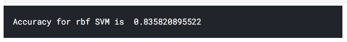
[48] : Radial Support Vector Machines (rbf-SVM)
model=svm.SVC(kernel='rbf',C=1,gamma=0.1)
model.fit(train_X,train_Y)
prediction1=model.predict(test_X)
print('Accuracy for rbf SVM is ',metrics.accuracy_score(prediction1,test_Y))
C : 얼마나 많은 데이터 샘플이 다른 클래스에 놓이는 것을 허용하는지 결정,
1이 기본값
gamma : 결정 경계의 곡률 결정, 값을 낮추면 초평면에서 멀리 떨어진 서포트 벡터들의 영향이 낮아짐.
metrics.accuracy_score는 정확도 평가
예측값과 정답을 넣으면 어느정도 정확한지 수치로 나타내준다.
[49] : Linear Support Vector Machine (linear-SVM)
model=svm.SVC(kernel='linear',C=0.1,gamma=0.1)
model.fit(train_X,train_Y)
prediction2=model.predict(test_X)
print('Accuracy for linear SVM is',metrics.accuracy_score(prediction2,test_Y))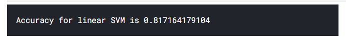
[50] : Logistic Regression
model = LogisticRegression()
model.fit(train_X,train_Y)
prediction3=model.predict(test_X)
print('The accuracy of the Logistic Regression is',metrics.accuracy_score(prediction3,test_Y))
[51] : Decision Tree
model=DecisionTreeClassifier()
model.fit(train_X,train_Y)
prediction4=model.predict(test_X)
print('The accuracy of the Decision Tree is',metrics.accuracy_score(prediction4,test_Y))
[52] : K-Nearest Neighbours(KNN)
model=KNeighborsClassifier()
model.fit(train_X,train_Y)
prediction5=model.predict(test_X)
print('The accuracy of the KNN is',metrics.accuracy_score(prediction5,test_Y))
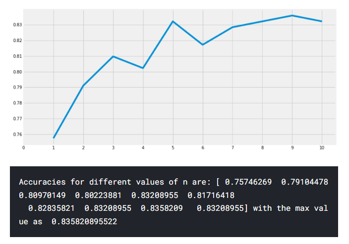
이제 n_neighbours의 속성 값을 변경하면 KNN 모델의 정확도가 달라집니다.
기본 값은 5입니다. n_neighbours의 다양한 값에 따른 정확도를 확인해봅시다.
n_neighbours : 근처의 이웃(값)을 참고할 개수
[53]
a_index=list(range(1,11))
a=pd.Series()
x=[0,1,2,3,4,5,6,7,8,9,10]
for i in list(range(1,11)):
    model=KNeighborsClassifier(n_neighbors=i)
    model.fit(train_X,train_Y)
    prediction=model.predict(test_X)
    a=a.append(pd.Series(metrics.accuracy_score(prediction,test_Y)))
plt.plot(a_index, a)
plt.xticks(x)
fig=plt.gcf()
fig.set_size_inches(12,6)
plt.show()
print('Accuracies for different values of n are:',a.values,'with the max value as ',a.values.max())
n_neighbours를 0~10으로 설정해서 반복문으로 반복마다 a에 리스트로 모델 정확도를 추가하여 plot 시각화
[54] : Gaussian Naive Bayes
model=GaussianNB()
model.fit(train_X,train_Y)
prediction6=model.predict(test_X)
print('The accuracy of the NaiveBayes is',metrics.accuracy_score(prediction6,test_Y))
[55] : Random Forests
model=RandomForestClassifier(n_estimators=100)
model.fit(train_X,train_Y)
prediction7=model.predict(test_X)
print('The accuracy of the Random Forests is',metrics.accuracy_score(prediction7,test_Y))
n_estimators : 생성할 tree 개수
모델의 정확도가 classifier의 robustness(강인함)을 결정하는 유일한 요인은 아니다.
(*강인함 : 가정이 성립한다는 조건일때 그 가정이 성립하지 않는 경우에도 원래 조건에서 많이 변하지 않을때 강인한 방법이라고 한다.)
classifier로 training data를 학습하여 테스트한 결과 90%의 정확도가 나왔다고 하자.
이제 이것은 매우 좋은 정확도를 가진 classifier로 보인다. 그러나, 모든 새로운 테스트 셋에 대해서 90%가 나올 것이라고 확실할 수 있을까? 답은 No다.
왜냐하면 classifier가 모든 경우에 대해 스스로 학습할 것이라고 확신할 수 없기 때문이다. training, testing data가 바뀌면 정확도 또한 바뀔 것이다. 아마 증가하거나 감소할 것이다. 이것을 model variance라고 부른다.
이를 극복하고 일반화된 모델을 얻기위해 우리는 Cross Validation을 사용한다.
- Cross Validation
: data는 자주 불균형을 이룬다. 즉, 높은 수의 class1 경우가 있지만 적은 수의 다른 class의 경우도 있다. 즉, 우리는 각각의 모든 데이터셋의 경우에 대해서 우리의 알고리즘을 학습시키고 테스트해야한다. 그런 뒤 우리는 데이터셋에 대해 알려진 모든 정확도를 구할 수 있다.
① K-Fold Cross Validation은 먼저 데이터 셋을 k-하위집합으로 나눈다.
② 우리가 데이터 셋을 5파트로 나눈다고 하자. 우리는 테스트를 위한 1개를 남기고 나머지 4개 파트는 알고리즘을 학습시킨다.
③ 우리는 테스트 파트를 반복하면서 바꾸는 절차와 나머지 다른 파트에 대해 알고리즘을 학습하는 절차를 계속 거친다. 그 후에 알고리즘의 평균 정확도를 얻기 위해 정확도와 오류를 평균화한다.
이것을 K-Fold Cross Validation이라고 한다.
④ 알고리즘은 training dataset에 대해 과소적합(underfit)을 보일 때도 있고 또한 다른 training dataset에 대해 과대적합(overfit)을 보일 때도 있다.
즉, cross-validation을 통해 우리는 일반화된 모델을 얻을 수 있다.
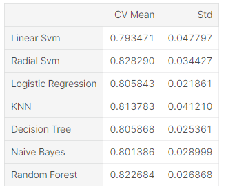
[56]
from sklearn.model_selection import KFold #for K-fold cross validation
from sklearn.model_selection import cross_val_score #score evaluation
from sklearn.model_selection import cross_val_predict #prediction
kfold = KFold(n_splits=10, random_state=22) # k=10, split the data into 10 equal parts
xyz=[]
accuracy=[]
std=[]
classifiers=['Linear Svm','Radial Svm','Logistic Regression','KNN','Decision Tree','Naive Bayes','Random Forest']
models=[svm.SVC(kernel='linear'),svm.SVC(kernel='rbf'),LogisticRegression(),KNeighborsClassifier(n_neighbors=9),DecisionTreeClassifier(),GaussianNB(),RandomForestClassifier(n_estimators=100)]
for i in models:
    model = i
    cv_result = cross_val_score(model,X,Y, cv = kfold,scoring = "accuracy")
    cv_result=cv_result
    xyz.append(cv_result.mean())
    std.append(cv_result.std())
    accuracy.append(cv_result)
new_models_dataframe2=pd.DataFrame({'CV Mean':xyz,'Std':std},index=classifiers)
new_models_dataframe2
KFold(n_splits=10, random_state=22)에서 n_splits는 데이터 분할 개수
classifiers에는 classifier의 이름 저장
models에는 model 저장
for 반복문에서
cross_val_score 사용
cross_val_score(모델, feature, target, cv (분할 설정값) , scoring(평가방법))
scoring : 예측 성능 평가 지표(다양하다)
cv = kfold(앞에서 데이터를 10개로 나눔)
pd.DataFrame으로 열을 xyz(CV mean), std(Std) / 행을 classifiers로 해서 데이터 프레임으로 출력
[57]
plt.subplots(figsize=(12,6))
box=pd.DataFrame(accuracy,index=[classifiers])
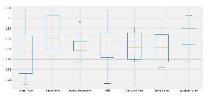
box.T.boxplot()box에 accuracy를 열으로하고 classifiers를 행으로 하는 데이터 프레임 저장
boxplot으로 출력
[58]
new_models_dataframe2['CV Mean'].plot.barh(width=0.8)
plt.title('Average CV Mean Accuracy')
fig=plt.gcf()
fig.set_size_inches(8,5)
CV Mean열을 가로 막대플롯으로 생성
.plot.bar : 수직 막대플롯
.plot.barh : 가로 막대 플롯

classification 정확도는 가끔씩 불균형때문에 잘못 길을 들 수도 있다. 우리는 모델이 어디가 잘못됐는지나 어느 class가 모델의 예측을 틀리게 하는지를 알려주는 confusion matrix의 도움을 받아서 요약된 결과를 얻을 수 있다.
Confusion Matrix
: Confusion Matrix는 classifier에 의해 만들어진 정답의 수와 정확하지 않은 classification의 수를 알려준다.
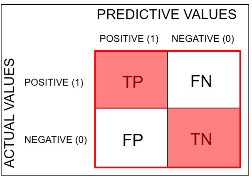
TP와 TN이 맞게 예측한 값, FN, FP가 실제값과 다르게 예측한 값
[59] : sns.heatmap 사용
f,ax=plt.subplots(3,3,figsize=(12,10))
y_pred = cross_val_predict(svm.SVC(kernel='rbf'),X,Y,cv=10)
sns.heatmap(confusion_matrix(Y,y_pred),ax=ax[0,0],annot=True,fmt='2.0f')
ax[0,0].set_title('Matrix for rbf-SVM')
y_pred = cross_val_predict(svm.SVC(kernel='linear'),X,Y,cv=10)
sns.heatmap(confusion_matrix(Y,y_pred),ax=ax[0,1],annot=True,fmt='2.0f')
ax[0,1].set_title('Matrix for Linear-SVM')
y_pred = cross_val_predict(KNeighborsClassifier(n_neighbors=9),X,Y,cv=10)
sns.heatmap(confusion_matrix(Y,y_pred),ax=ax[0,2],annot=True,fmt='2.0f')
ax[0,2].set_title('Matrix for KNN')
y_pred = cross_val_predict(RandomForestClassifier(n_estimators=100),X,Y,cv=10)
sns.heatmap(confusion_matrix(Y,y_pred),ax=ax[1,0],annot=True,fmt='2.0f')
ax[1,0].set_title('Matrix for Random-Forests')
y_pred = cross_val_predict(LogisticRegression(),X,Y,cv=10)
sns.heatmap(confusion_matrix(Y,y_pred),ax=ax[1,1],annot=True,fmt='2.0f')
ax[1,1].set_title('Matrix for Logistic Regression')
y_pred = cross_val_predict(DecisionTreeClassifier(),X,Y,cv=10)
sns.heatmap(confusion_matrix(Y,y_pred),ax=ax[1,2],annot=True,fmt='2.0f')
ax[1,2].set_title('Matrix for Decision Tree')
y_pred = cross_val_predict(GaussianNB(),X,Y,cv=10)
sns.heatmap(confusion_matrix(Y,y_pred),ax=ax[2,0],annot=True,fmt='2.0f')
ax[2,0].set_title('Matrix for Naive Bayes')
plt.subplots_adjust(hspace=0.2,wspace=0.2)
plt.show()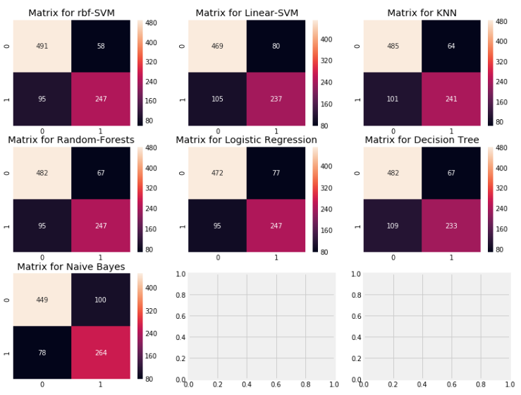
- Confusion Matrix 해석
: 왼쪽 대각선()은 맞는 예측을 보여주고 오른쪽 대각선(/)은 틀린 예측을 보여준다.
처음 plot인 rbf-SVM를 살펴보자.
① 맞는 예측은 491(사망자)+247(생존자)이며 우리 평균 CV의 정확도는 우리가 일찍 구한 82.8%이다.
② 오류 : 58개의 사망자로 분류된 사람은 생존자이고 95명의 생존자로 분류된 사람은 사망자이다. 즉 이것은 사망자를 생존자로 예측함으로써 실수를 더 유발하게 한다.
모든 matrics를 봄으로써 우리는 rbf-SVM이 사망자를 정확하게 예측할 가능성이 높다는 걸 알 수 있다. 하지만 NaiveBays는 생존자를 정확하게 예측할 가능성이 높다는 걸 알 수 있다.
(왼쪽 대각선을 기준으로 사망자 예측 수는 rbf-SVM이 제일 많고 생존자 예측수는 Naive Bayes가 가장 많다)
- Hyper-Parameters Tuning : 하이퍼 매개변수 최적화
Hyper-Parameter : 모델 학습 프로세스를 제어할 수 있게하는 조정 가능한 매개변수
예를 들어 신경망을 사용하여 히든 레이어 수와 각 레이어의 노드 수를 결정한다.
모델의 성능은 하이퍼 매개 변수에 따라 크게 달라진다.
→ Hyper-Parameters Tuning : 최상의 성능을 발휘하는 하이퍼 매개변수 구성을 찾는 프로세스
이 머신러닝 모델은 Black-Box(기능은 알지만 작동 원리를 이해할 수 없는 복잡한 기계장치)와 같다. 여기는 우리가 더 나은 모델을 얻기 위해 바꿀 수 있는 이 Black-Box를 위한 기본 값들이 있다. SVM 모델의 C와 gamma처럼, 그리고 다른 clasifiers의 다paramerter를 Hyper-Parameter라고 부르며, 우리는 알고리즘의 학습율을 바꾸고 더 나은 모델을 만들기 위해 Hyper-Parameter를 조절할 수 있다.
우리는 성능이 가장 좋은 SVM과 RandomForests(왼쪽 대각선 합 1,2위)의 hyper-parameter를 조절할 것이다.
[60]
- SVM
from sklearn.model_selection import GridSearchCV
C=[0.05,0.1,0.2,0.3,0.25,0.4,0.5,0.6,0.7,0.8,0.9,1]
gamma=[0.1,0.2,0.3,0.4,0.5,0.6,0.7,0.8,0.9,1.0]
kernel=['rbf','linear']
hyper={'kernel':kernel,'C':C,'gamma':gamma}
gd=GridSearchCV(estimator=svm.SVC(),param_grid=hyper,verbose=True)
gd.fit(X,Y)
print(gd.best_score_)
print(gd.best_estimator_)
GridSearchCV(estimator, param_gird, verbose)
estimator : classifier, regressor, pipeline 등 → classifier로 SVM 넣음
param_grid : 튜닝을 위해 사용될 파라미터를 dictonary 형태로 만들어서 넣는다.
(hyper라는 변수에 kernel : rbf, linear / C 파라미터 / gamma 파라미터 사전 형태로 만들어서 호출)
verbose : GridSearchCV의 반복마다 수행 결과 메세지를 출력하는 역할
verbose = 0(default) : 메세지 출력 X
verbose = 1 : 간단한 메세지 출력
verbose = 2 : 하이퍼 파라미터별 메세지 출력
verbose = True : ??? 뭔지 모르겠음
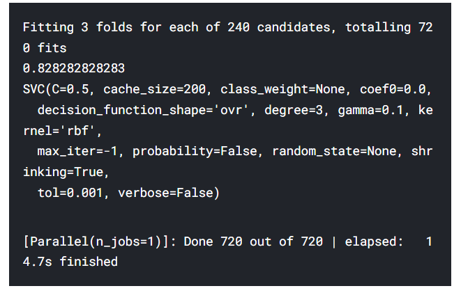
→ 가장 좋은 정확도는 82.82%이고 C=0.05, gamma=0.1일때이다.
[61]
- Random Forests
n_estimators=range(100,1000,100)
hyper={'n_estimators':n_estimators}
gd=GridSearchCV(estimator=RandomForestClassifier(random_state=0),param_grid=hyper,verbose=True)
gd.fit(X,Y)
print(gd.best_score_)
print(gd.best_estimator_)
GridSearchCV(estimator, param_gird, verbose)
estimator : classifier, regressor, pipeline 등 → classifier로 SVM 넣음
param_grid : 튜닝을 위해 사용될 파라미터를 dictonary 형태로 만들어서 넣는다.
(hyper라는 변수에 n_estimators 파라미터를 사전 형태로 만들어서 호출)
verbose : GridSearchCV의 반복마다 수행 결과 메세지를 출력하는 역할
verbose = 0(default) : 메세지 출력 X
verbose = 1 : 간단한 메세지 출력
verbose = 2 : 하이퍼 파라미터별 메세지 출력
verbose = True : ??? 뭔지 모르겠음
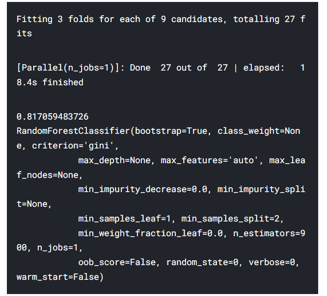
→ 가장 좋은 정확도는 81.8%이고 n_estimators가 900일때이다.
Ensembling
Ensembling은 모델의 성능이나 정확도를 증가시키는 좋은 방법이다. 간단하게 말하면, 이것은 하나의 강력한 모델을 만들기 위한 다양하고 간단한 모델들의 조합이다.
우리가 핸드폰을 사고 싶을 때 다양한 parameter를 기반으로 많은 사람들에게 물어보자.
그렇다면 모든 다른 parameter들을 분석한 후에 하나의 상품에 대한 강력한 판단을 내릴 수 있다. 이것이 모델의 안정성을 향상시키는 Ensembling이다. Ensembling은 이렇게 실행할 수 있다.
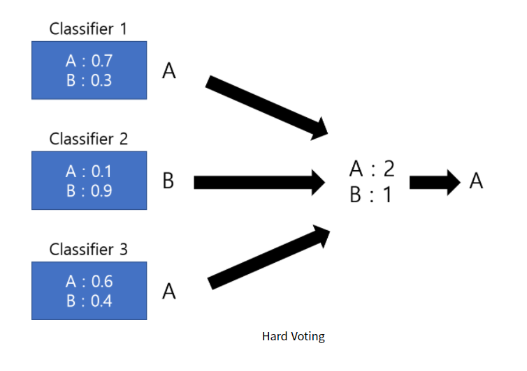
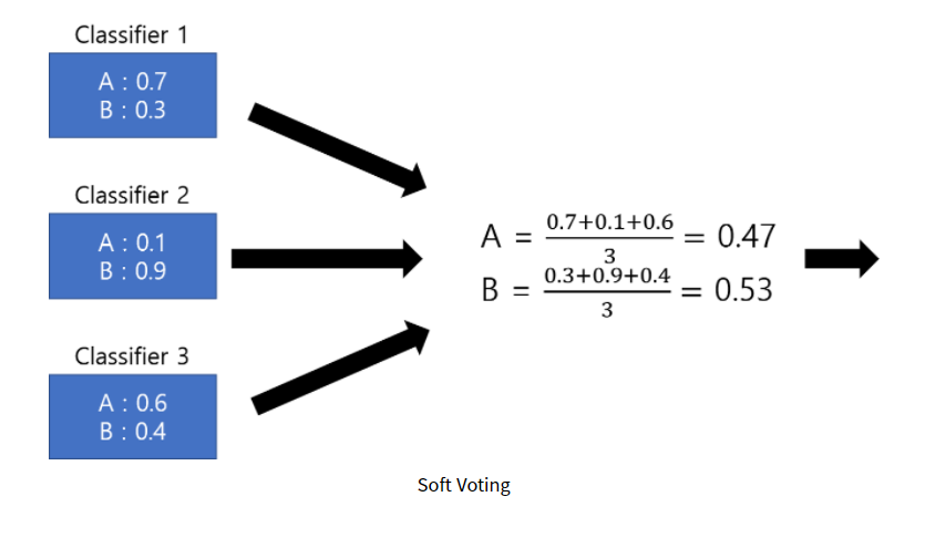
① Voting Classifier
② Bagging
③ Boosting
Voting Classifier
이것은 많고 다른 간단한 머신 러닝 모델로부터의 예측을 조합하는 가장 간단한 방법이다. 이것은 모든 서브모델의 예측을 기반으로 평균 예측결과를 보여준다. 서브 모델이나 베이스모델은 모두 다른 타입이다.
[62]
from sklearn.ensemble import VotingClassifier
ensemble_lin_rbf=VotingClassifier(estimators=[('KNN',KNeighborsClassifier(n_neighbors=10)),
                                              ('RBF',svm.SVC(probability=True,kernel='rbf',C=0.5,gamma=0.1)),
                                              ('RFor',RandomForestClassifier(n_estimators=500,random_state=0)),
                                              ('LR',LogisticRegression(C=0.05)),
                                              ('DT',DecisionTreeClassifier(random_state=0)),
                                              ('NB',GaussianNB()),
                                              ('svm',svm.SVC(kernel='linear',probability=True))
                                             ],
                       voting='soft').fit(train_X,train_Y)
print('The accuracy for ensembled model is:',ensemble_lin_rbf.score(test_X,test_Y))
cross=cross_val_score(ensemble_lin_rbf,X,Y, cv = 10,scoring = "accuracy")
print('The cross validated score is',cross.mean())
VotingClassifier(estimators, voting)
estimators : 분류기(Classifier)들을 튜플 형태로 입력
voting : 보팅 방식 hard or soft로 입력
-hard voting : 단순하게 각각의 모델의 결과중 가장 많은 표를 얻은 결과를 선택
-soft voting : 각 class별로 모델들이 예측한 각각의 확률을 더해서 가장 높은 class를 선택한다.

Bagging
: Bagging은 일반적인 ensemble 방법이다. 이것은 데이터 셋의 작은 부분에 비슷한 classfiers를 적용해서 모든 예측의 평균을 구한다. 평균화를 하기 때문에 분산이 감소한다. Voting Classifier와 달리 Bagging은 비슷한 classifiers를 사용한다.
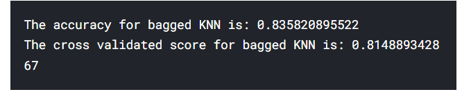
- Bagged KNN
: Bagging은 분산이 높은 모델에서 가장 잘 작동한다. Decision Tree나 Random Forests가 그 예이다. 우리는 KNN을 n_neighbours의 작은 값으로 사용할 수 있다.
[63]
from sklearn.ensemble import BaggingClassifier
model=BaggingClassifier(base_estimator=KNeighborsClassifier(n_neighbors=3),random_state=0,n_estimators=700)
model.fit(train_X,train_Y)
prediction=model.predict(test_X)
print('The accuracy for bagged KNN is:',metrics.accuracy_score(prediction,test_Y))
result=cross_val_score(model,X,Y,cv=10,scoring='accuracy')
print('The cross validated score for bagged KNN is:',result.mean())
BaggingClassifier(base_estimator, n_estimators)
base_estimator : 내가 넣을 모델(Classifier)
n_estimators : 모형의 갯수 (디폴트는 10) - 하나의 모델에게 몇 번의 시행을 할거냐
- Bagged DecisionTree
[64]
model=BaggingClassifier(base_estimator=DecisionTreeClassifier(),random_state=0,n_estimators=100)
model.fit(train_X,train_Y)
prediction=model.predict(test_X)
print('The accuracy for bagged Decision Tree is:',metrics.accuracy_score(prediction,test_Y))
result=cross_val_score(model,X,Y,cv=10,scoring='accuracy')
print('The cross validated score for bagged Decision Tree is:',result.mean())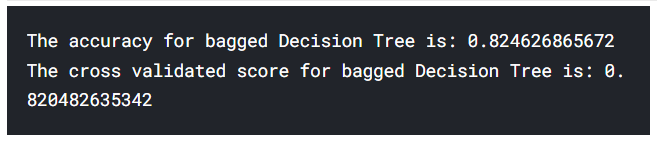
Boosting
: Boosting은 classifiers의 순차적인 학습을 이용하는 ensembling 기술이다. 이는 약한 모델의 단계적인 개선이다. Boosting은 다음과 같이 작동한다.
모델은 처음에 완전한 데이터셋으로 학습된다. 다음에 그 모델은 어떤 경우에는 맞고 어떤 경우에는 틀릴 것이다. 다음 반복에서, 학습자는 틀린 예측의 경우에 대해 더 초점을 맞추거나 무게를 둘 것이다. 즉 이것은 틀린 경우를 맞게 예측하기 위해 노력할 것이다. 이러한 반복적인 절차는 연속적이고, 정확도의 한계에 다다를때까지 새로운 calssifiers는 모델에 추가된다.
- AdaBoost(Adaptive Boosting)
: 이 경우에 안 좋은 학습자나 평가자는 Decision Tree이다. 그러나 우리는 기본 estimator를 우리가 선택한 알고리즘으로 바꿀 수 있다.
→ base_estimator의 default는 DecisionTreeClaasifier이다.
algorithm의 default는 “SAMME.R”이다.
[65]
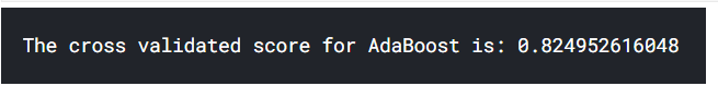
from sklearn.ensemble import AdaBoostClassifier
ada=AdaBoostClassifier(n_estimators=200,random_state=0,learning_rate=0.1)
result=cross_val_score(ada,X,Y,cv=10,scoring='accuracy')
print('The cross validated score for AdaBoost is:',result.mean())
AdaBoostClassifier(base_estimator, n_estimators, learning_rate, algorithm)
base_estimator : 기본으로 넣을 classifier종류 / default로 DecisionTreeClaasifier사용
n_estimators : 모델에 포함될 classifier 개수
learning_rate : 학습률
algorithm : 부스팅 알고리즘, dafult = “SAMME.R”
- Stochastic Gradient Boosting
: 이것도 마찬가지로 가장 안 좋은 학습자는 Decision Tree이다.
[66]
from sklearn.ensemble import GradientBoostingClassifier
grad=GradientBoostingClassifier(n_estimators=500,random_state=0,learning_rate=0.1)
result=cross_val_score(grad,X,Y,cv=10,scoring='accuracy')
print('The cross validated score for Gradient Boosting is:',result.mean())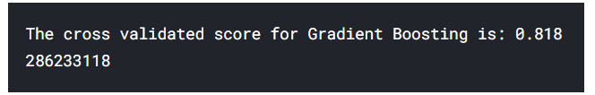
- XGBoost
[67]
import xgboost as xg
xgboost=xg.XGBClassifier(n_estimators=900,learning_rate=0.1)
result=cross_val_score(xgboost,X,Y,cv=10,scoring='accuracy')
print('The cross validated score for XGBoost is:',result.mean())
우리는 가장 높은 정확도를 AdaBoost에서 얻었다. 우리는 Hyper-Parameter Tuning을 통해 정확도를 증가시킬 것이다.
Hyper-Parameter Tuning for AdaBoost
[68]
n_estimators=list(range(100,1100,100))
learn_rate=[0.05,0.1,0.2,0.3,0.25,0.4,0.5,0.6,0.7,0.8,0.9,1]
hyper={'n_estimators':n_estimators,'learning_rate':learn_rate}
gd=GridSearchCV(estimator=AdaBoostClassifier(),param_grid=hyper,verbose=True)
gd.fit(X,Y)
print(gd.best_score_)
print(gd.best_estimator_)
hyper-Parameter를 n_estimator와 learning_rate로 설정하여 사전 형태로 저장
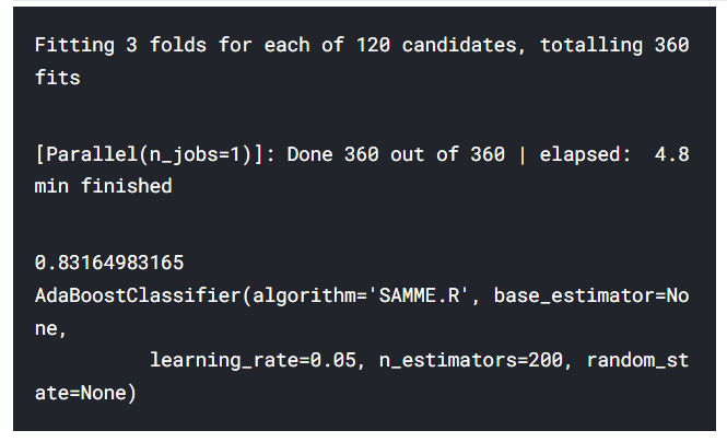
우리가 AdaBoost를 사용하여 얻을 수 있는 최대 정확도는 n_estimators = 200, learning_rate = 0.05일때 83.16%이다.
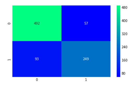
Confusion Matrix for the Best Model
[69]
ada=AdaBoostClassifier(n_estimators=200,random_state=0,learning_rate=0.05)
result=cross_val_predict(ada,X,Y,cv=10)
sns.heatmap(confusion_matrix(Y,result),cmap='winter',annot=True,fmt='2.0f')
plt.show()
cross_val_predict (estimator, X, Y, cv)
: 훈련 데이터셋의 각 샘플이 테스트 셋(폴드?)이 되었을 때 만들어진 예측을 반환한다.
→ cross_val_score 함수의 결과와 다르며 바람직한 일반화 성능 추정이 아니다
→ 훈련 데이터셋에 대한 예측 결과를 시각화하거나 다른 모델에 주입하기 위한 훈련 데이터를 만들 때 사용할 수 있다.
Feature Importance
f,ax=plt.subplots(2,2,figsize=(15,12))
model=RandomForestClassifier(n_estimators=500,random_state=0)
model.fit(X,Y)
pd.Series(model.feature_importances_,X.columns).sort_values(ascending=True).plot.barh(width=0.8,ax=ax[0,0])
ax[0,0].set_title('Feature Importance in Random Forests')
model=AdaBoostClassifier(n_estimators=200,learning_rate=0.05,random_state=0)
model.fit(X,Y)
pd.Series(model.feature_importances_,X.columns).sort_values(ascending=True).plot.barh(width=0.8,ax=ax[0,1],color='#ddff11')
ax[0,1].set_title('Feature Importance in AdaBoost')
model=GradientBoostingClassifier(n_estimators=500,learning_rate=0.1,random_state=0)
model.fit(X,Y)
pd.Series(model.feature_importances_,X.columns).sort_values(ascending=True).plot.barh(width=0.8,ax=ax[1,0],cmap='RdYlGn_r')
ax[1,0].set_title('Feature Importance in Gradient Boosting')
model=xg.XGBClassifier(n_estimators=900,learning_rate=0.1)
model.fit(X,Y)
pd.Series(model.feature_importances_,X.columns).sort_values(ascending=True).plot.barh(width=0.8,ax=ax[1,1],color='#FD0F00')
ax[1,1].set_title('Feature Importance in XgBoost')
plt.show()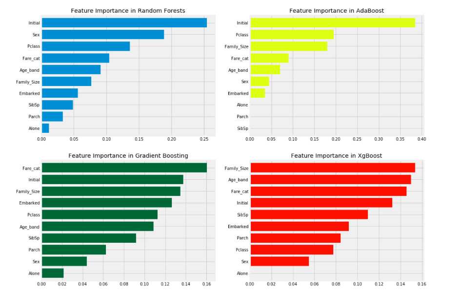
트리 기반 모델들(randomforest, xgboost, adaboost, Gradient Boosting 등)은 변수들의 중요도를 판단해주는 featureimportances 내장함수를 가진다.
이를 이용해서 plot.barh로 가로 막대 플롯으로 feature_importances를 시각화한다.
우리는 RandomForests, AdaBoost 등 여러 classifiers의 important features를 볼 수 있다.
분석 :
① 일반적으로 중요한 데이터 중 일부는 Initial, Fare_cat, Pclass, Family_size이다.
(classifier마다 중요 데이터 1위가 거의 다르다?!)
② Sex 데이터는 중요성을 보여주지 않는 것 같은데, 우리는 앞서 Pclass와 Sex를 결합한 데이터가 매우 좋은 차별화 요인임을 알기 때문에 놀랍다. Sex는 오직 RandomForests에서만 중요한 것 처럼 보인다.
그러나, 우리는 많은 classifiers에서 Initial 데이터가 상위에 있다는 것을 알 수 있다.
우리는 이미 Sex와 Initial이 양의 상관관계를 가지는 것을 봤었다. 따라서 그들은 둘 다 Sex를 참조한다!!
(Sex가 데이터 자체로는 여러 classifiers에서 중요성이 떨어지는 것처럼 보이지만 여러 classifiers에서 중요성 상위권인 Initial과 Sex는 양의 상관관계이므로 Initial은 Sex와 관계가 있어서 Sex도 마찬가지로 중요하다?)
③ 비슷하게 Pclass와 Fare_cat도 탑승객들의 상태와 Family_Size를 참고한다.
(따라서 Pclass, Fare_cat과 마찬가지로 Alone, Parch, SibSp도 중요하다?)
22.01.08 필사한 것 그대로 RAW 데이터로 가져왔다!
Notion에 정리했던 것 그대로 복붙이지만 이렇게 긴 길이로 포스팅한 적은 처음인 것 같다.
나중에 다시 이 글로 복습하면서 제목 같은 거 다듬어 봐야겠다.
캐글 필사는 처음이고 머신 러닝 개념도 거의 없었어서 하는데 시간 엄청 오래 걸렸다.
지금 머릿속에 뭔가 남는 건 없는 것 같지만 그래도 다음에 머신 러닝 개념들을 봤을 때
아 그때 필사했던 그거다! 이 정도는 생각이 날 것 같다!
이것만으로도 충분하지 않을까? 지금 단계에선 ㅎㅎ..
다음엔 그거다!에서 원리가 바로 튀어나왔으면 좋겠다