
1. 체크포인트
1. 애니메이션 이슈
1-1) 라인 애니메이션
1-2) 백그라운드 무한루프 애니메이션
1-3) 인트로 애니메이션 gsap
1-1. 라인 애니메이션
html
<section class="sc-visual">
            <div class="txt-area">
                <h2 class="sc-title">
                    <span class="tit-msg">배</span>
                    <span class="tit-msg">달</span>
                    <span class="tit-msg">의</span>
                    <span class="tit-msg">민</span>
                    <span class="tit-msg">족</span>
                </h2>
                <div class="line line-ani1 end">
                    <div class="guage"></div>
                </div>
                <p class="visual-desc">
                    <span class="desc-txt1">좋은 음식을</span>
                    <span class="desc-txt2">먹고 싶은 곳에서</span>
                </p>
                <div class="line line-ani2 start">
                    <div class="guage"></div>
                </div>
                <strong class="txt1">우리가</strong>
                <div class="line line-ani3 end">
                    <div class="guage"></div>
                </div>
                <strong class="txt2">어떤 민족</strong>
                <div class="line line-ani4 start">
                    <div class="guage"></div>
                </div>
                <strong class="txt3">입니까</strong>
                <div class="line line-ani5 end">
                    <div class="guage"></div>
                </div>
            </div>
            <figure class="thumb-area"></figure>
</section>
라인의 위치를 고정시키고 기준점을 주어 애니메이션을 실행하기위해, 게이지에 라인이라는 부모요소를 한번 감싸주었다 => .line > .guage
scss
.line{
    display: flex;
    width: 100%;
    height: 0.2vh;
    margin: 5.5vh 0;
    .guage {
        width: inherit;
        height: inherit;
    }
    &.end{
        justify-content: flex-end;
    }
    &.start{
        justify-content: flex-start;
    }
    &.center{
        justify-content: center;
    }
    &>* {
        @include gradi-Green;
    }
}
.line => 라인의 크기 및 위치
@include ~ > * => 라인의 컬러
.end,.start,.center => 움직이는 라인의 기준점 설정
j-query gsap
textMotion = gsap.timeline({
                scrollTrigger:{
                    trigger:'.sc-visual .txt1',
                    start:'top bottom',
                    end:'150% -100%',
                    scrub:1
                }
            })
            textMotion.addLabel('a')
            .to('.sc-visual .txt1',{xPercent:50, duration:2, scrub:1},'a')
            .to('.sc-visual .txt2',{ xPercent:-100, duration:2, scrub:1},'a')
            .to('.sc-visual .txt3',{ xPercent:50, duration:2, scrub:1},'a')
            //line 추가
            .from('.sc-visual .line-ani1 .guage',{width:"0%",duration:2},'a-=0.1')
            .from('.sc-visual .line-ani2 .guage',{width:"0%",duration:2},'a+=0.3')
            .from('.sc-visual .line-ani3 .guage',{width:"0%",duration:2},'a+=0.5')
            .from('.sc-visual .line-ani4 .guage',{width:"0%",duration:2},'a+=0.7')
            .from('.sc-visual .line-ani5 .guage',{width:"0%",duration:2},'a+=0.9')
gsap.from을 활용하여 width값을 0 -> 100% 설정해주면 게이지가 차오르는 애니메이션 효과를 줄 수 있다. css에서 라인의 기준점을 주었기때문에, .start는 왼쪽에서 오른쪽으로, end는 오른쪽에서 왼쪽으로, .center는 가운데의 기준점이 되어 애니메이션이 실행된다.
1-2. 백그라운드 무한루프 애니메이션
html
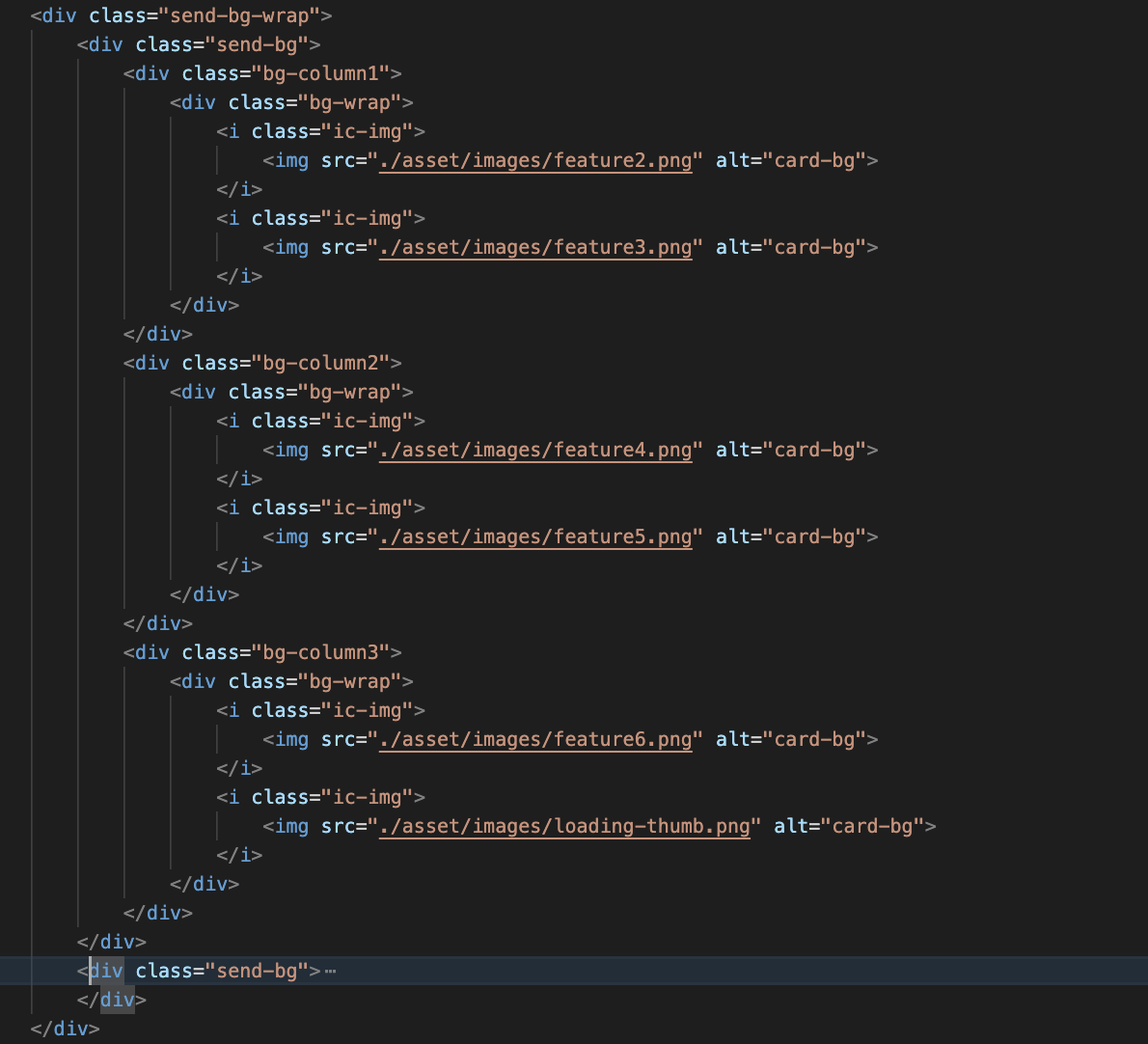
백그라운드를 코딩하고, 똑같은 백그라운드 코드를 복제한 뒤, 부모요소로 묶어 백그라운드 위치를 고정 및 백그라운드 배치를 한 후, 키프레임 애니메이션과 translateX를 활용하여 무한 루프 애니메이션을 구현한다.
scss
 .send-bg-wrap{
        position: absolute;
        top: 0;
        left: 0;
        // 배경이니까 absolute
        z-index: -1;
        display: flex;
        width: 100%;
        height: 100vh;
        animation: rolling 20s infinite linear;
    }
    .send-bg {
        position: relative;
        display: flex;
        flex: 1 0 100%;
        & > * {
            flex: 1;
        }
        .ic-img {
            flex-basis: 50%;
        }
        &::before {
            content: '';
            position: absolute;
            top: 0;
            left: 0;
            z-index: 3;
            display: inline-block;
            width: 100%;
            height: 100%;
            background-color: rgba(0,0,0,.89);
        }
    }

    // 백그라운드 css

    @keyframes rolling {
    0% {
        transform: translateX(0%);
     }
    100% {
        transform: translateX(-100%);
     }
    }

    // 백그라운드 애니메이션
1-3. 인트로 애니메이션 gsap
const introAni2 = gsap.timeline({
   paused:true
 })
introAni2.addLabel('a')
.from('.sc-visual .sc-title .tit-msg',{opacity:0, yPercent:103, stagger:0.2,duration:0.6},'a')
.from('.sc-visual .thumb-area',{top:"-70%",duration:1},'a') // top컨트롤
.from('.header',{opacity:0,duration:1.2},'a')


gsap.set('.loading .guage',{width:"100%"})
const introAni = gsap.timeline({
    onComplete:function(){
      introAni2.play();
    }
})
introAni.addLabel('a')
.to('.loading .guage', {width:0,delay:1},'a')
.to('.loading',{opacity:0,delay:1.5,duration:1,display:'none'},'a')
introAni -> introAni2 순서로 인트로 애니메이션을 구현할 때,
introAni2를 먼저 선언하고, paused:true를 통해 멈춤상태로 유지하다가
introAni를 선언하고 introAni의 애니메이션이 끝나면 introAni2를 실행하기 위해 play()를 사용한다.

퍼블리싱 코딩기록