참고한 사이트
추가로 보면 좋을 블로그
@wswy17님의 벨로그: CSS | 원근법 - perspective
Transform
- 회전, 크기 조절, 기울이기, 이동 효과 등
- ⭐
display가block이나inline-block일 때만 사용 가능 ⭐
/* x축으로 20px 이동 */
transform: translateX(10px);

/* x축 10px, y축 30px 이동 */
transform: translate(10px, 30px);translate이동scale확대 • 축소rotate회전 (+시계방향,-시계반대방향)skew왜곡
rotate는 X, Y, Z까지 설정 가능하며,perspective속성을 부모 요소에 적용하면 입체감 있게 표현 가능
🖥️ 실습으로 확인
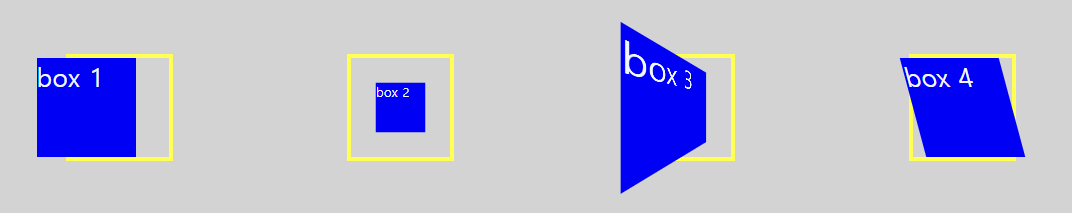
.box1 {
  transform: translateX(-20px);
}
.box2 {
  transform: scale(0.5);
}
.box3 {
  transform: rotateY(45deg);
}
.outline-box3 {
  perspective: 50px;
}
.box4 {
  transform: skewX(15deg);
}
rotate의 perspective 여부를 비교해 보자.
❌ perspective
css
/* perspective X */
.box5 {
	transform: rotateZ(45deg);
}
html
<!-- perspective X -->
<div class="outline">
  <div class="box box5">box 5</div>
</div>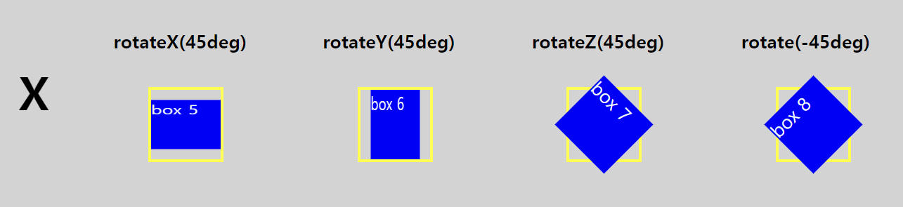
⭕ perspective
css
/* perspective O */
.box5 {
	transform: rotateZ(45deg);
}
.outline-box5 {
	perspective: 50px;
}
html
<!-- perspective O -->
<div class="outline outline-box5">
  <div class="box box5">box 5</div>
</div>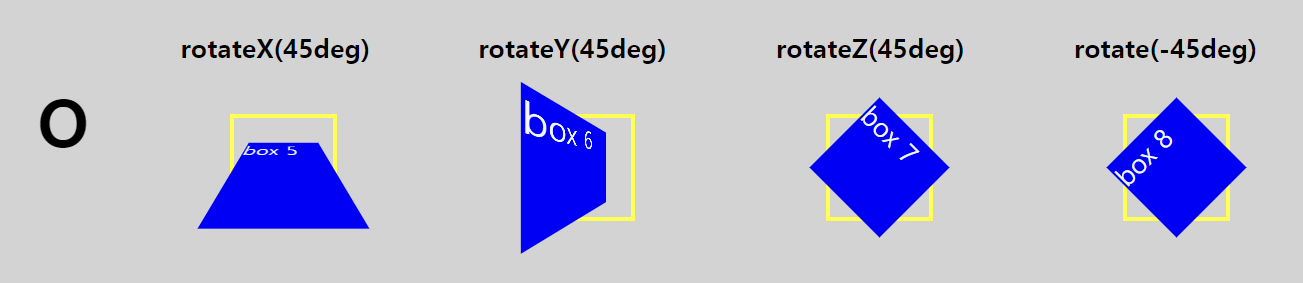
실습으로 비교해 보니 차이점이 확실히 느껴진다.
Z축인 box 7과반시계방향으로 45도 회전한 box 8은 perspective를 적용해도 같게 보이는 것을 확인할 수 있었다.