html, css 태초부터 깎기 (feat. 회사 랜딩 페이지 리디자인)
시작
최근에 회사 웹 사이트의 맨 첫번째 랜딩 페이지를 리디자인하는 작업을 했다. 아무래도 회사의 '얼굴'을 담당하는 곳이다 보니 1, 2px의 디테일과 다양한 디바이스에서 깨지지 않는 것이 1순위였다. 이 과정에서 "생각보다 html, css 에 대해 모르는 부분이 많구나"라는 걸 느꼈다. 작업하면서 AI와 함께 아이디어를 내고, 새롭게 알게 된 것들을 남겨보려고 한다.
그보다 먼저 리뉴얼한 우리 회사 랜딩페이지 구경하고 가세요 :)
👉 https://elice.io/ko
홈 리뉴얼 구현 러닝 포인트 2가지
Art direction 시행착오: display 스타일 반응형 방식에서 <picture>로 전환한 이유
Art direction 이란?
레이아웃에 따라 서로 다른 이미지를 제공하는 문제로, 예로 디바이스 크기에 따라 데스크탑에서는 가로로 긴 이미지, 모바일에서는 세로로 긴 이미지를 제공하는 것을 의미한다.
설명: https://developer.mozilla.org/en-US/docs/Web/HTML/Guides/Responsive_images#art_direction
- 처음엔 반응형 이미지를 각 브레이크포인트별
<img>를 여러 개 두고display: block/none으로 토글했어요. 보이기만 조절하면 될 줄 알았는데, 네트워크 레벨에선 여전히 불필요한 이미지가 로드될 수 있어 성능에 불리하고, 접근성/유지보수도 좋지 않았습니다.
초기(시행착오) 구현: display 토글 방식
<Box sx={{ position: 'relative' }}>
  {/* XS */}
  <Box
    component="img"
    src={image.xs.src}
    alt={`${title} mockup`}
    sx={{ display: { xs: 'block', sm: 'none' }, width: '100%', height: '100%', objectFit: 'cover' }}
  />
  {/* SM */}
  <Box
    component="img"
    src={image.sm.src}
    alt={`${title} mockup`}
    sx={{ display: { xs: 'none', sm: 'block', md: 'none' }, width: '100%', height: '100%', objectFit: 'cover' }}
  />
  {/* MD */}
  <Box
    component="img"
    src={image.md.src}
    alt={`${title} mockup`}
    sx={{ display: { xs: 'none', md: 'block', lg: 'none' }, width: '100%', height: '100%', objectFit: 'cover' }}
  />
  {/* LG */}
  <Box
    component="img"
    src={image.lg.src}
    alt={`${title} mockup`}
    sx={{ display: { xs: 'none', lg: 'block', xl: 'none' }, width: '100%', height: '100%', objectFit: 'cover' }}
  />
  {/* XL */}
  <Box
    component="img"
    src={image.xl.src}
    alt={`${title} mockup`}
    sx={{ display: { xs: 'none', xl: 'block' }, width: '100%', height: '100%', objectFit: 'cover' }}
  />
</Box>- 문제점
- 불필요한 리소스 다운로드 가능성
- JSX가 장황해지고, 브레이크포인트 정책 변경 시 유지보수 비용 증가
- 스크린 리더/SEO 관점에서 중복 alt/DOM 요소 증가
개선: <picture> + <source> 아트 디렉션
import { breakpoints } from '@elice/mui-system';
import { Box } from '@mui/material';

<Box
  component="picture"
  sx={{ width: '100%', height: '100%', display: 'flex', alignItems: 'center', justifyContent: 'center' }}
>
  <Box component="source" media={`(min-width: ${breakpoints.xl}px)`} srcSet={image.xl.src} />
  <Box component="source" media={`(min-width: ${breakpoints.lg}px)`} srcSet={image.lg.src} />
  <Box component="source" media={`(min-width: ${breakpoints.md}px)`} srcSet={image.md.src} />
  <Box component="source" media={`(min-width: ${breakpoints.sm}px)`} srcSet={(image.sm ?? image.md).src} />
  <Box
    component="img"
    src={(image.xs ?? image.md).src}
    alt={`${title} mockup`}
    sx={{ width: '100%', height: '100%', objectFit: 'contain', objectPosition: 'bottom' }}
  />
</Box>- 효과
- 브라우저가 미디어쿼리 매칭으로 “하나의 적절한 이미지”만 로드 → 성능 이점
- JSX 단순화, 정책 변경 시 수정 포인트 최소화
- 디자인 시스템의 브레이크포인트와 일관성 유지
이렇게 시행착오를 거쳐, 반응형 이미지는 <picture> 기반으로 표준적인 아트 디렉션을 적용하는 것이 가장 효율적이라는 점을 체감했습니다.
2) Masonry-스러운 UI: CSS Grid + nth-of-type 스팬으로 구현
- 현재 CSS 스펙으로는 아래와 같이 Masonry (벽돌 무늬) 레이아웃을 만들 수 있는 방법이 없음.
- 아직 css 의 masonry 레이아웃은 실험 단계(caniuse - masonry) 크롬 최신버전에서도 해당 기능을 사용할 수 없음
네이버에서 개발한 egjs-infinitegrid와 같은 JS 구현체를 사용해야함
출처: https://naver.github.io/egjs-infinitegrid/ko/
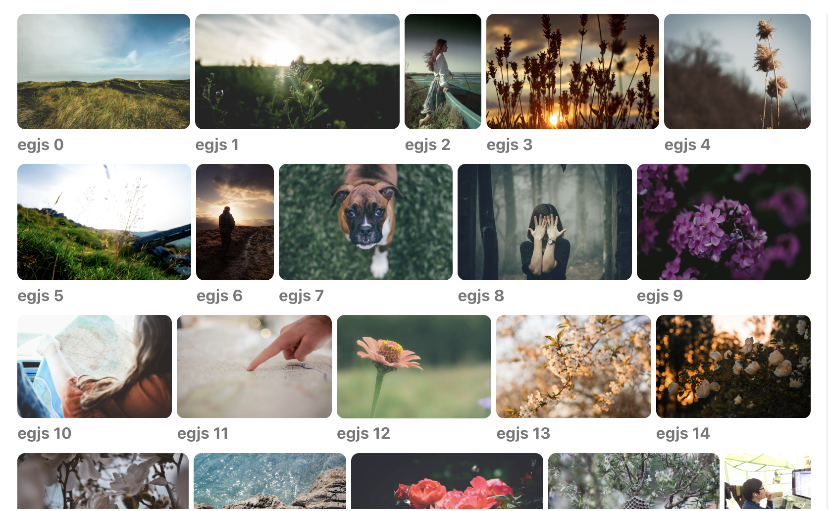
- 요구사항으로 반응형으로 masonry 무늬의 레이아웃을 요구함
| desktop | laptop | tablet |
|---|---|---|
 |  |  |
해결방법
- 핵심 아이디어: 배치하는 카드가 개수가 5개로 정해져있어서 CSS만으로 해결할 수 있다고 판단함. 6열(gridTemplateColumns: repeat(6, 1fr))을 기본으로 잡고, 카드 순서에 맞춰
nth-of-type에 반응형 span을 지정.
- 장점: Masonry 느낌의 비정형 레이아웃을 간단히, 반응형으로 제어 가능. JS 구현및 계산 비용 불필요.
구현 예시
<Box
  sx={{
    display: 'grid',
    gap: '24px',
    width: '100%',
    gridTemplateColumns: 'repeat(6, 1fr)',

    // 1번째 카드
    '& > *:nth-of-type(1)': {
      gridColumn: { xs: '1 / span 6', lg: '1 / 3' },
    },

    // 2번째 카드
    '& > *:nth-of-type(2)': {
      gridColumn: { xs: '1 / span 6', md: '1 / 4', lg: '3 / 5' },
    },

    // 3번째 카드
    '& > *:nth-of-type(3)': {
      gridColumn: { xs: '1 / span 6', md: '4 / 7', lg: '5 / 7' },
    },

    // 4번째 카드
    '& > *:nth-of-type(4)': {
      gridColumn: { xs: '1 / span 6', md: '1 / 4', lg: '1 / 4' },
    },

    // 5번째 카드
    '& > *:nth-of-type(5)': {
      gridColumn: { xs: '1 / span 6', md: '4 / 7', lg: '4 / 7' },
    },
  }}
>
  {CARD_DATA.map(card => (
    <Card key={card.key} />
  ))}
</Box>- 포인트
- 6열 그리드를 고정하고, 카드별로 브레이크포인트마다 다른
gridColumn스팬을 지정. - 마크업 순서를 그대로 유지하면서도 각 카드의 “시각적 배치”를 자유롭게 바꿀 수 있음.
- 디자인 스펙(Figma)과 1:1 매핑이 쉬워 협업 및 유지보수에 유리.
- 6열 그리드를 고정하고, 카드별로 브레이크포인트마다 다른
마무리
- Art Direction:
<picture>+<source>로 뷰포트별 최적 이미지 로드, 성능/가독성 향상. - Masonry-like Grid: CSS Grid +
nth-of-type스팬으로 단순하고 강력한 비정형 레이아웃 구현.

사람의 마음을 움직일 수 있는 글을 쓰고 싶어요