🔵 CSS
1. 디자인 구상하기
- 어떤 디자인으로 만들지 고민할 때 먼저 키워드 형식으로 떠올려보는 것 같다.
- 떠올려본 대표 키워드 : 픽셀, 레트로 게임, 유니콘, 몽환적
폰트 정하기
- 사용 폰트 : Neo둥근모체 (클릭하면 다운로드 링크로 갈 수 있다)
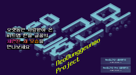
- 픽셀 컨셉에 맞게 픽셀 폰트를 찾던 중 발견한 글꼴이다. 무료로 제공되고 있다!
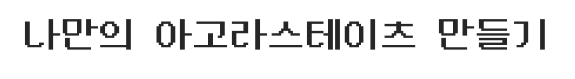
- 입력했을 때
색상 정하기
- 대표색은 연분홍, 연노랑, 연파랑으로 선택했다.

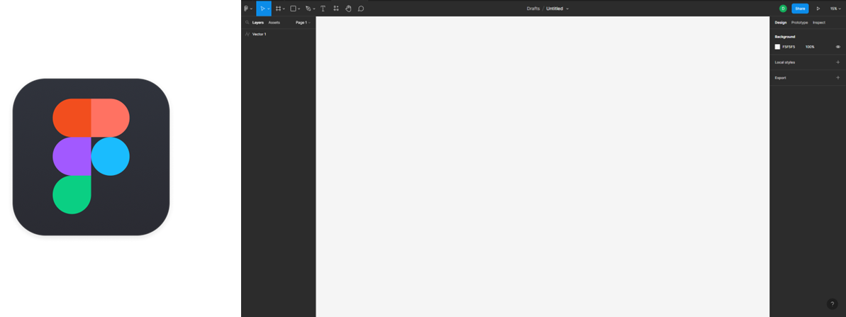
2. 디자인 레이아웃 잡기 (피그마)
- 이번에 디자인을 위한 웹 애플리케이션인 피그마를 알게 되었다.
유튜브에 사용법을 보니 디자이너들이 많이 사용하는 것 같았다.
피그마로 그린 레이아웃
- 피그마를 이용하여 레이아웃을 그려보았다.
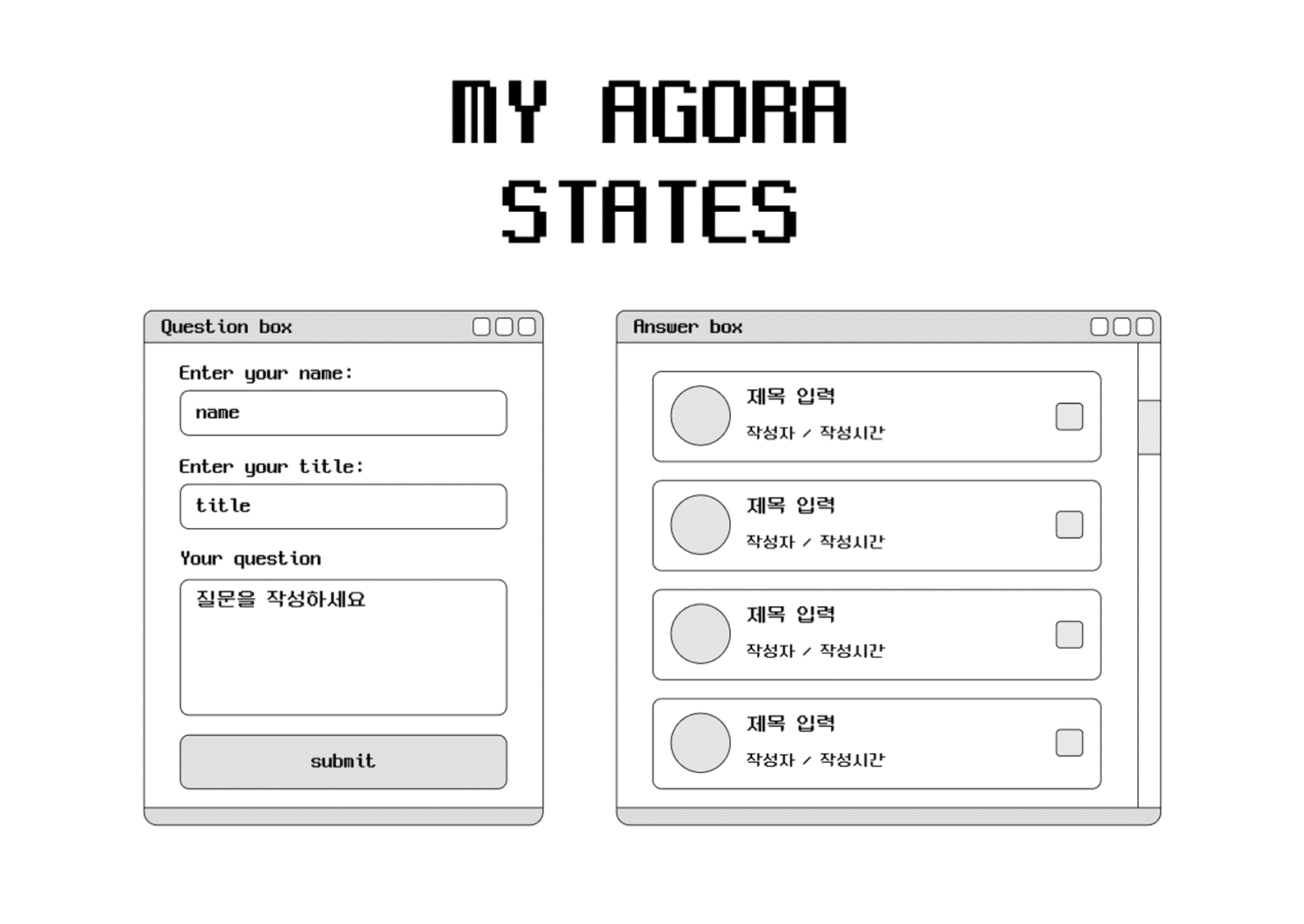
- 아직 사용법이 미숙해서 따로 사용법에 대해 더 공부해야 할 것 같다..!
3. 로고와 아이콘 만들기 (피그마)
- 이번에 피그마를 사용하기로 결심한 가장 큰 이유이다..!
레이아웃을 그리고 나서 어떻게 디자인할지 고민하는데 css로 픽셀 느낌을 살리는데엔 한계가 있고(방법을 모른다..)
무엇보다 상단에 'MY AGORA STATES'를 텍스트로 그대로 사용하기에는 마음에 들지 않아서였다..! - 그래서 이번 솔로 프로젝트에서 사용할 로고와 아이콘을 직접 만들어보기로 했다!😎..
힘..힘들었다..😅😅
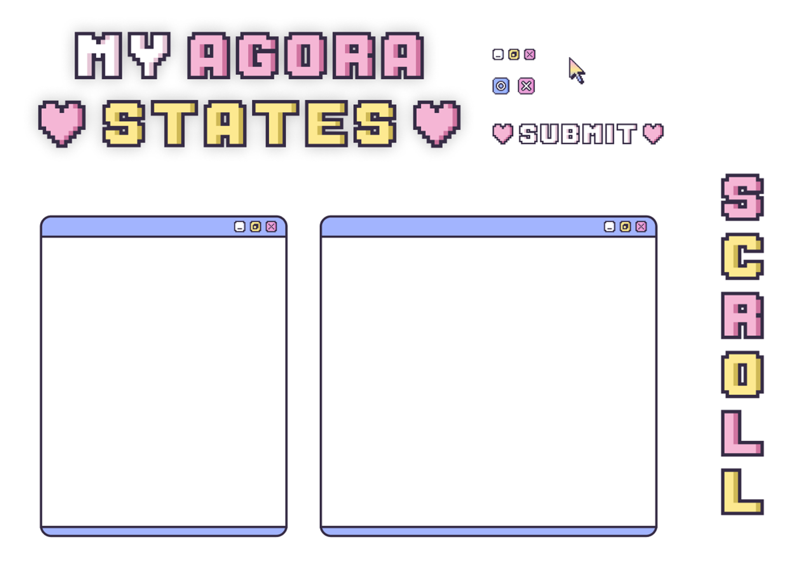
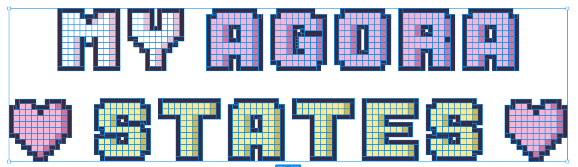
완성된 결과물
- 피그마 사용법을 잘 모르는 사람이 디자인 했을 때.jpg
- 픽셀처럼 보이고 싶어 네모 노가다를 했다..ㅎㅎ 그래도 완성된 모습을 보니 뿌듯했다..!!
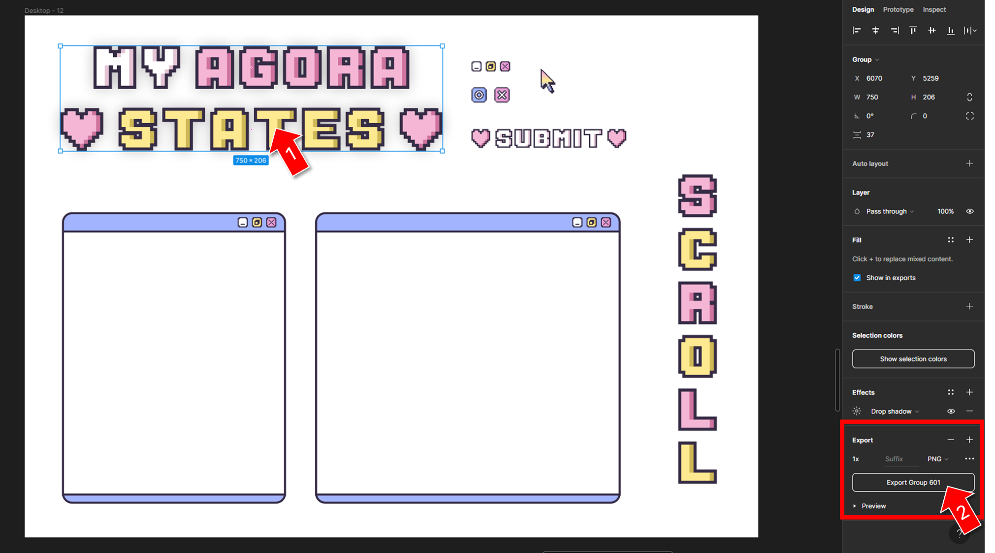
결과물 저장하기
- 완성된 로고 및 아이콘을 선택 후
Export Group버튼을 클릭해 저장한다.
4. CSS로 스타일 적용하기
- 직접 만든 로고와 아이콘을 CSS에 어떻게 적용했는지 알아보자!
1. 마우스
-
cursor 속성은 요소 위에 마우스 커서가 올라갔을 때 보여줄 모양을 지정한다.
여기에 내가 만든 마우스 디자인을 적용했다.html { cursor: url("img/아이콘_마우스3.png") 5 5, auto; }- 사용한 마우스 이미지
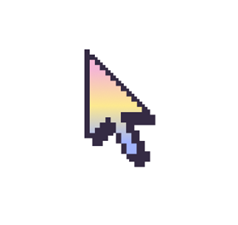
- 사용한 마우스 이미지
2. 스크롤바
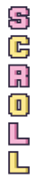
-
::-webkit-scrollbar 의사 요소는 설정된 경우 요소의 스크롤 막대 스타일에 영향을 준다.
::-webkit-scrollbar { width: 26px; /* 스크롤바의 너비 */ } ::-webkit-scrollbar-thumb { height: 20%; /* 스크롤바의 길이 */ background: #EABDE6; /* 스크롤바의 색상 */ background-image: url("img/scroll.png"); background-position: center; /* 이미지 정중앙 */ background-size: contain; border: 4px solid rgba(255, 255, 255, 0.5); margin: 0px -4px 0px 0px; } ::-webkit-scrollbar-track { background: rgba(255, 255, 255, 0.5); /*스크롤바 뒷 배경 색상*/ margin: -4px -4px -4px 0px; }::-webkit-scrollbar: 전체 스크롤바::-webkit-scrollbar-thumb: 드래그 가능한 스크롤 핸들::-webkit-scrollbar-track: 흰색 막대 위에 회색 막대가 있는 스크롤 막대의 트랙(진행률 막대)이다.- 사용한 스크롤바 이미지
3. 배경화면
- background-size, background-repeat 속성 참고
body { display: flex; background-image: url("img/배경화면.jpg"); width: 100vw; height: 100vh; justify-content: center; align-items: center; background-size: cover; background-repeat: no-repeat; flex-direction: column; padding: 45px; }- 사용한 배경화면 이미지 (출처 : freepik)
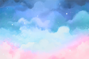
- 사용한 배경화면 이미지 (출처 : freepik)
4. 로고
-
hover 했을 때와 active 했을 때 로고가 조금씩 움직이게 설정하였다.
img.agoraStates { width: 700px; } img.agoraStates:hover { position: relative; top: 3px; } img.agoraStates:active { position: relative; top: 5px; }- 적용된 모습

- 적용된 모습
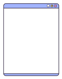
5. 창 버튼
-
부모 클래스를 만들어
justify-content: space-between속성으로 양 끝에 정렬하고
각 버튼에 이미지를 넣어준다..btn { width: 20px; height: 20px; background-size: contain; background-repeat: no-repeat; background-color:transparent; border: 0px solid #352B44; margin: 0px 0px 0px 8px; } .min { background-image: url("img/버튼_최소화.png"); } .max { background-image: url("img/버튼_최대화.png"); } .close { background-image: url("img/버튼_닫기.png"); }- 사용한 이미지
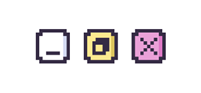
- 사용한 이미지
6. 등록 버튼
- 처음 코드를 짤 때 자꾸 이미지가 아래 사진처럼 상단에 붙어 골치가 아팠다.
- 배경색까지 입혀 이미지를 만들까 했지만 구글링으로 열심히 찾아보니 이미지를 정중앙으로 배치해주는
background-position: center속성이 있어 이를 해결할 수 있었다!
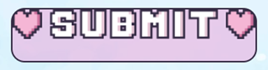
-
이 등록 버튼은 커서를 올렸을 때와 클릭했을 때 모두 다른 색상를 주고싶어 각각 이벤트마다 다른 색깔을 적용했다.
input[type="submit"] { display: flex; background-color: rgba(234, 161, 216, 0.5); background-image: url("img/submit.png"); background-position: center; /* 이미지 정중앙 */ background-size: auto; background-repeat: no-repeat; justify-content: center; align-items: center; font-size: 24px; width: 360px; height: 80px; border: 3px solid #352B44; border-radius: 20px; padding: 10px; color: rgb(255, 255, 255, 0); } input[type="submit"]:hover { position: relative; background-color: rgba(253, 233, 144, 0.5); } input[type="submit"]:active { position: relative; background-color: rgba(162, 180, 254, 0.5); top: 5px; margin-top: 5px; }- 적용된 모습
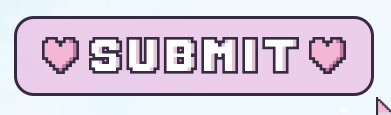
- 적용된 모습
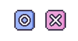
7. 답변 여부
- 이건 CSS가 아닌 javaScript를 사용했다.
const checked = document.createElement("img"); checked.className = "discussion__answered"; checked.textContent = obj.answer ? `${checked.src = "img/버튼_O.png"}` : `${checked.src = "img/버튼_X.png"}`;- 삼항연산자를 사용해 답변이 있는 경우 O 버튼 이미지를, 답변이 없는경우 X 버튼 이미지를 넣었다.
- 사용한 이미지
8. 겹치는 창 효과
position속성과z-index속성을 이용해 창이 겹친 효과를 주었다.
- 질문 창 전체 영역
section.form__container{ position: relative; z-index: 3; flex-direction: column; } - 질문 창 뒤 겹치는 이미지
.imgBox { position: absolute; margin: 20px 0px 0px 20px; opacity: 0.7; /* 투명도 */ }- 사용한 이미지
- 사용한 이미지
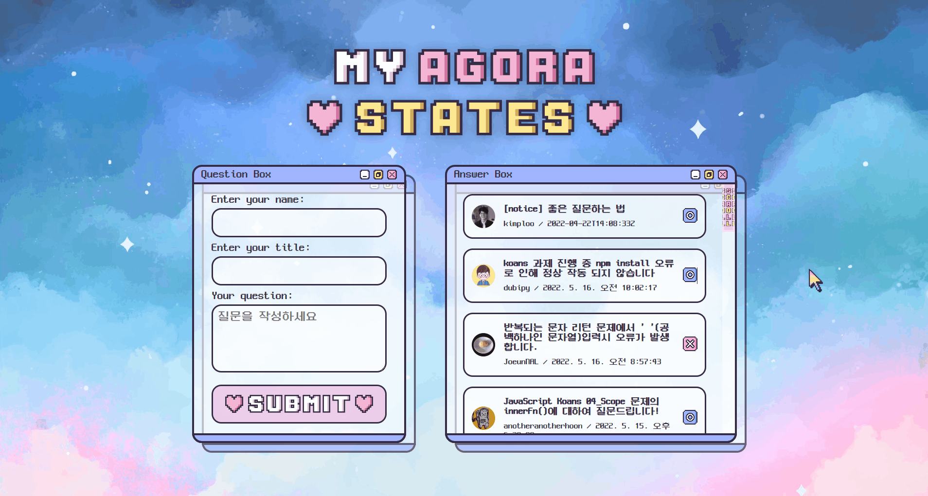
5. 나만의 아고라스테이츠 완성 🦄

- 시간이 충분하지 않아 많은 기능을 구현하지는 못해 아쉬움이 남지만 프론트엔드 개발 공부를 시작한 4주차의 결과물이니 아직 성장할 시간이 많이 남았다고 생각하자!
- 다음번 좀 더 다양한 기능을 추가해보고 싶다. (페이지네이션, 디스커션 유지 기능, 버튼 기능 추가 등)

요즘 픽셀아트에 빠져있는데 너무 예뻐요 원래 디자이너이신가요?