
❇️ import matplotlib as plt
유용한 사이트
#️⃣ 한글 폰트 설정
# 한글 깨짐 방지 코드
import matplotlib
matplotlib.rcParams['font.family'] = 'Malgun Gothic' # Window
# matplotlib.rcParams['font.family'] = 'AppleGothic' # Mac
matplotlib.rcParams['font.size'] = 15 # 글자 크기
matplotlib.rcParams['axes.unicode_minus'] = False # 한글에서 마이너스 기호 깨짐 방지


# 사용가능한 폰트 리스트 출력
import matplotlib.font_manager as fm
fm.fontManager.ttflist # 사용가능한 폰트 확인
[f.name for f in fm.fontManager.ttflist]
#️⃣ 제목 / 축 제목 설정
제목 설정
# 제목 설정
# plt.title(제목)

plt.title('꺾은선 그래프', fontdict={'family':'HYGungSo-Bold', 'size':20})
# fontdict= 폰트와 사이즈를 한 번에 설정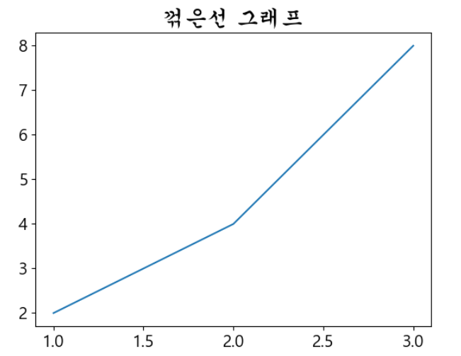
축 제목 설정
# 축 제목 설정
# plt.xlabel(x축 제목)
# plt.ylabel(y축 제목)

plt.xlabel('x축', color='red', loc='right') # left, center, right
plt.ylabel('y축', color='#00aa00', loc='top') # top, center, bottom
# color= 색 지정
# loc= 위치 지정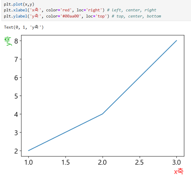
축 숫자 설정
# 축 숫자 설정
# plt.xticks(x축에 표시될 숫자)
# plt.yticks(y축에 표시될 숫자)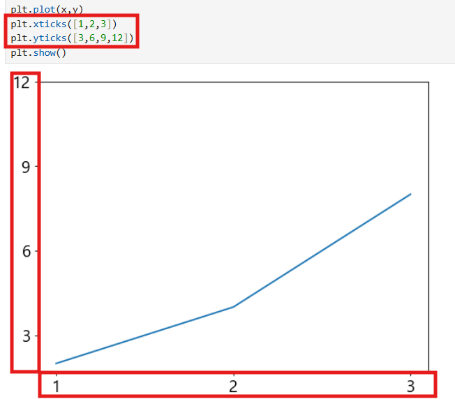
#️⃣ 범례
# 범례
# plt.legend()

plt.legend(loc='lower right')
plt.legend(loc=(0.7,0.8))
# loc= 위치 지정가능 코드 또는 좌표지정 가능
'''
'best'
'upper right'
'upper left'
'lower left'
'lower right'
'right'
'center left'
'center right'
'lower center'
'upper center'
'center'
'''
# 범례 제목 설정
plt.legend(loc=(1.2,0.3), title='언어별 선호도')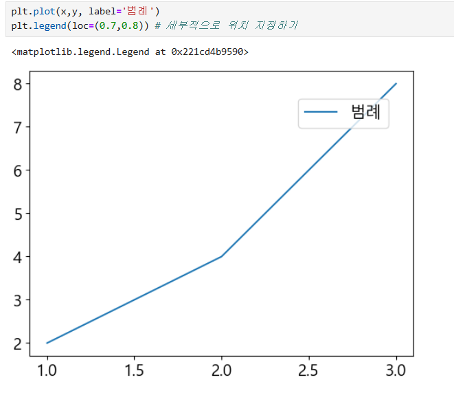
#️⃣ 스타일
선 스타일
# 선 굵기
plt.plot(x,y, linewidth=5)

# 선 스타일
plt.plot(x,y,linestyle=':')
# linestyle= 선 스타일 == ls

# 선 색깔
plt.plot(x,y, color='pink')
# https://matplotlib.org/stable/gallery/color/named_colors.html

# 선 투명도 설정
alpha=
plt.plot(x,y,alpha=0.2)
마커
plt.plot(x, y, marker='o')
plt.plot(x, y, marker='v', markersize=10)
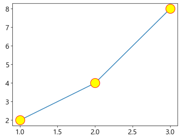
plt.plot(x, y, marker='o', markersize=20, markeredgecolor='red', markerfacecolor='yellow')

# markeredgecolor= 마커 테두리색 설정 == mec
# markerfacecolor= 마커 안쪽색 설정  == mfc

# plt.plot(x,y, marker='o', mfc='red', ms=10, mec='blue', ls=':')
# ms= 마커 크기 설정
포멧
plt.plot(x,y, 'ro--') # color, marker, linestyle
plt.plot(x,y, 'bv:')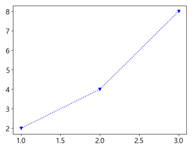
그래프 크기/ 배경
plt.figure(figsize=(10, 5))
plt.figure(figsize=(10, 5), dpi= 200)

# dpi= 크기 조정 가능함, dpi로 조정하면 저장시 크기 조절 가능

# 배경 색 설정
plt.figure(facecolor='yellow') # 구글에 color picker 검색
plt.figure(facecolor='#a1c3ff')

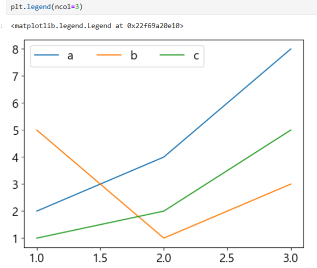
plt.legend(ncol=3)
# ncol 범례에서 1줄에 들어갈 수 있는 변수의 수 설정 가능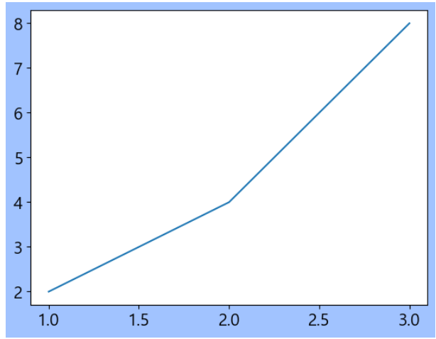
그리드
plt.grid()
plt.grid(axis='x') # 세로 줄만
plt.grid(axis='y') # 가로 줄만

plt.grid(axis='y', c='purple', alpha=0.5, ls='--', linewidth=2)
#️⃣ 파일 활용
그래프 저장
# 그래프 파일 저장
plt.figure(dpi=200)
plt.plot(x,y)
plt.savefig('graph200.png')
# dpi로 크기를 조정해서 저장 가능
데이터 프레임으로 그래프 그리기
plt.plot(df['컬럼명1'],df['컬럼명2'])#️⃣ 텍스트 수정
텍스트 추가
plt.plot(x,y,marker='o')
for idx, txt, in enumerate(y):
    plt.text(x[idx], y[idx] + 0.3, txt , ha='center', color='blue')

# y축을 살짝 위로 해서 텍스트가 살짝 위에 나오도록함
# ha= 'center'로 하면 딱 텍스트가 x가 맞게 나옴
# 데이터 수치 각도 조절해주기
plt.xticks(rotation=45) # x축의 이름 데이터 각도를 45도로 설정
plt.yticks(rotation=45) # y축의 키 데이터 각도를 45도로 설정#️⃣ 여러가지 데이터 보기
plt.plot(days, a)
plt.plot(days, b)
plt.plot(days, c)

# 그냥 plot를 여러 번 찍으면 됨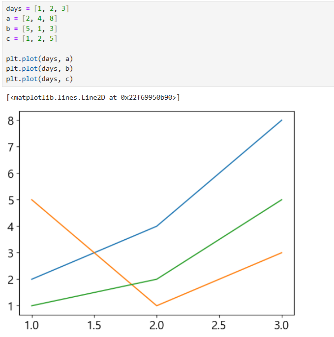
#️⃣ 막대 그래프
# 막대 그래프
# plt.bar(x,y)

# 각각 색 지정하기
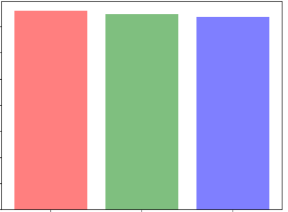
colors = ['r', 'g', 'b']
plt.bar(labels, values, color=colors, alpha=0.5)

# 값의 한계를 정하기
plt.ylim(100, 200)
# 만약 그래프를 100부터 200사이로 보고 싶다면 사용


# 바 굵기 조절
plt.bar(labels, values, width=0.5)

# plt.bar(labels, values, width=0.5)

# 바 해칭 하기
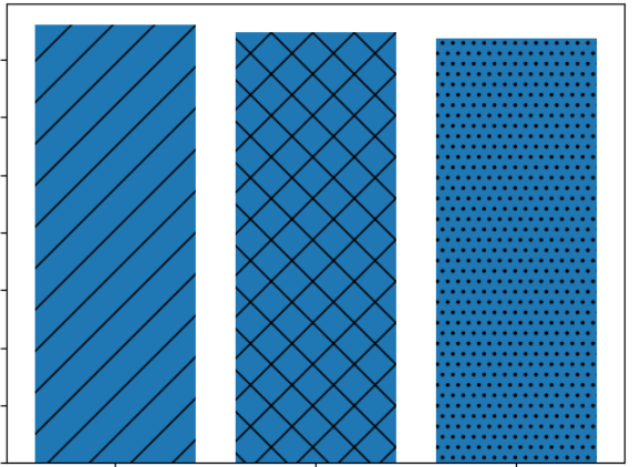
bar = plt.bar(labels, values)
bar[0].set_hatch('/')
bar[1].set_hatch('x')
bar[2].set_hatch('..')
# https://matplotlib.org/stable/gallery/shapes_and_collections/hatch_style_reference.html

# 그래프에 수치 넣기
bar = plt.bar(labels, values)
plt.ylim(175, 195)

for idx, rect in enumerate(bar):
    plt.text(idx, rect.get_height()+0.5, values[idx], ha='center', color='blue')

# get_height()= 막대의 높이를 반환
# get_width()= 막대의 너비를 반환
#️⃣ 가로 막대 그래프
plt.barh(labels, values)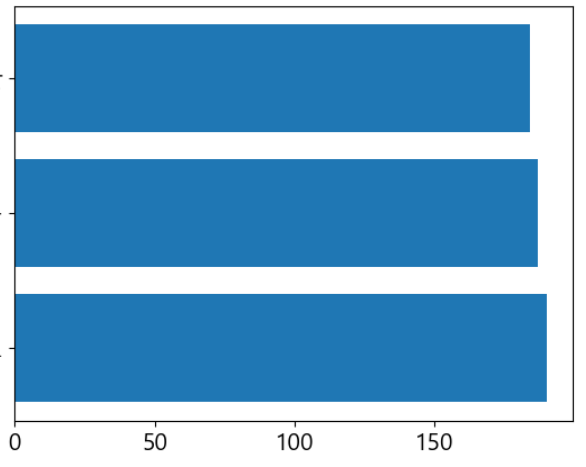
#️⃣ 누적 막대 그래프
plt.bar(df['컬럼명1], df['컬럼명2'])
plt.bar(df['컬럼명1'], df['컬럼명3'], bottom=df['컬럼명2']) # bottom 을 사용해서 이런식으로 bar 그래프를 얼마나 띄울지를 정할수 있음
plt.bar(df['컬럼명1'], df['컬럼명4'], bottom=df['컬럼명2'] + df['컬럼명3'])

# bottom= 바 그래프를 주는 값 만큼 띄움 그래서 누적 막대 그래프를 그릴 수 있음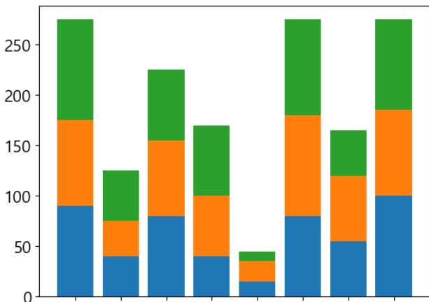
#️⃣ 다중 막대 그래프
w = 0.25
plt.bar(index-w, df['컬럼명1'], width=w)
plt.bar(index, df['컬럼명2'], width=w)
plt.bar(index+w, df['컬럼명3'], width=w)

# 바그래프의 x축 위치를 조금씩 어긋나게 해서 다중 막대 그래프를 만들수 있음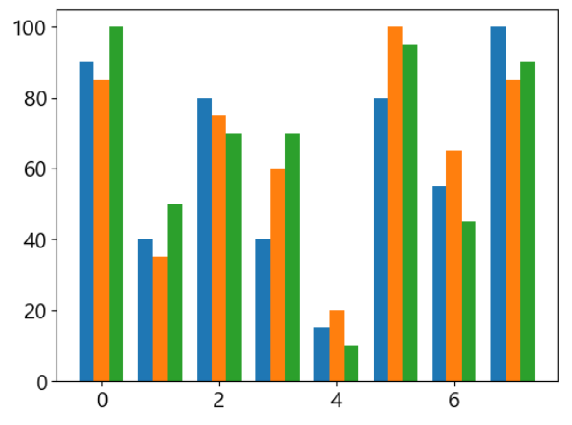
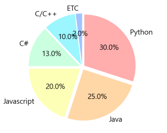
#️⃣ 원 그래프
# 기본적인 원 그래프 그리기
values = [30, 25, 20, 13, 10, 2]
labels = ['Python', 'Java', 'Javascript', 'C#', 'C/C++', 'ETC']
# colors = ['b', 'g', 'r', 'c', 'y', 'm']
colors = ['#ffadad', '#ffd6a5', '#fdffb6', '#caffdf', '#9bf6ff', '#a0c4ff']
explode = [0.05] * 6

plt.pie(values, labels=labels, autopct='%.1f%%', startangle=90, counterclock=False, colors=colors, explode=explode)
# autopct='%.1f%%' 소수점 1번째 자리 까지 %% 붙이면 뒤에 % 붙일 수 있음
# startangle=90 원 그래프를 90도로 회전 시킴
# counterclock=False 시계 방향으로 그래프 그리기
# explode= 원 그래프를 떼어낼 간격
#️⃣ 도넛 그래프
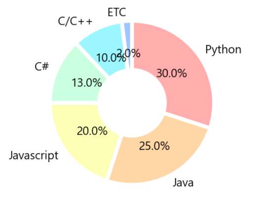
wedgeprops = {'width':0.6, 'edgecolor':'w', 'linewidth':5}
plt.pie(values, labels=labels, autopct='%.1f%%', startangle=90, counterclock=False, colors=colors, wedgeprops=wedgeprops)
# wedgeprops : 가운데 구멍 뚫기, 남길 퍼센트
# edgecolor :'w' 테두리 하얀색
# linewidth :5 테두리 굵기
# pctdistance :  글자 거리 조절

# 데이터가 10프로 미만이면 텍스트 생락해보기
# 데이터가 10% 미만이면 퍼센트 안보여줌
def custom_autopct(pct):
    # return ('%.1f%%' % pct) if pct >= 10 else ''
    # return '{:.1f}%'.format(pct) if pct >= 10 else ''
    return '{:.0f}%'.format(pct) if pct >= 10 else ''
plt.pie(values, labels=labels, autopct=custom_autopct, startangle=90, counterclock=False, colors=colors, wedgeprops=wedgeprops, pctdistance=0.3)
plt.show()
#️⃣ 산점도 그래프
# 산점도 그래프 그리기
# plt.scatter()
plt.scatter(df['컴럼명1'], df['컴럼명2'], s=sizes)

plt.colorbar(ticks=[1,2,3], label='학년', shrink=0.5, orientation='horizontal')
# orientation='horizontal' 컬러바 위치 변경 아랫 쪽으로 보냄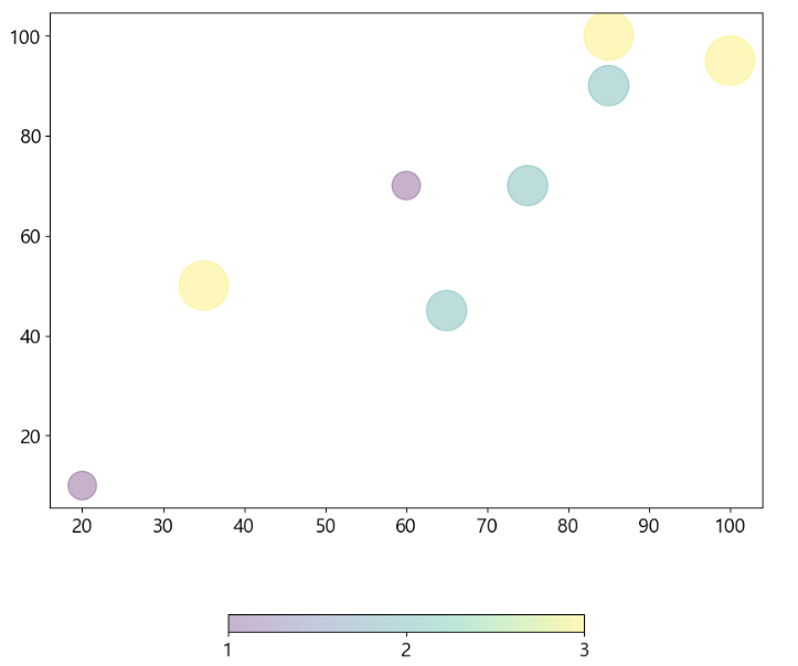
#️⃣ 여러개의 그래프 그리기
fig, axs = plt.subplots(2, 2, figsize=(15, 10)) # 2 X 2에 해당하는 plot 들을 생성
fig.suptitle('여러 그래프 넣기')

# 첫 번째 그래프
axs[0, 0].bar(df['이름'],df['국어'], label='국어점수') #데이터설정
axs[0, 0].tick_params(axis='x', labelrotation=45)
axs[0, 0].set_title('첫번째 그래프') # 제목
axs[0, 0].legend() # 범례
axs[0, 0].set(xlabel='이름', ylabel='점수') # x,y 축 label
axs[0, 0].set_facecolor('lightyellow') # 전면 색
axs[0, 0].grid(ls='--', linewidth=0.5) # 그리드

# 두 번째 그래프
axs[0, 1].plot(df['이름'], df['수학'], label='수학')
axs[0, 1].plot(df['이름'], df['영어'], label='영어')
axs[0, 1].legend()

# 세 번째 그래프
axs[1, 0].barh(df['이름'], df['키'])

# 네 번째 그래프
axs[1, 1].plot(df['이름'], df['사회'], c='y', alpha=0.5)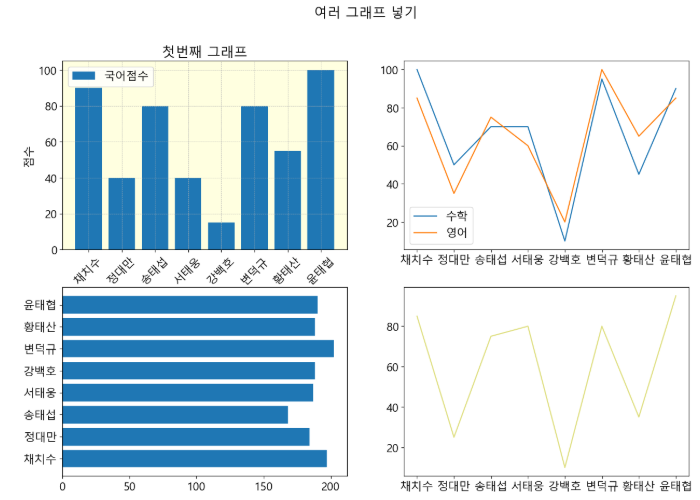

Re: 제로부터 시작하는 데이터분석
하나도 안 싂네쬬