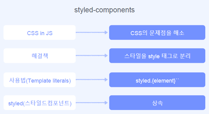
기존 css 방법의 문제점
https://speakerdeck.com/vjeux/react-css-in-js
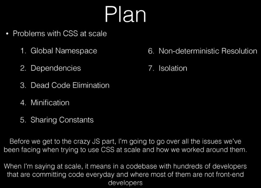
Global Namespace: 글로벌 변수를 지양해야하는 JS 와 대치Dependencies: Dependencies: css
간의 의존 관리Dead Code Elimination: 안쓰는 css 인지 어려움Minification: 클래스 이름 최소화Sharing Constants: JS 의 코드와 값을 공유하고 싶음Non-deterministic Resolution: css 파일 로드 타이밍 이슈Isolation: 격리(컴포넌트의 재사용의 어려움)
styled-component
개요
설치
# with npm
npm install --save styled-components

# with yarn
yarn add styled-components
실습
Getting Started
import Raect from "react";
import styled from "styled-components";

export default function StyledComponentsExample() {
  // Create a Title component that'll render an <h1> tag with some styles
  const Title = styled.h1`
    font-size: 1.5em;
    text-align: center;
    color: palevioletred;
  `;

  // Create a Wrapper component that'll render a <section> tag with some styles
  const Wrapper = styled.section`
    padding: 4em;
    background: papayawhip;
  `;

  // Use Title and Wrapper like any other React component – except they're styled!
  return (
    <Wrapper>
      <Title>Hello World!</Title>
    </Wrapper>
  );
}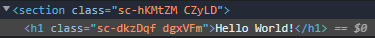
class 이름이 자동으로 유니크한 값으로 들어갑니다.
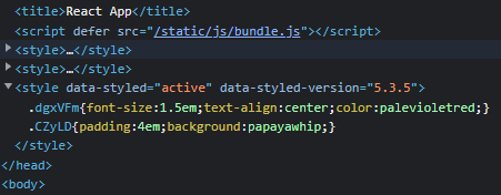
스타일 태그안에 자동으로 넣어줍니다.
Adapting based on props
const Button = styled.button`
    /* Adapt the colors based on primary prop */
    background: ${(props) => (props.primary ? "palevioletred" : "white")};
    color: ${(props) => (props.primary ? "white" : "palevioletred")};

    font-size: 1em;
    margin: 1em;
    padding: 0.25em 1em;
    border: 2px solid palevioletred;
    border-radius: 3px;
  `;

  return (
    <>
      <Wrapper>
        <Title>Hello World!</Title>
      </Wrapper>
      <Button>Normal</Button>
      <Button primary>Primary</Button>
    </>
  );
}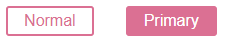
props를 전달할 수 있고, props에 의해서 다른 css값을 적용할 수 있습니다.
Extending Styles
1
  // A new component based on Button, but with some override styles
  const TomatoButton = styled(Button)`
    color: tomato;
    border-color: tomato;
  `;

<TomatoButton>Tomato Button</TomatoButton>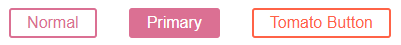
기존에 만든 css 컴포넌트에 css를 더 확장하여 적용한 컴포넌트를 만들 수 있습니다.
2
  <Button as="a" href="#">
    Link with Button styles
  </Button>
  <TomatoButton as="a" href="#">
    Link with Tomato Button styles
  </TomatoButton>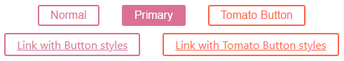
as를 사용하여 태그를 바꿀수 있습니다.
3
const ReversedButton = (props) => (
  <Button {...props} children={props.children.split("").reverse()} />
);

<Button as={ReversedButton}>
  Custom Button with Normal Button styles
</Button>
as에는 native태그만 넣을수 있는 것이 아닙니다.
Styling any component
어떤 컴포넌트 든 전부 스타일링을 할 수 있습니다.
// This could be react-router-dom's Link for example
const Link = ({ className, children }) => (
  <a className={className}>
    {children}
  </a>
);

const StyledLink = styled(Link)`
  color: palevioletred;
  font-weight: bold;
`;

render(
  <div>
    <Link>Unstyled, boring Link</Link>
    <br />
    <StyledLink>Styled, exciting Link</StyledLink>
  </div>
);
The styled method works perfectly on all of your own or any third-party component, as long as they attach the passed className prop to a DOM element.
스타일이 지정된 메서드는 전달된 className prop을 DOM 요소에 연결하는 한 모든 자체 또는 타사 구성 요소에서 완벽하게 작동합니다.
여기까지 정리
Pseudoelements, pseudoselectors, and nesting
const Thing = styled.div.attrs((/* props */) => ({ tabIndex: 0 }))`
  color: blue;

  &:hover {
    color: red; // <Thing> when hovered
  }

  & ~ & {
    background: tomato; // <Thing> as a sibling of <Thing>, but maybe not directly next to it
  }

  & + & {
    background: lime; // <Thing> next to <Thing>
  }

  &.something {
    background: orange; // <Thing> tagged with an additional CSS class ".something"
  }

  .something-else & {
    border: 1px solid; // <Thing> inside another element labeled ".something-else"
  }
`

render(
  <React.Fragment>
    <Thing>Hello world!</Thing>
    <Thing>How ya doing?</Thing>
    <Thing className="something">The sun is shining...</Thing>
    <div>Pretty nice day today.</div>
    <Thing>Don't you think?</Thing>
    <div className="something-else">
      <Thing>Splendid.</Thing>
    </div>
  </React.Fragment>
)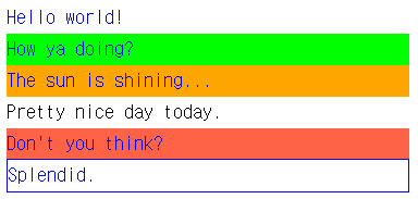
&는 자기 자신을 가리킵니다.
.something-else & 이런식으로 자기 자신의 부모(class로 something-else 가진 Element) 범위도 명시할 수 있습니다.
Attaching additional props
const Input = styled.input.attrs(props => ({
  // we can define static props
  type: "text",

  // or we can define dynamic ones
  size: props.size || "1em",
}))`
  color: palevioletred;
  font-size: 1em;
  border: 2px solid palevioletred;
  border-radius: 3px;

  /* here we use the dynamically computed prop */
  margin: ${props => props.size};
  padding: ${props => props.size};
`;

render(
  <div>
    <Input placeholder="A small text input" />
    <br />
    <Input placeholder="A bigger text input" size="2em" />
  </div>
);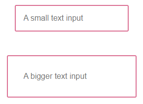
input 태그에 type='text' 을 주지 않았음에도 type='text'로 render링 된 이유는 styled component에서
styled.input.attrs((props) => ({
  // we can define static props
  type: "text",

  // or we can define dynamic ones
  size: props.size || "1em",
}))`...`
attrs(() =>({})) 으로 속성을 부여하거나 동적으로 속성 값을 바꿀수 있기 때문입니다.
오버라이드 또한 가능합니다.(아래코드)
// Input's attrs will be applied first, and then this attrs obj
const PasswordInput = styled(Input).attrs({
  type: "password",
})`
  // similarly, border will override Input's border
  border: 2px solid aqua;
`;
Input에서 정의한 type: 'text'를 type: "password" 로 오버라이드 했습니다.
Animations
import styled, { keyframes } from "styled-components";
// Create the keyframes
const rotate = keyframes`
from {
transform: rotate(0deg);
}
to {
transform: rotate(360deg);
}
`;
// Here we create a component that will rotate everything we pass in over two seconds
const Rotate = styled.div`
display: inline-block;
animation: ${rotate} 2s linear infinite;
padding: 2rem 1rem;
font-size: 1.2rem;
`;
render(
<Rotate>< 💅🏾 ></Rotate>
);import 로 { keyframes } 를 추가해야합니다.
Advanced Usage
Theming
styled-components has full theming support by exporting a <ThemeProvider> wrapper component. This component provides a theme to all React components underneath itself via the context API. In the render tree all styled-components will have access to the provided theme, even when they are multiple levels deep.
styled-components는 <ThemeProvider> 래퍼 구성 요소를 내보내 전체 테마를 지원합니다. 이 구성 요소는 컨텍스트 API를 통해 자체 아래에 있는 모든 React 구성 요소에 테마를 제공합니다. 렌더 트리에서 모든 스타일 구성 요소는 여러 수준의 깊이에 있는 경우에도 제공된 테마에 액세스할 수 있습니다.
import styled, { ThemeProvider } from "styled-components";


// Define our button, but with the use of props.theme this time
const Button = styled.button`
  font-size: 1em;
  margin: 1em;
  padding: 0.25em 1em;
  border-radius: 3px;

  /* Color the border and text with theme.main */
  color: ${props => props.theme.main};
  border: 2px solid ${props => props.theme.main};
`;

// We are passing a default theme for Buttons that arent wrapped in the ThemeProvider
Button.defaultProps = {
  theme: {
    main: "palevioletred"
  }
}

// Define what props.theme will look like
const theme = {
  main: "mediumseagreen"
};

render(
  <div>
    <Button>Normal</Button>

    <ThemeProvider theme={theme}>
      <Button>Themed</Button>
    </ThemeProvider>
  </div>
); 
color: ${props => props.theme.main} : props에서 theme를 받습니다.
Button.defaultProps = { theme: { main: "palevioletred" } } : theme를 props로 전달합니다.
이후에 테마를 바꾸고 싶다면 const theme = { main: "mediumseagreen" };
로 테마를 객체에 담아 정의하고,
<ThemeProvider theme={theme}>
프로바이더로 하위 모든 컴포넌트의 theme를 전달하여 변경시켜줍니다.
ThemeProvider 는 import로 가져올 수 있습니다.
API Reference
createGlobalStyle
A helper function to generate a special StyledComponent that handles global styles. Normally, styled components are automatically scoped to a local CSS class and therefore isolated from other components. In the case of createGlobalStyle, this limitation is removed and things like CSS resets or base stylesheets can be applied.
전역 스타일을 처리하는 특수 StyledComponent를 생성하는 도우미 함수입니다. 일반적으로 스타일이 지정된 구성 요소는 자동으로 로컬 CSS 클래스로 범위가 지정되므로 다른 구성 요소와 격리됩니다. createGlobalStyle의 경우 이 제한이 제거되고 CSS 재설정 또는 기본 스타일시트와 같은 것들이 적용될 수 있습니다.
import styled, { createGlobalStyle } from "styled-components";

const GlobalStyle = createGlobalStyle`
  body {
    color: ${props => (props.whiteColor ? 'white' : 'black')};
  }
`

// later in your app

<React.Fragment>
  <GlobalStyle whiteColor />
  <Navigation /> {/* example of other top-level stuff */}
</React.Fragment>
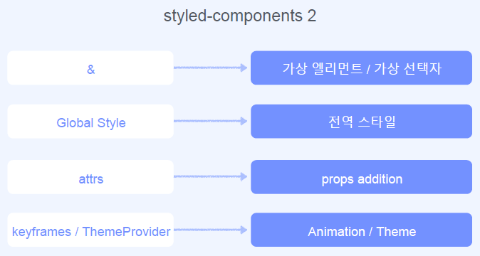
정리
참고
- You can also pass tag names into the styled() factory call, like so: styled("div"). In fact, the styled.tagname helpers are just aliases that do the same.
styled("div")와 같이 태그 이름을 styled() 팩토리 호출에 전달할 수도 있습니다. 사실, styled.tagname 도우미는 같은 일을 하는 별칭일 뿐입니다.
