이 포스트의 코드 전문은 여기서 확인할 수 있습니다!
소셜 어플리케이션에서 가장 중요한 것은 나의 프로필을 잘 꾸미는 것이라고 생각한다. 계정의 첫인상을 드러내는 것이기 때문이다. 프로필을 형성하는 요소들 중에서도 가장 중추적인 역할을 하는 것은 역시 프로필 사진이라고 생각한다. 내 계정의 성격을 대표하는 가장 중요한 이미지 하나를 보여주는 것이기 때문이다.

보통 소셜 어플리케이션의 프로필 편집 기능에 진입하면, 프로필 사진을 업로드할 수 있게 사진 업로드 버튼을 제공한다. 사진을 첨부하면 내가 첨부한 이미지를 미리보기로 보여준다.
(요즘에는 대부분 사진 업로드 버튼이 이미지 중앙에 오버레이되어 있는 형태가 많다.)

얼마 전부터 내가 근무하는 회사에서 Next.js 기반으로 앱을 개발하고 있다. 따라서 이 포스트에서는 Next.js와 MUI를 이용하여 프로필 사진 변경 위젯을 간단히 만들어보고자 한다.
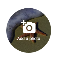
기본 위젯 디자인
기본적인 위젯 디자인은 다음과 같이 만들었다. 기본 이미지를 하나 띄워주고, 그 다음 그 위에 아이콘과 "Add a photo" 문구가 포함된 버튼을 오버레이한다.
import { Box, ButtonBase, Stack, Typography } from '@mui/material';
import { AddAPhoto } from '@mui/icons-material';
import Image from 'next/image';
import React from 'react';

export default function ProfileImageChangeButton() {
  return (
    <Box
      sx={{
        width: 150,
        height: 150,
        position: 'relative',
        m: 10,
      }}
    >
      <Image
        alt="sample image"
        src="/sample1.jpeg"
        width={150}
        height={150}
        style={{
          width: 150,
          height: 150,
          objectFit: 'cover',
          position: 'absolute',
          borderRadius: 75,
          zIndex: 1,
        }}
      />
      <ButtonBase
        sx={{
          position: 'absolute',
          width: 150,
          height: 150,
          borderRadius: 75,
          zIndex: 2,
          bgcolor: '#00000077',
        }}
      >
        <Stack spacing={0.5} alignItems="center">
          <AddAPhoto sx={{ width: 50, height: 50, color: '#FFFFFF' }} />
          <Typography variant="body2" color="#FFFFFF">
            Add a photo
          </Typography>
        </Stack>
      </ButtonBase>
    </Box>
  );
}
file 유형의 input HTML 요소 알아보기
웹에서는 File API를 사용하여 웹 애플리케이션이 파일과 콘텐츠에 접근할 수 있다. 일반적으로 사용되는 방식은 input 요소를 사용하는 것인데, input 태그의 타입을 file로 바꿔주면 된다.
<input type='file' />MUI 버튼 컴포넌트를 통하여 파일 업로드하기
MUI 패키지의 버튼 컴포넌트를 이용하여 어떻게 파일 업로드를 구현할 수 있을까? 공식 문서의 해당 단락에 따르면 버튼 컴포넌트의 타입을 "label"로 두고 버튼 컴포넌트 내에 보이지 않는 input 컴포넌트를 집어넣는 방식으로 구현한다.
문서에 나와있는대로 보이지 않는 input 컴포넌트를 작성한다.
import { styled } from '@mui/material';

export const VisuallyHiddenInput = styled('input')({
  clip: 'rect(0 0 0 0)',
  clipPath: 'inset(50%)',
  height: 1,
  overflow: 'hidden',
  position: 'absolute',
  bottom: 0,
  left: 0,
  whiteSpace: 'nowrap',
  width: 1,
});
그 다음 버튼 컴포넌트를 변경한다.
'use client';

import { VisuallyHiddenInput } from '@/components/visually-hidden-input';
// ...

export default function ProfileImageChangeButton() {
  return (
      // ...
        <ButtonBase
          component="label"
          // ...
        >
          <VisuallyHiddenInput type="file" accept="image/*" />
          // ...
        </ButtonBase>
      // ...
  );
}
그 결과 일단 파일 선택창을 띄우는 데는 성공하였다.
선택한 파일을 핸들링하기
선택한 파일은 input의 onChange를 정의함으로써 핸들링할 수 있다. VisuallyHiddenInput의 change 이벤트를 핸들링하는 handleFileInput 함수를 정의하고, 이 함수 내에서 파일을 컴포넌트 내부 상태값으로 저장하도록 한다.
/* import 생략 ... */

export default function ProfileImageChangeButton() {
  const [file, setFile] = useState<Blob | null | undefined>(null);

  useEffect(() => {
    console.log(file);
  }, [file])

  const handleFileInput = useCallback(
    (ev: React.ChangeEvent<HTMLInputElement>) => {
      const { files } = ev.target;
      const item = files?.item(0);

      if (files && item) {
        setFile(item);
      }
    },
    []
  )

  return (
    <Box
      //...
    >
      {/* ... */}
      <ButtonBase
        component="label"
        // ...
      >
        <VisuallyHiddenInput type="file" accept="image/*" onChange={handleFileInput} />
        {/* ... */}
      </ButtonBase>
    </Box>
  );
}
여기까지 완성하니 일단 상태값에 현재 선택한 파일을 저장할 수 있었다.
선택한 이미지 미리보기 구현하기
내가 선택한 이미지를 미리보기 하려면 어떻게 해야할까?
웹의 URL API의 정적 메소드인 createObjectURL()을 이용하여 객체 URL을 생성하고 이를 이미지 요소로 띄울 수 있다.
객체 URL은 blob:http://localhost:3000/9deeae3d-cb71-4aeb-9934-5e66d832bf2f 와 같은 형태를 띠었다.
파일이 선택이 되면 Image 컴포넌트가 기본 이미지 대신 선택한 이미지를 띄우도록 하면 해결될 것으로 보인다!
/* import 생략 ... */
export default function ProfileImageChangeButton() {
const [file, setFile] = useState<Blob | null | undefined>(null);
const [imageUrl, setImageUrl] = useState<string | null | undefined>(null);
useEffect(() => {
if (file) {
setImageUrl(URL.createObjectURL(file));
}
}, [file])
const handleFileInput = useCallback(
(ev: React.ChangeEvent<HTMLInputElement>) => {
const { files } = ev.target;
const item = files?.item(0);
if (files && item) {
setFile(item);
}
},
[]
)
return (
<Box
//...
>
<Image
alt="sample image"
src={imageUrl ?? '/sample1.jpeg'}
width={150}
height={150}
style={{
position: 'absolute',
borderRadius: 75,
zIndex: 1,
}}
/>
<ButtonBase
component="label"
// ...
>
<VisuallyHiddenInput type="file" accept="image/*" onChange={handleFileInput} />
{/* ... */}
</ButtonBase>
</Box>
);
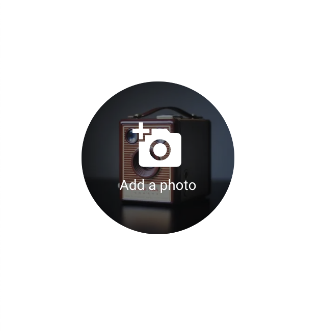
}결과
코드 전문
import { Box, ButtonBase, Stack, Typography } from '@mui/material';
import { AddAPhoto } from '@mui/icons-material';
import Image from 'next/image';
import { VisuallyHiddenInput } from './visually-hidden-input';
import { useCallback, useEffect, useState } from 'react';

export default function ProfileImageChangeButton() {
  const [file, setFile] = useState<Blob | null | undefined>(null);
  const [imageUrl, setImageUrl] = useState<string | null | undefined>(null);

  useEffect(() => {
    if (file) {
      setImageUrl(URL.createObjectURL(file));
    }
  }, [file]);

  const handleFileInput = useCallback(
    (ev: React.ChangeEvent<HTMLInputElement>) => {
      const { files } = ev.target;
      const item = files?.item(0);

      if (files && item) {
        setFile(item);
      }
    },
    []
  );

  return (
    <Box
      sx={{
        width: 150,
        height: 150,
        position: 'relative',
        m: 10,
      }}
    >
      <Image
        alt="sample image"
        src={imageUrl ?? '/sample1.jpeg'}
        width={150}
        height={150}
        style={{
          width: 150,
          height: 150,
          objectFit: 'cover',
          position: 'absolute',
          borderRadius: 75,
          zIndex: 1,
        }}
      />
      <ButtonBase
        component="label"
        sx={{
          position: 'absolute',
          width: 150,
          height: 150,
          borderRadius: 75,
          zIndex: 2,
          bgcolor: '#00000077',
        }}
      >
        <VisuallyHiddenInput
          type="file"
          accept="image/*"
          onChange={handleFileInput}
        />
        <Stack spacing={0.5} alignItems="center">
          <AddAPhoto sx={{ width: 50, height: 50, color: '#FFFFFF' }} />
          <Typography variant="body2" color="#FFFFFF">
            Add a photo
          </Typography>
        </Stack>
      </ButtonBase>
    </Box>
  );
}