버튼 컴포넌트 코드
text, type, onClick을 props으로 받는다.
type은 버튼의 타입을 말하는데 취소, 등록, 클릭 같은 속성에 맞게 타입을 다르게 주어서 css를 변경하는 것이다.type은 css명으로 들어가기 때문에 바로 아래 코드에는 없다.
const MyButton = ({text, type, onClick}) => {
  return (
    <button className={"MyButton"} onClick={onClick}>
      {text}
    </button>
  );
};

export default MyButton;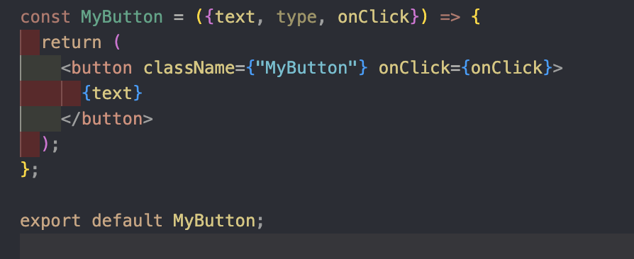
사용하는법
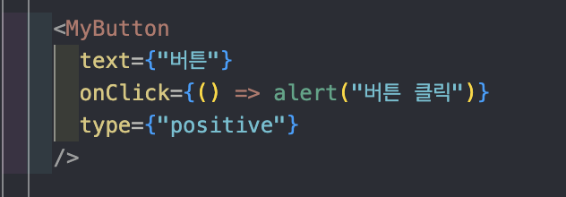
적용된 버튼

type 적용하는 법
 <button
      className={["MyButton", `MyButton_${type}`].join(" ")}
      onClick={onClick}>
      {text}
    </button>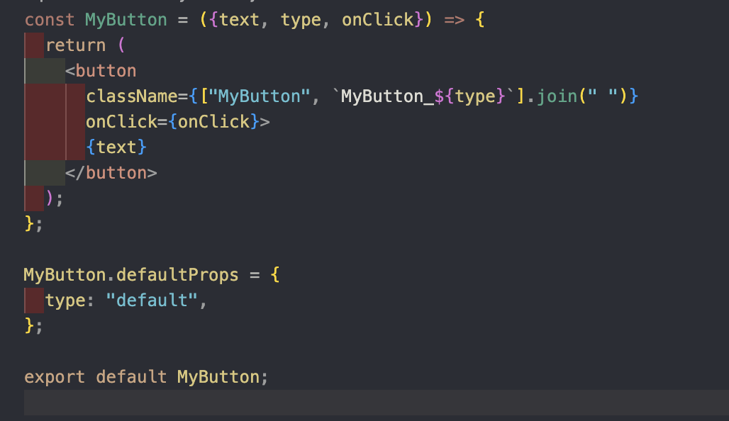
위처럼 클래스명에 배열을 넣고 백틱을 써서 MyButton_${type}을 쓴 다음 join으로 클래스 명 두 개를 연결한다. 이렇게 하면 클래스명이 자연스럽게 "MyButton MyButton_default"가 된다. 클래스명에 타입에 맞는 css로 변경하면 끝.

응용
const MyButton = ({text, type, onClick}) => {
  const btnType = ["positive", "negative"].includes(type) ? type : "default";

  return (
    <button
      className={["MyButton", `MyButton_${btnType}`].join(" ")}
      onClick={onClick}>
      {text}
    </button>
  );
};

MyButton.defaultProps = {
  type: "default",
};

export default MyButton;
const btnType = ["positive", "negative"].includes(type) ? type : "default";
위 코드처럼 btnType을 써주면 type에 엉뚱한 값이 들어와도 막아진다.

병아리 프론트엔드 개발자