ex1-1
- 목표 border 속성을 다룰 수 있다.
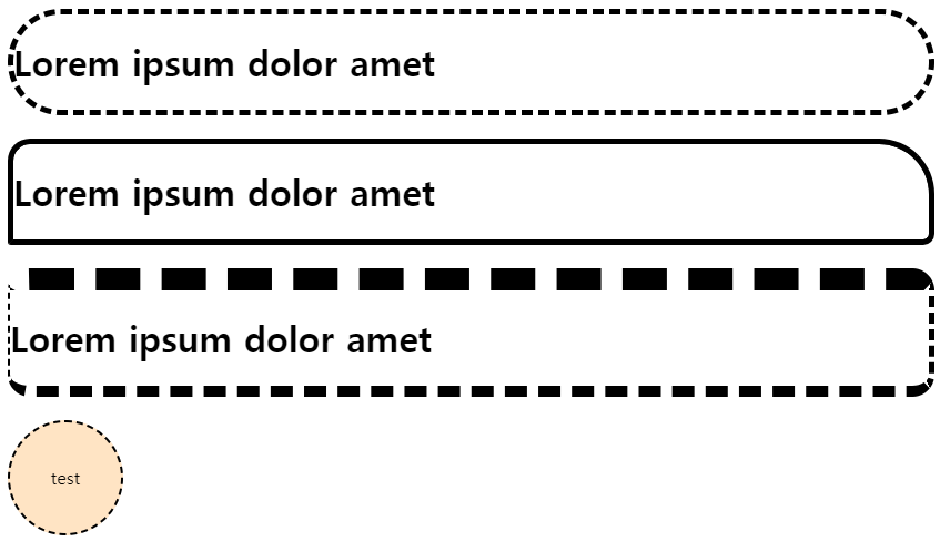
- border-witdth
- border-radius
- border 원모양
<style>
    .box{/*thick 두꺼운 테두리, medium 일반적인 두께, thin 얇은 두께*/
        border-width: thick;
        border-style: dashed;
        border-color: black;
        border-radius: 50px;
    }
    .box2{
        border-width: thick;
        border-style: groove;
        border-color: black;
        border-radius: 20px 50px 10px 3px;/*시계방향 좌상, 우상, 우하, 좌하*/
    }
    .box3{
        border-width: 20px 5px 10px 2px; /*시계방향 상 우 하 좌*/
        border-style: dashed;
        border-color: black;
        border-radius: 20px;
    }
    .box4{
        width: 100px;
        height: 100px;
        border-width: 2px;
        border-style: dashed;
        border-radius: 100px;
        border-color: black;
        text-align: center;
        line-height: 100px;/*텍스트 라인의 높이를 정한다.*/
        background-color: bisque;
    }

</style>
<body>
    <div class="box">
        <h1>Lorem ipsum dolor amet</h1>
    </div>
    <br>
    <div class="box2">
        <h1>Lorem ipsum dolor amet</h1>
    </div>

    <br>
    <div class="box3">
        <h1>Lorem ipsum dolor amet</h1>
    </div>

    <br>
    <div class="box4">
        test
    </div>
</body>
결과
ex1-2
목표 - display 속성에 대한 이해
- display: none
- display: block
- disply: inline
- disply: inline-block
<style>
    #box{
        display: inline-block;
        background-color: black;
        color: white;
        width: 300px;
        height: 50px;
    }/*none 보이지 않게 한다, block 블록화 시킨다, inline 인라인화 시킨다*/
    /*inline은 margin, padding은 적용되지만 상하좌우 값은 적용되지 않는다.*/
    /*inline-block은 높이와 너비에 따라 공간을 차지한다. width는 적용된다*/
    /*height는 보통 내부 컨텐츠의 높이에 따라 자동 조절된다// 잘 먹히는데?*/

</style>
<body>
    <span>더미 객체</span>
    <div id="box">대상 객체</div>
    <span>더미 객체</span>
</body>
결과

ex1-3
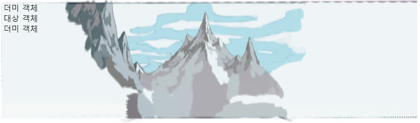
목표 - background 속성에 대한 이해
- background-image 배경 이미지 추가하기
- background-size: 배경 이미지 사이즈 변경
- background-repeat: 이미지 반복 제어
- background-attachment: scroll
- background-attachment: fixed
<style>
   body{/*각각의 그림을 레이어라고 합니다.*/
    background-image: url(img/BackgroundFront.png), url(img/BackgroundBack.png);
    background-size: 100% 250px;/*브라우저 크기에 맞춰서 크기가 변경된다*/
    /*px값을 할당하면 레이어의 높이에 적용되고 브라우저 크기를 변경해도 높이는 고정된다.*/
    background-repeat: no-repeat; /*레이어가 하나만 적용된다.*/
    background-attachment: scroll;
    /*scroll 스크롤의 움직임에 따라 고정되지 않고 함께 움직인다.*/
    /*fixed 배경이미지가 고정되어 스크롤에 상관없이 고정된 위치에 유지된다.*/
   }
</style>
<body>
    <span>더미 객체</span>
    <div id="box">대상 객체</div>
    <span>더미 객체</span>
</body>
결과
ex2-1
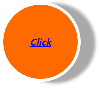
목표 box-shadow, line-height를 이해한다.
- box-shdow
- line-height
<style>
    .font_big{
        font-size: 2em;
    }
   .font_italic{
    font-style: italic;
   }
   .font_bold{
    font-weight: bold;
   }
   .font_center{
    text-align: center;
   }

    .button{
        width: 250px;
        height: 250px;
        background-color: #ff6a00;
        border: 10px solid #ffffff;
        border-radius: 250px;
        box-shadow: 50px 5px 10px #a9a9a9;
        /*1. 가로거리 그림자의 수평 위치를 정한다.  - 왼쪽, + 오른쪽
          2. 세로거리 그림자의 수직 위치를 정한다.  - 위쪽, + 아래쪽
          3. 그림자의 흐림정도를 정한다. 양수만 존재한다 높을 수록 흐려진다.
          4. 그림자의 색상을 정한다. */
    }
    .button > a{
        display: block;
        line-height: 250px;/*글자를 감싸는 박스 높이와 같은 크기의 line-height를 적용하면 중앙에 위치하게 된다.*/
    }

</style>
<body>
   <div class="button">
    <a href="#" class="font_big font_italic font_bold font_center">Click</a>
   </div>
    </div>
</body>
결과
ex2-2
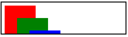
목표 - position: absolute에 대한 이해
- position: absolute
- left, top, right, bottom
- z-index
- overflow: hidden;
- overflow: scroll;
<style>
    .box{
        width: 100px;
        height: 100px;
        position: absolute;/*요소의 위치를 절대적인 위치로 설정하는 데 사용된다. 요소를 독립적으로 위치시킬 수 있다. */
        /*요소가 일반적인 문서흐름에서 벗어나, 다른 요소에 영향을 주지 않는다.*/
        /*left, top, right, bottom 속성으로 요소를 이동시킬 수 있다.*/
        /*부모 위치를 기준으로 잡는다.(position:relative)*/
    }
    .box:nth-child(1){
        background-color: red;
        left: 10px; top: 10px;
        z-index: 100;/*값이 큰 요소가 앞에 위치하게 된다*/
    }.box:nth-child(2){
        background-color: green;
        left: 50px; top: 50px;
        z-index: 300;
    }.box:nth-child(3){
        background-color: blue;
        left: 90px; top: 90px;
        z-index: 1000;
    }
    body > div{
        width: 400px;
        height: 100px;
        border: 3px solid black;
        position: absolute;
        overflow: hidden; /*부모 영역을 벗어난 부분을 잘라 모두 감춤*/
        /*overflow: scroll; 벗어난 부분을 스크롤로 표현*/
        /*특정한 방향으로만 스크롤 생성할 때 overflow-y: scroll overflow-x: scroll*/
        /*인라인 요소는 자연스럽게 자식 요소의 크기에 맞춰져 콘텐츠가 넘칠 경우 자동으로
        줄바꿈되므로 overflow: hidden; 속성이 적용되지 않는다*/
        /*position: absolute;를 가진 요소: 절대 위치로 배치된 요소는 부모 컨테이너의
        경계를 벗어날 수 있으므로 overflow: hidden;이 작동하지 않는다.
        */
    }

</style>
<body>
    <div>

        <div class="box"></div>
        <div class="box"></div>
        <div class="box"></div>
    </div>
</body>
결과
ex2-3
목표 - layout 정렬방법인 float에 대한 이해
- float: left, right
- clear: both
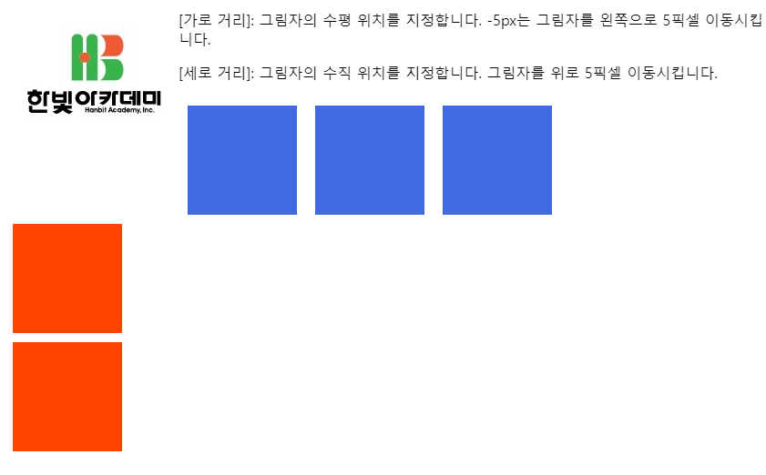
<style>
    img {
        float: left;
    }
    .box{
        width: 100px; height: 100px;
        background-color: royalblue;
        margin: 10px; padding: 10px;
        float: left;/* 한 줄 안에 가득찰 때까지 요소를 왼쪽으로 정렬한다.*/
    }
    .nobox{
        clear: both; /*float가 적용되지 않는다.*/
        width: 100px; height: 100px;
        background-color: orangered;
        margin: 10px; padding: 10px;
    }
</style>

<body>
    <img src="img/hanbit.jpg">
    <p> [가로 거리]: 그림자의 수평 위치를 지정합니다.
        -5px는 그림자를 왼쪽으로 5픽셀 이동시킵니다.</p>
    <p> [세로 거리]: 그림자의 수직 위치를 지정합니다.
        그림자를 위로 5픽셀 이동시킵니다. </p>

        <div class="box"></div>
        <div class="box"></div>
        <div class="box"></div>
        <div class="nobox"></div>
        <div class="nobox"></div>
</body>
결과
ex4-1
목표 float를 활용할 줄 안다.
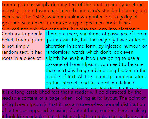
<style>
    .mom{
        width: 500px; height: 400px;
        background-color: red;
        /*부모 요소의 크기를 벗어난 자식 요소는 overflow: hidden을 설정하지 않으면 범위 밖에 표시가 된다.*/
        /*부모 요소의 크기를 줄였을 때 자식 크기 역시 줄어든다면 자식의 크기 설정을 하지 않았거나, hiddn이다.*/
    }
    .first{
        background-color: orangered;
        width: 500px;
        height: 100px;
        overflow: hidden;
    }
    .second{
        background-color: royalblue;
        height: 200px;
        overflow: hidden;
    }
    .second_one{
        background-color: white;
        width: 150px;
        height: 200px;
        float: left;/*float가 선언되면 공간안의 뒤따라 오는 요소들도 float로 정렬된다.*/
        /*second 내부에 second_one과 second_two가 존재하고, one을 float left로 정렬하면 two도 뒤따른다*/
        /*two가 공간의 크기를 벗어났다면 left로 한 줄 정렬이 되지 않고 다음 줄에 표시가 된다.*/
        /*다음 줄은 second의 범위를 벗어나므로 보이지가 않게 된다.*/
        /*second의 높이는 200px이고 second_one의 높이 역시 200px이다. 다음 줄이 존재하지 않는다.*/
        /*공간 크기가 중요하므로 width, height 설정에 따라 전혀 다른 결과가 나올 수 있다. */
    }
    .son{
        background-color: pink;
        width: 150px;
        height: 100px;
        overflow: hidden;
    }
    .second_two{
        background-color: aqua;
        width: 350px;
        height: 200px;
        overflow: hidden;

    }
    .third{
        background-color: purple;
        height: 100px;
        overflow: hidden;
    }
</style>

<body>
    <div class="mom">
        <div class="first"><span>Lorem Ipsum is simply dummy text of the printing and typesetting industry. Lorem Ipsum has been the industry's standard dummy text ever since the 1500s, when an unknown printer took a galley of type and scrambled it to make a type specimen book. It has survived not only five centuries, but also the leap into electronic typesetting, remaining essentially unchanged. It was popularised in the 1960s with the release of Letraset sheets containing Lorem Ipsum passages, and more recently with desktop publishing software like Aldus PageMaker including versions of Lorem Ipsum.</span></div>
        <div class="second">
            <div class="second_one">
                <div class="son"><span>Contrary to popular belief, Lorem Ipsum is not simply random text. It has roots in a piece of classical Latin literature from 45 BC, making it over 2000 years old. Richard McClintock, a Latin professor at Hampden-Sydney College in Virginia, looked up one of the more obscure Latin words, consectetur, from a Lorem Ipsum passage, and going through the cites of the word in classical literature, discovered the undoubtable source. Lorem Ipsum comes from sections 1.10.32 and 1.10.33 of "de Finibus Bonorum et Malorum" (The Extremes of Good and Evil) by Cicero, written in 45 BC. This book is a treatise on the theory of ethics, very popular during the Renaissance. The first line of Lorem Ipsum, "Lorem ipsum dolor sit amet..", comes from a line in section 1.10.32.</span></div>
                <div></div>
            </div>
            <div class="second_two"><span>There are many variations of passages of Lorem Ipsum available, but the majority have suffered alteration in some form, by injected humour, or randomised words which don't look even slightly believable. If you are going to use a passage of Lorem Ipsum, you need to be sure there isn't anything embarrassing hidden in the middle of text. All the Lorem Ipsum generators on the Internet tend to repeat predefined chunks as necessary, making this the first true generator on the Internet. It uses a dictionary of over 200 Latin words, combined with a handful of model sentence structures, to generate Lorem Ipsum which looks reasonable. The generated Lorem Ipsum is therefore always free from repetition, injected humour, or non-characteristic words etc.</span></div>
        </div>
        <div class="third"><span>It is a long established fact that a reader will be distracted by the readable content of a page when looking at its layout. The point of using Lorem Ipsum is that it has a more-or-less normal distribution of letters, as opposed to using 'Content here, content here', making it look like readable English. Many desktop publishing packages and web page editors now use Lorem Ipsum as their default model text, and a search for 'lorem ipsum' will uncover many web sites still in their infancy. Various versions have evolved over the years, sometimes by accident, sometimes on purpose (injected humour and the like).</p></div>
    </div>
</body>
결과

개발자가 되기 위해 페달을 밟아가는 과정