안녕하세요:) 개발자 우디입니다! 아래 내용 관련하여 작업 중이신 분들께 도움이되길 바라며 글을 공유하니 참고 부탁드립니다😊
(이번에 벨로그로 이사오면서 예전 글을 옮겨적었습니다. 이 점 양해 부탁드립니다!)
작업 시점: 2021년 10월
배경
- 프로그램 내 모든 요소들 디자인 설정값이 1920 x 1080으로 고정되어 있음 → 하지만 데이터를 살펴보니 프로그램의 주 사용자들은 1920 x 1080 보다 높은 해상도의 모니터 사용하는 경우 많음.
- 그래서 사용자 경험을 개선하기 위해 모든 해상도의 모니터에서 접근 가능하도록 반응형 레이아웃을 적용함. 프로그램 내 모든 UI 요소들이 다양한 해상도의 모니터에서도 적절하게 크기가 조정되도록 수정.
- 사실 이전부터 반응형 디자인 관련하여 말이 나왔었는데, 다른 우선순위에 밀리다 보니 이제서야 작업함
- 한 팀원이 문제를 공유해줬는데, 모니터 해상도가 3840x2160 인데 프로그램을 최대로 키워도 모니터가 꽉 차지 않았다고 함.
반응형 디자인 관련 조사
-
반응형 디자인에 대한 방법론은 찾아보니 여러 가지가 있었음
-
미디어 쿼리를 활용하는 방법
-
반응형을 위한 기본이자 핵심임
-
아래와 같은 방식으로 활용 → 타이틀의 텍스트 크기를 40px로 하되, 600px보다 작은 화면에서는 20px로 줄인다는 내용임
.title { font-size: 40px; } @media (max-width: 600px) { .title { font-size: 20px; } }- css 파일에 직접 작성하거나 link 태그에 media 속성을 설정해 사용할 수 있음
- 미디어 유형, 논리연산자, 특성 등을 설정할 수 있음
-
-
반응형, 적응형 웹 디자인
- 반응형 웹 디자인은 감지된 화면 크기에 따라 자동으로 페이지가 재배열되는 유동적인 접근 방식.
- 적응형 웹 디자인은 브라우저가 주어진 플랫폼에 맞춰 특별히 생성된 레이아웃을 불러오는 웹 디자인 유형.
-
메타 태그와 뷰포트를 활용한 방법
- 메타태그 삽입
- width는 뷰포트의 가로 크기 설정
- initial-scale은 페이지에 처음 접속했을 때 보일 확대 배율 설정. 1로 정하면 CSS 픽셀과 화면에 보일 픽셀이 1:1을 이룸.
- 달리 말해, 이 값이 1보다 작다면 페이지는 축소되어 보이고, 1보다 크다면 확대되어 보임
- user-scalable는 사용자의 축소/확대 허용 여부. 초기값은 yes며, no로 금지 가능
- minimum-scale는 뷰포트의 최소 배율값 (0~10)
- maximum-scale는 뷰포트의 최대 배율값 (0~10)
-
vw, vh를 활용한 방법
- CSS 작업을 할 때 주로 사용하는 단위의 기본은 픽셀(px)임. 하지만 px값은 고정값이기 때문에 화면의 크기에 대한 변경에 유연하게 대응하기 위해서는 유동 단위인 %를 사용함.
- %가 가장 기본적이긴 하지만, 유연한 값을 가지는 vw, vh도 있음.
-
-
고민 및 테스트 끝에 vw, vh를 활용하기로 결정함
- 많은 요소들에 대해 세부적인 작업이 필요할 것 같아서 미디어 쿼리나 반응형 단위를 활용해야겠다는 생각이 들었음.
- 하지만 미디어 쿼리의 경우 매번 너비의 최대를 지정해야 하는 등 리소스가 너무 투입될 것 같아서 배제함
- %의 경우 기본적인 단위이긴 하지만, 부모의 사이즈를 기준으로 하기 때문에 복잡한 구조일 경우 그 크기를 한 눈에 파악하기 어렵다는 문제가 있음
- 그래서 기존에 작성되어 있는 px에 대해 보다 직관적으로 반응형 단위를 적용할 수 있는 vw, vh로 결정함
메인 프로세스에 반응형 디자인 적용
- main.js - 고정 값이었던 프로그램 크기 관련 설정 값들을 사용자 주 디스플레이 정보에 맞게 반응형으로 바뀌도록 변경
function createWindow() {
  const primaryDisplayInfo = screen.getPrimaryDisplay();
  win = new BrowserWindow({
    width: Math.floor(primaryDisplayInfo.size.width),
    maxWidth: Math.floor(primaryDisplayInfo.size.width),
    minWidth: Math.floor(primaryDisplayInfo.size.width / 2),
    height: Math.floor(primaryDisplayInfo.size.height),
    maxHeight: Math.floor(primaryDisplayInfo.size.height),
    minHeight: Math.floor(primaryDisplayInfo.size.height / 2),
	...
}
렌더러 프로세스에 반응형 디자인 적용
- 기존에 이미지 확장자가 png 였던 것들은 크기가 커지면 깨짐 현상이 있어서 전부 svg로 변경.
- PNG vs SVG
- 가장 근본적인 차이점은 PNG는 래스터 파일 유형이고, SVG는 벡터 파일 유형이라는 것.
- PNG는 픽셀 기반의 래스터 이미지 포맷임. 래스터 이미지를 너무 확대하면 입자가 거칠어지는 픽셀화 현상이 나타남. 또한, 이미지를 너무 축소해도 이미지가 희미해짐. PNG가 고해상도를 지원하기는 하지만, 무한대로 확대할 수는 없음.
- SVG는 선, 점, 도형, 알고리즘의 복잡한 수학적 조합으로 만든 벡터 기반의 파일 포맷이기 때문에 크기를 변경해도 해상도가 저하되지 않음.
- PNG vs SVG
- 기존에 px 단위로 되어 있어 크기가 고정적이었던 것을 vw, vh 단위로 바꿔줘서 크기가 사용자의 viewport 값에 따라 변경되도록 구현.
- 예시
- 변경 전
const modalStyles = { ... width: '508px', height: '458px' } }; - 변경 후
const modalStyles = {
  ...
    width: '26.458vw',
    height: '23.854vw',
  },
};
- 변경 전
- 예시
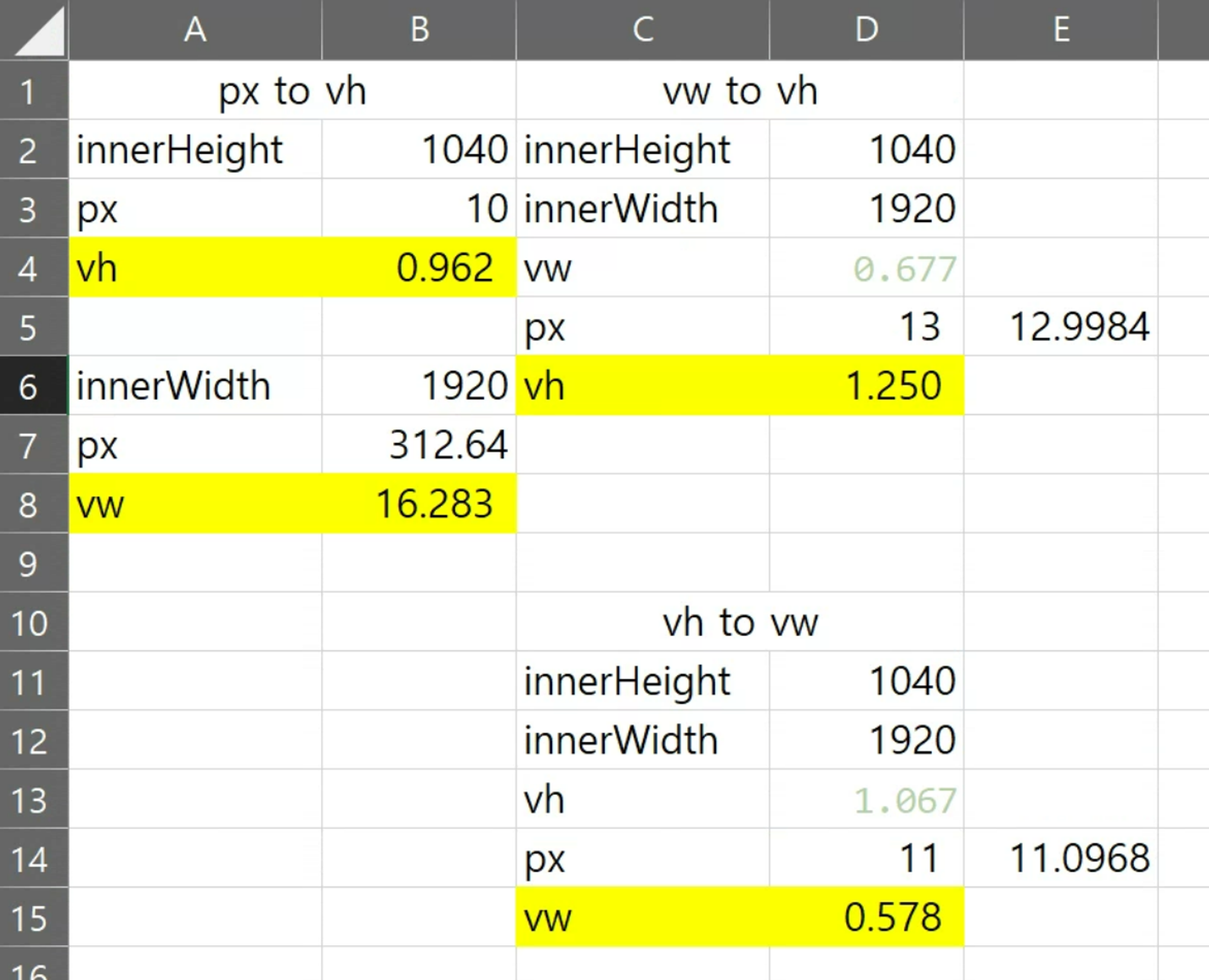
단위 변환 작업 과정에서 활용하기 위해 엑셀로 단위 변환기 제작
-
아래의 엑셀 캡쳐 이미지는 px에서 vh, vw로 그리고 vh에서 vw로 변환하기 위한 수식이 적용된 엑셀 파일.
-
vw, vh가 적용되지 않는 경우에는 자체적으로 계산해서 값 할당해 줌.
-
utils.js - 1920을 기준으로 주어진 값을 사용자 해상도에 맞는 값으로 바꿔주는 함수 getResponsiveLength.
/** * Apply the given number responsively * @param {number} givenNum */ const getResponsiveLength = givenNum => { return (givenNum * window.innerWidth) / 1920; }; -
getResponsiveLength 활용 예시
    ...
    import { formatDuration, getResponsiveLength, nFormatter } from '../../../utils';
        ...

        focusPoint
          .style('fill', this.FOCUS_POINT_COLOR_STR)

          .style('stroke-width', 0)
          .attr('rx', d => {
            return getResponsiveLength(fillPointLength);
          })
          .attr('ry', d => {
            return getResponsiveLength(fillPointLength / heightDivisor);
          })
        ...
    ```
-
-
react-tooltip 라이브러리를 활용해 구현한 툴팁의 경우에도 vw, vh 가 잘 적용되지 않아서 별도로 함수 만들어서 사용해 줌
-
utils.js - 툴팁에 반응형 디자인 적용시키는 함수 applyTooltipResponsiveOffset.
/** * apply responsive tooltip-offset * @param {number} topVal * @param {number} bottomVal * @param {number} rightVal * @param {number} leftVal */ const applyTooltipResponsiveOffset = (topVal, bottomVal, rightVal, leftVal) => { const offsetResult = {}; const innerWidth = window.innerWidth; if (topVal) { offsetResult.top = (topVal * innerWidth) / 1920; } if (bottomVal) { offsetResult.bottom = (bottomVal * innerWidth) / 1920; } if (rightVal) { offsetResult.right = (rightVal * innerWidth) / 1920; } if (leftVal) { offsetResult.left = (leftVal * innerWidth) / 1920; } return JSON.stringify(offsetResult); }; -
applyTooltipResponsiveOffset 활용 예시
import {
  ...
  applyTooltipResponsiveOffset,
} from '../../../utils';

<ReactTooltip id="videoAnalysisInfoModalVideoInfoImageTooltip" />
<div
  ...
  data-offset={applyTooltipResponsiveOffset(0, 10, 90, 0)}
>
-
작업 과정에서의 어려움들
- 여러 요소가 연결되어 있고, 다양한 모니터 환경을 고려하다 보니, 테스트하느라 시간이 상당히 오래 걸렸음.
- 반응형 작업 과정에서 추가로 구현된 UI 요소들에 대해서 다시 반응형을 적용해 줘야 하는 상황이 발생함
- 본 작업이 마무리될 시점에 추가로 구현되었거나 곧 구현될 UI 요소들이 있어서 바로 merge 되지 못했음 → 나중에 모든 요소들에 반응형 요소가 적용되도록 수정한 후에 마무리 되었음.
- ⇒ 앞으로는 처음 작업할 때 다양한 환경과 변수를 최대한 고려해서 작업할 수 있도록 노력할 것!
- vw, vh 중에 무엇을 사용해야 할지에 관한 문제
- vw는 width와 관련된 것이고, vh는 height와 관련된 것임.
- 보통 모니터 해상도의 width 가 커지면 height도 커지는 경우가 많지만, 사용자 케이스 중에 21:9 와 같이 가로로 긴 모니터를 사용하는 경우도 있음. 반대로 세로로 긴 모니터를 사용하는 경우도 있을 것임.
- 본 프로그램은 데이터 그래프가 가로로 쭉 길게 보이는 형태임 → 긴 데이터를 한 눈에 보기 위해 가로로 긴 모니터를 활용하는 경우가 더 많을 것임 → 세로로 긴 경우보다는 21:9와 같이 가로로 긴 경우를 중점적으로 고려하기로 결정.
- 그래서 대부분의 경우는 vw로 변환하고, 가로로 길게 늘렸을 때 영향을 많이 받으면 안 되는 요소들에만 vh를 적용해 줌.
적용 결과
- 다양한 해상도에도 레이아웃 틀어지지 않는 것 확인해 봤을 때 잘 적용되었다고 판단됨.
배우고 느낀 점
- 끈기와 근성이 역시 중요함!
- 끝 없는 단위 변환과 테스트의 연속이었지만, 그래도 다양한 환경에서 사용자들이 프로그램을 사용할 수 있다는 희망을 가지고 작업을 하면서 끈기와 근성을 다시금 체득할 수 있었음
- 다양한 환경을 고려하는 것의 중요성
- 다양한 환경에서 실행 가능하게 만들기 위해 많은 고민을 하는 과정에서, 처음 작업을 할 때 다양한 환경과 변수를 잘 고려하는 것이 중요함을 다시 한 번 깨달음.
넓고 깊은 지식을 보유한 개발자를 꿈꾸고 있습니다:) 기억 혹은 공유하고 싶은 내용들을 기록하는 공간입니다