CDD, CSS in JS , styled Components 의 이론을 학습했고, React Custom Component 과제를 통해 실습을 진행했다. 리액트 라이브러리를 사용하여 UI 컴포넌트를 만드는 실습
지금까지 배운 React, Styled Components, Storybook을 활용하여 React-custom-component를 완성합니다.
Modal,Toggle,Tab,Tag컴포넌트를 구현합니다.- npm run test 스크립트로 기본적인 기능을 테스트하는 테스트 케이스를 통과합니다.
/src/tests/index.test.js 에서 구현할 컴포넌트의 테스트 주석을 하나씩 해제하면서 진행합니다. - npm run storybook 스크립트로 컴포넌트들을 눈으로 확인하며 코드를 작성해, 하단 GIF 파일과 같은 모양을 구현합니다.
- 모든 테스트를 통과한 뒤, npm run submit 스크립트로 과제를 제출합니다.
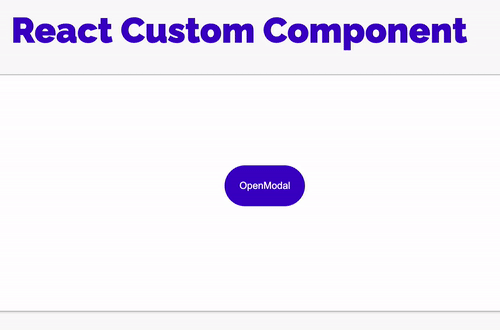
✅ Modal
import { useState } from 'react';
import styled from 'styled-components';
export const ModalContainer = styled.div`
display: flex;
justify-content : center;
align-items: center;
height : 300px;
`;
export const ModalBackdrop = styled.div`
// TODO : Modal이 떴을 때의 배경을 깔아주는 CSS를 구현합니다.
position: fixed;
background-color: rgba(0,0,0,0.4);
top : 0;
left : 0;
right : 0;
bottom : 0;
display: flex;
justify-content : center;
align-items : center;
`;
export const ModalBtn = styled.button`
background-color: #4000c7;
text-decoration: none;
border: none;
padding: 20px;
color: white;
border-radius: 30px;
cursor: grab;
`;
export const ModalView = styled.div.attrs(props => ({
// attrs 메소드를 이용해서 아래와 같이 div 엘리먼트에 속성을 추가할 수 있습니다.
role: 'dialog'
}))`
// TODO : Modal창 CSS를 구현합니다.
border-radius: 10px;
background-color: #ffffff;
width: 500px;
height: 200px;
margin-bottom : 300px;
display : flex;
flex-direction: column;
align-items : center;
> div.desc {
font-size : 30px;
color : #475ed4;
margin : 50px;
}
`;
export const Exitbtn = styled(ModalBtn)`
background-color: gold;
color: blue;
margin : 10px;
padding: 5px 10px;
`;
export const Modal = () => {
const [isOpen, setIsOpen] = useState(false);
const openModalHandler = () => {
// TODO : isOpen의 상태를 변경하는 메소드를 구현합니다.
setIsOpen(!isOpen)
};
return (
<>
<ModalContainer onClick={openModalHandler}>
<ModalBtn
// TODO : 클릭하면 Modal이 열린 상태(isOpen)를 boolean 타입으로 변경하는 메소드가 실행되어야 합니다.
onClick={openModalHandler}
>
{isOpen ? 'Opened!' : 'OpenModal'}
{/* TODO : 조건부 렌더링을 활용해서 Modal이 열린 상태(isOpen이 true인 상태)일 때는 ModalBtn의 내부 텍스트가 'Opened!' 로 Modal이 닫힌 상태(isOpen이 false인 상태)일 때는 ModalBtn 의 내부 텍스트가 'Open Modal'이 되도록 구현해야 합니다. */}
</ModalBtn>
{/* TODO : 조건부 렌더링을 활용해서 Modal이 열린 상태(isOpen이 true인 상태)일 때만 모달창과 배경이 뜰 수 있게 구현해야 합니다. */}
{isOpen === false ? null
: <ModalBackdrop>
<ModalView>
<Exitbtn onClick={openModalHandler}>×</Exitbtn>
<div className='desc'>Congratulation!</div>
</ModalView>
</ModalBackdrop>
}
</ModalContainer>
</>
);
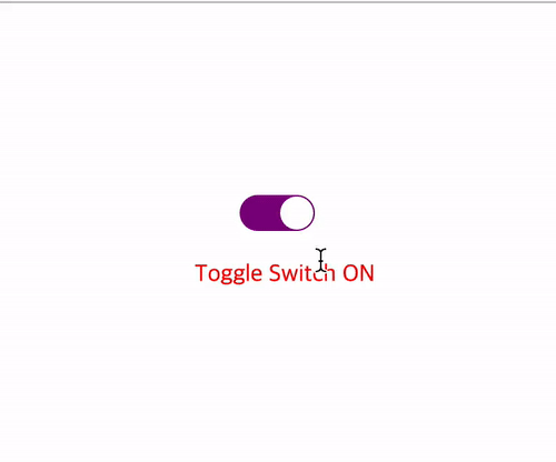
};✅ Toggle
import { useState } from 'react';
import styled from 'styled-components';
const ToggleContainer = styled.div`
position: relative;
margin-top: 8rem;
left: 48%;
cursor: pointer;
> .toggle-container {
width: 50px;
height: 24px;
border-radius: 30px;
background-color: #8b8b8b;
// TODO : .toggle--checked 클래스가 활성화 되었을 경우의 CSS를 구현합니다.
} > .toggle--checked {
background-color: purple;
}
> .toggle-circle {
position: absolute;
top: 1px;
left: 1px;
width: 22px;
height: 22px;
border-radius: 50%;
background-color: #ffffff;
transition : 0.2s
// TODO : .toggle--checked 클래스가 활성화 되었을 경우의 CSS를 구현합니다.
} > .toggle--checked {
left: 27px;
transition : 0.2s
}
`;
const Desc = styled.span`
text-align : center;
margin : 30px;
> .switch--On {
color : red;
}
> .switch--Off {
color : lightgrey;
}
`;
export const Toggle = () => {
const [isOn, setisOn] = useState(false);
const toggleHandler = () => {
// TODO : isOn의 상태를 변경하는 메소드를 구현합니다.
setisOn(!isOn)
};
return (
<>
<ToggleContainer
// TODO : 클릭하면 토글이 켜진 상태(isOn)를 boolean 타입으로 변경하는 메소드가 실행되어야 합니다.
onClick={toggleHandler}
>
{/* TODO : 아래에 div 엘리먼트 2개가 있습니다. 각각의 클래스를 'toggle-container', 'toggle-circle' 로 지정하세요. */}
{/* TIP : Toggle Switch가 ON인 상태일 경우에만 toggle--checked 클래스를 div 엘리먼트 2개에 모두 추가합니다. 조건부 스타일링을 활용하세요. */}
<div className={`toggle-container ${isOn ? "toggle--checked" : null}`} />
<div className={`toggle-circle ${isOn ? "toggle--checked" : null}`} />
</ToggleContainer>
{/* TODO : Desc 컴포넌트를 활용해야 합니다. */}
{/* TIP: Toggle Switch가 ON인 상태일 경우에 Desc 컴포넌트 내부의 텍스트를 'Toggle Switch ON'으로, 그렇지 않은 경우 'Toggle Switch OFF'가 됩니다. 조건부 렌더링을 활용하세요. */}
{isOn === false ?
<Desc> <div className='switch--Off'> Toggle Switch OFF </div> </Desc> :
<Desc> <div className='switch--On'> Toggle Switch ON </div> </Desc> }
</>
);
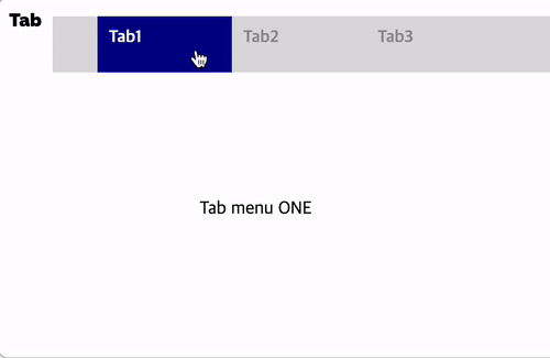
};✅ Tab
import { useState } from 'react';
import styled from 'styled-components';

// TODO: Styled-Component 라이브러리를 활용해 TabMenu 와 Desc 컴포넌트의 CSS를 구현합니다.

const TabMenu = styled.ul`
  background-color: #dcdcdc;
  color: rgba(73, 73, 73, 0.5);
  font-weight: bold;
  display: flex;
  flex-direction: row;
  justify-items: center;
  align-items: center;
  list-style: none;
  margin-bottom: 7rem;
  cursor : pointer;

  .submenu {
    ${'' /* 기본 Tabmenu 에 대한 CSS를 구현합니다. */}
    display: flex;
    justify-content: space-between;
    width : 100px;
    height : 30px;
    padding : 10px;
    font-size : 15px;
  }

  .focused {
    ${'' /* 선택된 Tabmenu 에만 적용되는 CSS를 구현합니다.  */}
    background-color: darkblue;
    color : white
  }

  & div.desc {

    text-align: center;
  }
`;

const Desc = styled.div`
  padding-left : 180px
`;

export const Tab = () => {
  // TIP: Tab Menu 중 현재 어떤 Tab이 선택되어 있는지 확인하기 위한
  // currentTab 상태와 currentTab을 갱신하는 함수가 존재해야 하고, 초기값은 0 입니다.
  const [currentTab,setTab] = useState(0);

  const menuArr = [
    { name: 'Tab1', content: 'Tab menu ONE' },
    { name: 'Tab2', content: 'Tab menu TWO' },
    { name: 'Tab3', content: 'Tab menu THREE' },
  ];

  const selectMenuHandler = (index) => {
    // TIP: parameter로 현재 선택한 인덱스 값을 전달해야 하며, 이벤트 객체(event)는 쓰지 않습니다
    // TODO : 해당 함수가 실행되면 현재 선택된 Tab Menu 가 갱신되도록 함수를 완성하세요.

    setTab(index);

  };

  return (

    <>
      <div>
        <TabMenu>
          {/*TODO: 아래 하드코딩된 내용 대신에, map을 이용한 반복으로 코드를 수정합니다.*/}
          {/*TIP: li 엘리먼트의 class명의 경우 선택된 tab 은 'submenu focused' 가 되며,
                  나머지 2개의 tab은 'submenu' 가 됩니다.*/}

         {menuArr.map( (tap,index) => {
             return (
             <li key={index} className={currentTab === index ? "submenu focused" : "submenu"}
              onClick={() => selectMenuHandler(index)}>{tap.name}</li>
             )
          })}
        </TabMenu>
        <Desc>
          {/*TODO: 아래 하드코딩된 내용 대신에, 현재 선택된 메뉴 따른 content를 표시하세요*/}
          <p>{menuArr[currentTab].content}</p>
        </Desc>
      </div>
    </>
  );
};
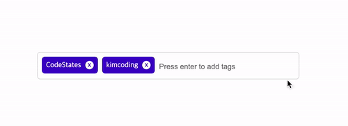
✅ Tag
import { useState } from 'react';
import styled from 'styled-components';

// TODO: Styled-Component 라이브러리를 활용해 여러분만의 tag 를 자유롭게 꾸며 보세요!

export const TagsInput = styled.div`
  margin: 8rem auto;
  display: flex;
  align-items: flex-start;
  flex-wrap: wrap;
  min-height: 48px;
  width: 480px;
  padding: 0 8px;
  border: 1px solid rgb(214, 216, 218);
  border-radius: 6px;

  > ul {
    display: flex;
    flex-wrap: wrap;
    padding: 0;
    margin: 8px 0 0 0;

    > .tag {
      width: auto;
      height: 32px;
      display: flex;
      align-items: center;
      justify-content: center;
      color: #fff;
      padding: 0 8px;
      font-size: 14px;
      list-style: none;
      border-radius: 6px;
      margin: 0 8px 8px 0;
      background: #4000c7;
        > .tag-close-icon {
        display: block;
        width: 16px;
        height: 16px;
        line-height: 16px;
        text-align: center;
        font-size: 14px;
        margin-left: 8px;
        color: #4000c7;
        border-radius: 50%;
        background: #fff;
        cursor: pointer;
      }
    }
  }

  > input {
    flex: 1;
    border: none;
    height: 46px;
    font-size: 14px;
    padding: 4px 0 0 0;
    :focus {
    outline: transparent;
  }
  }

  &:focus-within {
    border: 1px solid #4000c7;
  }

`;

export const Tag = () => {
  const initialTags = ['CodeStates', 'kimcoding'];
  const [tags, setTags] = useState(initialTags);

  const removeTags = (indexToRemove) => {
    // TODO : 태그를 삭제하는 메소드를 완성하세요.

    // console.log(tagCopy[indexToRemove])
    // tagCopy.pop()
    // console.log(tagCopy)
    // setTags(tagCopy)
  	const filter = tags.filter( (el,index) => index !== indexToRemove);
    setTags(filter);
  };

  const addTags = (event) => {
    // TODO : tags 배열에 새로운 태그를 추가하는 메소드를 완성하세요.
    // 이 메소드는 태그 추가 외에도 아래 3 가지 기능을 수행할 수 있어야 합니다.
    // - 이미 입력되어 있는 태그인지 검사하여 이미 있는 태그라면 추가하지 말기
    // - 아무것도 입력하지 않은 채 Enter 키 입력시 메소드 실행하지 말기
    // - 태그가 추가되면 input 창 비우기
    const inputVal = event.target.value;

  if(event.key === "Enter" && inputVal !== '' && !tags.includes(inputVal)){
      setTags([...tags,inputVal]);
      event.target.value = '';
     }
    }


  return (
    <>
      <TagsInput>
        <ul id='tags'>
          {tags.map((tag, index) => (
            <li key={index} className='tag'>
              <span className='tag-title'>{tag}</span>
              <span className='tag-close-icon' onClick={ () => removeTags(index)} >x
                {/* TODO :  tag-close-icon이 tag-title 오른쪽에 x 로 표시되도록 하고,
                            삭제 아이콘을 click 했을 때 removeTags 메소드가 실행되어야 합니다. */}
              </span>
            </li>
          ))}
        </ul>
        <input
          className='tag-input'
          type='text'
          onKeyUp={ (e) => addTags(e) }
          placeholder='Press enter to add tags'
        />
      </TagsInput>
    </>
  );
};
Run Start 🔥