📌 inline-block을 활용한 레이아웃 구현
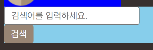
화면크기에 따라 검색창이 늘어났다 줄어들었다를 구현하고 싶다
input 창의 display를 확인해보니 inline-block이라서 inline으로 바꿔 보았다.
.searchForm__group .formInput {
  display: inline;
}
바꿨더니 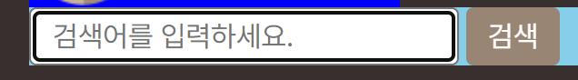 원하는대로 됐지만
 inline 요소에서는 내가 원하는대로 width를 줄 수 없어
그래서 inline처럼 보이지만 block처럼 길이를 조절할 수 있는 inline-block을 선언하고 width를 화면의 크기에 맞게 늘어날 수 있도록 100%로 선언했다.
.formInput__input {
  border: 1px solid var(--border-color);
  widthborder-radius: 0.25rem;
  height: 2rem;
  padding: 0.125rem 0.75rem;
  width: 100%;
}
.searchForm__group .formInput {
  display: inline-block;
  /* 60px == 버튼 크기 + 옆에 공백 */
  width: calc(100% - 60px);
  margin-right: 4px;
}
이렇게 하면 화면의 크기대로 잘 움직인다 하지만 모바일 환경에서만 Flexible하게 움직이고 싶으므로
@media (min-width: 768px) {

  /* 데스크탑 검색 폼 */
  .searchForm__group .formInput {
    width: 400px;
  }
}
화면 크기가 일정 크기를 넘어가면 width 값을 고정해줬다.
📌display: flex
https://css-tricks.com/snippets/css/a-guide-to-flexbox/
flex는 아이템을 배치하려면 그 요소의 부모 CSS를 건들여야 한다
그럼 그 요소는 인라인 / 블록 개념이 아니라 플렉스 아이템이 된다.
display는 블록이지만 인라인처럼보임 하지만 플렉스 아이템이라고 생각!!
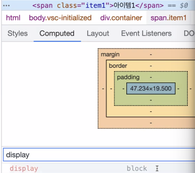
부모가 flex일때 자식이 span이더라도 display:block으로 표시
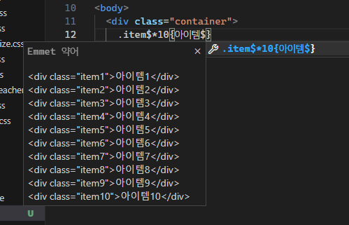
📌 order
.container {
  border: 2px solid blue;
  display: flex;
  /* 플랙스의 방향을 자ㅣ정 */
  flex-direction: column;

}

.item1 {
  background: yellow;
  order: 1;
}
.item2 {
  background: khaki;
}
.item3 {
  background: beige;
}
.item4 {
  background: salmon;
}
.item5 {
  background: goldenrod;
}
.item6 {
  background: palegreen;
}
.item7 {
  background: teal;
}
.item8 {
  background: orange;
}
.item9 {
  background: purple;
}
.item10 {
  background: darkblue;
  order: -1;
}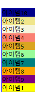
🤔 oreder를 1로 줬는데 맨아래로 내려갔다 이유는 뭘까?
✅ order의 기본값이 0이기 때문이다 선언한 숫자가 같으면 마크업한 순서대로 표시되고 음수값도 줄 수 있다.
📌 flex- grow, shrink, basis
body {
  margin: 100px;
}

.container {
  border: 2px solid blue;
  display: flex;
  flex-direction: row;
  width: 1000px;
}

.item1 {
  background: yellow;
  order: 1;
  width: 100px;
}
...
.item10 {
  background: darkblue;
  width: 200px;
  order: -1;
}
➡️ container의 width는 1000px이지만 item들에게 선언해준 width 값은 총 1100px이다. 당연히 원하는대로 결과가 나오지 않을거라고 생각했다.
그러나 결과를 확인해보면 문제 없이 출력되고 레이아웃은 무너지지 않았다.
개발자 도구를 사용하여 item10의 width를 확인해보면 200이 안된다!
사실 우리 눈에 그렇게 보이도록 트릭을 사용한 것이다.
(200px / 1100px * 1000px ) 이런식으로 1000px 안에서 알아서 비율을 계산 해주면서 화면에 표시하기 한다.
flex-basis - 플렉스 아이템의 초기 크기를 지정한다 width랑 비슷하게 동작
flex-grow - 나머지 영역을 제외하고 남은영역을 차지한다. (비율대로 확대)
flex-shrink - 비율대로 줄여줌! width를 넘어도 레이아웃 깨지지 않는 이유
flex-grow: 1;
flex-shrink: 1;
flex-basis: 50px;
/*단축속성*/
flex: grow, shrink, basis;
📌grid를 사용해서 데스크탑 레이아웃 구성
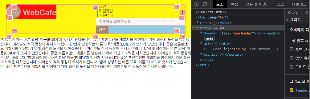
위와 같이 만들고 싶을때 사용하면 되는 grid 속성이다.
/* 데스크탑 로고 */
.logo {
grid-row-start: 1;
grid-column-start: 1;
grid-row-end: 3;
grid-column-end: 2;
/* 행 열 끼리 같이 선언 */
grid-row: 1/3;
grid-column: 1/2;
/* rs/cs/re/ce */
grid-area: 1 / 1 / 3 / 2;
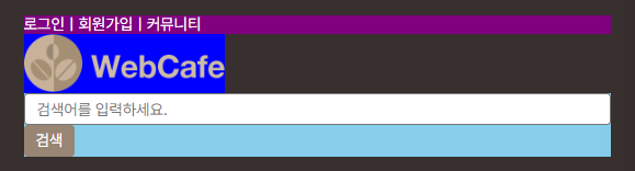
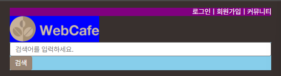
}다음 사진에서 memberOnly들을 오른쪽에 배치하고 싶은데 flex를 사용하면 손쉽게 옮길 수 있는 코드다.
/* 공통 멤버 서비스 */
.memberOnly {
  padding-left: 0;
  list-style-type: none;
  display: flex;
  background-color: purple;
}
/* 공통 멤버 서비스 */
.memberOnly {
  padding-left: 0;
  list-style-type: none;
  display: flex;
  background-color: purple;
  /* 헷갈리지 않게 디렉션 명시*/
  /* 컬럼인지 로우인지에 따라 start와 end가 달라지기 때문에 */
    flex-direction: row;
    justify-content: end;
}