
데이터프레임 정렬
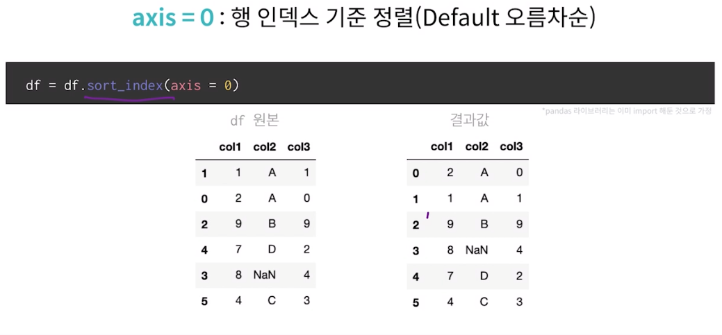
axis = 0 : 행 인덱스 기준 정렬(Default 오름차순)
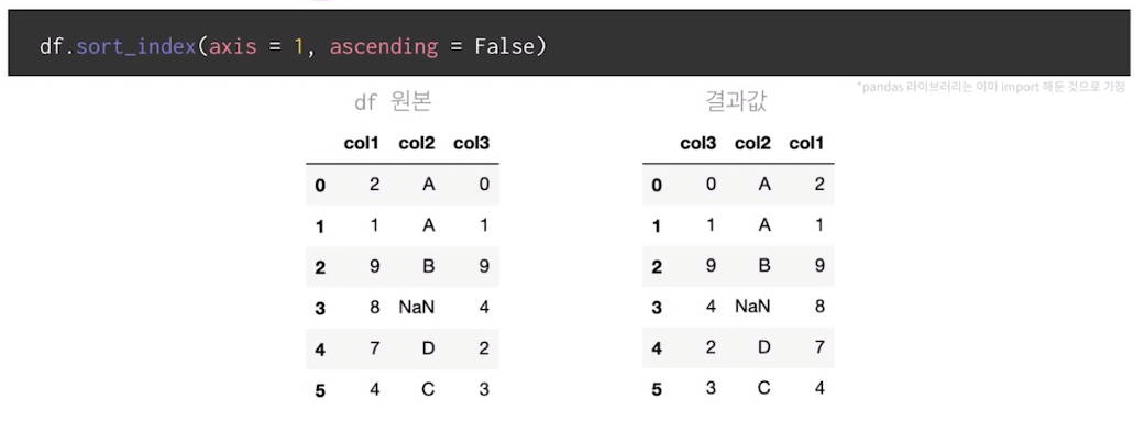
axis = 1 : 열 인덱스 기준 내림찿순 정렬
ascending = true -> 오름차순
ascending = false -> 내림차순
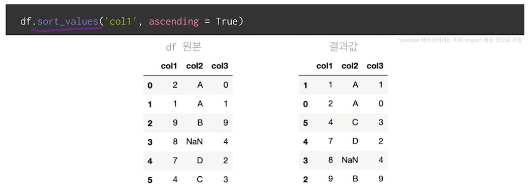
col1컬럼 기준 정렬 (Default 오름차순)
col2컬럼 기준 오름차순 정렬 후 col1 컬럼 기준 내림차순 정렬
df.sort_values(['col2' , 'col1'] , ascending = [True,False])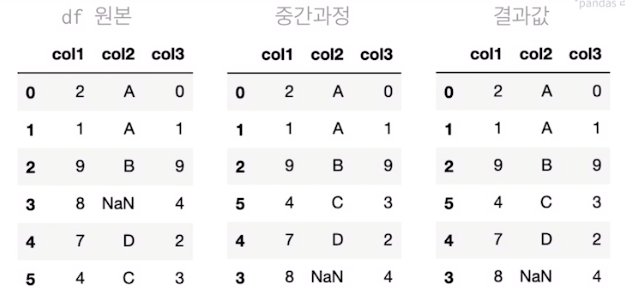
데이터프레임 분석용 함수
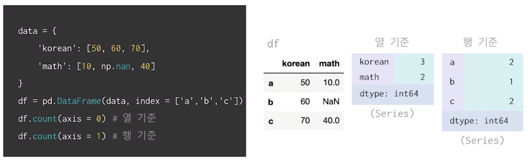
집계함수 - count,max,min,sum
count메서드 활용하여 데이터 개수 확인 가능(Default:NaN값 제외)
max,min메서드 활용하여 최대,최소값 확인 가능(Default:열 기준,NaN값 제외)
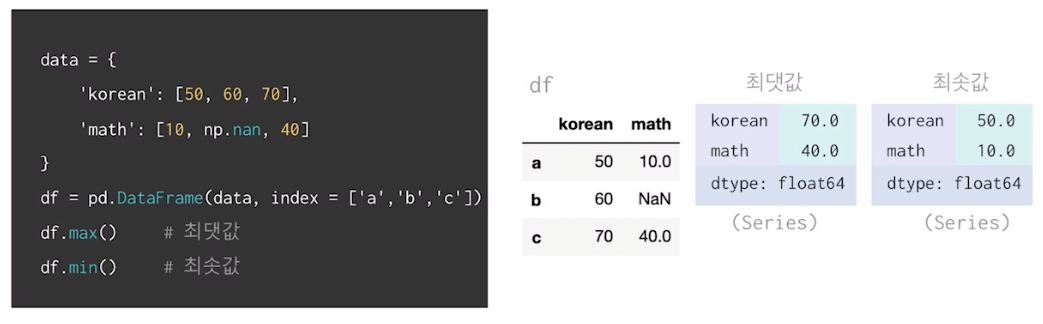
dtype : float64 로 나옴
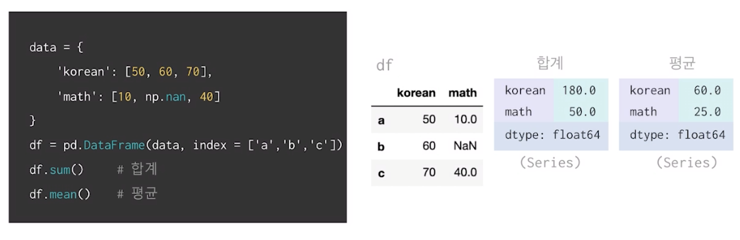
sum,mean메서드 활용하여 합계 및 평균 계산(Defualt:열 기준,NaN값 제외)
axis,skipna 인자 활용하여 합계 및 평균 계산 (행 기준,NaN값 포함 시)
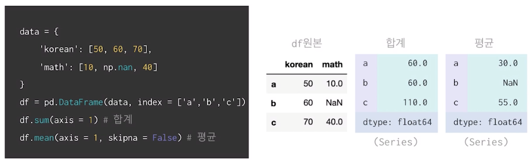
skipna (NaN을 무시 할것인가 아닐것인가 ...)
예시에서 True 였다면 60
NaN값이 존재하는 column의 평균 구하여 NaN값 대체
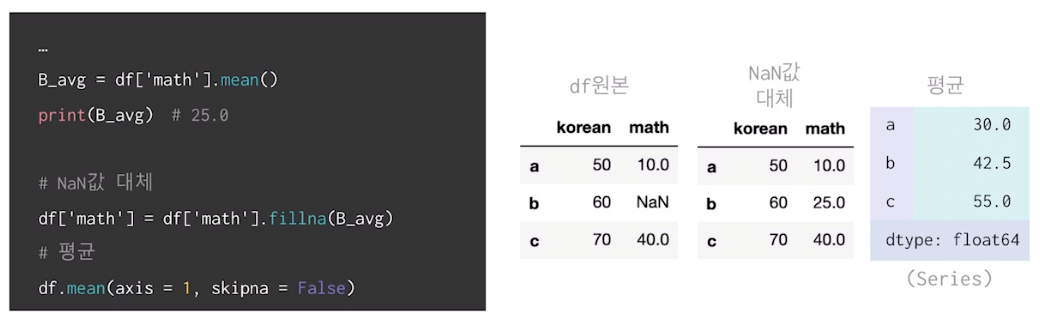
fillna로 채우기!
그룹으로 묶기
group by
간단한 집계를 넘어서서 조건부로 집계하고 싶은 경우
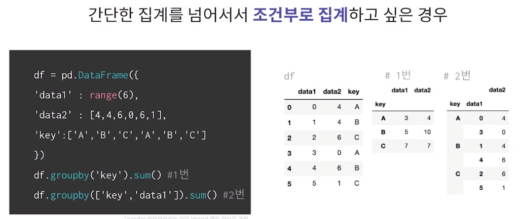
groupby를 통해서 집계를 한번에 계산하는 방법 (fast.aggregate: 합계)
df.groupby('key').aggregate(['min',np.median,max]) #1번
df.groupby('key').aggregate({'data1':'min','data2':np.sum}) #2번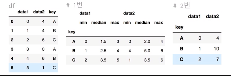
groupby를 통해서 그룹 속성을 기준으로 데이터 필터링
def filter_by_mean(x):
	return x['data2'].mean() > 3

df.groupby('key').mean() #1번
df.groupby('key').filter(gilter_by_mean) #2번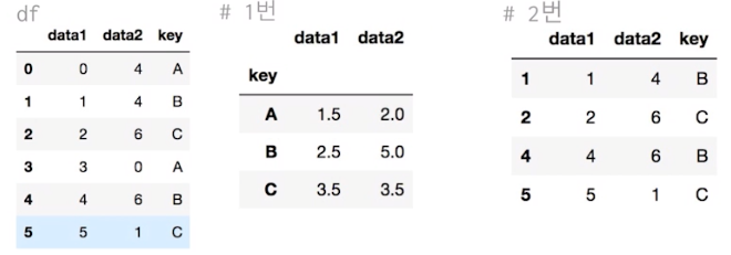
groupby를 통해서 묶인 데이터에 함수 적용
df.groupby('key').apply(lambda x: x.max() - x.min())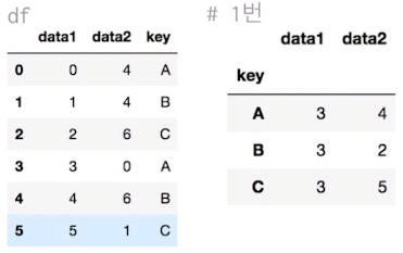
groupby로 묶인 데이터에서 key값으로 데이터를 가져올 수 있다.
df = pd.read_csv("./univ.csv") # 상위 5개 데이터

df.head() # 데이터 추출

df.groupby("시도").get_group("충남")
len(df.groupby("시도").get_group("충남")) # 94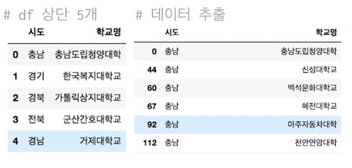
Matplotlib
Line plot
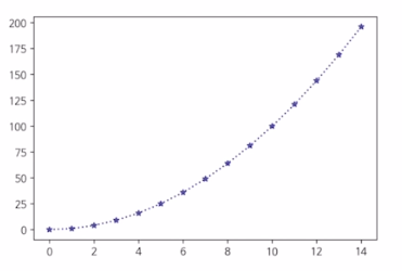
fig,ax = plt.subplots()
x = np,arange(15)
y = x ** 2 # ** -> 제곱
ax.plot(
	x,y,
   linestyle=":", -> ... 으로 표시
   marker="*", -> *모양
   color="#524FA1" -> rgb16진수(보라)
)
Line style
x=np.arange(10)
fig,ax = plt.subplots()
ax.plot(x,x, linestyle="-")  # solid

ax.plot(x,x+2, linestyle="--")  # dashed

ax.plot(x,x+4, linestyle="-.")  # dashdot

ax.plot(x,x+6, linestyle=":")  # dotted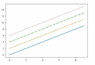
Line Color
x = np.arange(10)
fig,ax = plt.subplots()
ax.plot(x,x, color="r")

ax.plot(x,x+2, color="green")

ax.plot(x,x+4, color="0.8")

ax.plot(x,x+6, color="F524FA1")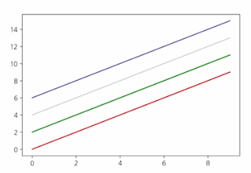
Line Marker
x = np.arange(10)
fig,ax = plt.subplots()
ax.plot(x,x, marker=".")

ax.plot(x,x+2, marker="o")

ax.plot(x,x+4, marker="v")

ax.plot(x,x+6, marker="s")

ax.plot(x,x+8, marker="*")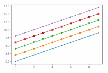
축 경계 조정하기
x = np.linspace(0,10,1000) # -> start , end , step

fig, ax = plt.subplots()

ax.plot(x, np.sin(x))
ax.set_xlim(-2,12)   # -> lim -> limit
ax.set_ylim(-1.5,1.5)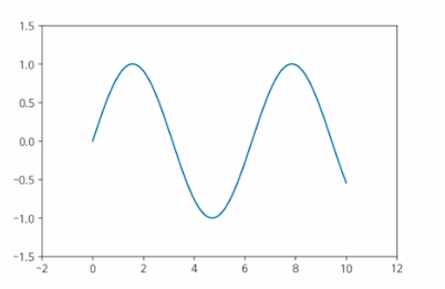
범례
x = np.arange(10)
fig, ax = plt.subplots()
ax.plot(x,x, label='y=x')

ax.plot(x,x**2, label='y=x^2')

ax.set_xlabel("x")

ax.set_ylabel("y")

ax.legend(loc = 'upper right', # legend -> 범례
			shadow=True,
            fancybox=True,
            borderpad = 2) # 패드의 크기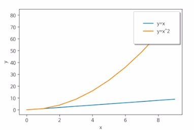
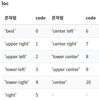
범례 문자형 코드
Bar & Histogram
Bar plot
x = np.arange(10)
fig, ax = plt.subplots(figsize=(12,4))
ax.bar(x,x*2)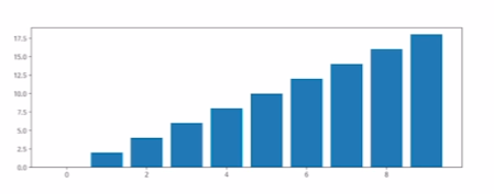
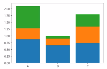
x= np.random.rand(3)

y= np.random.rand(3)

z= np.random.rand(3)

data = [x,y,z]
fig, ax = plt.subplots()
x_ax = np.arange(3)
for i in x_ax:
	ax.bar(x_ax, data[i],
    bottom = np.sum(data[:i], axis=0))
    ax.set_xticks(x_ax)
    ax.set_xticklabels(["A","B","C"])
Histogram (도수분포표)
fig, ax = plt.subplots()
data = np.random.randn(1000)
ax.hist(data,bins=50)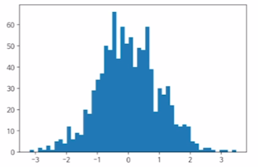
한글을 지원하는 나눔바른고딕 폰트로 바꾸기 코드
import matplotlib.font_manager as fm
fname='./NanumBarunGothic.ttf'
font = fm.FontProperties(fname = fname).get_name()
plt.rcParams["font.family"] = font
Matplotlib with Pandas
df = pd.read_scv("./president_heights.scv")

fig, ax = plt.subplots()

ax.plot(df["order"],df["height(cm)"], label="height")

ax.set_xlabel("order")

ax.set_ylabel("height(cm)")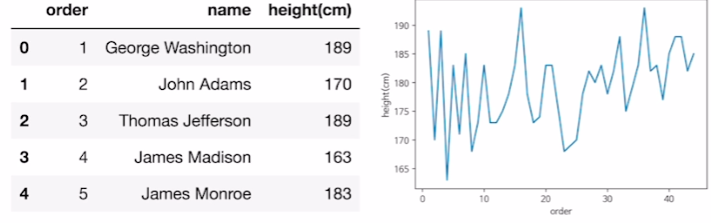
시각화 해보기
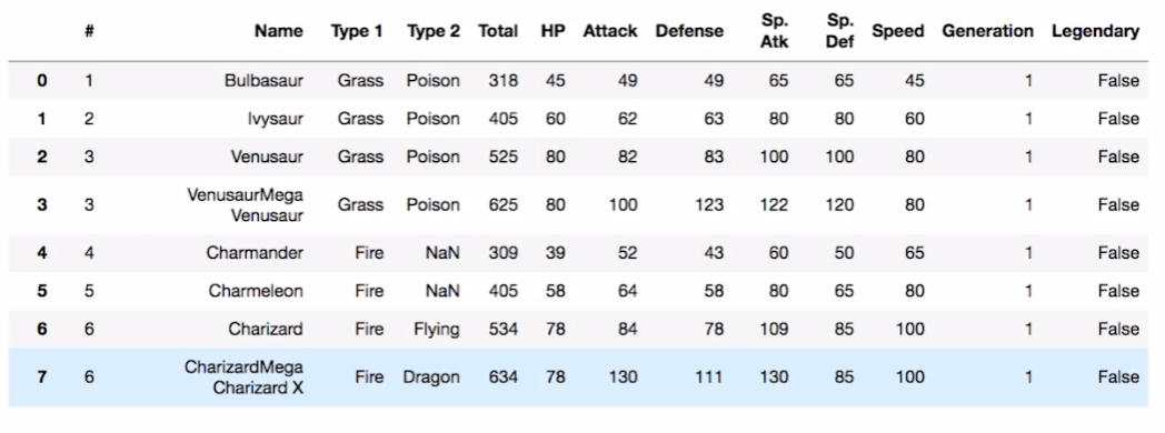
df = pd.read_csv("./data/pokemon.scv")

fire = df[(df['Type 1']=='Fire') | (df['Type 2'])=="Fire")] # 둘중 하나라도 해당시 fire

water = df[(df['Type 1']=='Water') | (df['Type 2'])=="Water")]

fig, ax = plt.subplots()

ax.scatter(fire['Attack'], fire['Defense'], color = 'R', label ='Fire', marker="*", s=50)


ax.scatter(water['Attack'], water['Defense'], color = 'B', label ='Water', s=25)

ax.set_xlabel("Attack")

ax.set_ylabel("Defense")

ax.legend(loc="upper right')