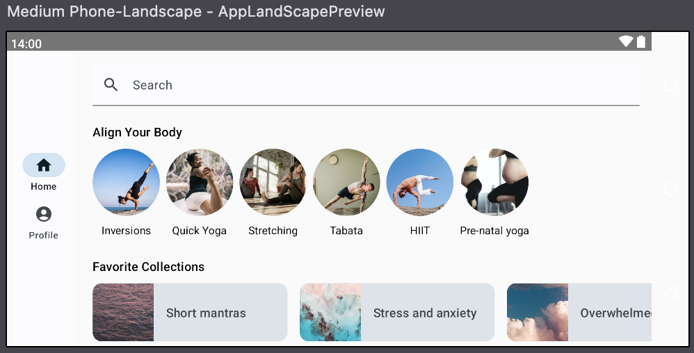
Android Developer의 Compose Codelab 공부.
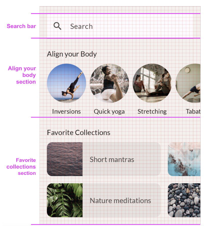
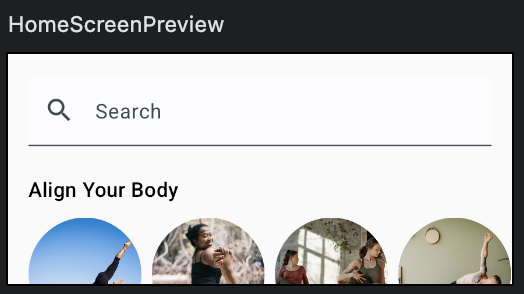
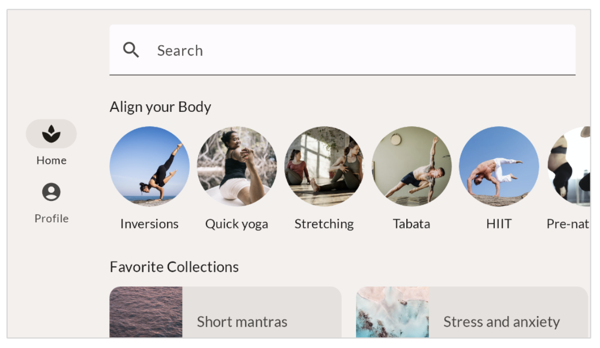
아래 이미지와 동일하게 만들어 보며 레이아웃을 공부한다.
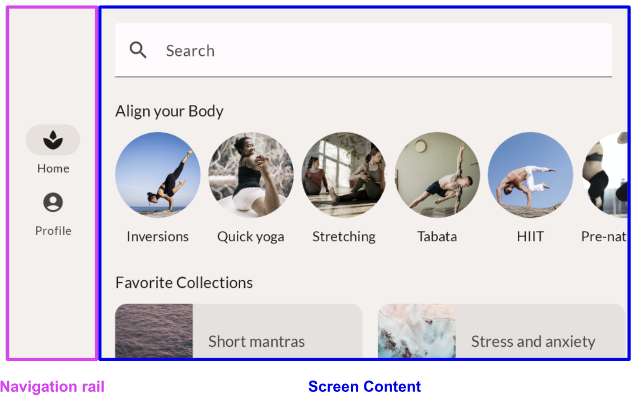
해당 이미지를 크게 2개로 나누면 Screen Content와 Bottom Navigation으로 나눌 수 있다.
Screen Content는 SearchBar, Align your body Section, Favorite collections Section으로 나눌 수 있다.
Align your body Section과 Favorite collections Section에서 재사용되는 하위 수준 요소들도 확인할 수 있다.
SearchBar - Modifier
TextField와 Icon, Text로 구성되어 있다.
우선적으로 TextField 구현.
@Composable
fun SearchBar(
    modifier: Modifier = Modifier
) {
    TextField(
        value = "Search",
        onValueChange = {},
        modifier = modifier
    )
}
modifier을 통해 수정할 내용.
- 컴포저블의 크기, 레이아웃, 동작, 모양 변경
- 접근성 라벨과 같은 정보 추가
- 사용자 입력 처리
- 요소를 클릭 가능, 스크롤 가능, 드래그 가능 또는 확대/축소 가능하게 만드는 것과 같은 높은 수준의 상호작용 추가
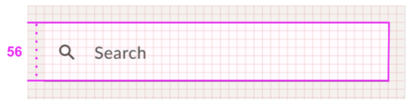
[업데이트 내용]
검색창은 높이가 최소 56이고, 너비가 상위 요소의 전체 너비를 차지한다.
-> heightIn 사용, fillMaxWidth 사용.
@Composable
fun SearchBar(
    modifier: Modifier = Modifier
) {
    TextField(
        value = "Search",
        onValueChange = {},
        modifier = modifier.fillMaxWidth().heightIn(min = 56.dp)
    )
}
[업데이트 내용]
검색 아이콘 추가, 색상 재정의, 자리 표시자 텍스트 추가
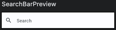
@Composable
fun SearchBar(
    modifier: Modifier = Modifier
) {
    TextField(
        value = "",
        onValueChange = {},
        leadingIcon = {
            Icon(
                imageVector = Icons.Default.Search,
                contentDescription = null
            )
        },
        colors = TextFieldDefaults.colors(
            unfocusedContainerColor = MaterialTheme.colorScheme.surface,
            focusedContainerColor = MaterialTheme.colorScheme.surface
        ),
        placeholder = {
            Text(text = stringResource(id = R.string.placeholder_search))
        },
        modifier = modifier
            .fillMaxWidth()
            .heightIn(min = 56.dp)
    )
}
AlignYourBody - Alignment
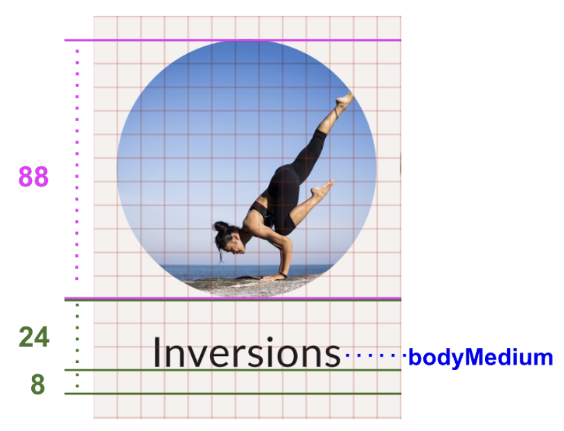
알 수 있는 정보
- 이미지 높이는 88dp.
- 텍스트 기준선과 이미지 기준선의 사이 간격은 24dp.
- 기준선과 요소 하단 사이의 간격은 8dp.
- 텍스트의 서체 스타일은 bodyMedium.
@Composable
fun AlignYourBodyElement(
    modifier: Modifier = Modifier
) {
    Column {
        Image(
            painter = painterResource(id = R.drawable.ab1_inversions),
            contentDescription = null
        )
        Text(
            text = stringResource(id = R.string.ab1_inversions)
        )
    }
}- 사진 원형, 높이 88dp 적용
@Composable
fun AlignYourBodyElement(
    modifier: Modifier = Modifier
) {
    Column(
        modifier = modifier
    ) {
        Image(
            painter = painterResource(id = R.drawable.ab1_inversions),
            modifier = modifier.size(88.dp).clip(shape = CircleShape),
            contentDescription = null
        )
        Text(text = stringResource(id = R.string.ab1_inversions))
    }
}
-> 이미지 형태가 잘려서 나옴.
=> ContentScale.Crop 사용하여 원하는 형태로 나오도록 함.
@Composable
fun AlignYourBodyElement(
    modifier: Modifier = Modifier
) {
    Column(
        modifier = modifier
    ) {
        Image(
            painter = painterResource(id = R.drawable.ab1_inversions),
            modifier = modifier.size(88.dp).clip(shape = CircleShape),
            contentScale = ContentScale.Crop,
            contentDescription = null
        )
        Text(text = stringResource(id = R.string.ab1_inversions))
    }
}- 이미지와 문구가 가운데 정렬 되도록.
-> Column에서 가운데 정렬한다.
@Composable
fun AlignYourBodyElement(
    modifier: Modifier = Modifier
) {
    Column(
        modifier = modifier,
        horizontalAlignment = Alignment.CenterHorizontally
    ) {
        Image(
            painter = painterResource(id = R.drawable.ab1_inversions),
            modifier = modifier.size(88.dp).clip(shape = CircleShape),
            contentScale = ContentScale.Crop,
            contentDescription = null
        )
        Text(text = stringResource(id = R.string.ab1_inversions))
    }
}- 이미지를 동적으로, 구성 가능한 함수에 인수로 전달.
- bodyMedium 서체 스타일을 사용하도록 텍스트 업데이트
- 텍스트 요소의 기준선 간격 업데이트
@Composable
fun AlignYourBodyElement(
@DrawableRes drawable: Int,
@StringRes text: Int,
modifier: Modifier = Modifier
) {
Column(
modifier = modifier,
horizontalAlignment = Alignment.CenterHorizontally
) {
Image(
painter = painterResource(id = drawable),
modifier = modifier.size(88.dp).clip(shape = CircleShape),
contentScale = ContentScale.Crop,
contentDescription = null
)
Text(
text = stringResource(id = text),
modifier = Modifier.paddingFromBaseline(top = 24.dp, bottom = 8.dp),
style = MaterialTheme.typography.bodyMedium
)
}
}
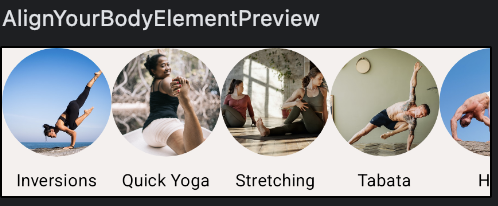
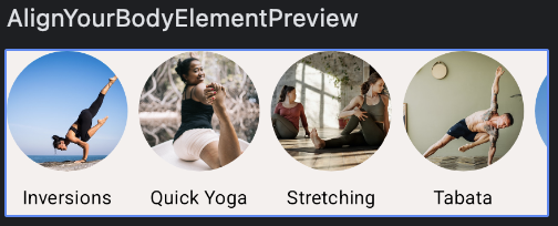
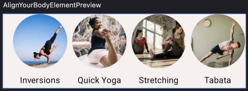
@Preview(showBackground = true, backgroundColor = 0xFFF5F0EE)
@Composable
fun AlignYourBodyElementPreview() {
ComposeDefaultLayoutTheme {
AlignYourBodyElement(
text = R.string.ab1_inversions,
drawable = R.drawable.ab1_inversions,
modifier = Modifier.padding(8.dp)
)
}
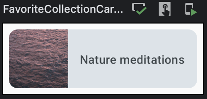
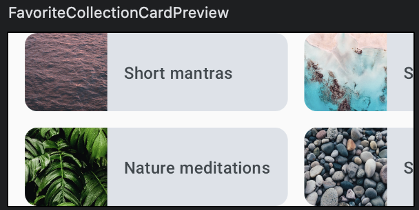
}Favorite Collection Card - Material Surface
@Composable
fun FavoriteCollectionCard(
    modifier: Modifier = Modifier
) {
    Row (
        modifier = modifier
    ){
        Image(painter = painterResource(
            id = R.drawable.fc1_short_mantras),
            contentDescription = null
        )
        Text(
            text = stringResource(id = R.string.fc1_short_mantras)
        )
    }
}
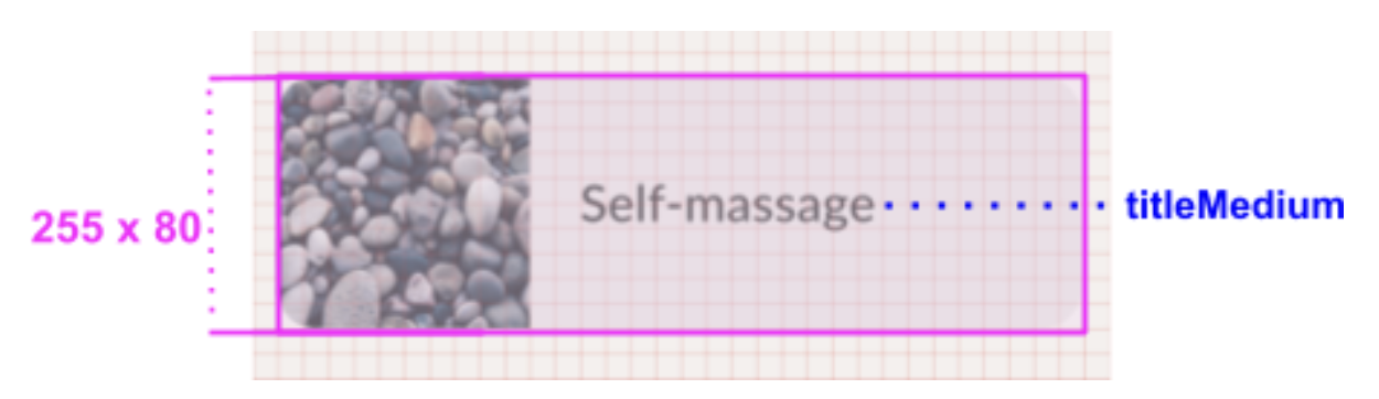
Row의 너비를 설정하고 하위 요소를 세로로 정렬.
다이어그램에 따라 이미지 크기를 설정하고 컨테이너에서 자른다.
@Composable
fun FavoriteCollectionCard(
    modifier: Modifier = Modifier
) {
    Surface(
        shape = MaterialTheme.shapes.medium,
        modifier = modifier
    ) {
        Row (
            verticalAlignment = Alignment.CenterVertically,
            modifier = Modifier.width(255.dp)
        ){
            Image(
                painter = painterResource(id = R.drawable.fc1_short_mantras),
                contentDescription = null,
                contentScale = ContentScale.Crop,
                modifier = modifier.size(80.dp)
            )
            Text(
                text = stringResource(id = R.string.fc1_short_mantras)
            )
        }
    }
}
- 이미지와 텍스트를 동적으로 만든다. 구성 가능한 함수에 인수로 전달한다.
- 색상을 SurfaceVariant로 업데이트 한다.
- titleMedium 서체 스타일을 사용하도록 텍스트를 업데이트 한다.
- 이미지와 텍스트 사이의 간격을 업데이트 한다.
@Composable
fun FavoriteCollectionCard(
    modifier: Modifier = Modifier,
    @DrawableRes drawable: Int,
    @StringRes text: Int
) {
    Surface(
        shape = MaterialTheme.shapes.medium,
        color = MaterialTheme.colorScheme.surfaceVariant,
        modifier = modifier
    ) {
        Row (
            verticalAlignment = Alignment.CenterVertically,
            modifier = Modifier.width(255.dp)
        ){
            Image(
                painter = painterResource(id = drawable),
                contentDescription = null,
                contentScale = ContentScale.Crop,
                modifier = Modifier.size(80.dp)
            )
            Text(
                text = stringResource(id = text),
                style = MaterialTheme.typography.titleMedium,
                modifier = Modifier.padding(horizontal = 16.dp)
            )
        }
    }
}
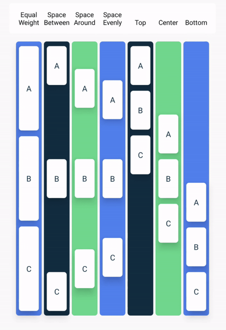
본문 행 정렬 - 배치
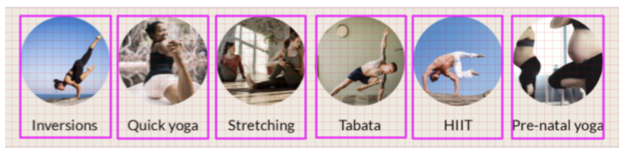
그리드의 한 블록은 8dp, 첫번째 항목의 앞과 마지막 항목의 뒤에 16dp의 간격이 있음.
각 항목 사이의 간격은 8dp.
Compose에서는 LazyRow를 사용하여 스크롤 가능한 행을 만드는 것이 가능.
@Composable
fun AlignYourBodyRow(
    modifier: Modifier = Modifier
) {
    LazyRow(
        modifier = modifier
    ) {
        items(alignYourBodyData) { item ->
            AlignYourBodyElement(
                item.drawable,
                item.text
            )
        }
    }
}

private val alignYourBodyData = listOf(
    R.drawable.ab1_inversions to R.string.ab1_inversions,
    R.drawable.ab2_quick_yoga to R.string.ab2_quick_yoga,
    R.drawable.ab3_stretching to R.string.ab3_stretching,
    R.drawable.ab4_tabata to R.string.ab4_tabata,
    R.drawable.ab5_hiit to R.string.ab5_hiit,
    R.drawable.ab6_pre_natal_yoga to R.string.ab6_pre_natal_yoga
).map { DrawableStringPair(it.first, it.second) }

private data class DrawableStringPair(
    @DrawableRes val drawable: Int,
    @StringRes val text: Int
)
Row에서 선택 가능한 배치
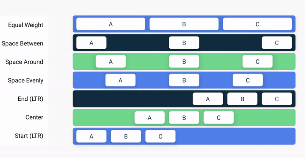
Column에서 선택 가능한 배치
이러한 배치 외에도, Arrangement.spaceBy()를 사용하여 각 하위 컴포저블 사이에 고정된 공간을 추가할 수 있음.
@Composable
fun AlignYourBodyRow(
    modifier: Modifier = Modifier
) {
    LazyRow(
        modifier = modifier,
        horizontalArrangement = Arrangement.spacedBy(8.dp)
    ) {
        items(alignYourBodyData) { item ->
            AlignYourBodyElement(item.drawable, item.text)
        }
    }
}
LazyRow의 측면에도 padding을 추가해야 한다.
동일한 padding을 유지하되, 상위 목록의 경계 내에서 컨텐츠를 자르지 않고 스크롤하려면 모든 목록에서 LazyRow에 contentPadding 매개변수를 제공하고 16.dp로 설정한다.
@Composable
fun AlignYourBodyRow(
    modifier: Modifier = Modifier
) {
    LazyRow(
        modifier = modifier,
        horizontalArrangement = Arrangement.spacedBy(8.dp),
        contentPadding = PaddingValues(horizontal = 16.dp)
    ) {
        items(alignYourBodyData) { item ->
            AlignYourBodyElement(item.drawable, item.text)
        }
    }
}
즐겨찾는 컬렉션 그리드 - LazyGrid
LazyRow를 만들고 각 항목이 2개의 FavoriteCollectionCard 인스턴스를 갖는 Column을 갖도록 해서 비슷하게 구현할 수 있으나, 여기서는 항목-그리드 패턴을 더 효과적으로 지원하는 LazyHorizontalGrid를 사용한다.
두개의 고정행이 있는 그리드를 간단하게 구현.
@Composable
fun FavoriteCollectionCard(
    modifier: Modifier = Modifier,
    @DrawableRes drawable: Int,
    @StringRes text: Int
) {
    Surface(
        shape = MaterialTheme.shapes.medium,
        color = MaterialTheme.colorScheme.surfaceVariant,
        modifier = modifier
    ) {
        Row (
            verticalAlignment = Alignment.CenterVertically,
            modifier = Modifier.width(255.dp)
        ){
            Image(
                painter = painterResource(id = drawable),
                contentDescription = null,
                contentScale = ContentScale.Crop,
                modifier = Modifier.size(80.dp)
            )
            Text(
                text = stringResource(id = text),
                style = MaterialTheme.typography.titleMedium,
                modifier = Modifier.padding(horizontal = 16.dp)
            )
        }
    }
}

@Composable
fun FavoriteCollectionsGrid(
    modifier: Modifier = Modifier
) {
    LazyHorizontalGrid(
        rows = GridCells.Fixed(2),
        modifier = modifier
    ) {
        items(favoriteCollectionsData) { item ->
            FavoriteCollectionCard(
                drawable = item.drawable,
                text = item.text
            )
        }
    }
}

private val favoriteCollectionsData = listOf(
    R.drawable.fc1_short_mantras to R.string.fc1_short_mantras,
    R.drawable.fc2_nature_meditations to R.string.fc2_nature_meditations,
    R.drawable.fc3_stress_and_anxiety to R.string.fc3_stress_and_anxiety,
    R.drawable.fc4_self_massage to R.string.fc4_self_massage,
    R.drawable.fc5_overwhelmed to R.string.fc5_overwhelmed,
    R.drawable.fc6_nightly_wind_down to R.string.fc6_nightly_wind_down
).map { DrawableStringPair(it.first, it.second) }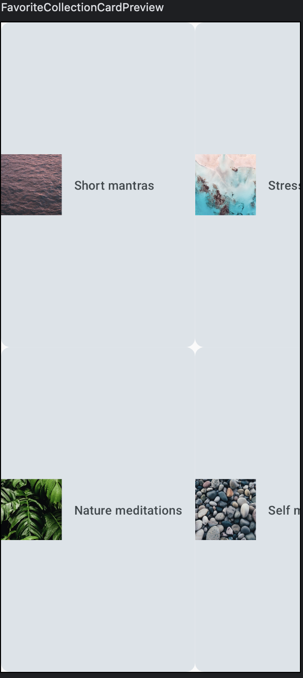
그리드가 상위 요소의 전체 공간을 차지하고 있음.
-> 컬렉션 카드가 세로 방향으로 지나치게 늘어져 있음.
다음과 같이 조정.
- 그리드의 가로 contentPadding을 16dp로
- 가로 및 세로 정렬 간격은 16dp로
- 그리드의 높이를 168dp로
- 카드의 modifier 높이를 80dp로 조정
@Composable
fun FavoriteCollectionsGrid(
    modifier: Modifier = Modifier
) {
    LazyHorizontalGrid(
        rows = GridCells.Fixed(2),
        modifier = modifier.height(168.dp),
        contentPadding = PaddingValues(horizontal = 16.dp),
        horizontalArrangement = Arrangement.spacedBy(16.dp),
        verticalArrangement = Arrangement.spacedBy(16.dp),

    ) {
        items(favoriteCollectionsData) { item ->
            FavoriteCollectionCard(
                drawable = item.drawable,
                text = item.text,
                modifier = Modifier.height(80.dp)
            )
        }
    }
}
홈 섹션 - 슬롯API
홈 화면에는 동일 패턴을 따르는 여러개의 섹션이 있음.
각각 제목이 있으며, 섹션에 따라 다른 컨텐츠가 제공됨.

각 섹션에는 제목과 슬롯이 있고, 제목에는 간격 및 스타일 정보가 있다.
섹션은 섹션에 따라 달라지는 콘텐츠로 동적으로 채울 수 있다.
이러한 유연한 섹션 컨테이너를 구현하려면 슬롯API를 사용한다.
제목과 슬롯 컨텐츠를 받도록 HomeSection 컴포저블을 조정한다.
@Composable
fun HomeSection(
@StringRes title: Int,
modifier: Modifier = Modifier,
content: @Composable () -> Unit
) {
Column(modifier) {
Text(stringResource(id = title))
content()
}
}
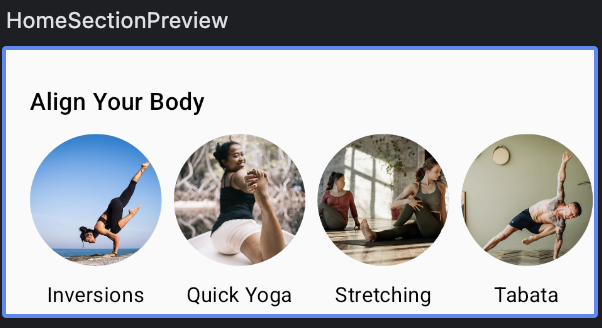
@Preview(showBackground = true)
@Composable
fun HomeSectionPreview() {
ComposeDefaultLayoutTheme {
HomeSection(R.string.align_your_body) {
AlignYourBodyRow()
}
}
}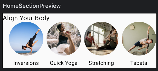
업데이트 사항
- titleMedium 서체 사용
- 텍스트 기준선과 상단 사이 간격은 40dp
- 기준선과 요소 하단 사이 간격은 16dp
- 가로 패딩은 16dp
@Composable
fun HomeSection(
    @StringRes title: Int,
    modifier: Modifier = Modifier,
    content: @Composable () -> Unit
) {
    Column(modifier) {
        Text(
            stringResource(id = title),
            style = MaterialTheme.typography.titleMedium,
            modifier = modifier.paddingFromBaseline(top = 40.dp, bottom = 16.dp).padding(horizontal = 16.dp)
        )
        content()
    }
}
홈 화면 - 스크롤
모든 구성 요소를 만들고 전체 화면으로 결합.
검색창 아래에 섹션 하나, 그 아래에 또 하나의 섹션을 배치하면 된다.
디자인과 동일하게 하기 위해선 간격을 추가해야 한다.
Spacer를 사용하면 Column 내부에서 더 많은 공간을 확보할 수 있다.
Spacer 대신 Column의 패딩을 설정하면 그리드에서 본 것과 동일한 cut-out 동작이 적용된다.
@Composable
fun HomeScreen(modifier: Modifier = Modifier) {
    Column(
        modifier.verticalScroll(rememberScrollState())
    ) {
        Spacer(modifier = Modifier.height(16.dp))
        SearchBar(Modifier.padding(horizontal = 16.dp))
        HomeSection(title = R.string.align_your_body) {
            AlignYourBodyRow()
        }
        HomeSection(title = R.string.favorite_collections) {
            FavoriteCollectionsGrid()
        }
        Spacer(modifier = Modifier.height(16.dp))
    }
}

@Preview(showBackground = true, heightDp = 180)
@Composable
fun HomeScreenPreview() {
    ComposeDefaultLayoutTheme {
        HomeScreen()
    }
}
하단 탐색 - Material
Material의 NavigationBar를 사용하면 된다.
NavigationBar 내에서 하나 이상의 NavigationBarItem 요소를 추가하면 라이브러리에 의해 자동으로 스타일이 지정된다.
@Composable
fun BottomNavigation(
    modifier : Modifier = Modifier
) {
    NavigationBar(
        modifier = modifier
    ) {
        NavigationBarItem(
            selected = true,
            onClick = {},
            icon = {
                Icon(
                    imageVector = Icons.Default.Home,
                    contentDescription = null
                )
            },
            label = {
                Text(text = stringResource(id = R.string.bottom_navigation_home))
            }
        )
        NavigationBarItem(
            selected = false,
            onClick = {},
            icon = {
                   Icon(
                       imageVector = Icons.Default.AccountCircle,
                       contentDescription = null
                   )
            },
            label = {
                Text(text = stringResource(id = R.string.bottom_navigation_Profile))
            }
        )
    }
}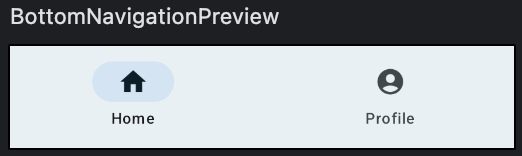
컨텐츠 색상과 탐색 메뉴 색상과의 대비가 크지 않다.
스타일 조정이 필요하다.
containerColor 매개변수를 사용하여 하단 탐색의 배경색을 업데이트 한다.
Material 테마의 surfaceVariant 색상을 사용하면 된다.
@Composable
fun BottomNavigation(
    modifier : Modifier = Modifier
) {
    NavigationBar(
        modifier = modifier,
        containerColor = MaterialTheme.colorScheme.surfaceVariant
    ) {
        NavigationBarItem(
            selected = true,
            onClick = {},
            icon = {
                Icon(
                    imageVector = Icons.Default.Home,
                    contentDescription = null
                )
            },
            label = {
                Text(text = stringResource(id = R.string.bottom_navigation_home))
            }
        )
        NavigationBarItem(
            selected = false,
            onClick = {},
            icon = {
                   Icon(
                       imageVector = Icons.Default.AccountCircle,
                       contentDescription = null
                   )
            },
            label = {
                Text(text = stringResource(id = R.string.bottom_navigation_Profile))
            }
        )
    }
}
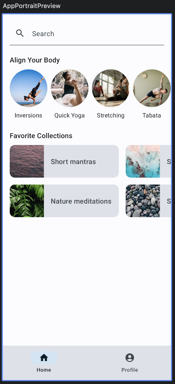
Scaffold
하단 탐색을 포함하는 전체 화면 구현을 만든다.
Matrerial의 Scaffold 컴포저블을 사용한다.
Scaffold는 구현하는 앱을 위한 구성 가능한 최상위 수준 컴포저블을 제공한다.
AppPortrait() 컴포저블을 구현.
앱의 최상위 수준 컴포저블이므로, 아래와 같은 구현을 해야 함.
- AppTheme Material 테마 적용
- Scaffold 추가
- 하단 막대가 BottomNavigation 컴포저블이 되도록 수정
- 컨텐츠가 HomeScreen 컴포저블이 되도록 설정
@Composable
fun AppPortrait() {
    ComposeDefaultLayoutTheme {
        Scaffold(
            bottomBar = { BottomNavigation() }
        ) { padding ->
            HomeScreen(Modifier.padding(padding))
        }
    }
}

@Preview(showBackground = true)
@Composable
fun AppPortraitPreview() {
    AppPortrait()
}
탐색 레일 - Material
앱 레이아웃을 만들때는 가로 모드를 비롯한 여러 구성에서 앱이 어떻게 표시될 지도 고려해야 한다.
이를 구현하려면, Compose Material 라이브러리의 일부이며, 하단 탐색 메뉴를 만드는데 사용된 NavigationBar와 유사하게 구현되는 NavigationRail을 사용한다.
@Composable
fun BottomNavigationRail(
    modifier: Modifier = Modifier
) {
    NavigationRail {
        Column {
            NavigationRailItem(
                selected = true,
                onClick = {},
                icon = {
                       Icon(
                           imageVector = Icons.Default.Home,
                           contentDescription = null
                       )
                },
                label = {
                    Text(text = stringResource(id = R.string.bottom_navigation_home))
                }
            )
            NavigationRailItem(
                selected = false,
                onClick = {},
                icon = {
                    Icon(
                        imageVector = Icons.Default.AccountCircle,
                        contentDescription = null
                    )
                },
                label = {
                    Text(text = stringResource(id = R.string.bottom_navigation_Profile))
                }
            )
        }
    }
}
스타일 조정이 필요한 것을 알 수 있다.
- 레일의 시작과 끝에 패딩 8dp를 추가한다.
- 이를 위해 Material Theme의 배경색을 사용하여 containerColor 매개변수를 설정해 탐색 레일의 배경색을 업데이트 한다.
배경색을 설정하면 아이콘과 텍스트의 색상이 onBackground 색상으로 자동 조절된다. - 열이 최대 높이를 채워야 한다.
- 열의 세로정렬을 가운데로 설정한다.
- 열의 가로 정렬을 가로로 가운데로 설정한다.
두 아이콘 사이에 8dp 패딩을 추가한다.
@Composable
fun BottomNavigationRail(
    modifier: Modifier = Modifier
) {
    NavigationRail(
        modifier = modifier.padding(start = 8.dp, end = 8.dp),
        containerColor = MaterialTheme.colorScheme.background
    ) {
        Column(
            modifier = modifier.fillMaxHeight(),
            horizontalAlignment = Alignment.CenterHorizontally,
            verticalArrangement = Arrangement.Center
        ) {
            NavigationRailItem(
                selected = true,
                onClick = {},
                icon = {
                       Icon(
                           imageVector = Icons.Default.Home,
                           contentDescription = null
                       )
                },
                label = {
                    Text(text = stringResource(id = R.string.bottom_navigation_home))
                }
            )
            Spacer(modifier = Modifier.height(8.dp))
            NavigationRailItem(
                selected = false,
                onClick = {},
                icon = {
                    Icon(
                        imageVector = Icons.Default.AccountCircle,
                        contentDescription = null
                    )
                },
                label = {
                    Text(text = stringResource(id = R.string.bottom_navigation_Profile))
                }
            )
        }
    }
}
가로 모드 레이아웃에 탐색 레일 추가
앱의 세로 모드에서는 Scaffold를 사용했지만, 가로모드에선 Row를 사용하고 두 컴포저블을 나란히 배치한다.
@Composable
fun AppLandScape(
    modifier: Modifier = Modifier
) {
    ComposeDefaultLayoutTheme {
        Row {
            BottomNavigationRail()
            HomeScreen()
        }
    }
}
세로 모드 버전에서 Scaffold를 사용하면 컨텐츠 색상을 배경색으로 설정하는 작업도 처리하였다.
탐색 레일의 색상을 설정하려면 Row를 Surface로 래핑하고 배경색으로 설정한다.
@Composable
fun AppLandScape(
    modifier: Modifier = Modifier
) {
    ComposeDefaultLayoutTheme {
        Surface(color = MaterialTheme.colorScheme.background) {
            Row {
                BottomNavigationRail()
                HomeScreen()
            }
        }
    }
}