
🐧 펭귄 종별 체중 분포 시각화 (Plotly Box Plot)
seaborn의 penguins 데이터셋을 활용하여 펭귄 종별 체중(body_mass_g) 분포를 시각화했다.
plotly.express를 사용하여 Box Plot과 개별 관측값 포인트를 함께 그려줌으로써, 각종의 체중을 분석 했다.
코드
python
import plotly.express as px
import seaborn as sns

# 펭귄 데이터셋 로드
df = sns.load_dataset("penguins")

# Box Plot 시각화
fig = px.box(
    df,
    x="species",
    y="body_mass_g",
    color="species",
    points="all",  # 개별 점 표시
    title="펭귄 종별 체중 Box Plot"
)

fig.update_layout(
    xaxis_title="펭귄 종",
    yaxis_title="체중 (g)",
    template="plotly_white"
)

fig.show()plotly.express.box(): 그룹별 Box Plot 시각화points="all"옵션: 모든 관측값 시각화
결과
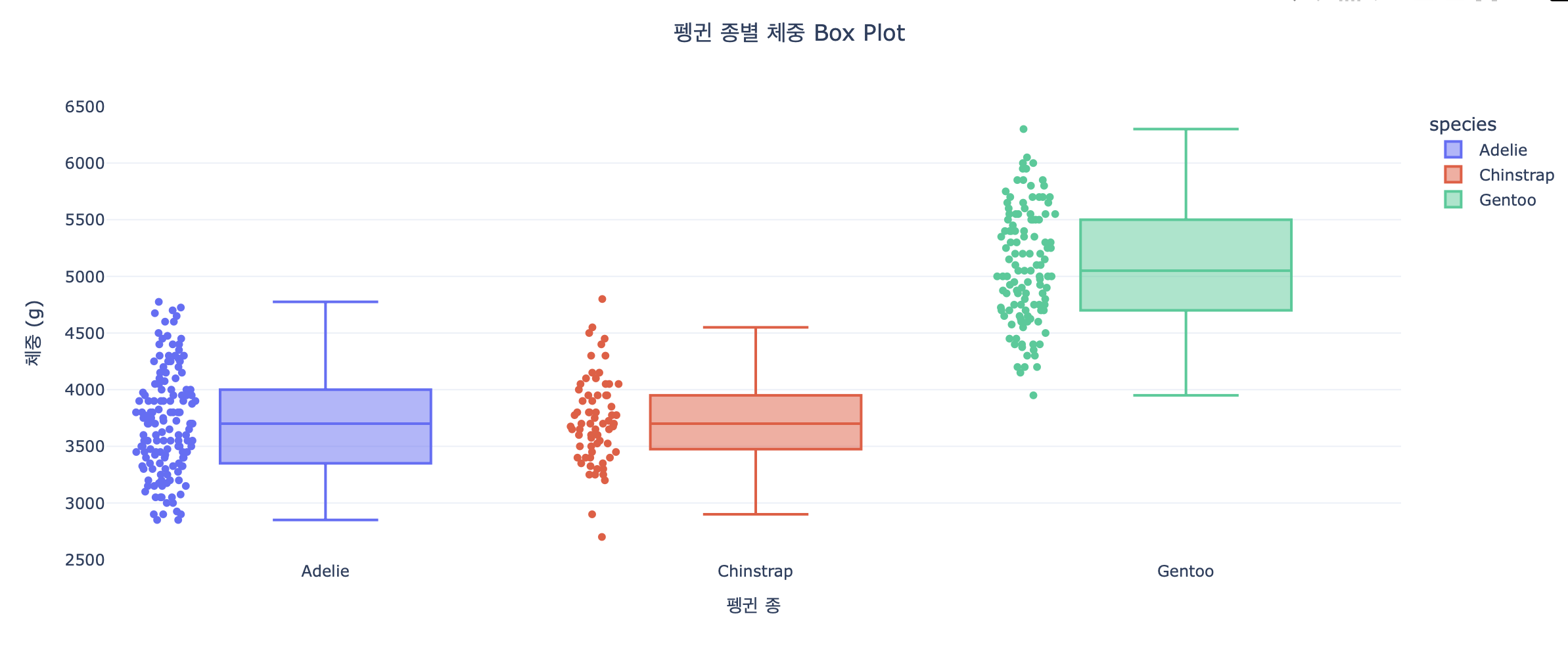
- Gentoo 종은 다른 종보다 체중이 뚜렷하게 무겁다.
평균 체중이 약 5000g 이상
체중 분포 범위도 넓음 → 전체적으로 덩치가 큼- Adelie와 Chinstrap은 평균 체중은 비슷하지만:
Adelie: 대부분 3300~4000g 구간에 몰려 있음, 박스크기가 작아서 평균쪽으로 몰려있음
Chinstrap: 분산이 약간 더 크고, 낮은 체중값 일부 존재- Chinstrap은 이상치가 존재한다
Plotly 드롭다운
#기본 구조

fig.update_layout(
    updatemenus=[
        {
            "buttons": [
                {"label": "옵션1", "method": "update", "args": [...]},
                {"label": "옵션2", "method": "update", "args": [...]}
            ],
            "direction": "down",  # 방향: down, up, left, right
            "x": 1.1,             # 드롭다운 위치 (가로)
            "y": 1.2,             # 드롭다운 위치 (세로)
            "showactive": True    # 선택된 버튼 강조 여부
        }
    ]
)
버튼의 구성요소
| 속성 | 설명 |
|---|---|
label | 드롭다운에 표시될 버튼 이름 |
method | 실행할 방식, 일반적으로 "update" 사용 |
args | 어떤 변경을 할지 정의하는 인자 리스트. 주로 visible, title, xaxis, yaxis 등 포함 |
예시구조
fig.update_layout(
    updatemenus=[{
        "buttons": [
            # 히스토그램 드롭다운
            {"label": "히스토그램", "method": "update",
             "args": [{"visible": [True, False, False]},
                      {"title": "아시아 국가 - 기대수명 히스토그램 (2007년)",
                       "xaxis": {"title": "기대수명"},
                       "yaxis": {"title": "국가 수"}}]},

            # 꺾은선 드롭다운
            {"label": "꺾은선", "method": "update",
             "args": [{"visible": [False, True, False]},
                      {"title": "아시아 평균 기대수명 추이",
                       "xaxis": {"title": "연도"},
                       "yaxis": {"title": "평균 기대수명"}}]},

             # 산점도 드롭다운
            {"label": "산점도", "method": "update",
             "args": [...]},
        ],
        "direction": "down",
        "x": 1.0,
        "y": 1.2,
        "showactive": True
    }],
    title="아시아 기대수명 시각화",
    title_x=0.5
)
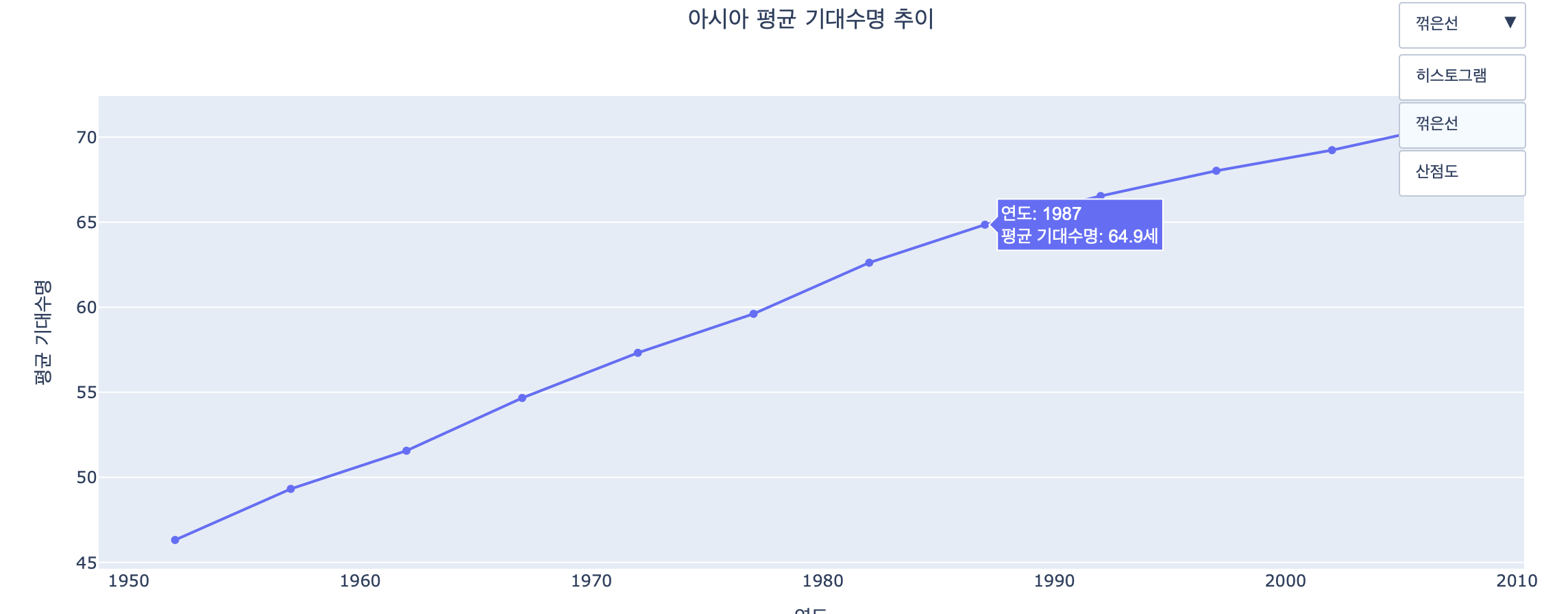
"visible": [True, False, False] : 첫 번째 trace(히스토그램)만 보이게 함
"direction": "down" : 메뉴 펼침 방향 (아래로)
"x": 1.0,"y": 1.2 : 메뉴 위치 (그래프 우측 위 바깥쪽)
"showactive": True : 현재 선택된 버튼을 강조 표시함
자세한 코드는 깃허브