
Plotly
express / graph_object
express: 완성형 보편적인 그래프를 그릴수 있다.
graph_object: 내가 원하는데로 그래프를 커스터마이징할 수 있다.
그래프의 내용을 자세히 나타내고 싶으면 graph_object를 사용하는게 좋다.
✔️ seaborn 데이터셋을 이용한 데이터 분석
seaborn 데이터셋은 총
['anagrams', 'anscombe', 'attention', 'brain_networks', 'car_crashes', 'diamonds', 'dots', 'dowjones', 'exercise', 'flights', 'fmri', 'geyser', 'glue', 'healthexp', 'iris', 'mpg', 'penguins', 'planets', 'seaice', 'taxis', 'tips', 'titanic']
사용할 데이터셋 : MPG
총 index : 398, 총 column : 9
- mpg : 연비측정단위
- cylinders : 실린더 개수
- displacement : 배기량
- horsepower : 마력
- weight : 무게
- acceleration : 가속
- model_year : 출시연도
- origin : 제조사
- name : 차 이름
| index | mpg | cylinders | displacement | horsepower | weight | acceleration | model_year | origin | name |
|---|---|---|---|---|---|---|---|---|---|
| 0 | 18.0 | 8 | 307.0 | 130.0 | 3504 | 12.0 | 70 | usa | chevrolet chevelle malibu |
| 1 | 15.0 | 8 | 350.0 | 165.0 | 3693 | 11.5 | 70 | usa | buick skylark 320 |
| 2 | 18.0 | 8 | 318.0 | 150.0 | 3436 | 11.0 | 70 | usa | plymouth satellite |
| 3 | 16.0 | 8 | 304.0 | 150.0 | 3433 | 12.0 | 70 | usa | amc rebel sst |
| 4 | 17.0 | 8 | 302.0 | 140.0 | 3449 | 10.5 | 70 | usa | ford torino |
🟡mpg와 각 컬럼 비교
✅mpg, horsepower, weight비교
(대표적인 코드만 올림)
import plotly.graph_objects as go
import plotly.express as px

x = df["mpg"]
y = df["horsepower"]
fig = go.Figure(data=go.Scatter(x=x, y=y, mode='markers'))

fig.update_xaxes(title_text='mpg')
fig.update_yaxes(title_text='horsepower')

fig.show()
mpg VS horsepower
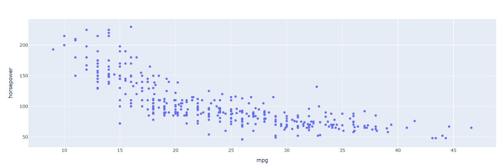
그래프를 확인하면 마력이 높을 수록 mpg는 낮아진다.
❓ 여기서 왜 마력이 높을 수록 mpg가 낮아지지? 라는 의문이 있을수있다.
❓ 힘을 많이쓰나? 차가 무겁나? 라는 생각을 할 수있다.
weight VS horsepower
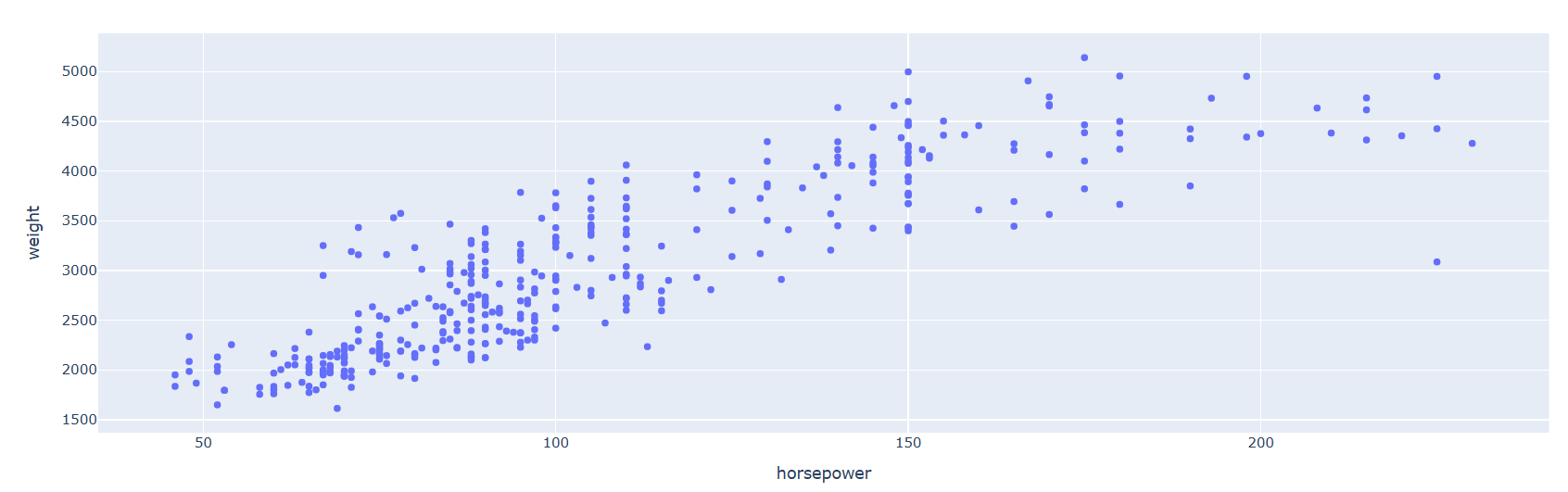
확인해 본 결과 그렇다는 것을 알수 있다. 대부분 마력이 낮으면 무게도 낮고, 마력이 높으면 무게도 높다는 걸 볼수 있다.
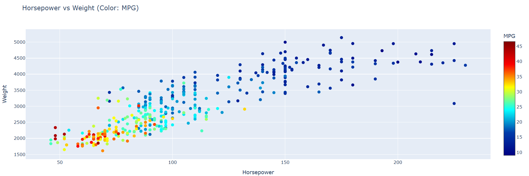
결과적으로 마력이 높으면, 무게가 많이 나가, 연비(mpg)가 좋지 않다라는 결론이 나온다.
✅ displacement ,cylinders, weight
배기량, 실린더 개수, 무게 분석하기
import plotly.graph_objects as go

x = df["weight"]
y = df["cylinders"]

fig = go.Figure(data=go.Scatter(x=x, y=y, mode='markers'))
fig.update_xaxes(title_text='weight')
fig.update_yaxes(title_text='cylinders')

fig.update_layout(
    title=dict(
        text="Weight vs Cylinders",
        x=0.5,
        xanchor='center',
        yanchor='top'
    ),
)

fig.show()
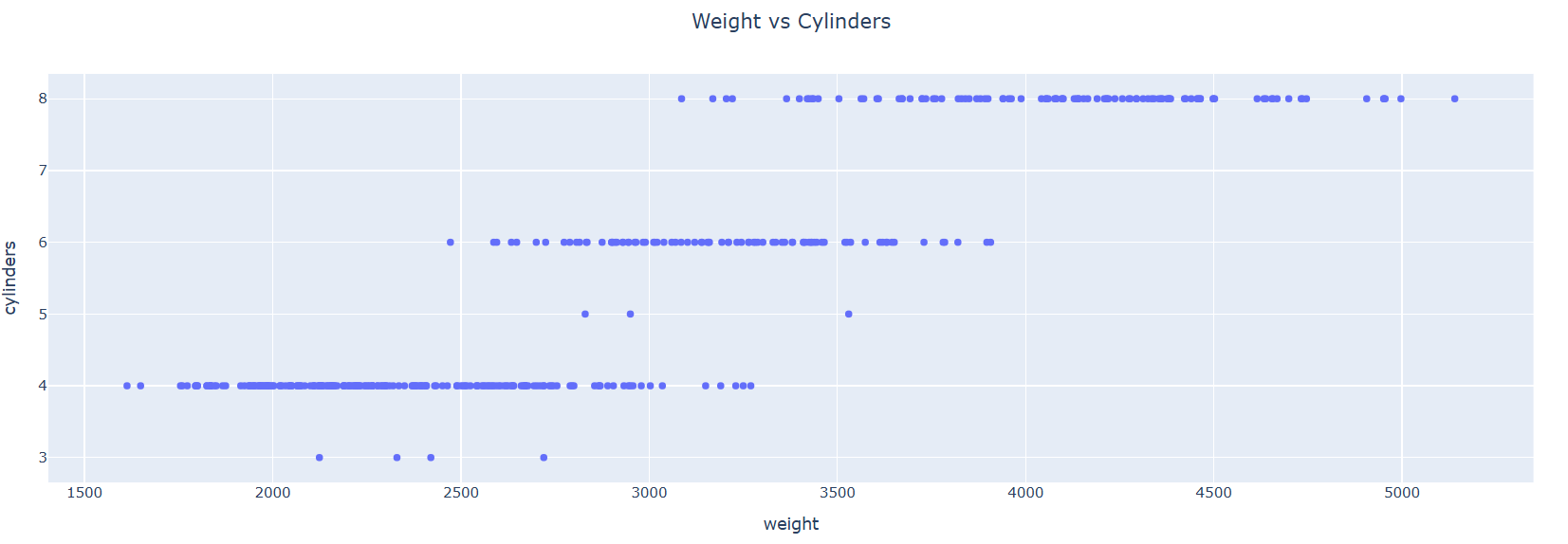
실린더 개수가 많으면 무개가 많이 나간다.
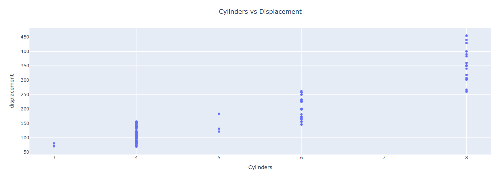
실린더가 많으면 배기량이 많다.
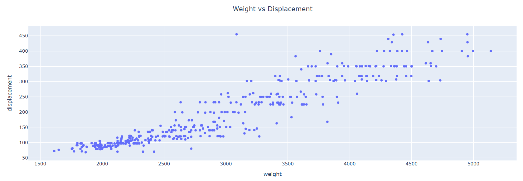
무게가 많이 나가면 배기량이 많다.
✔️ 결론
무게가 많이나가면 마력이 높고, 연비가 낮으며, 실린더의 개수는 많고,
배기량은 높은것으로 알 수 있다.
자세한 코드는 깃허브