[개발일지 5월 24일] 반응형 웹 소개와 실습-반응형 웹 사이트 만들기1 / 김희연 강사님
1. 학습한 내용
https://hellowworlds.tistory.com/77
: 한글깨짐 현상 방지 방법
<meta charset="UTF-8">→ 웬만한 언어들이 utf-8로 표현 가능!
최신 웹트렌드
- 플랫 디자인
- 그리드 레이아웃 디자인 : 화면에 보이지 않는 모눈종이를 그린다고 생각 / 시각적으로 안정적인 디자인 / 단순한 웹 디자인 / 원하는 대로 내용 배치 가능
- 원 페이지 사이트
: 필요한 내용이 한 페이지 안에 다 들어 있을 것 / 각 영역마다 배경색, 배경의 명도를 다르게 해서 구분 - 풀 스크린 배경과 사이트
https://fontawesome.com/ : start for free 클릭 → 이메일 인증 받기 → 폰트 사용 가능
ㅡㅡㅡㅡㅡㅡㅡㅡㅡㅡㅡㅡㅡㅡㅡㅡㅡㅡㅡㅡㅡㅡㅡㅡㅡㅡㅡㅡㅡㅡㅡㅡㅡㅡㅡㅡ
0524 / responsive / grid-column / index.html
<!DOCTYPE html>
<html lang="en">
<head>
    <meta charset="UTF-8">
    <meta http-equiv="X-UA-Compatible" content="IE=edge">
    <meta name="viewport" content="width=device-width, initial-scale=1.0">
    <link rel="stylesheet" href="./css/style.css">
    <title>Document</title>
</head>
<body>
    <!-- 다단 컬럼 -->
    <h1>Yummy Yummy</h1>
    <div id="wrapper">
        <div id="columns">
            <div class="card">
                <img src="./images/img1.jpg">
                <p>Icecream1</p>
            </div>
            <div class="card">
                <img src="./images/img2.jpg">
                <p>Icecream2</p>
            </div>
            <div class="card">
                <img src="./images/img3.jpg">
                <p>Icecream3</p>
            </div>
            <div class="card">
                <img src="./images/img4.jpg">
                <p>Icecream4</p>
            </div>
            <div class="card">
                <img src="./images/img5.jpg">
                <p>Icecream5</p>
            </div>
            <div class="card">
                <img src="./images/img6.jpg">
                <p>Icecream6</p>
            </div>
            <div class="card">
                <img src="./images/img6.jpg">
                <p>Icecream7</p>
            </div>
            <div class="card">
                <img src="./images/img6.jpg">
                <p>Icecream8</p>
            </div>
            <div class="card">
                <img src="./images/img6.jpg">
                <p>Icecream9</p>
            </div>
        </div>
    </div>

</body>
</html>
0524 / responsive / grid-column / css / style.css
@charset "utf-8";
*{
    margin:0;
    padding:0;

}

h1{
    width:100%;
    height: 150px;
    line-height: 150px;  /*h1 텍스트 y축 가운데 정렬 */
    padding-left: 50px;
    background: url("../images/img6.jpg") no-repeat left top;
    background-size: cover;
    color: #fff;
}

#wrapper{
    width:90%;
    max-width:1400px;
    min-width: 760px;
    margin: 50px auto; /*높이 50px 띄우고 가운데정렬*/
}

/* 칼럼 수 지정, 칼럼 사이 간격 지정 */
#columns{
    column-count:2;
    column-gap:10px;
}

.card{
    display:inline-block;
    width:200px;
    background-color: #fff;
    box-shadow: 0 1px 1px #ccc;
    padding:15px;
}

.card img{
    width: 100%;
    height: 160px;
    border-bottom: 1px solid #ccc;
    padding-bottom:15px;
    margin-bottom:5px;
}

.card p{
    padding:10px;
}

/* 900px 이상 */
@media (min-width:900px){
    #columns{
        column-count: 3;
    }
}
/* 1100px 이상 */
@media (min-width:1100px){
    #columns{
        column-count: 4;
    }
}
→ 결과(아래 사진)
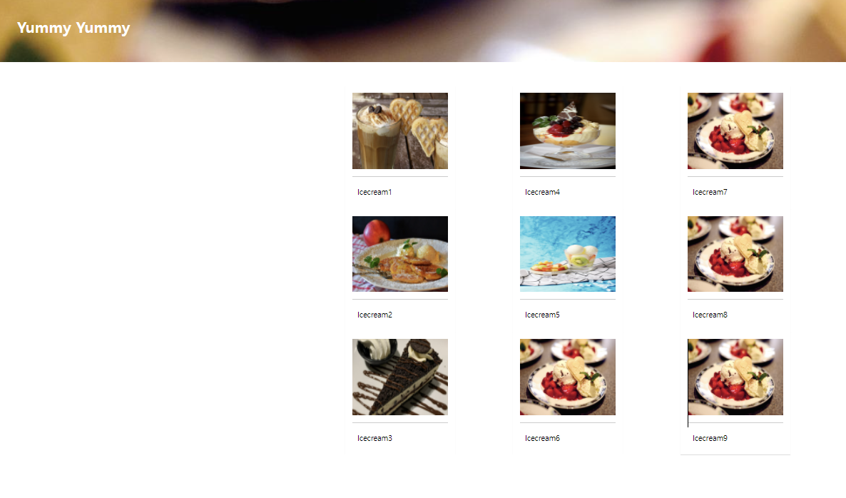
#columns{
    column-count:2;
    column-gap:10px;
}
를 통해서 그리드 column의 개수를 2개로 설정하고, column간의 gap을 10px로 설정
/* 900px 이상 */
@media (min-width:900px){
    #columns{
        column-count: 3;
    }
}
/* 1100px 이상 */
@media (min-width:1100px){
    #columns{
        column-count: 4;
    }
}
→ 브라우저 창의 크기에 따라 @media 쿼리를 이용해서, 조건을 설정하고, 그리드 columns의 개수를 설정할 수 있게 함
ㅡㅡㅡㅡㅡㅡㅡㅡㅡㅡㅡㅡㅡㅡㅡㅡㅡㅡㅡㅡㅡㅡㅡㅡㅡㅡㅡㅡㅡㅡㅡㅡㅡㅡㅡ
0524 / responsive / grid-css표준 / index.html
<!DOCTYPE html>
<html lang="en">
<head>
    <meta charset="UTF-8">
    <meta http-equiv="X-UA-Compatible" content="IE=edge">
    <meta name="viewport" content="width=device-width, initial-scale=1.0">
    <link rel="stylesheet" href="./css/style.css">
    <title>CSS grid layout</title>
</head>
<body>

    <h1>Yummy Yummy</h1>
    <div id="wrapper">
        <!-- <div id="columns"> -->
            <div class="card">
                <img src="./images/img1.jpg">
                <p>Icecream1</p>
            </div>
            <div class="card">
                <img src="./images/img2.jpg">
                <p>Icecream2</p>
            </div>
            <div class="card">
                <img src="./images/img3.jpg">
                <p>Icecream3</p>
            </div>
            <div class="card">
                <img src="./images/img4.jpg">
                <p>Icecream4</p>
            </div>
            <div class="card">
                <img src="./images/img5.jpg">
                <p>Icecream5</p>
            </div>
            <div class="card">
                <img src="./images/img6.jpg">
                <p>Icecream6</p>
            </div>
            <div class="card">
                <img src="./images/img6.jpg">
                <p>Icecream7</p>
            </div>
            <div class="card">
                <img src="./images/img6.jpg">
                <p>Icecream8</p>
            </div>
            <div class="card">
                <img src="./images/img6.jpg">
                <p>Icecream9</p>
            </div>
        <!-- </div> -->
    </div>

</body>
</html>
0524 / responsive / grid-css표준 / css / style.css
@charset "utf-8";
*{
    margin:0;
    padding:0;

}

h1{
    width:100%;
    height: 150px;
    line-height: 150px;  /*h1 텍스트 y축 가운데 정렬 */
    padding-left: 50px;
    background: url("../images/img6.jpg") no-repeat left top;
    background-size: cover;
    color: #fff;
}

#wrapper{
    display:grid; /*grid, grid-inline */
    grid-template-columns: repeat(2, 200px);
    grid-template-rows: minmax(220px auto);
    grid-gap:10px 10px;
    justify-content: center;
}

.card{
    display:inline-block;
    width:200px;
    background-color: #fff;
    box-shadow: 0 1px 1px #ccc;
    padding:15px;
}

.card img{
    width: 100%;
    height: 160px;
    border-bottom: 1px solid #ccc;
    padding-bottom:15px;
    margin-bottom:5px;
}


/* 900px 이상 */
@media (min-width:900px){
    #columns{
        justify-content: center;
        grid-template-columns: repeat(3, 200px);
    }

}
/* 1100px 이상 */
@media (min-width:1100px){
    #columns{
        justify-content: center;
        grid-template-columns: repeat(4, 200px);
    }
}
→ 결과(아래 사진)
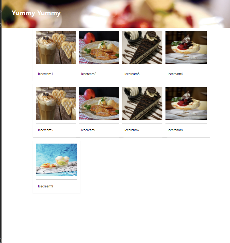
→ 위의 설명과 마찬가지
ㅡㅡㅡㅡㅡㅡㅡㅡㅡㅡㅡㅡㅡㅡㅡㅡㅡㅡㅡㅡㅡㅡㅡㅡㅡㅡㅡㅡㅡㅡㅡㅡㅡㅡㅡ
0524 / one-page / index.html
<!DOCTYPE html>
<html lang="en">
<head>
    <meta charset="UTF-8">
    <meta http-equiv="X-UA-Compatible" content="IE=edge">
    <meta name="viewport" content="width=device-width, initial-scale=1.0">
    <title>Document</title>
    <link rel="stylesheet" href="./css/style.css">
	<link href="https://fonts.googleapis.com/css2?family=Dancing+Script&display=swap" rel="stylesheet">
	<!-- FontAwesome -->
	<script src="https://kit.fontawesome.com/b8a7fea4d4.js" crossorigin="anonymous"></script>

</head>
<body>
    <div class="container">
        <section class="top">
            <h1 class="title">Good Dessert</h1>
            <p>시원한 아이스크림<br>
            빵과 과일<br>
        맛있는 디저트입니다.</p>
    </section>
        <section class="menu">
                <h2 class="title">Menu</h2>
            </section>
        <section class="contact">
                <h2 class="title">Contact</h2>
                <p>서울시 서초구 서문로 00-00</p>
                <p>영업시간 : 08:00 ~ 20:00</p>
                <a class="btn" href="#">문의사항</a>
                <ul class="contact-sns">
                    <li><a href="#"><i class="fab fa-instagram"></i></a></li>
                    <li><a href="#"><i class="fab fa-facebook-square"></i></a></li>
                    <li><a href="#"><i class="fab fa-twitter"></i></a></li>
                </ul>
                </section>
    </div>
</body>
</html>
0524 / one-page / css / style.css
@charset "utf-8";


*{
    box-sizing:border-box;
    padding: 0;
}

html{
    font-size:100%;
    line-height: 1.15;
}
body{
    font-family: sans-serif;
    margin:0;
}

a{
    background-color: transparent;
    text-decoration: none;
}

img{
    border-style:none;
    vertical-align: bottom;
}

h1, h2{
    font-weight: lighter;  /* 가늘게 */
    margin:0;
    color: white;
}

/* title section */
.title{
    font-family: 'Dancing Script', cursive;
    font-size: 7rem; /*112px; */
    margin-bottom: 2rem; /*32px;*/
    padding-top:10vh;
    /* text-align: center; */
}

p{
    line-height: 1.7;
    font-size:18px;
    color: white;
}
.container{
    height: 100vh;
    overflow: auto;
    scroll-snap-type: y mandatory;
}

.top{
    background-image: url("../images/img1.jpg");
    /* padding-top:10vh;
    text-align: center; */
}
section{
    height:100vh;
    background-size: cover;
    background-repeat: no-repeat;
    background-position: center;
    text-align: center;
    scroll-snap-type: start;
}

.menu{
    background-image: url("../images/img2.jpg");
}
.contact{
    background-image: url("../images/img3.jpg");
}

.btn{
    background-color: #555;
    font-size:24px;
    color:#fff;
    padding: 16px 56px;
    border-radius: 6px;
    display: inline-block;
    margin: 32px 0 36px;
}
.btn:hover{
    background-color: #777;
}
.contact-sns{
    display: flex;
    justify-content: center;
}
.contact-sns a{
    display: inline-block;
    background-color: #fff;
    color:#555;
    width:60px;
    height: 60px;
    margin: 0 8px;
    border-radius: 50%;
    font-size: 32px;
    padding: 12px 0 0 2px;
}
.contact-sns a:hover{
    background-color: rgba(255, 255, 255, .5)
}

@media (max-width:700px){
    .contact h2{
        font-size: 64px;
    }
}
→ 결과(아래 사진)
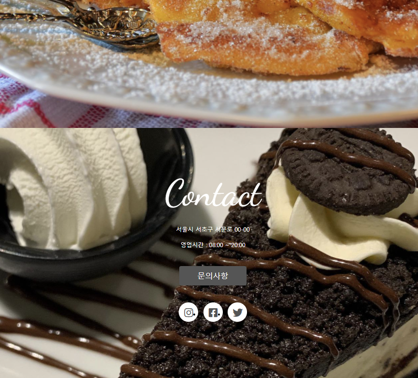
→ index.html에 있는
<ul class="contact-sns">
                    <li><a href="#"><i class="fab fa-instagram"></i></a></li>
                    <li><a href="#"><i class="fab fa-facebook-square"></i></a></li>
                    <li><a href="#"><i class="fab fa-twitter"></i></a></li>
                </ul>
→ 를 통해서 각종 아이콘을 불러올 수 있음
2. 학습한 내용 중 어려웠던 점 또는 해결못한 것들
1) 이번 수업은 그리드에 대해서 좀 헷갈렸던 것 같음! 칼럼, 칼럼 갭, 패딩 등을 통해서 width를 설정하는데 값을 계산해야한다는 점?
3. 해결방법 작성
1) 헷갈리지 않게 잘 계산하면 됨
4. 학습 소감
1) 세부적인 기능, 가시화할 수 있는 기능들을 알게 되면서, 실제 각종 홈페이지 구성을 해 볼 수 있다는 것에 흥미를 갖게 되었다