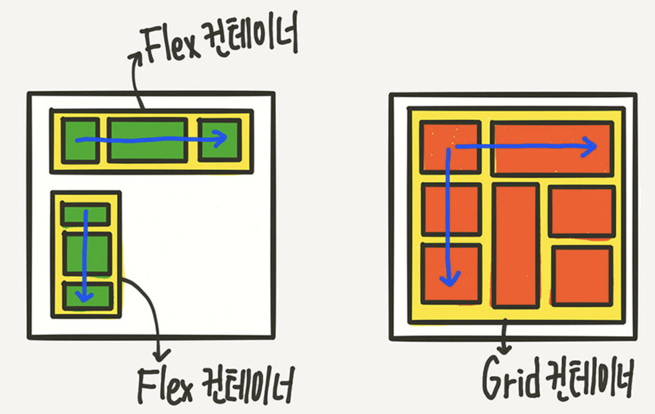
Flex vs Grid
💡
FlexvsGrid
Flex는 한 방향 레이아웃 시스템이고 (1차원)Grid는 두 방향(가로-세로) 레이아웃 시스템 (2차원)
➡️ Flex보다 더 복합적인 레이아웃 표현이 가능
Grid
그리드 컨테이너 (부모 요소) 레벨에서 대부분의 레이아웃을 구축할 수 있게한다.
격자 (템플릿)을 만들어냄
➡️ 부모 요소 안에서 거의 모든 지정 가능
.parent { // grid container
	display: grid;
}
.children { // grid items
}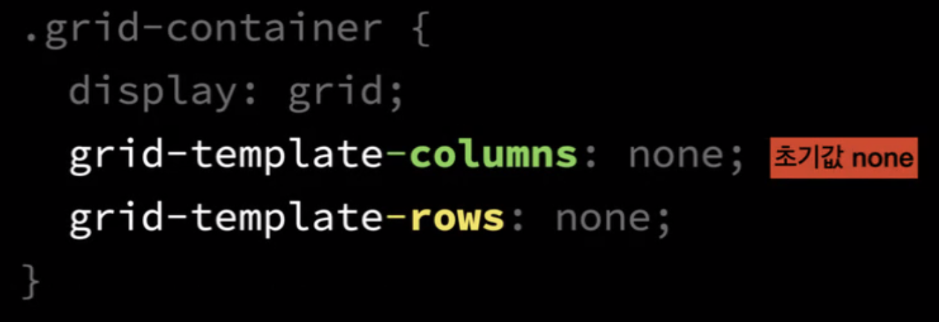
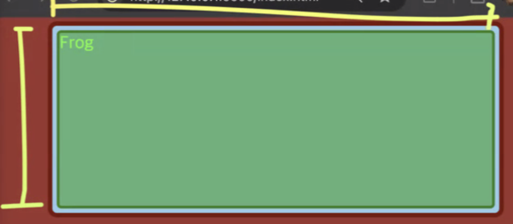
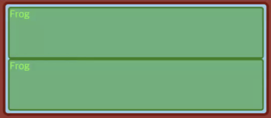
최초에는 템플릿이 지정 되어 있지 않으므로 1개의 column, row로 지정
❗️ 우리는 언제나 해당 요소의 크기가 어떻게 설정 되어있는 지 관심을 가져야한다!
❗️ auto면 stretch!

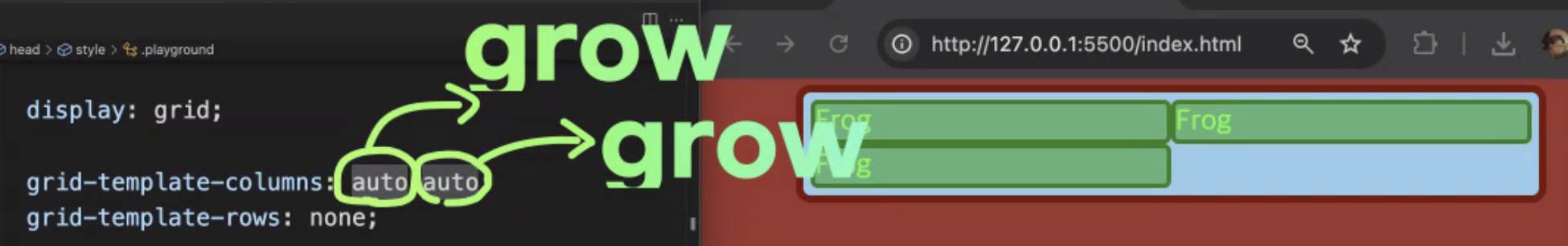
.grid-container {
display: grid; height: 400px;
grid-template-columns: auto auto;
grid-template-rows: none;
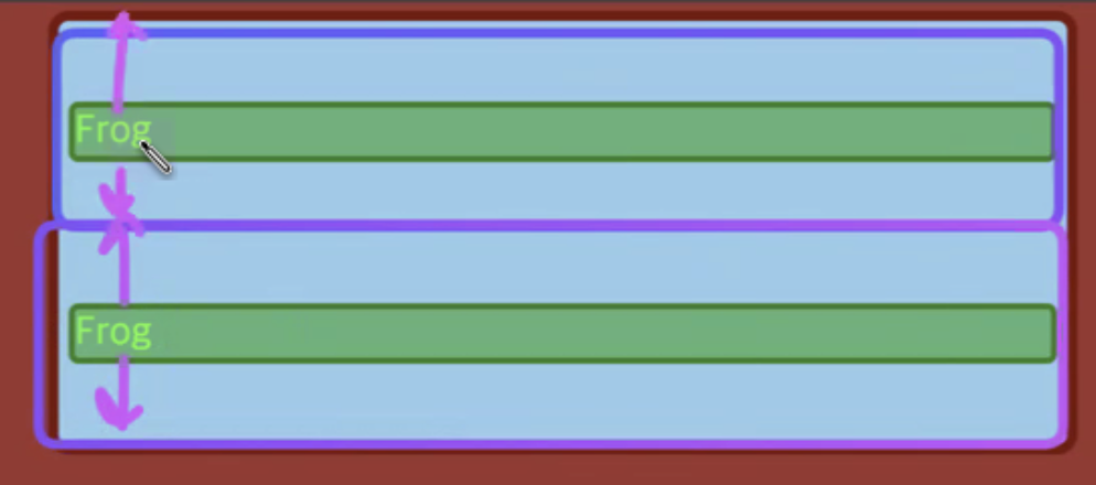
}➡️ justify-items: none이 기본값으로 적용이 되는데 이건 justify-items: stretch와 같으므로 늘어나서 적용이 된다.
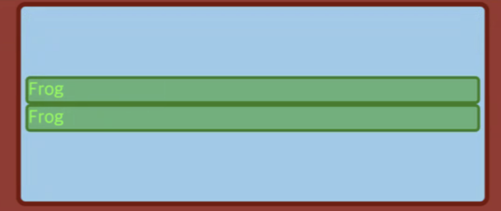
.grid-container {
	display: grid; height: 400px;
	grid-template-columns: auto auto;
	grid-template-rows: none;
	justify-items: center;
}
➡️ justify-items: center 이므로 stretch 되지 않고 가운데 정렬이 된다.
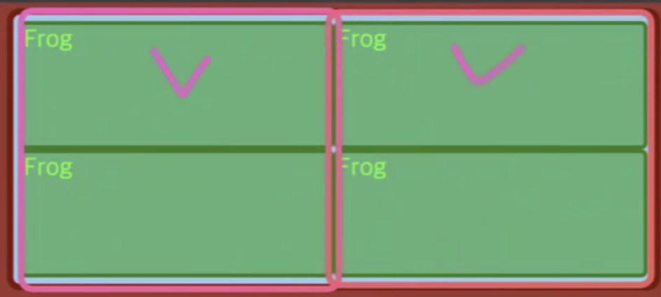
.grid-container {
	display: grid; height: 400px;
	grid-template-columns: 1fr 1fr;
	grid-template-rows: 1fr 1fr;
}
➡️ 가로와 세로 모두 1:1 비율을 가진다.
.playground {
display: grid;
grid-template-columns: none; // 기본값
grid-template-rows: none; // 기본값
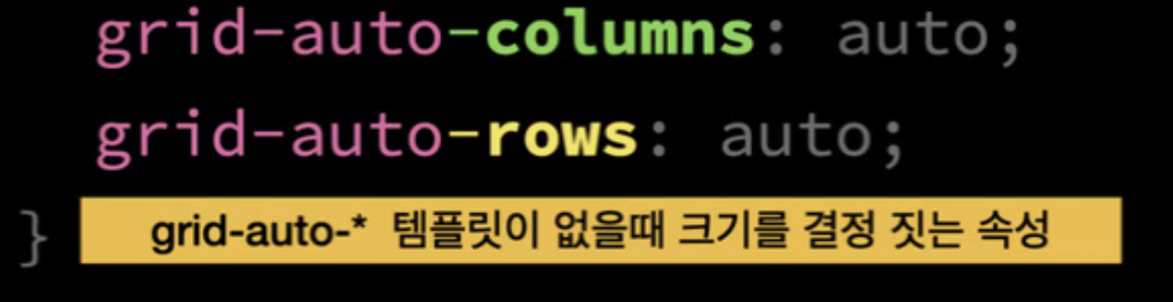
grid-auto-columns: auto; // width 개념
grid-auto-rows: auto // height 개념 (내부 컨텐츠 크기만큼)
}
.frog {
}
.playground {
	display: grid;
    grid-template-columns: **auto auto** // column의 개수!
    grid-template-rows: none; // 기본값

    grid-auto-columns: auto; // 위의 auto auto 이고, 이 코드는 의미 없음
    grid-auto-rows: auto // height 개념 (내부 컨텐츠 크기만큼)
}
.frog {
}
➡️ grid에서 auto는 flex에서 grow와 비슷하다.

컨텐츠 채우고 남은 공간 가져온다. 내부컨텐츠 너비 + 가용공간을 n등분하여 나누어 가짐
--> grid-template-rows: auto

각 요소들이 어떻게 공간 차지하고 기본적으로 속성 부여하지 않았을 때 초기값이 무엇인지!
각 셀 값 지정
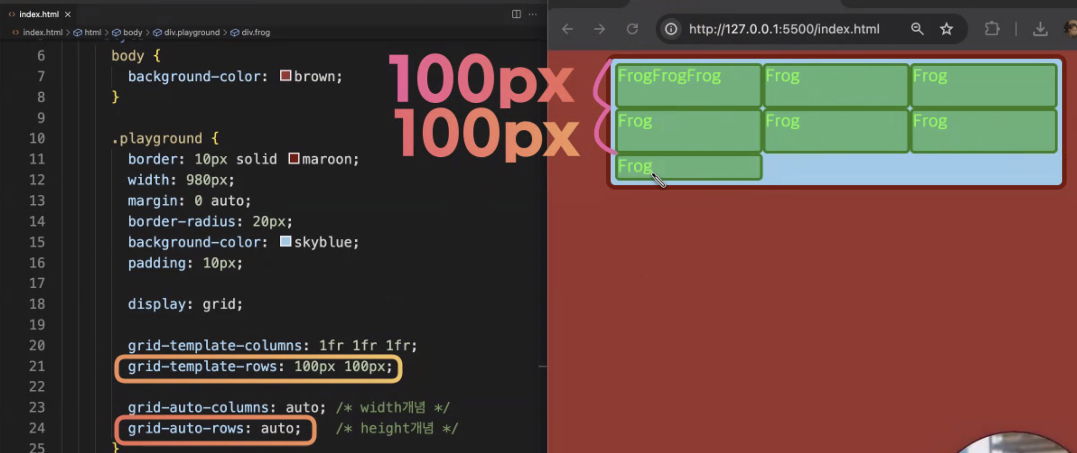
.playground {
display: grid;
grid-template-columns: 1fr 1fr 1fr // 템플릿 (1:1:1)
grid-template-rows: 200px 200px // 템플릿
grid-auto-columns: auto;
grid-auto-rows: auto ;
}
.frog {
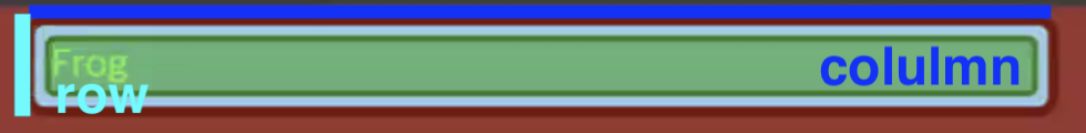
}grid-template-columns(가로) grid-template-rows(세로)은 템플릿의 가로, 세로의 각 셀을 정해준다.
예를 들면 지금 grid-template-columns: 1fr 1fr 1fr 값은 가로에 담긴 3개의 col의 각 셀의 너비를 정한다.
grid-template-rows: 200px 200px값은 세로에 담긴 3개의 row 중 위의 2개의 값에만 높이 값을 지정해준다.
사진을 보면 이 코드는 row의 값이 3개인데 2개만 지정해주었으므로 grid-auto-rows: auto를 이용하여 지정하지 않은 나머지를 일괄적으로 적용해준다.
grid-auto-columns: auto 도 마찬가지로 지정되지 않은 세로의 값들을 일괄적으로 처리하는 코드이다.
이때 auto가 아니라 실제 픽셀을 지정하면 그 크기만큼 너비와 높이가 지정된다.
❗️ grid-template-columns: repeat(5, 1fr)를 이용하면 5개를 따로 1fr 1fr 1fr 1fr 1fr 이렇게 써주지 않아도 한번에 지정이 된다.
❗️fr : fraction을 의미하며 비율을 뜻한다.
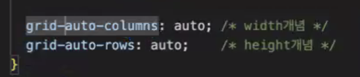
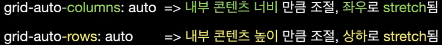
.playground {
    grid-auto-columns: auto; // 내부 콘텐츠 너비
    grid-auto-rows: auto ; // 내부 콘텐츠 높이
}
정렬
justify-items align-items를 이용하여 grid item을 정렬 할 수 있다
❗️ 그리드에서는 justify-align이 아니라 justify-items이다.
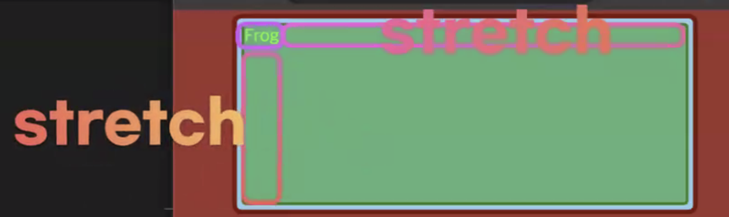
정렬에 의해 나머지 공간이 stretch된다.
.playground {

	justify-items: strecth; // 내부 콘텐츠 너비에 추가적으로 stretch가 되어 width: auto 처럼 동작
    align-items: stretch; // 내부콘텐츠 높이에 추가적인 값 붙어서 부모 높이에 맞게끔 커짐

    grid-auto-columns: auto; // 내부 콘텐츠 너비만큼 --> ** 이 성질과 stretch 때문에 너비 + ∂**
    grid-auto-rows: auto ; // 내부 콘텐츠 높이
}
.playground {
	justify-items: strecth;
    grid-auto-columns: 200px; ** 콘텐츠의 너비 지정 **
}
➡️ justify-items가 일어나지 않은 것이 아니라 내가 지정한 컨텐츠의 너비인 200px 안에서 stretch 되는 것

.playground {
	justify-items: center;
    grid-auto-columns: 200px;
}
💡
justify-items& 얼라인아이템 -> 내부정렬
items의 auto 안에서의 정렬 (grid-auto-columns의 공간 안에서 정렬)
❗️grid-auto-columns 값이 auto면 flex-container안에서 정렬
justify-items와 justify-content 차이점
💡
justify-items
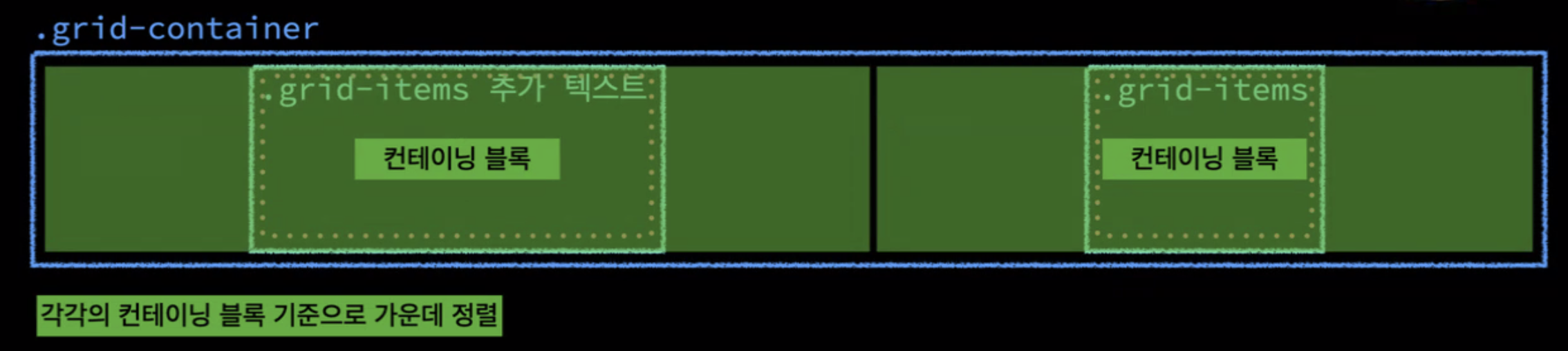
부모 컨테이너 내에서 정렬을 다루고 한칸의 컬럼 내부에서의 정렬
--> 원룸 내부에서의 정렬 (원룸(컨테이닝 블록) 내부의 .frog가 최대치로)
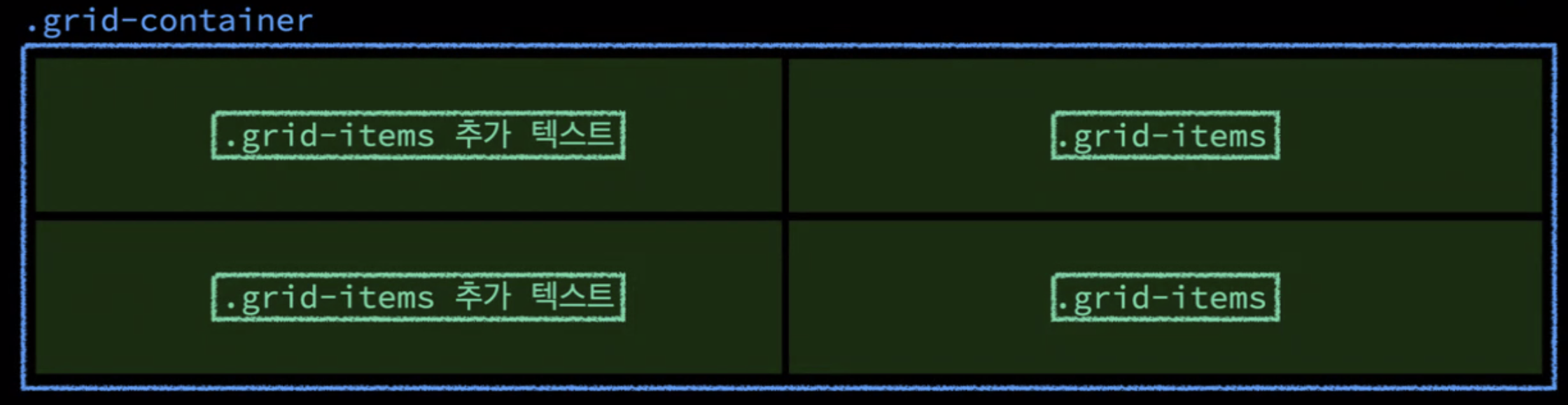
💡justify-content
justify-items보다 더 상위 내부에서의 정렬 --> 원룸 자체를 정렬(원룸 자체의 너비가 최대치로)
justify-content의 초기값
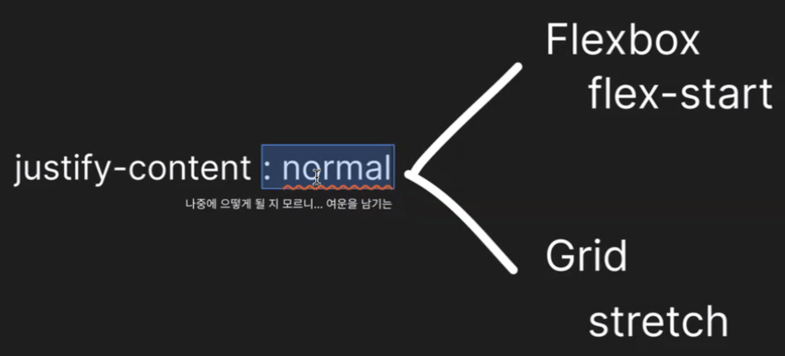
justify-content의 초기값을 고정적으로 두지 않고 normal로 지정하여 flexbox와 grid에서 각각 다르게 해석되어 동작한다. (속성에 따라 다른 초기 값)
➡️ 초기값이 normal이나 auto라면 어떤 기준에서 동작되는 지 잘 파악해야한다.
➡️ 각 속성에서마다 초기값이 다름
.playground {
	height: 400px;

	justify-content: stretch;
    align-content: stretch;

	justify-items: stretch; // 원룸의 너비를 전부 차지
    align-items: stretch; // 원룸의 높이를 전부 차지

    grid-auto-columns: auto; // 부모 요소가 주는대로 원룸 너비 지정 (개수에 맞춰 원룸으로 나눔)
    grid-auto-rows: auto; // 부모 요소가 주는대로 원룸 높이 지정 (개수에 맞춰 원룸으로 나눔)
}
.playground {
	height: 400px;

	justify-content: stretch;
    align-content: stretch;

	justify-items: stretch;
    align-items: center; // 원룸 내에서 가운데로 정렬 (높이)

    grid-auto-columns: auto;
    grid-auto-rows: auto; // 부모의 전체 높이를 개수대로 알아서 원룸을 나눔
}
.playground {
	height: 400px;

	justify-content: stretch;
    align-content: center;

	justify-items: stretch;
    align-items: center; // 원룸 내에서 가운데로 정렬 (높이)

    grid-auto-columns: auto;
    grid-auto-rows: auto; // 부모의 전체 높이를 개수대로 알아서 원룸을 나눔
}
➡️ items : 컨테이닝 블록 내부에서 --> 원룸 안에서의 정렬
➡️ content : 원룸 자체 --> stretch라면 부모가 제공하는 원룸을 전부 다 쓰는 것
grid-template-columns
gird-container 안에서 만들어지는 columns의 전부에 영향을 미치는 것
➡️ 특정 요소의 사이즈를 지정하는 것이 아니라 columns 전부의 사이즈를 지정
.playground {
	width: 980px;
	height: 400px;

    **grid-template-columns: auto auto; **

	justify-content: stretch;
    align-content: stretch;

	justify-items: stretch;
    align-items: stretch;

    // grid-template-columns 속성 떄문에
    // column이 두개로 예약 되어져 있기 때문에
    // grid-auto-columns의 지정값은 무시된다.
    grid-auto-columns: 100px;

    // grid-template-rows: none이기 때문에
    // 이 속성은 무시안되고 쓰이고 있음
    grid-auto-rows: auto;
}
➡️ 체크 부분만 특정적으로 사이즈 지정이 아니라 네모 부분을 전체적으로 사이즈 지정 (컬럼이 추가되면 그 요소들까지 지정)
.playground {
	height: 400px;

	justify-content: stretch;
    align-content: stretch;

	justify-items: center;
    align-items: center; // 원룸 내에서 가운데로 정렬 (높이)

    grid-auto-columns: auto;
    grid-auto-rows: auto; // 부모의 전체 높이를 개수대로 알아서 원룸을 나눔
}
➡️ content 속성 때문에 원룸이 네칸으로 나눠짐
➡️ item 속성 때문에 그 원룸 안에서 가운데로 배치됨
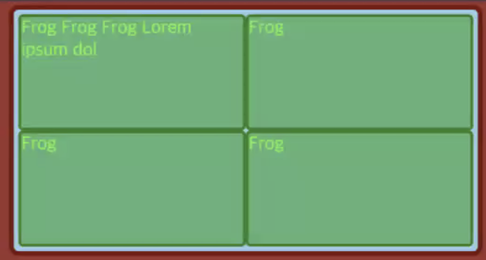
.playground {
	width: 980px;
	height: 400px;

    grid-template-columns: 1fr 1fr; // 두개의 컬럼 예약
    grid-template-rows: 1fr 1fr; // 두개의 로우 예약

	justify-content: stretch;
    align-content: stretch;

	justify-items: stretch;
    align-items: stretch // 원룸 내에서 가운데로 정렬 (높이)

    grid-auto-columns: auto;
    grid-auto-rows: auto; // 부모의 전체 높이를 개수대로 알아서 원룸을 나눔
}
grid-template-columns , grid-template-rows 이 1fr 1fr 라면 내부의 콘텐츠를 신경쓰지 않고 그냥 무조건 너비 높이를 1:1로 나눈 것이다.
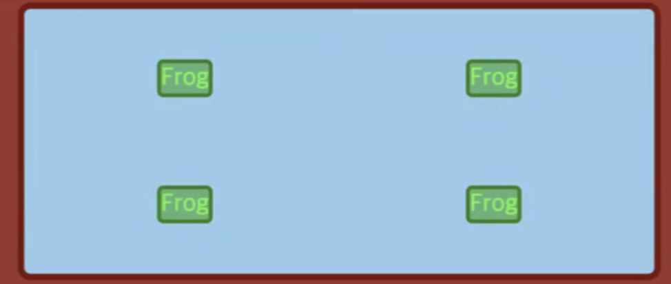
.playground {
    grid-template-columns: 1fr 1fr;

    grid-auto-columns: auto;
    grid-auto-rows: auto; // 부모의 전체 높이를 개수대로 알아서 원룸을 나눔
}
➡️ row를 예약하지 않았다면 컨텐츠에 의해 차지된 공간 (flex-basis) + 가용공간을 나눈 공간 (flex-grow)으로 나누어진다.
++ https://happygunja.tistory.com/107
items 와 content 의 차이점
❗️ items 는 그리드에서 각각의 cell 을 의미. content 는 그리드 전체를 의미.