Layout 위한 Wrapper
❗️wrapper와 bucketlist로 두번 감싸서 wrapper는 Layout하는 데에만 사용한다.
.wrapper {
  width: 448px;
  margin: 110px auto;
}
✔️ before
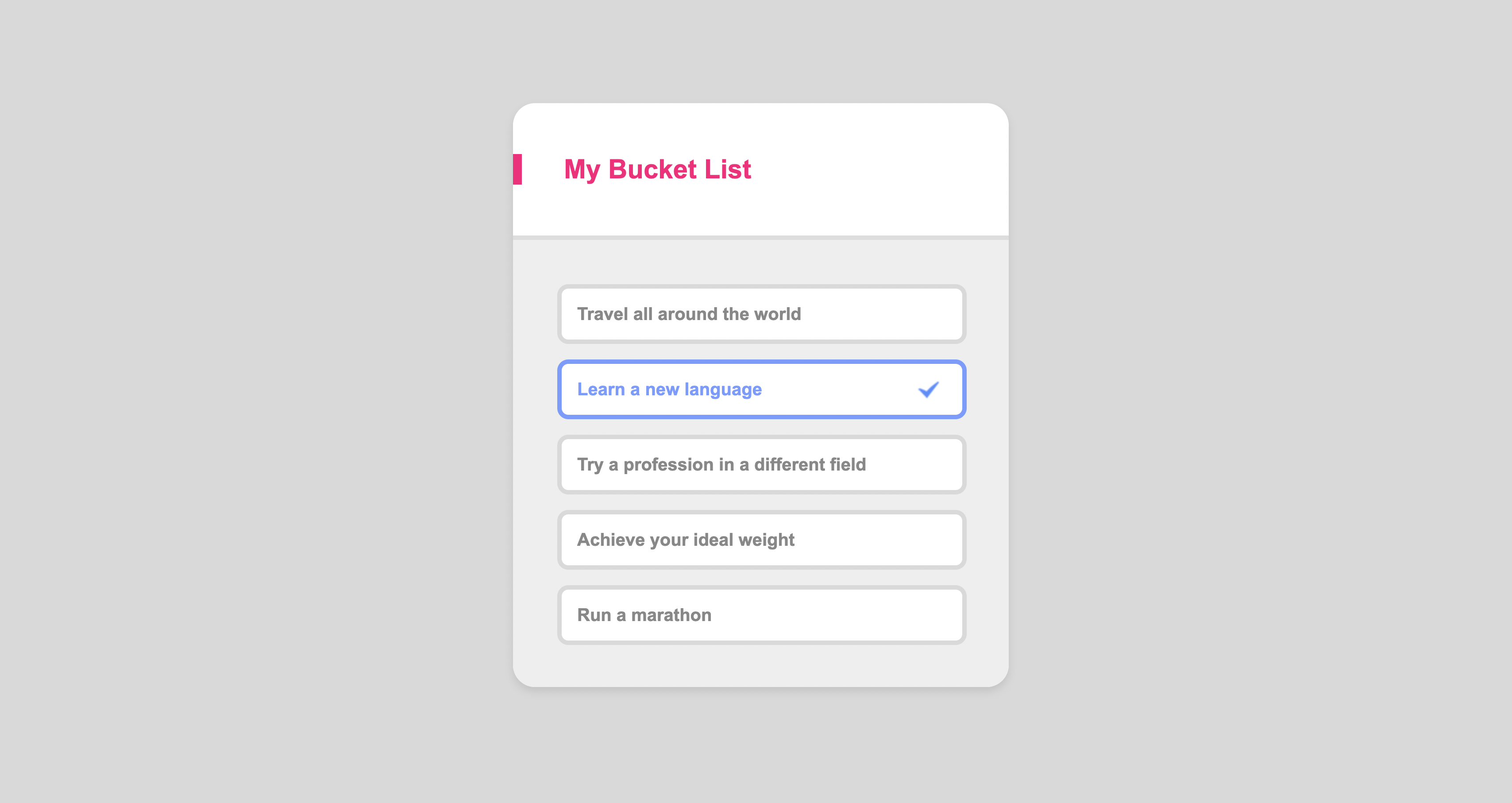
    <div class="wrapper">
      <header class="header">
        <h1>My Bucket List</h1>
      </header>
      <main class="content">
        <ul class="section">
          <li>Travel all around the world</li>
          <li class="check">Learn a new language</li>
          <li>Try a profession in a different field</li>
          <li>Achieve your ideal weight</li>
          <li class="final">Run a marathon</li>
        </ul>
      </main>
    </div>

 css
/*Design*/
body {
  background-color: #d9d9d9;
}

.wrapper {
  font-weight: bold;
  background-color: white;
  border-radius: 20px;
  width: 448px;
  margin: 0 auto;
  box-shadow: 0 4px 8px rgba(0, 0, 0, 0.1);
  overflow: hidden;
}
✔️ after
  <div class="wrapper">
      <section class="bucketlist">
        <header class="header">
          <h1>My Bucket List</h1>
        </header>
        <main class="content">
          <ul class="section">
            <li>Travel all around the world</li>
            <li class="check">Learn a new language</li>
            <li>Try a profession in a different field</li>
            <li>Achieve your ideal weight</li>
            <li class="final">Run a marathon</li>
          </ul>
        </main>
      </section>
    </div>

 css

/*Layout*/
.wrapper {
  width: 448px;
  margin: 110px auto;
}

/*Design*/
body {
  background-color: #d9d9d9;
}

.bucketlist {
  font-weight: bold;
  background-color: white;
  border-radius: 20px;
  box-shadow: 0 4px 8px rgba(0, 0, 0, 0.1);
  overflow: hidden;
}
font-family
실무에서 제일 먼저 해야할 일은 폰트를 파악하는 것이다.
여기서 :root라는 가상클래스는 html을 의미한다.
/*Typography*/
:root {
  font-family: "Arial";
}
overflow
❗️ 피그마에서 stroke는 border
❗️ 피그마에서 effects는 box-shadow
💡 문제점 1
wrapper에border-radius를 작성했는데도 적용이 안됨
이 이유는 wrapper에 border-radius를 적용해도 그 밑에 header에 배경 색을 지정해서 실제로는 둥근 모서리가 적용이 되었지만 색으로 덮이는 문제가 발생한다.
이런 문제는 어떻게 해결해야할까?
❗️ overflow 를 사용하여 넘치는 요소를 조절할 수 있다.
overflow의 기본 속성은 visible이고 넘치는 요소를 보여주는 것이 기본이라고 보면된다.
그렇다면 넘치는 요소를 잘라내고 지정한 크기, 모양대로 유지하고 싶을 때는 overflow: hidden 을 사용하여 넘치는 부분은 숨기기를 진행하면 된다.
border-radius: 20px;
overflow: hidden;
➡️ wrapper에 둥근 모서리를 적용하고 넘치는 부분이 있다면 숨겨줘~
💡 문제점2
마지막li에만margin-bottom을 안주고 싶음
section에 padding을 지정한 후 li 요소들을 각각 떨어뜨리고 싶은데, 이럴 땐 margin 속성을 사용하면 된다.
margin-top이나 margin-bottom 을 사용하면 각 리스트 요소를 떨어뜨릴 수 있다.
하지만 이때 발생하는 문제가 있다. section 에도 padding을 적용하고 li에도 margin을 적용하니 맨 위나 맨 마지막의 li 요소 때문에 위 아래의 padding이 균형이 안맞는다.
예를 들어 margin-top을 사용한다면 맨 위는 section의 padding + margin-top 이 합쳐졌기 때문에 section의 padding만 지정된 맨 아래와 균형이 안맞는다.
이때 사용할 수 있는 방법은 여러가지가 있다.
li:last-child
list li {
	margin-bottom: 10px;
}
list li:last-child {
	margin-bottom: unset;
}
list li + li
.list li + li {
    margin-top: 14px;
}
li:not(:first-child)
.list li:not(:first-child) {
    margin-top: 14px;
}
li:first-child ~ li
.list li:first-child ~ li {
    margin-top: 14px;
}
flexbox gap