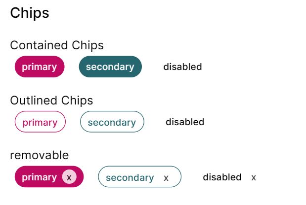
칩 만들었당
interface ChipProps extends Omit<React.HTMLAttributes<HTMLDivElement>, 'size'> {
  variant?: 'contained' | 'outlined';
  removable?: boolean;
  color?: 'primary' | 'secondary';
  disabled?: boolean;
  text?: string;
}
칩은 div를 다듬어서 만들었고 5가지 props를 주었다. removable을 제외하면 button과 크게 다른 것이 없어서 textfield보다 쉽게 만들었다.
const baseStyles = 'font-medium rounded  h-9 rounded-full px-3 pt-1 w-fit';

const disabledSyles = 'cursor-default pointer-events-none';

const colorStyles = {
  contained: {
    primary: 'text-white bg-primary-500',
    secondary: 'text-white bg-secondary-500',
  },
  outlined: {
    primary: 'text-primary-500 bg-white border border-primary-500',
    secondary: 'text-secondary-500 bg-white border border-secondary-500',
  },
};
w-fit로 내부 아이템들의 크기에 맞춰 chip 크기가 조정되도록 설정했다. 나머지는 앞전에 했던 것 들이라 딱히 설명할 것이 없다.
        {removable && (
          <div
            className="bg-white rounded-xl text-center
                  text-black w-6 opacity-80 cursor-pointer"
          >
            x
          </div>
        )}
removabled은 기본값을 false로 설정했고 true일 경우에만 칩 오른쪽에 생기게 했다. hidden을 작성해서 클릭하면 사라지는 기능도 구현했는데 그건 사용자가 따로 설정하는게 좋을 것 같다는 피드백을 받아서 삭제했다. 색을 따로 조정하는 것보다 간단할 것 같아서 opacity로 x 버튼의 투명도를 조절했다!
export function Chip({
  className,
  variant = 'contained',
  color = 'primary',
  disabled = false,
  removable = false,
  text,
  children,
  ...props
}: ChipProps) {
  const chipClass = disabled
    ? clsx(className, baseStyles, disabledSyles)
    : clsx(className, baseStyles, colorStyles[variant][color]);

  return (
    <div className={chipClass} {...props}>
      <div className="flex gap-2 pt-0.5">
        <div>{text && <div>{text}</div>}</div>
        {removable && (
          <div
            className="bg-white rounded-xl text-center
                  text-black w-6 opacity-80 cursor-pointer"
          >
            x
          </div>
        )}
      </div>
    </div>
  );
}
tailwind 문법 쓰다보니 너무 마음에 든다. 이미 css 문법에 익숙해진 상태여서 그런 것일 수도 있지만 margin left를 ml 이런식으로 쓰는게 너무 매력있다!!! chip은 수돌로그에서 관심사를 태그할 때 쓸 것 같다. 디자인 너무 맘에 든다. chip 다음은 Toast를 해야하는데 아이콘도 써야하고 contained와 outlined의 디자인이 많이 달라서 chip보다 어려울 것 같다. 그래두 공부가 많이 될 것 같아서 빨리 만들고싶다!!