들어가며
Flutter에서는 기본 위젯으로 여러가지 버튼 위젯들을 제공하고 있습니다. 가장 대표적으로 ElevatedButton 위젯이 존재합니다. 이를 이용해서도 충분히 훌륭한 UI를 제작할 수 있지만, 만약 그라데이션 색상의 버튼 등등 요구사항에 따라서 새롭게 버튼을 제작해야 되는 일들이 있습니다.
그래서, 이번에는 커스텀 그라데이션 버튼을 제작하는 방법에 대해서 알아보겠습니다.
InkWell, GestureDetector
우리는 InkWell 혹은 GestureDetector를 통해서 사용자의 제스쳐를 감지하여 여러가지 이벤트를 발생시킬 수 있습니다. 그 중, InkWell은 highlightColor를 통해서 터치 효과를 발생시킬 수 있습니다. 이를 이용하면 사용자에게 더욱 친숙하게 버튼을 표현할 수 있습니다.
기본 환경
우선, 버튼의 모습을 잡기 위해서 화면 중앙에 해당 위젯을 위치시키겠습니다. 가장 기본적인 형식으로 간단하게 표현하겠습니다.
class App extends StatelessWidget {
const App({super.key});
Widget build(BuildContext context) {
return Scaffold(
body: Center(
child: GradationButton(),
),
);
}
}Widget 기본 형태 잡기
우선, 우리는 이 위젯을 UI 중 여러 군데에서 다양하게 참조해서 사용할 수 있도록 새롭게 Widget 클래스로 나타내겠습니다.
import 'package:flutter/material.dart';
class GradationButton extends StatelessWidget {
const GradationButton({super.key});
Widget build(BuildContext context) {
return Container();
}
}이는 아직 컨테이너와 동일한 위젯입니다. 컨테이너는 다양하게 디자인 할 수 있는 decoration 속성이 있습니다. 이를 이용해서 버튼의 기본 모습을 나타내겠습니다.
import 'package:flutter/material.dart';
class GradationButton extends StatelessWidget {
const GradationButton({super.key});
Widget build(BuildContext context) {
return Container(
decoration: BoxDecoration(
gradient:
LinearGradient(
colors: [
Color(0xff24caea),
Color(0xff000395)
]
)
),
);
}
}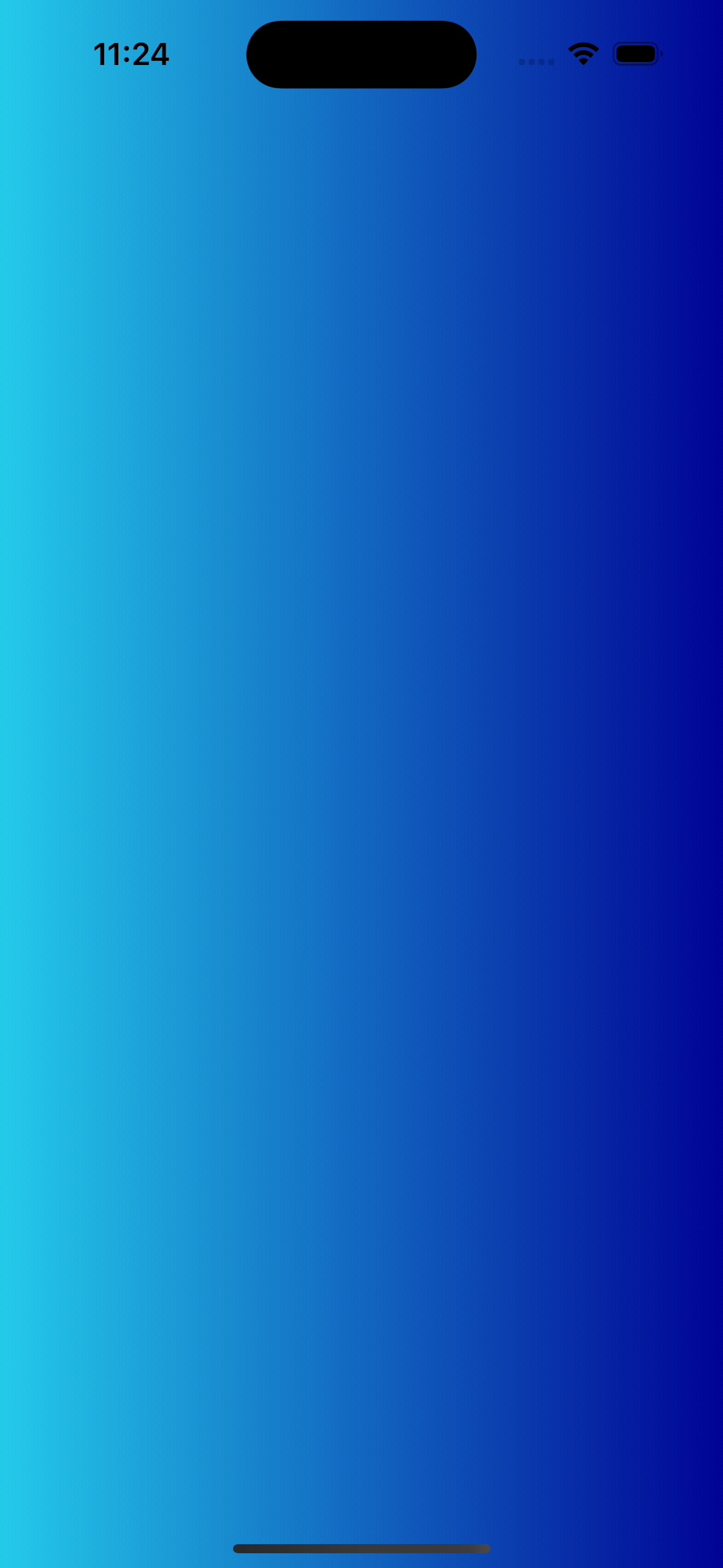
컨테이너 위젯은 기본적으로 위젯이 혼자 있을 경우 최대의 공간을 차지합니다. 일단, 버튼의 모습처럼 사이즈를 고정시키겠습니다. 추가적으로 임의의 label을 주겠습니다. 그리고 버튼처럼 BorderRadius도 주도록 하겠습니다.
import 'package:flutter/material.dart';
class GradationButton extends StatelessWidget {
const GradationButton({super.key});
Widget build(BuildContext context) {
return Container(
width: 300,
height: 50,
decoration: BoxDecoration(
borderRadius: BorderRadius.circular(12.0),
gradient:
LinearGradient(colors: [Color(0xff24caea), Color(0xff000395)])),
child: Center(
child: Text(
"버튼",
style: TextStyle(color: Colors.white, fontWeight: FontWeight.w600),
),
),
);
}
}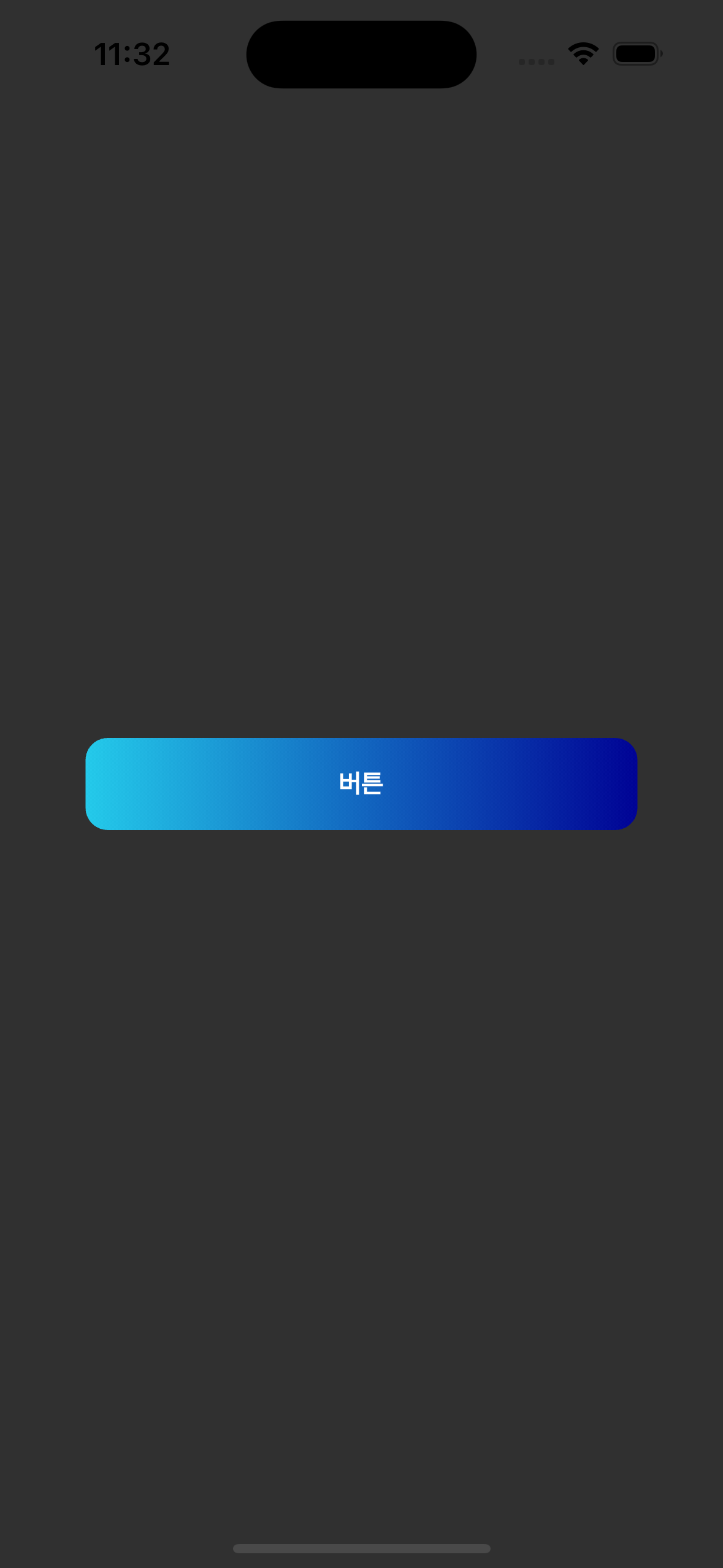
이제 모습이 꽤 버튼처럼 되었지만, 클릭이벤트와 클릭효과는 발생하지 않습니다. 이를 위해서 InkWell을 이용해서 클릭이벤트가 발생할 수 있도록 하겠습니다.
import 'package:flutter/material.dart';
class GradationButton extends StatelessWidget {
const GradationButton({super.key});
Widget build(BuildContext context) {
return InkWell(
onTap: () {},
highlightColor: Colors.white70,
child: Container(
width: 300,
height: 50,
decoration: BoxDecoration(
borderRadius: BorderRadius.circular(12.0),
gradient:
LinearGradient(colors: [Color(0xff24caea), Color(0xff000395)])),
child: Center(
child: Text(
"버튼",
style: TextStyle(color: Colors.white, fontWeight: FontWeight.w600),
),
),
),
);
}
}하지만, 이렇게 되면 하이라이트 효과는 컨테이너에 가려져서 보이지 않습니다. 그 대신, Ink 위젯을 이용하면 하이라이트 효과를 앞으로 가져올 수 있습니다. 그리고, InkWell 위젯 역시도 BorderRadius를 동일하게 주어야 클릭효과가 버튼과 일치하게 됩니다.
import 'package:flutter/material.dart';
class GradationButton extends StatelessWidget {
const GradationButton({super.key});
Widget build(BuildContext context) {
return InkWell(
onTap: () {},
highlightColor: Colors.white30,
borderRadius: BorderRadius.circular(12.0),
child: Ink(
width: 300,
height: 50,
decoration: BoxDecoration(
borderRadius: BorderRadius.circular(12.0),
gradient:
LinearGradient(colors: [Color(0xff24caea), Color(0xff000395)])),
child: Center(
child: Text(
"버튼",
style: TextStyle(color: Colors.white, fontWeight: FontWeight.w600),
),
),
),
);
}
}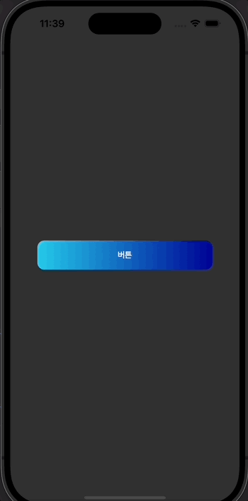
화질이 좋지 못해서 픽셀이 조금 깨졌지만, 실제로는 훌륭한 모습의 버튼입니다 ㅋㅋ. 이제 필요한 모든 외부 프로퍼티를 설정하면 버튼 제작 완료입니다.
완성 소스 코드
import 'package:flutter/material.dart';
class GradationButton extends StatelessWidget {
final void Function()? onPressed;
final double? width;
final double? height;
final Widget label;
const GradationButton(
{super.key,
this.onPressed,
this.width = 300,
this.height = 50,
required this.label});
Widget build(BuildContext context) {
return InkWell(
onTap: onPressed,
highlightColor: Colors.white30,
borderRadius: BorderRadius.circular(12.0),
child: Ink(
width: width,
height: height,
decoration: BoxDecoration(
borderRadius: BorderRadius.circular(12.0),
gradient:
LinearGradient(colors: [Color(0xff24caea), Color(0xff000395)])),
child: Center(child: label),
),
);
}
}