Flex 또는 Flexbox란?
Flex는 행과 열 형태로 레이아웃을 간편하게 배치 할 수 있는 메서드이다.
특별한 계산 없이도 쉽게 정렬을 할 수 있어서 웹 페이지 레이아웃을 만들때 사용하기 매우 편리하다.
Flexbox 구성
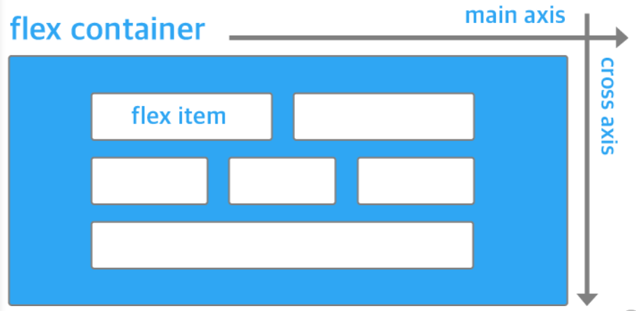
이미지 출처: https://d2.naver.com/helloworld/8540176
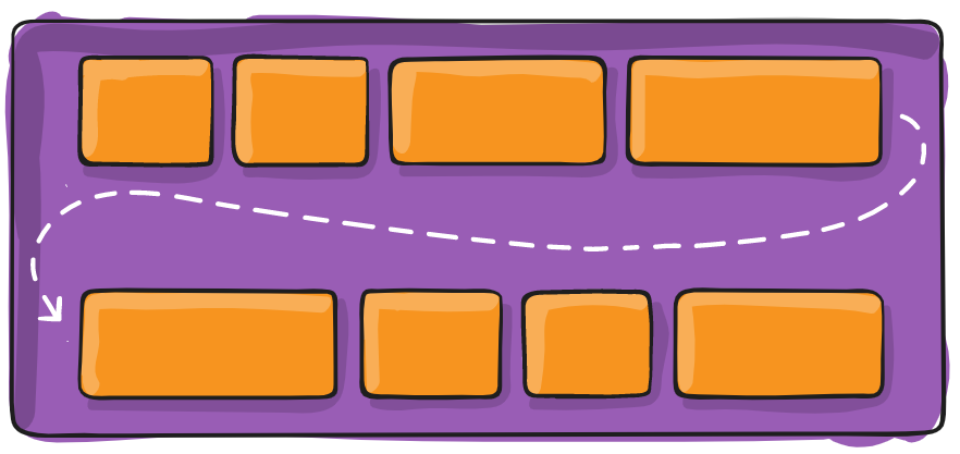
Flexbox의 구성은 flex container(부모 요소)와 Flex Item(자식 요소)이 있다. 또한 컨테이너에 적용하는 속성 그리고 아이템에 적용하는 속성으로 나눠어진다. Flex container는 전체 공간이라고 생각하고 안에 있는 items를 row 또는 column 레이아웃으로 정렬할 수 있다.
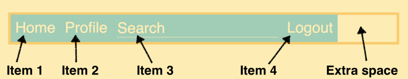
Example of Flexbox on navigation bar
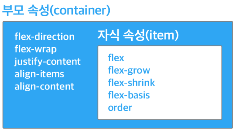
Flexbox 구성 속성 그리고 사용법
출처: https://www.freecodecamp.org/news/how-to-create-a-fully-responsive-navbar-with-flexbox-a4435d175dd3/
Flex로 사용하고싶은 요소에 display flex를 선언하여 시작한다. flex의 item들이 가로방향으로 배치되고 width는 item의 크기만큼 자동으로 설정이 된다. width와 height는 따로 추가하여 수정이 가능하다
----------------Example----------------
.container {
	display: flex;
}
모든 이미지 출처: https://css-tricks.com
flex container 부보 속성
- flex direction - flex container 안에 있는 items 방향을 정한다
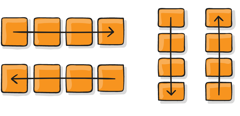
.container {
	display: flex;
    flex-direction : row;
    flex-direction: row-reverse;
    flex-direction: column;
    flex-direction: column-reverse
}- flex wrap - flex container width을 벗어날때 다음 줄로 넘어갈지 또는 다 한줄로 정렬할지 정하는 커멘드.
.container {
	display: flex;
    flex-wrap: wrap;
    flex-wrap: no-wrap; //default
    flex-wrap: wrap-reverse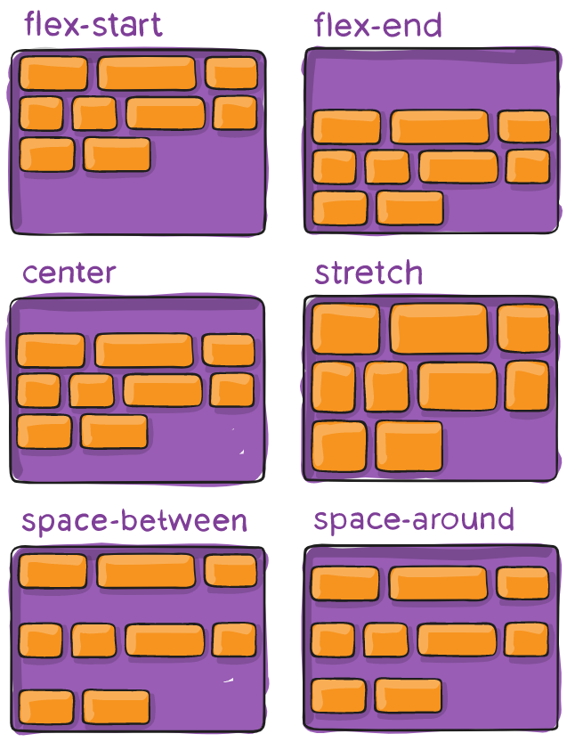
}- justify-content - flex-direction 설정에 따라 item을 정렬하는 방법
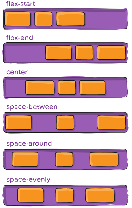
.container {
	display: flex;
   justify-content: flex-start; // default
   justify-content: flex-end;
   justify-content: center;
   justify-content: space-between;
   justify-content: space-around;
   justify-content: space-evenly;
}- align-items - flex-direction으로 정해진 방향 기준으로 수직으로 items를 정렬하는 방법
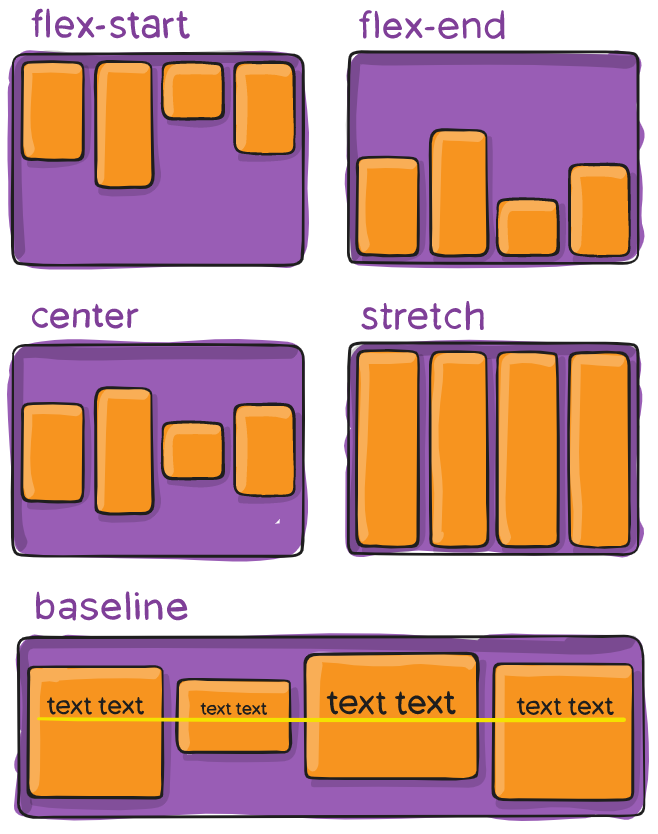
	display: flex;
    align-items: stretch //default
    align-items: flex-start;
    align-items: flex-end
    align-items: center
align-items: baseline -
align-content - 정해진 방향 기준으로 수직으로 여러 줄인 item을 정렬하는 방법
-
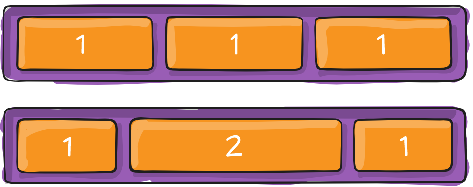
flex-grow
flex grow는 flex container 안에 있는 item의 크기를 조정하며 컨테이너 공간 크기의 따라 아이템이 알아서 조정됨. 만약 flex-grow: 1로 되어 있으면, container 안에 있는 모든 아이템의 크기는 똑같이 분배될 것이다. 하지만 특징 item을 선택해서 flex-grow속성을 설정하면, 그 아이템만 크기가 조정이 된다.
-
flex-shrink
flex item이 얼마나 작은 공간을 차지하고 싶은지 정해주는 속성. flex-grow의 반대 개념이라고 생각하면 된다.
.container:nth-child(2){
	flex-shrink: 2;
}
flex 더 쉽게 이해하고 연습할 수 있는 미니 게임 공유
https://flexboxfroggy.com/
