21년 11월 05일
📝 CSS
📎 Box Model
box-sizing
box-sizing속성은 박스의 크기에 대한 기준을 정한다.box-sizing: content-box일 때,
.box {
  box-sizing: content-box;
  width: 300px;
  height: 200px;
  padding: 20px;
  border: 5px solid black;
  margin: 15px;
}
box-sizing: border-box일 때,
.box {
  box-sizing: border-box
  /* border까지 width에 포함 */
  width: 300px;
  height: 200px;
  padding: 20px;
  border: 5px solid black;
  margin: 15px;
}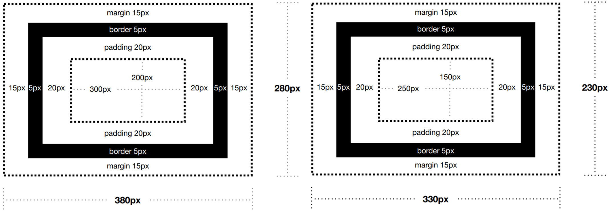
[출처: 제주코딩베이스캠프 - content-box, border-box 비교]
display
-
display속성은 박스의 성질을 지정하여 요소를 어떻게 보여줄지 결정inline 줄바꿈이 일어나지 않는다.
width,heigth,margin-top,margin-bottom값 지정 불가block 줄바꿈이 일어난다.
width,heigth,margin,padding등 모든 값을 지정 가능inline-block inline 처럼 한 줄에 여러 요소가 존재할 수 있고,
block 처럼width,heigth,margin,padding등 모든 값을 지정 가능contents 선택한 요소의 내용 앞이나 뒤에 콘텐츠를 붙인다. flex 레이아웃을 다룰 때 하나의 행 또는 열을 다룸
(1차원 레이아웃)grid 2차원 레이아웃을 설정하는데 사용

[출처: 위니브]
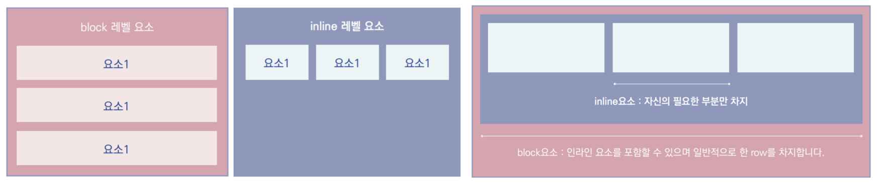
[출처: 튜토리얼로 배우는 HTML & CSS]
<img>태그는 inline 요소인데 어떻게width값을 지정할 수 있을까?
=><img>는 예외적으로width값을 지정할 수 있다.
- 예)
<div>안녕하세요</div>
위의 예시에서 '안녕하세요'는 요소가 아니다.
=> 브라우저는 요소가 아닌 글자 하나하나를inline요소로 인식한다.
- 레이아웃을 짤 때 수평정렬은 매우 중요하다. 이 때
display: inline-block속성을 이용하면 수평정렬을 할 수 있으나 이 방법은 사용하지 않는 것이 좋다.
=> 각 요소 사이의 빈 칸/줄 바꿈이 스페이스로 인식되어 작은 여백을 가지게 된다.- 해결 방법
- 빈 칸 없이 한 줄로 코드 작성
<div></div><div></div>- 부모 요소에
font-siz: 0적용
=> 이 방법은 해당 요소에 다시font-size를 적용해야 한다.
📎 Position
- Position? 웹 페이지에서 HTML 태그나 id, class 박스 등의 위치를 지정해주는 속성. 페이지의 레이아웃을 결정할 수 있다.
position: static
- 기본값, html에 쓴 태그 순으로 위치가 지정됨 = normal flow에 따라 배치
top,bottom,left,right,z-index가 적용되지 않는다.- 굳이 기입할 필요는 없지만, 부모 객체에서 다른
position속성 값이 지정된 경우, 이를 무시하기 위해 사용할 수 있다.
position: relative
- 상대적인 속성을 가짐
=> 무엇에 상대적인가?static, 즉 원래 자신이 있어야 하는 위치에 상대적 - normal flow에 따라 위치한 다음,
top,bottom,left,right값에 따라 배치
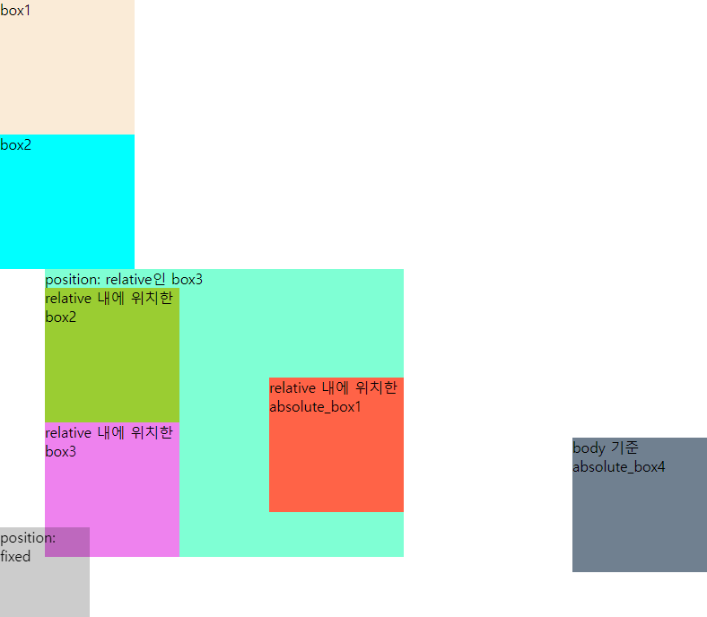
position: absolute
- normal flow를 벗어나는 속성
position:relative, absolute, fixed속성을 가진 가장 가까운 부모 요소를 기준으로,top,bottom,left,right값에 따라 배치- 부모 요소에
position값이 지정되지 않은 경우,body를 기준으로 배치
position: absolute를 사용하는 이유?
=> 웹 접근성의 초점 이동(tab키로 이동) : 스크린리더 이용자와 키보드 사용자를 위해 콘텐츠의 순서가 논리적으로 제공되어 웹 페이지를 탐색하는데 어려움이 없어야 한다.예) 초점이동이 아이디 입력 → 비밀번호 입력 → 로그인 버튼 → 아이디 저장 순서라면 '로그인 버튼'을 먼저 클릭하기 때문에 '아이디 저장을 못할 가능성이 높다.
그러므로, 아이디, 비밀번호 입력 → 아이디 저장 → 로그인 버튼 순서인 논리적으로 초점이 이동해야 한다.
=> 논리적인 순서로 마크업 한 후position을 이용해 요소를 보기 좋게 배치하여 스크린리더 이용자나 비이용자 모두 웹 페이지를 탐색하는데 어려움이 없어야 한다.
position: fixed
- normal flow를 벗어나는 속성
- 현재 사용자가 보고있는 viewport를 기준으로 마치 화면에 붙은 것처럼 그 자리에 위치
- 스크롤을 올리거나 내려도
position: fixed가 지정된 요소는 고정되어 움직이지 않음 => 팝업창, 메뉴, top 버튼 등
<!DOCTYPE html>
<html>
  <head>
    <meta charset="utf-8">
    <meta name="viewport" content="width=device-width">
    <title>replit</title>
    <link href="style.css" rel="stylesheet" type="text/css" />
  </head>
  <body>
    <div class="box box1">box1</div>
    <div class="box box2">box2</div>
    <div class="box box3 relative_box">
      position: relative인 box3
      <div class="box absolte_box">relative 내에 위치한 absolute_box1</div>
      <div class="box">relative 내에 위치한 box2</div>
      <div class="box">relative 내에 위치한 box3</div>
    </div>
    <div class="box box4 absolte_box">body 기준 absolute_box4</div>

    <div class="fixed_box">position: fixed</div>
    <script src="script.js"></script>
  </body>
</html>
body {
margin: 0;
padding: 0;
/* height: 1500px; */
}
.box {
width: 150px;
height:150px;
background: rgba(0, 0, 0, 0.5);
}
.relative_box {
position: relative;
left: 50px;
width: 400px;
height: auto;
background: tomato;
}
.absolte_box {
position: absolute;
right: 0;
bottom: 50px;
}
.box1 {
background-color: antiquewhite;
}
.box2 {
background-color: aqua;
}
.box3 {
background-color: aquamarine;
}
.box4 {
background-color:slategrey;
}
.relative_box .box:nth-child(1) {
background-color: tomato;
}
.relative_box .box:nth-child(2) {
background-color: yellowgreen;
}
.relative_box .box:nth-child(3) {
background-color: violet;
}
.fixed_box {
position: fixed;
bottom: 0;
left: 0;
width: 100px;
height: 100px;
background-color: rgba(0, 0, 0, 0.2);
}position: sticky
- normal flow에 따라 위치하며, 스크롤이 되는 가장 가까운 블록 레벨의 상위 요소를 기준으로 배치
- 자신의 위치 임계점(offset)을 넘을 때 붙음
<!DOCTYPE html>
<html lang="ko">
  <head>
    <meta charset="UTF-8" />
    <meta http-equiv="X-UA-Compatible" content="IE=edge" />
    <meta name="viewport" content="width=device-width, initial-scale=1.0" />
    <title>position - sticky</title>
    <style>
      section {
        height: 1000px;
        border: 3px solid #000;
      }
      h2 {
        position: sticky;
        position: -webkit-sticky;
        top: 10px;
        background-color: cornflowerblue;
      }
    </style>
  </head>
  <body>
    <h1>sticky test</h1>
    <section>
      <h2>1. 오늘의 아침 메뉴</h2>
      <ul>
        <li>
          Lorem ipsum dolor sit, amet consectetur adipisicing elit. Soluta
          exercitationem odit similique non maiores eveniet quidem reiciendis
          aperiam quas fugiat? Minus ducimus culpa inventore sunt pariatur
          mollitia dolorum nemo reiciendis, fuga alias voluptatum facere modi
          officia debitis soluta error, odio nobis consequuntur. Atque placeat
          nulla sed sequi officiis architecto doloribus.
        </li>
      </ul>
    </section>
    <section>
      <h2>1. 오늘의 점심 메뉴</h2>
      <ul>
        <li>
          Lorem ipsum dolor sit, amet consectetur adipisicing elit. Soluta
          exercitationem odit similique non maiores eveniet quidem reiciendis
          aperiam quas fugiat? Minus ducimus culpa inventore sunt pariatur
          mollitia dolorum nemo reiciendis, fuga alias voluptatum facere modi
          officia debitis soluta error, odio nobis consequuntur. Atque placeat
          nulla sed sequi officiis architecto doloribus.
        </li>
        <li>
          Lorem ipsum dolor sit, amet consectetur adipisicing elit. Soluta
          exercitationem odit similique non maiores eveniet quidem reiciendis
          aperiam quas fugiat? Minus ducimus culpa inventore sunt pariatur
          mollitia dolorum nemo reiciendis, fuga alias voluptatum facere modi
          officia debitis soluta error, odio nobis consequuntur. Atque placeat
          nulla sed sequi officiis architecto doloribus.
        </li>
        <li>
          Lorem ipsum dolor sit, amet consectetur adipisicing elit. Soluta
          exercitationem odit similique non maiores eveniet quidem reiciendis
          aperiam quas fugiat? Minus ducimus culpa inventore sunt pariatur
          mollitia dolorum nemo reiciendis, fuga alias voluptatum facere modi
          officia debitis soluta error, odio nobis consequuntur. Atque placeat
          nulla sed sequi officiis architecto doloribus.
        </li>
      </ul>
    </section>
    <section>
      <h2>1. 오늘의 저녁 메뉴</h2>
      <ul>
        <li>
          Lorem ipsum dolor sit, amet consectetur adipisicing elit. Soluta
          exercitationem odit similique non maiores eveniet quidem reiciendis
          aperiam quas fugiat? Minus ducimus culpa inventore sunt pariatur
          mollitia dolorum nemo reiciendis, fuga alias voluptatum facere modi
          officia debitis soluta error, odio nobis consequuntur. Atque placeat
          nulla sed sequi officiis architecto doloribus.
        </li>
        <li>
          Lorem ipsum dolor sit, amet consectetur adipisicing elit. Soluta
          exercitationem odit similique non maiores eveniet quidem reiciendis
          aperiam quas fugiat? Minus ducimus culpa inventore sunt pariatur
          mollitia dolorum nemo reiciendis, fuga alias voluptatum facere modi
          officia debitis soluta error, odio nobis consequuntur. Atque placeat
          nulla sed sequi officiis architecto doloribus.
        </li>
        <li>
          Lorem ipsum dolor sit, amet consectetur adipisicing elit. Soluta
          exercitationem odit similique non maiores eveniet quidem reiciendis
          aperiam quas fugiat? Minus ducimus culpa inventore sunt pariatur
          mollitia dolorum nemo reiciendis, fuga alias voluptatum facere modi
          officia debitis soluta error, odio nobis consequuntur. Atque placeat
          nulla sed sequi officiis architecto doloribus.
        </li>
      </ul>
    </section>
  </body>
</html>
z-index
position속성을 가진 요소에 대해 z축 상의 위치z-index가 지정된 경우, 높은 번호를 가진 레이어는 낮은 번호를 가진 레이어 위에 위치- z-index 적용 / z-index가 없는 경우의 쌓임
📎 Float
float 의미
- '띄우다'라는 뜻을 가지며, float 정렬은 다양한 객체를 띄워서 장렬을 하는 속성

float의 기본 개념
- 원래
float은 아래 사진처럼 그림을 따라 흐르는 텍스트 레이아웃을 웹에서 구현하기 위해 탄생한 속성

- 하지만 왼쪽/오른쪽으로 정렬되는 특성 덕분에 현재는 블록 속성을 가진 객체를 정렬하는 가장 기본적인 방법으로 사용되고 있다.
float: left/float: right의 성질은 블록 박스에 해당하는 만큼의 공간만 차지하고 나머지 내용은 박스 오른쪽/왼쪽에 위치하며 위에서 아래의 방향인 흐름을 가짐

[출처: Web Animation 1부 css Animation - <img>에 float 적용]
float 속성의 문제점
- 자식 요소들이 모두
float속성을 가질 때 부모 요소가 자식 요소들을 인지하지 못한다.
=> 부모 요소가height값을 잃는다.

[출처: Web Animation 1부 css Animation - float 적용 전]

[출처: Web Animation 1부 css Animation - float 적용 후]
- 부모 요소가
float된 자식 요소를 인식할 수 있게 하는 방법 =float해제- 부모 요소에
overflow속성 추가
=>overflow: hidden/overflow: scroll등의 필요한 속성을 추가 - 부모 요소에
display: inline-block속성 추가 - 부모 요소의 높이 값을 직접 지정
=> 자식 요소에 지정된 값들이 변경될 수 있으므로 적절한 방법은 아니다. clear속성 적용
=>float이 사용된 요소의 바로 다음 형제 요소에float정렬의 방향에 따라clear속성을 적용- clear-fix : 부모 요소에
::after가상요소를 이용하여clear속성 적용
=> 보통 clear-fix 클래스를 만들어 부모 요소에 적용하여 사용
=>display: block속성이 없으면 적용되지 않는다.
- 부모 요소에
.clear::after {
  content: "";
  display: block;
  clear: both;
}
- 가상 요소 만들기
::after: 가장 마지막 자식 요소가 된다.::before: 가장 첫 번째 자식 요소가 된다.- 가상 요소를 이용하는 이유?
- 의미없는 html을 만들지 않고 필요한 기능을 사용하기 위해
=> 필요없는 html은 최대한 자제해야 한다.
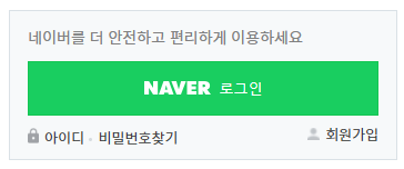
float 실습 - 로그인 레이아웃 만들기
<!DOCTYPE html>
<html lang="ko">
  <head>
    <meta charset="UTF-8" />
    <meta http-equiv="X-UA-Compatible" content="IE=edge" />
    <meta name="viewport" content="width=device-width, initial-scale=1.0" />
    <title>Login Layout</title>
    <style>
      @import url("https://fonts.googleapis.com/css2?family=Noto+Sans+KR&display=swap");

      @import "../reset.css";

      * {
        box-sizing: border-box;
      }

      body {
        color: #404040;
        font-family: "Noto Sans KR", sans-serif;
      }

      .login-container {
        width: 350px;
        height: 135px;
        margin: 20px;
        padding: 16px;
        border: 1px solid #dae1e6;
        background-color: #f7f9fa;
      }

      .login-container p {
        color: #808080;
        font-size: 14px;
      }

      .login-btn {
        width: 100%;
        margin: 15px 0 10px;
        padding: 15px 0;
        border: 1px solid #15c654;
        background-color: #19ce60;
        color: #fff;
        font-size: 13px;
      }

      .login-btn::before {
        content: "";
        display: inline-block;
        width: 60px;
        height: 12px;
        margin-right: 8px;
        background-image: url(images/title.png);
        background-size: 60px;
      }

      a {
        color: inherit;
        font-size: 13px;
        text-decoration: none;
      }

      a:hover {
        text-decoration: underline;
      }

      .find-id::before {
        content: "";
        display: inline-block;
        width: 10px;
        height: 14px;
        margin-right: 5px;
        background-image: url(images/lock.png);
        background-size: 10px;
      }

      .find-pw::before {
        content: "";
        display: inline-block;
        width: 3px;
        height: 3px;
        margin-right: 5px;
        border-radius: 50%;
        background-color: #d7dce0;
        vertical-align: middle;
      }

      .sign-up::before {
        content: "";
        display: inline-block;
        width: 11px;
        height: 11px;
        margin-right: 5px;
        background-image: url(images/user.png);
        background-size: 11px;
      }

      .sign-up {
        float: right;
      }

      footer::after {
        content: "";
        display: block;
        clear: both;
      }
    </style>
  </head>
  <body>
    <article class="login-container">
      <p>네이버를 더 안전하고 편리하게 이용하세요</p>
      <!-- button 보다 a로 작성하는 것이 적절 -->
      <button type="button" class="login-btn">로그인</button>
      <footer>
        <a href="#" class="find-id">아이디</a>
        <a href="#" class="find-pw">비밀번호찾기</a>
        <a href="#" class="sign-up">회원가입</a>
      </footer>
    </article>
  </body>
</html>
<img>에alt값이 필요하지 않아도alt=""를 작성하는 이유
=> 스크린리더가alt값이 비어있는 경우 설명이 필요없는 이미지로 인식하자민alt속성 자체가 없으면src을 글자 하나하나 읽는다.
vertical-align속성
=>inline요소에만 적용이 가능
=>vertical-align: middle은 라인의 중심이 아니다. 참고 링크
📎 Flex
- flex? 콘텐츠를 정렬하거나 공간을 나눌 수 있는 CSS 속성의 집합
기본 속성 정보
- 부모 요소인
div.container를 통해 자식요소인div.item을 컨트롤
이때, 부모 요소를flex-container, 영향을 받는 자식 요소를flex-item이라고 부른다.
=>flex는 자신의 직계 자식에게만 영향을 준다.
  <div class="container">
    <div class="item">box1</div>
    <div class="item">box2</div>
    <div class="item">box3</div>
</div> - 블록 레벨 요소의 성질을 가지는 새로운 display 속성
  .container {
	display: flex;
	/* display: inline-flex; */
  }
flex-item은 기본적으로 Axis를 기준으로 정렬
- 기본 방향 : 왼쪽 → 오른쪽

- axis와 짝을 이루는 cross-axis가 존재
=> axis가row일 때, cross-axis는colum
=> axis가colum일 때, cross-axis는row
flex-direction
- 정렬 방향을 결정
 |  |
flex-direction: row | flex-direction: row-reverse |
 |  |
flex-direction: column | flex-direction: column-reverse |
justify-content
- 메인축 뱡향 정렬
  .container {
    display: flex;
    /* justify-content: flex-start; */
    /* justify-content: flex-end; */
    /* justify-content: center; */
    /* justify-content: space-between; */
    /* justify-content: space-around; */
    /* justify-content: space-evenly; */
}| flex-start | 기본값, 아이템을 시작점을 정렬 |
| flex-end | 아이템을 끝점을 정렬 |
| center | 아이템을 가운데로 정렬 |
| space-between | 아이템들의 “사이(between)”에 균일한 간격 컨테이너 양 끝에 여백 없이 정렬 |
| space-around | 아이템들의 “둘레(around)”에 균일한 간격 아이템의 양쪽 여백을 포함하여 정렬 |
| space-evenly | 아이템들의 사이와 컨테이너 양 끝에 균일한 간격 |
🏁 제 1회 자신만의 캐릭터 그리기 경진대회 결과
마무리
- float, position을 더 깊게 이해할 수 있었다. 어물쩡 알고 있던 부분들이 명확해진다.
한 번 공부한 것은 공부한 것이 아니다.라는 말이 와닿았다. 그리고 같은 내용이더라도 여러 선생님의 강의를 통해 익히면 이해도가 높아진다는 부분도 공감이 되었다.- 동네 사람들! 저 캐릭터 그리기 상장 받았습니다아아!!! (쩌렁쩌렁) 열심히 하길 잘했다. 히히😆
- 처음 작성했던 TIL을 다시 봤다. 그때는 나름 나쁘지 않게 작성했다고 생각했는데 지금보니 내용이 부실해보인다. 틈틈히 수정해야겠다.
