자기 자신이 중앙으로 갈 경우
-
position absolute , top 50%, left 50%, transform translate(-50%, -50%)
-
블록요소는 자기 자신 margin auto 수평정렬
부모요소가 자식요소를 중앙으로 보낼 경우
옮길려는 부모에다가 속성추가해야 함
(부모)
flex
justify content (수평 중앙)
align-items (수직 중앙)
(부모)
grid
justify content (수평 중앙)
align-items (수직 중앙)
(부모)
grid
place-items: center
수평 중앙 정렬할 때 블록요소와 인라인, 인라인블록과 차이가 있다.
인라인 블록, 인라인은 부모요소에 text-align:center가 있다.
블록요소는 자기 자신 margin auto 수평정렬
수직 중앙 정렬하는 경우
vertical-align middle ,transform translate
인접해 있는 요소와 수직 중앙을 맞출 경우
vertical-align middle 그리고 transform translateY로 세세하게 맞춘다.
요소가 아닌 텍스트 자체를 중앙
display flex
justify-content: center
align-items: center
img 마진
img 마진이 생긴다.
(div가 height가 없다고 가정하에)
div 안에 img 넣을 경우 마진 생긴다.
이럴 때 img에 block을 주면 된다.
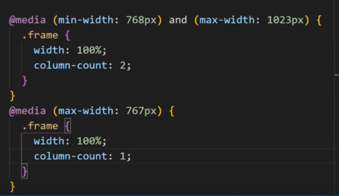
grid column count
테블릿, PC, 모바일에 맞게 column count 다르게
텍스트 넘치는 거
text-overflow : ellipsis ... 표시
white-space : nowrap 너비에 넘칠 경우 줄 안바꿈
overflow hidden 사용
텍스트 여러 줄
webkit 사용
aspect-ratio

개인 학습 정리 블로그