- 안드로이드 폰트에 대하여
기본적으로 폰트를 적용하려면 밑에 그림과 같이 하면된다.
font 태그의 속성중 가장많이 쓰는데 3가지가 있다.
<font
        android:font="@font/nanum_square_acr"
        android:fontWeight="300"
        android:fontStyle="normal"
        />
font: 말그대로 사용할 폰트를 가져온다
fontWeight : 내가 가져온 폰트의 weigth를 설정한다.
이 fontWeight 개발자가 설정을 해주는것이라고 생각하면된다.
fontStyle : nomarl, italic 이 있는데 italic 체는 italic을 지원하는 폰트만 적용가능하다. italic을 지원하지 않는 폰트에 italic 을 설정해도 당연히 바뀌지 않는다.
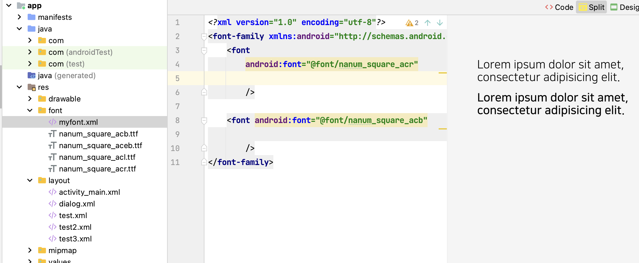
<?xml version="1.0" encoding="utf-8"?>
<font-family xmlns:android="http://schemas.android.com/apk/res/android">
    <font
        android:font="@font/nanum_square_acr"

        />

    <font android:font="@font/nanum_square_acb"

        />
</font-family>
//acr 은 나눔스퀘어 regular
//acb 는 나눔스퀘어 bold
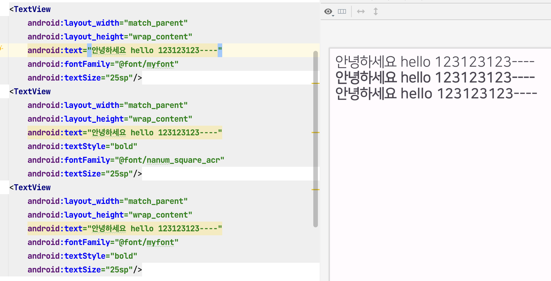
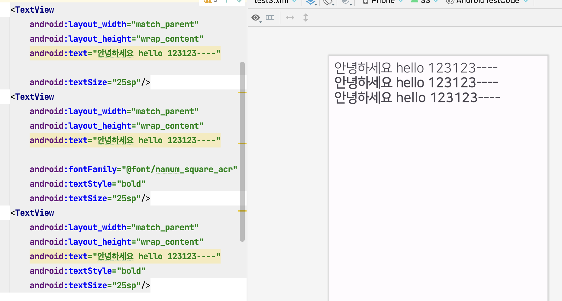
안드로이드는 ttf의 메타데이터를 분석해서 textStyle="bold" 일경우 가장 비슷한 글시체를 가져온다
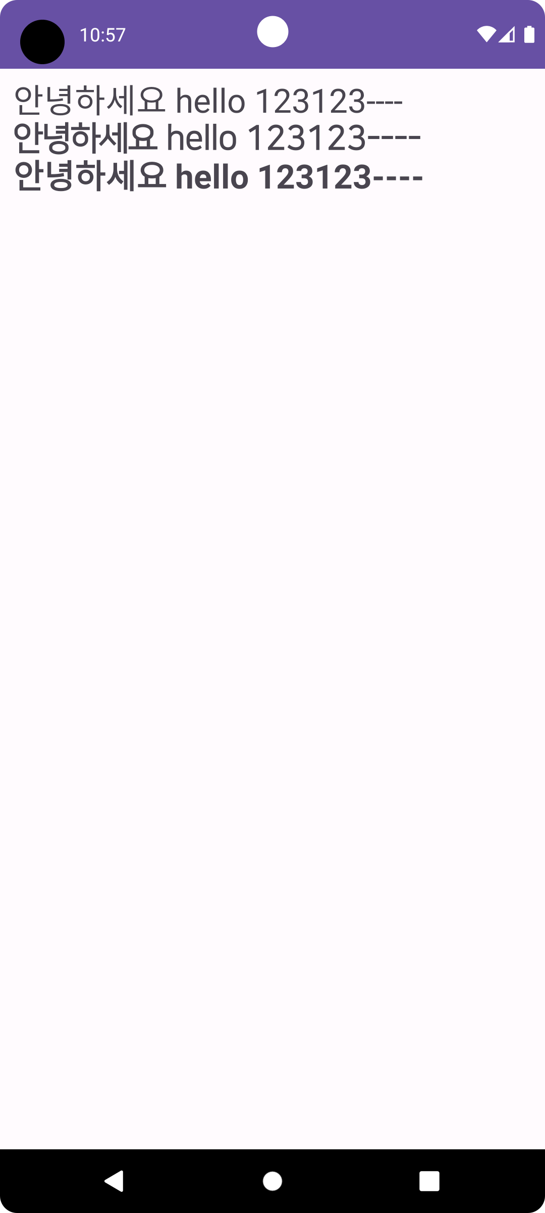
밑의 예시와 같이 1번째는 acr, 2번째는 acr bold , 3번째는 acb 이다.
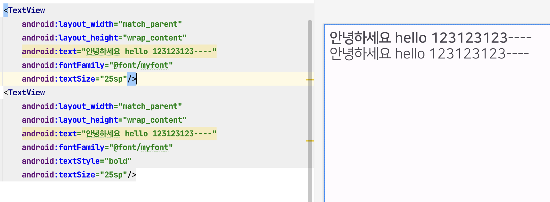
만약 개발자가 myfont에서 regular를 bold체로 주고 싶다면 이렇게 하면된다
<?xml version="1.0" encoding="utf-8"?>
<font-family xmlns:android="http://schemas.android.com/apk/res/android">
    <font
        android:font="@font/nanum_square_acr"
        android:fontWeight="700"
        />

    <font android:font="@font/nanum_square_acb"

        />
</font-family>
1번째는 bold(개발자가 fontweight를 regular를 700으로 줘서 기본은 acb가 된다)
2번째는 acr(bold가 regular로 설정되어 있어서)
fontWeight 수치별 의미
100: 매우 얇은 글꼴 (Ultra Thin)
200: 매우 얇은 글꼴 (Extra Light / Ultra Light)
300: 얇은 글꼴 (Light)
400: 일반 글꼴 (Normal / Regular)
500: 중간 두께의 글꼴 (Medium)
600: 약간 굵은 글꼴 (Semi Bold / Demi Bold)
700: 굵은 글꼴 (Bold)
800: 매우 굵은 글꼴 (Extra Bold / Ultra Bold)
900: 최대 두께의 글꼴 (Black / Heavy)
- 전역설정
manifest에서 기본 테마로 설정되어 있는 곳으로가서 설정하기
   <application
        android:allowBackup="true"
        android:dataExtractionRules="@xml/data_extraction_rules"
        android:fullBackupContent="@xml/backup_rules"
        android:icon="@mipmap/ic_launcher"
        android:label="@string/app_name"
        android:roundIcon="@mipmap/ic_launcher_round"
        android:supportsRtl="true"
        android:theme="@style/Theme.AndroidTestCode" <-- 여기
        tools:targetApi="31">
        <activity
            android:name=".MainActivity"
            android:exported="true">
            <intent-filter>
                <action android:name="android.intent.action.MAIN" />

                <category android:name="android.intent.category.LAUNCHER" />
            </intent-filter>
        </activity>
</application> <style name="Theme.AndroidTestCode" parent="Base.Theme.AndroidTestCode">
<item name="android:fontFamily">@font/myfont</item>
<item name="android:includeFontPadding">false</item> // 폰트중에 padding 효과 있는것들 없애기
</style>- regular 볼드 처리한것이 핸드폰 마다 차이가 있을 수 있어서 볼드체를 사용하는것을 권장
- Design
- 에뮬레이터 Pixel 6
- 갤럭시 A53
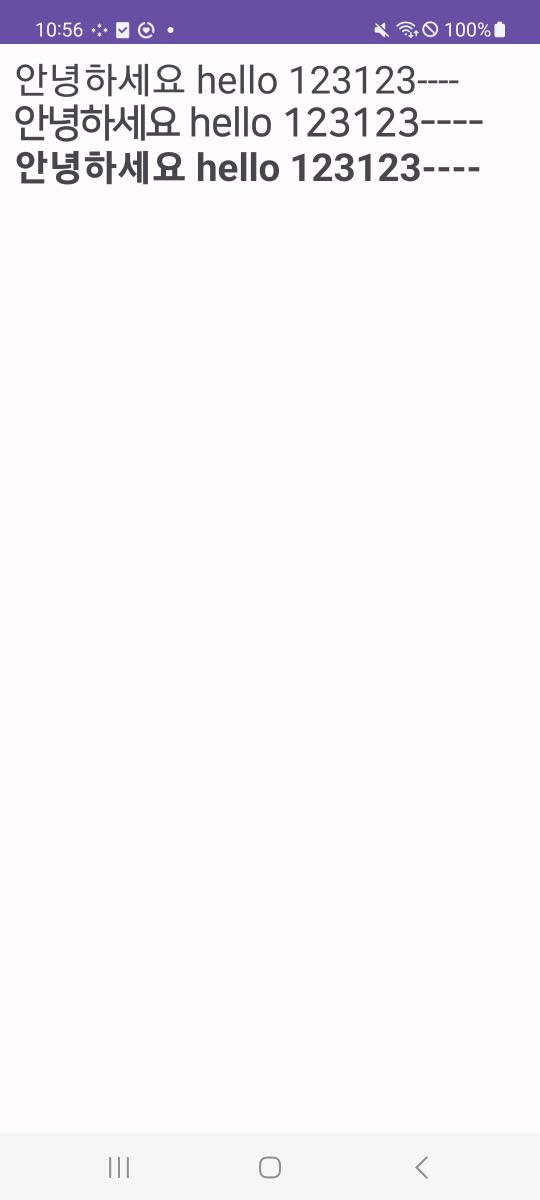
세 경우가 다 다르게 보임. 개발할때 폰트는 layout 디자인을 믿을 수 없을듯
2번째인 regular의 볼드가 기기별로 차이가 있는것을 알 수 있음. 반면 볼드체는 일정하게 보인다
