본 글은 Android developers' Jetpack Compose 공식문서를 참고하여 작성되었습니다.

Compose를 기존 프로젝트에 적용할 수는 없을까
만약 이미 View xml을 활용해서 프로젝트를 진행중에 있다면 Compose를 도입할 수 없는것일까요?
Jetpack Compose는 뷰 상호운영성을 고려하여 설계되었으며 뷰 시스템과 공존할 수 있다고 개발진들이 강조하고 있습니다. 즉 이미 View 시스템으로 구축한 서비스를 Compose로 점진적으로 Migration할 수 있다는 뜻이며 만약 Compose가 익숙하지 않다면 View와 Compose를 함께 사용하여 프로젝트를 구성할 수 도 있다는 뜻입니다.
예를들면 기존의 기능은 View 시스템을 유지하는 대신 새로생기는 기능은 Compose로 개발할 수 있겠습니다.
또한 전체화면을 Compose로 빌드하지 않아도 한 화면 내에 View와 Compose가 공존하는 것도 가능합니다.
이번에는 View xml로 작성되어 있는 특정 화면을 Compose로 이전하며 어떻게 두 가지 시스템이 공존할 수 있는지 알아보도록 하겠습니다.
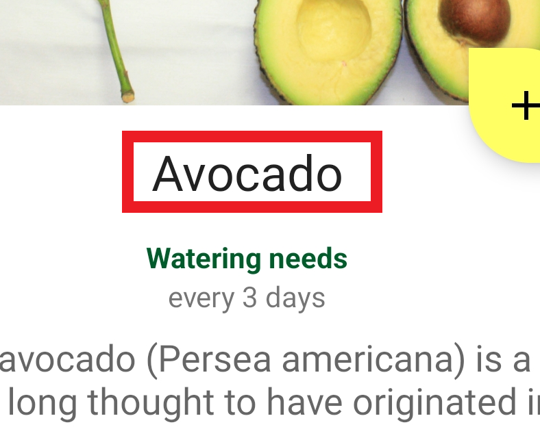
초기상태 셋팅
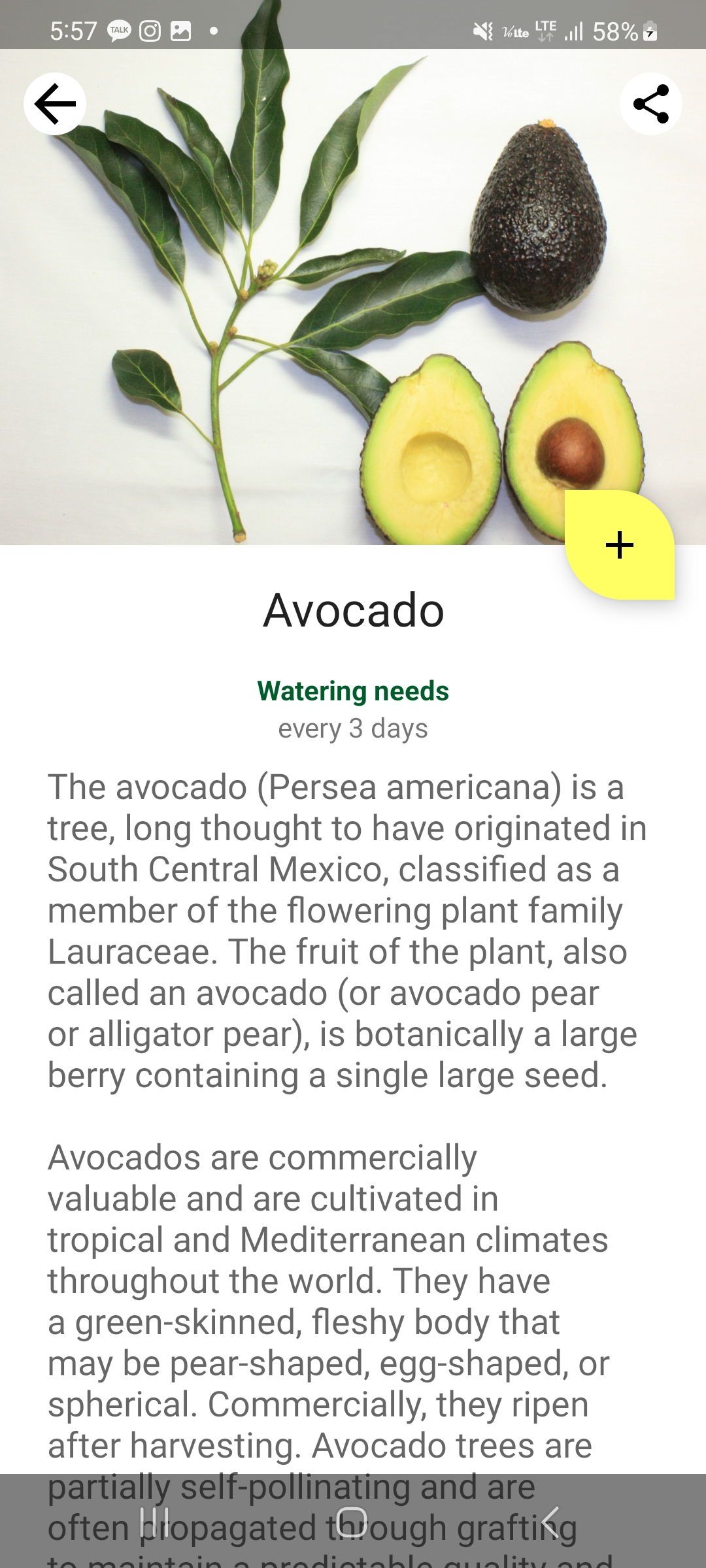
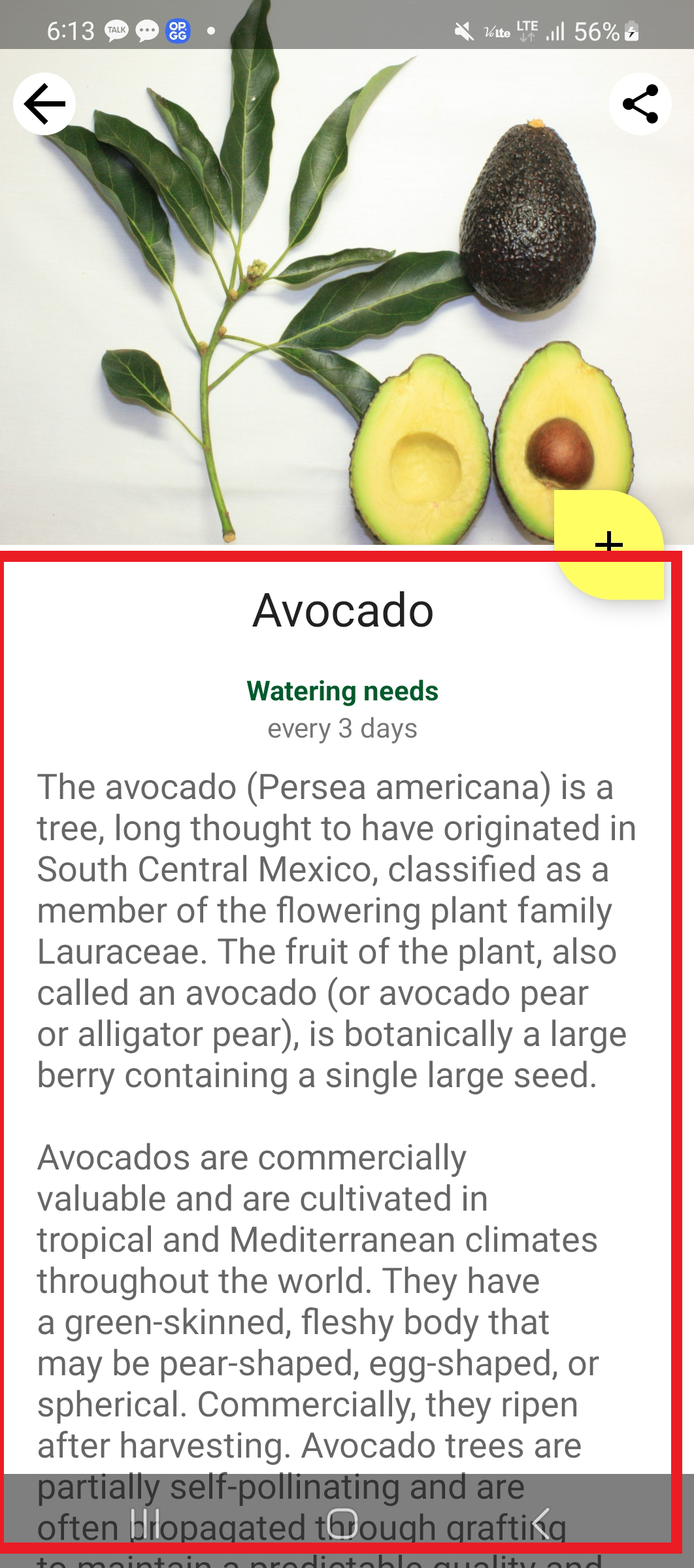
위와 같은 화면이 xml파일로 작성되어 있습니다. 이를 Compose로 점진적으로 migration하면서 어떻게 View와 Compose 시스템이 한 화면에 공존하게 되는지 알아보겠습니다.
먼저 프로젝트 안에서 Compose를 사용하려면 모듈 단위의 gradle 파일에
buildFeatures {
        //...
        compose true
    }

dependencies {
	def composeBom = platform('androidx.compose:compose-bom:2023.08.00')
    implementation(composeBom)
    androidTestImplementation(composeBom)

    implementation "androidx.compose.runtime:runtime"
    implementation "androidx.compose.ui:ui"
    implementation "androidx.compose.foundation:foundation"
    implementation "androidx.compose.foundation:foundation-layout"
    implementation "androidx.compose.material:material"
    implementation "androidx.compose.runtime:runtime-livedata"
    implementation "androidx.compose.ui:ui-tooling-preview"
    debugImplementation "androidx.compose.ui:ui-tooling"
}
관련 의존성들을 추가해주어야 합니다.
androidx.compose:compose-bom:2023.08.00 의 라이브러리는 compose-bom (bil of material)이라 하여 compose 관련한 라이브러리들의 모음입니다. 따라서 특정 버전의 compose를 쓰고싶으면 bom 으로 implement한 다음 특정 라이브러리만 다른 버전을 사용하고 싶을 때 개별적으로 implement 하여 버전관리가 가능합니다.
특정 레이아웃을 Compose로 대체
<androidx.core.widget.NestedScrollView
            android:id="@+id/plant_detail_scrollview"
            android:layout_width="match_parent"
            android:layout_height="match_parent"
            android:clipToPadding="false"
            android:paddingBottom="@dimen/fab_bottom_padding"
            app:layout_behavior="@string/appbar_scrolling_view_behavior">

            <androidx.constraintlayout.widget.ConstraintLayout
                android:layout_width="match_parent"
                android:layout_height="match_parent"
                android:layout_margin="@dimen/margin_normal">

                <TextView
                    android:id="@+id/plant_detail_name"
                    .../>

                <TextView
                    android:id="@+id/plant_watering_header"
                    .../>

                <TextView
                    android:id="@+id/plant_watering"
                    .../>

                <TextView
                    android:id="@+id/plant_description"
                    .... />

            </androidx.constraintlayout.widget.ConstraintLayout>

        </androidx.core.widget.NestedScrollView>
위와 같이 정보를 텍스트로 표현하여 스크롤 가능하게 구현한 레이아웃을 Compose로 대체하려면 Layout 파일에서 View부분을 그리는 코드를 없애고 ComposeView를 넣어야 합니다.
<androidx.core.widget.NestedScrollView
            android:id="@+id/plant_detail_scrollview"
            android:layout_width="match_parent"
            android:layout_height="match_parent"
            android:clipToPadding="false"
            android:paddingBottom="@dimen/fab_bottom_padding"
            app:layout_behavior="@string/appbar_scrolling_view_behavior">

	<androidx.compose.ui.platform.ComposeView
        android:id="@+id/compose_view"
        android:layout_width="match_parent"
        android:layout_height="match_parent"/>

</androidx.core.widget.NestedScrollView>
layout에 ComposeView를 넣었다면 @Coposable 객체를 생성하여 ComposableView에 setContent를 해줄 수 있습니다.
setContent안의 문법은 일반 Jetpack Compose를 활용할 때와 동일합니다.
@Composable
fun PlantDetailDescription() {
    Surface {
        Text("Hello Compose")
    }
}

// plant_detail_fragment
val binding = DataBindingUtil.inflate<FragmentPlantDetailBinding>(
            inflater,
            R.layout.fragment_plant_detail,
            container,
            false
        ).apply {
composeView.setContent {
                // You're in Compose world!
                MaterialTheme {
                    PlantDetailDescription()
                }
            }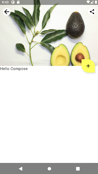
ScrollView 안쪽의 레이아웃이 날아가고 ComposeView로 채워진 결과를 볼 수 있습니다.
그림으로 정리해보면 아래와 같은 형식인데
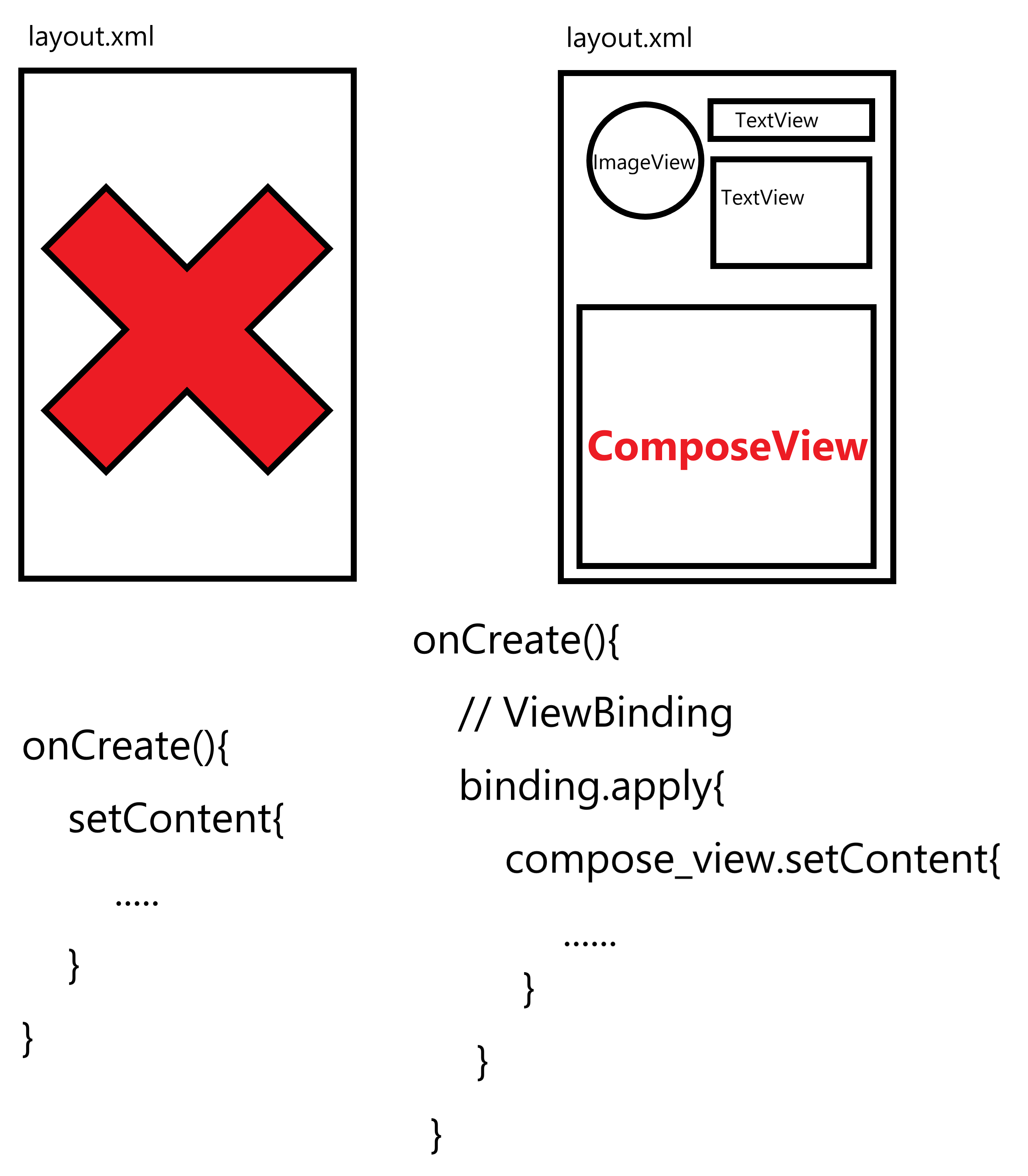
순수 Compose만으로 구현할 때에는
layout xml 파일 자체를 작성할 필요가 없고 오로지 activity 코드 안에 setContent로 Compose UI를 채워넣으면 됩니다.
만약 layout xml과 Compose를 함께 사용하고 싶다면
xml 파일 안에 ComposeView 컴포넌트를 추가하고 뷰바인딩을 진행할 때 해당 ComposeView에 setContent를 걸어주면 됩니다..
동일한 layout의 형태로 완성하기
// layout xml
<TextView
    android:id="@+id/plant_detail_name"
    android:layout_width="0dp"
    android:layout_height="wrap_content"
    android:layout_marginStart="@dimen/margin_small"
    android:layout_marginEnd="@dimen/margin_small"
    android:gravity="center_horizontal"
    android:text="@{viewModel.plant.name}"
    android:textAppearance="?attr/textAppearanceHeadline5"
    app:layout_constraintEnd_toEndOf="parent"
    app:layout_constraintStart_toStartOf="parent"
    app:layout_constraintTop_toTopOf="parent"
    tools:text="Apple" />

// kotlin jetpack compose
@Composable
private fun PlantName(name: String) {
    Text(
        text = name,
        style = MaterialTheme.typography.h5,
        modifier = Modifier
            .fillMaxWidth()
            .padding(horizontal = dimensionResource(R.dimen.margin_small))
            .wrapContentWidth(Alignment.CenterHorizontally)
    )
}

@Composable
private fun PlantNamePreview() {
    MaterialTheme {
        PlantName("Apple")
    }
}- textAppearance와 비슷한 형태를 가지는 머티리얼 테마의 typography.h5를 style 로 주었습니다.
- marginStart와 marginEnd를 paddingHorizontal로 치환하였습니다.
- constraintLayout의 종속성으로 정의한 텍스트뷰의 위치를 Alignment와 wrapContentWidth를 활용하여 동일하게 가운데정렬되도록 코딩하였습니다.
- 마지막으로 적절한 text가 Composable UI에 입력될 수 있도록 name:String을 변수로 받아 text로 삽입할 수 있도록 함수화 하였습니다.
이번엔 제목 아래의 물주는 기준에 대한 내용을 Compose로 작성해보겠습니다.
// layout xml
<TextView
     android:id="@+id/plant_watering_header"
     android:layout_width="0dp"
     android:layout_height="wrap_content"
     android:layout_marginStart="@dimen/margin_small"
     android:layout_marginTop="@dimen/margin_normal"
     android:layout_marginEnd="@dimen/margin_small"
     android:gravity="center_horizontal"
     android:text="@string/watering_needs_prefix"
     android:textColor="?attr/colorAccent"
     android:textStyle="bold"
     app:layout_constraintEnd_toEndOf="parent"
     app:layout_constraintStart_toStartOf="parent"
     app:layout_constraintTop_toBottomOf="@id/plant_detail_name" />

 <TextView
     android:id="@+id/plant_watering"
     android:layout_width="0dp"
     android:layout_height="wrap_content"
     android:layout_marginStart="@dimen/margin_small"
     android:layout_marginEnd="@dimen/margin_small"
     android:gravity="center_horizontal"
     app:layout_constraintEnd_toEndOf="parent"
     app:layout_constraintStart_toStartOf="parent"
     app:layout_constraintTop_toBottomOf="@id/plant_watering_header"
     app:wateringText="@{viewModel.plant.wateringInterval}"
     tools:text="every 7 days"/>


// kotlin jetpack compose
@Composable
private fun PlantWatering(wateringInterval: Int) {
    Column(Modifier.fillMaxWidth()) {
        // Same modifier used by both Texts
        val centerWithPaddingModifier = Modifier
            .padding(horizontal = dimensionResource(R.dimen.margin_small))
            .align(Alignment.CenterHorizontally)

        val normalPadding = dimensionResource(R.dimen.margin_normal)

        Text(
            text = stringResource(R.string.watering_needs_prefix),
            color = MaterialTheme.colors.primaryVariant,
            fontWeight = FontWeight.Bold,
            modifier = centerWithPaddingModifier.padding(top = normalPadding)
        )

        val wateringIntervalText = pluralStringResource(
            R.plurals.watering_needs_suffix, wateringInterval, wateringInterval
        )
        Text(
            text = wateringIntervalText,
            modifier = centerWithPaddingModifier.padding(bottom = normalPadding)
        )
    }
}

@Preview(showBackground=true)
@Composable
private fun PlantWateringPreview() {
    MaterialTheme {
        PlantWatering(7)
    }
}
뭔가 코드가 갑자기 긴게 나와서 당황스러울 순 있지만 뜯어보면 별거없습니다.
- Column으로 Text 2개를 위아래로 붙인 형태의 Composable UI입니다.
- 위쪽 Text에는 fontWeight로 bold형태의 적절한 폰트모양을 지정해주었고 color또한 지정해주었습니다.
- 각각의 Text에 위아래 패딩을 주어 xml layout을 margin과 같이 동작하도록 하였고 Alignment를 활용하여 레이아웃을 가운데정렬 해주었습니다.
이런식으로 View안에 ComposeView를 넣고 해당 Composable UI를 구성하여 ComposeView에 setContent 하는 방식으로 View와 Compose를 동시에 사용할 수 있습니다.
Compose에서 지원하지 않는 View 대체
Compose는 현재 시점에서 어느정도 안정화된 버전이 배포되었지만, 아직까지 완전하게 View를 대체하지는 못하고 있습니다.
그렇다면 Compose에서 자체적으로 지원하지 않는 View를 그리기 위해서는 어떻게 해야할까요?
예를들어 아래와 같이 상세설명 부분의 경우 html로 이루어져 있다고 합시다.
<TextView
    android:id="@+id/plant_description"
    style="?android:attr/textAppearanceMedium"
    android:layout_width="0dp"
    android:layout_height="wrap_content"
    android:layout_marginStart="@dimen/margin_small"
    android:layout_marginTop="@dimen/margin_small"
    android:layout_marginEnd="@dimen/margin_small"
    android:minHeight="@dimen/plant_description_min_height"
    app:layout_constraintEnd_toEndOf="parent"
    app:layout_constraintStart_toStartOf="parent"
    app:layout_constraintTop_toBottomOf="@id/plant_watering"
    app:renderHtml="@{viewModel.plant.description}"
    tools:text="Details about the plant" />
위 코드처럼 renderHtml로 Html형식의 텍스트를 렌더링할 수 도 있고 혹은 TextView에 Html.fromHtml() 과 같은 함수로 Html을 String으로 렌더링할 수 있습니다.
그러나 Compose의 Text는 이러한 기능을 자체적으로 지원하고 있지 않다면 어떻게 해야 할까요?

(구글에서 기능 만들어줄 때 까지 벅벅 긁으면서 기다린다.)
그럴 때는 AndroidView를 활용하여 구현할 수 있습니다.
@Composable
@UiComposable
fun <T : View> AndroidView(
    factory: (Context) -> T,
    modifier: Modifier = Modifier,
    update: (T) -> Unit = NoOpUpdate
): Unit
위와 같이 생긴 API가 AndroidView입니다. 주요 구성요소 세 가지가 있는데
- factory : view가 compose UI로 처음 렌더링 될 때 실행됩니다.
- modifier : 일반적인 Compose UI에 사용되는 Modifier입니다.
- update : 데이터가 변경되거나 하여 compose UI가 변경될 때 마다 실행됩니다.
각각 위와 같은 역할을 하며 그에 맞게 함수를 정의해주어야 합니다.
@Composable
private fun PlantDescription(description: String) {
// Remembers the HTML formatted description. Re-executes on a new description
val htmlDescription = remember(description) {
HtmlCompat.fromHtml(description, HtmlCompat.FROM_HTML_MODE_COMPACT)
}
// Displays the TextView on the screen and updates with the HTML description when inflated
// Updates to htmlDescription will make AndroidView recompose and update the text
AndroidView(
factory = { context ->
TextView(context).apply {
movementMethod = LinkMovementMethod.getInstance()
}
},
update = {
it.text = htmlDescription
}
)
}
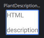
@Preview(showBackground = true)
@Composable
private fun PlantDescriptionPreview() {
Surface {
PlantDescription("HTML<br><br>description")
}
}위 PlantDescription 컴포넌트를 보면
- htmlDescription 변수에 HtmlCompat.fromHtml함수를 활용하여 주어진 문자열을 Html코드로 취급하여 Spanned 객체로 반환합니다.
- factory를 구현하여 AndroidView가 초기화될 때 TextView를 생성하고 LinkMovementMethod를 활용하여 하이퍼링크를 클릭할 수 있도록 초기설정해줍니다.
- update를 구현하여 TextView의 텍스트가 html에 의해 변환된 htmlDescription Spanned 객체로 렌더링 될 수 있도록 합니다.
Spanned란?
TextView의 Text에 String이 아니라 Spanned라는 객체가 들어가서 물음표가 머릿속에서 뜨신 분들이 있을것 같습니다.
쉽게말해 Spanned는 문자열의 subsequence에 하이퍼링크를 걸거나, 배경 혹은 글자색을 바꾸는 등의 꾸미는 작업이 가능한 문자열 객체를 의미합니다.
자세한 내용은 Span 관련한 공식문서를 첨부해놓겠습니다.
위 코드를 Preview해보면 실제로 Html의 <br> 태그가 적용된 형태의 TextView가 생성된 것을 알 수 있습니다.
정리하면 AndroidView란 Compose를 활용할 때 Compose가 자체적으로 지원하지 않는 기존의 뷰를 구현하기 위한 저수준의 통합 모듈이며 이를 구현하기 위하여
- modifier : Compose UI 관련 꾸밈 속성
- factory : 어떤 속성을 가진 어떤 View를 생성할지 선언 및 초기화
- update : View에 어떤 데이터를 렌더링, 업데이트할 것인지 구현
위 세 가지를 구현하시면 됩니다.
위에서 만든 모듈에 샘플 데이터 대신 실제 ViewModel에 있는 상세설명 데이터를 넣게 되면
@Composable
fun PlantDetailContent(plant: Plant) {
Surface{
Column(Modifier.padding(dimensionResource(R.dimen.margin_normal))) {
PlantName(plant.name)
PlantWatering(plant.wateringInterval)
PlantDescription(plant.description)
}
}
}
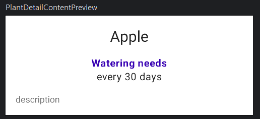
@Preview(showBackground = true)
@Composable
private fun PlantDetailContentPreview() {
val plant = Plant("id", "Apple", "description", 3, 30, "")
MaterialTheme {
PlantDetailContent(plant)
}
}위와 같이 최종적으로 ComposeView에 렌더링 되는 모듈을 PlantDetailContent로 만들 수 있을 것입니다.
해당 모듈은 Plant라는 객체를 입력받아 각 객체에 있는 name, wateringInterval, description 정보들을 우리가 위에서 만들었던 모듈을 활용하여 하나의 ComposeUI로 만들어 줄 것입니다.
이제 프래그먼트에서 뷰모델을 연결하고, 뷰모델의 데이터를 아래와 같이 주입해주면
private val plantDetailViewModel: PlantDetailViewModel by viewModels {
    InjectorUtils.providePlantDetailViewModelFactory(requireActivity(), args.plantId)
}

composeView.setContent {
    // You're in Compose world!
    MaterialTheme {
        PlantDetailDescription(plantDetailViewModel)
    }
}

@Composable
fun PlantDetailDescription(plantDetailViewModel: PlantDetailViewModel) {
    // Observes values coming from the VM's LiveData<Plant> field
    val plant by plantDetailViewModel.plant.observeAsState()

    // If plant is not null, display the content
    plant?.let {
        PlantDetailContent(it)
    }
}
와 같이 프래그먼트에서 코드를 작성할 수 있고
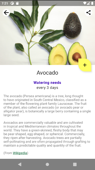
위 사진과 같이 html 문법에 따라 하이퍼링크도 잘 동작하도록 구현된걸 확인할 수 있습니다.
이러한 과정을 통해 기존의 View System을 Compose로 이전할 수 있고 개발할 때에도 동시에 두 개의 UI 시스템을 구축할 수 있으므로 적절히 조합하여 사용하면 좋을것 같습니다.