-
[React Component] Type Guard를 활용한 여러가지 Button 구현하기
"디자인 시스템의 Button, 단순히 props로 분기 처리하면 되지 않을까요?"
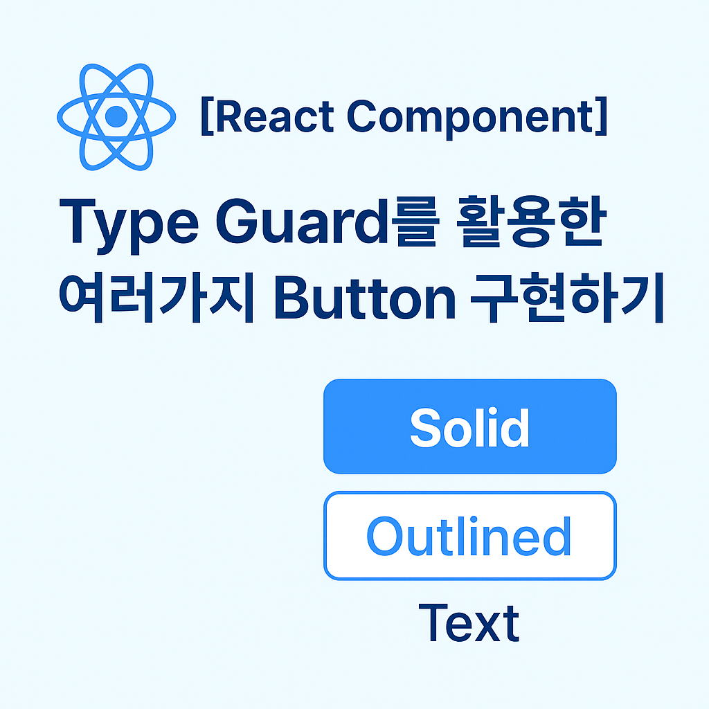
처음엔 간단해 보였던 버튼 컴포넌트. 하지만 Solid, Outlined, Text 등 스타일마다 다른 Variant와 규칙을 적용하려다 보니 if문
지옥과 타입 불안정성에 빠졌습니다. 이를 Discriminated Union(구별된 유니온)과 Type Guard로 우아하게 해결한 과정을 공유합니다.💡 핵심 포인트
-
Discriminated Union: frame 속성 하나로 타입을 명확히 구분하고 잘못된 props 조합을 원천 차단하는 방법.
-
Type Narrowing: TypeScript가 조건문을 통해 자동으로 타입을 좁혀나가는 원리.
-
OCP (개방-폐쇄 원칙): 기존 코드를 건드리지 않고 새로운 버튼 스타일(GhostButton 등)을 안전하게 추가하는 설계 철학.
👉 [전체 읽기: Type Guard를 활용한 여러가지 Button 구현하기]
🔗 https://blog.sangwook.dev/posts/react-component-type-guard-button
(https://blog.sangwook.dev/posts/react-component-type-guard-button)