#. 프로젝트 제작 과정에서 반복되는 메뉴탭 컴포넌트화
레이아웃까지 가능하도록 만들었습니다.
사용기술: react, material ui, styled-components
import React from "react";
import { Box } from "@material-ui/core";
import styled from "styled-components";

interface ButtonsProps {
  label: string[];
  current: number;
  onChange: (index: number) => void;
  width?: number;
  height?: number;
  my?: number;
  mx?: number;
}

const Button = styled(Box)<{ isactive: string }>`
  display: flex;
  justify-content: center;
  align-items: center;
  padding: 10px;
  height: 100%;
  background: #e7e8ec;
  color: #aaa;
  border-radius: 10px;
  margin-right: 10px;
  cursor: pointer;

  ${({ isactive }) =>
    isactive === "true" &&
    `
    background: #2d3e4f;
    color: #fff;
    font-weight: bold;
  `}
`;

const ButtonsTab: React.FC<ButtonsProps> = ({
  label,
  current,
  onChange,
  width,
  height,
  my,
  mx,
}) => {
  const handleTabChange = (index: number) => {
    if (onChange) {
      onChange(index);
    }
  };

  return (
    <Box width={width} height={height} my={my} mx={mx} display="flex" alignItems="center">
      {label.map((item, index) => (
        <Button
          key={index}
          isactive={current === index ? "true" : "false"}
          onClick={() => handleTabChange(index)}
        >
          {item}
        </Button>
      ))}
    </Box>
  );
};

export default ButtonsTab;
사용법.
const [menuBtnTab, setMenuBtnTab] = useState<number>(0);
const handleMenuBtnTabChange = (index: number) => {
setChartTab(index);
};
return(
<ButtonsTab
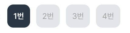
label={["1번", "2번"]}
current={menuBtnTab}
onChange={handleMenuBtnTabChange}
width={250}
/>
)ex.
width,height,mx,my를 통하여 기본 레이아웃 및 위치 수정 가능합니다.
<ButtonsTab
   label={["1번", "2번", "3번", "4번"]} // label 을 통하여 넣고자 하는 아이템 입력 가능
   current={menuBtnTab} // 메뉴탭이 바뀌는 state 값
   onChange={handleMenuBtnTabChange} // 클릭 시 실행되는 함수
   width={250} // 넓이
   height={250} // 높이
   my={10} // 위아래 margin
   mx={10} //좌우 margin
 />

프론트엔드 개발자 (22.9.19~~)