
1) CSS(SCSS) 단위
- CSS에서 각 요소(블록 & 인라인)마다 스타일링을 부여하기 위해 사용하는 개념을 단위라고 한다.
2) 단위 종류
- px : 픽셀
(width : 300px)- % : 상대적 백분율
(height : 1% ~ 100%)- em : 요소의 글꼴 크기 (1em -> 10px)
(div {
font-size: 20px;
width: 10em; / 200px /
})- rem : html 루트 요소 기준의 글꼴 크기
(div {
font-size: 20px;
width: 10rem; / 16px 10rem = 160px */
})- vw : 뷰포트(Viewport)의 가로 너비의 백분율
- vh : 뷰포트(Viewport)의 세로 너비의 백분율
3) 단위 결과 값
(1) % : 상대적 백분율
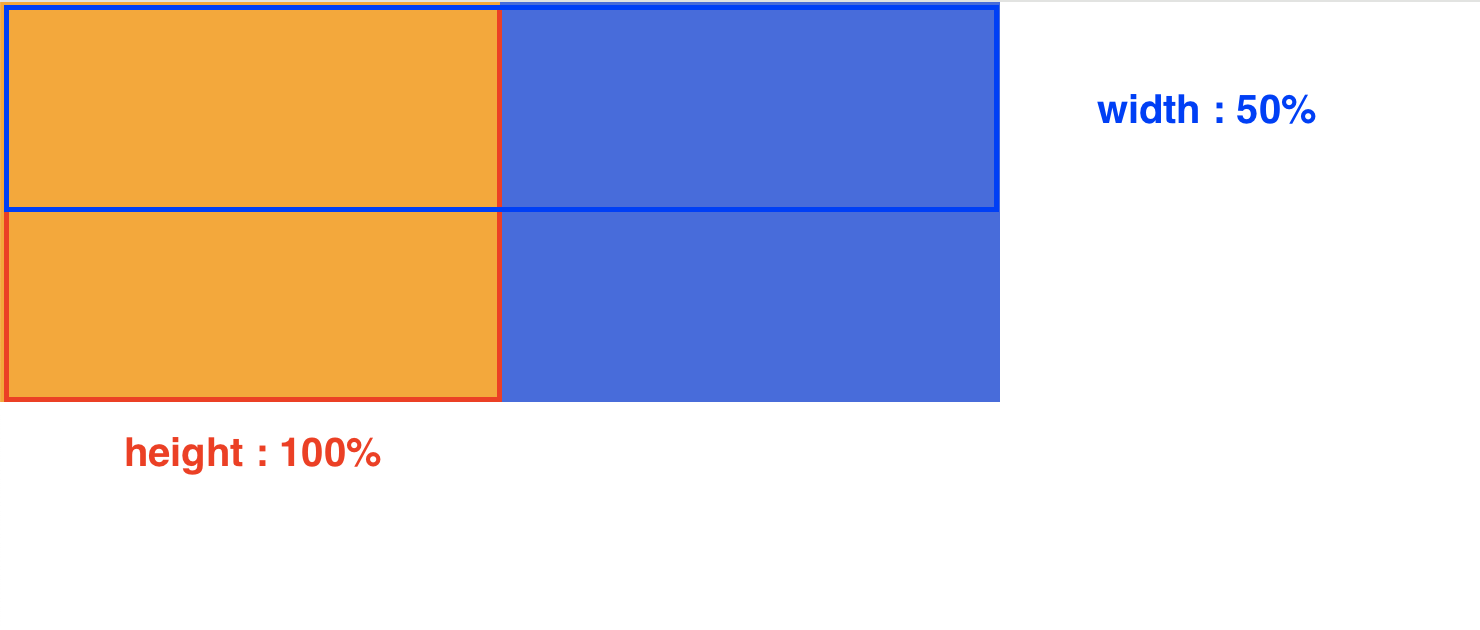
<div class="parent">
  <div class="child"></div>
</div>
...

.parent {
  width: 500px;
  height: 200px;
  background-color: royalblue;
}

.child {
  width: 50%;
  height: 100%;
  background-color: orange;
}
POINT
- em의 기본 값은? 글꼴 크기 기준으로 기본 값이 된다.
- 0px, 0vw 중에 가장 큰 값은? 물론 vw가 더 커보일 수 있지만 0을 쓸땐 단위를 붙이지 않는다.

안녕하세요 Junior UIUX Designer 입니다 😊