
Seaborn
- matplotlib와 함께 실행
import matplotlib.pyplot as plt
import seaborn as sns

# %matplotlib inline
get_ipython().run_line_magic("matplotlib", "inline")
- import하는 것만으로도 효과를 줌
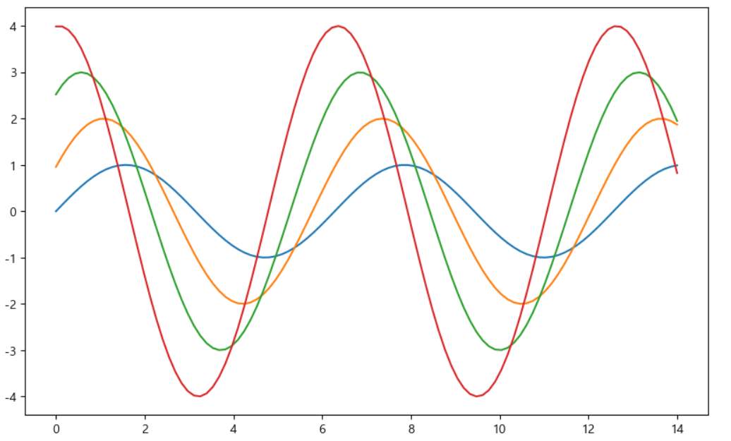
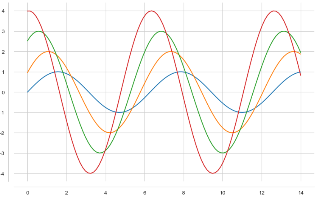
x = np.linespace(0, 14, 100)
y1 = np.sin(x)
y2 = 2 * np.sin(x + 0.5)
y3 = 3 * np.sin(x + 1.0)
y4 = 4 * np.sin(x + 1.5)

plt.figure(figsize=(10, 6))
plt.plot(x, y1, x, y2, x, y3, x, y4)
plt.show()
Seaborn의 스타일
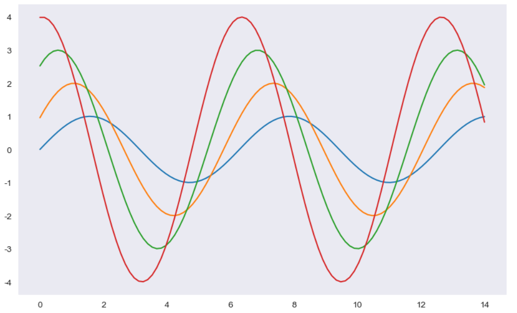
- white 스타일
sns.set_style("white")
plt.figure(figsize=(10, 6))
plt.plot(x, y1, x, y2, x, y3, x, y4)
plt.show()
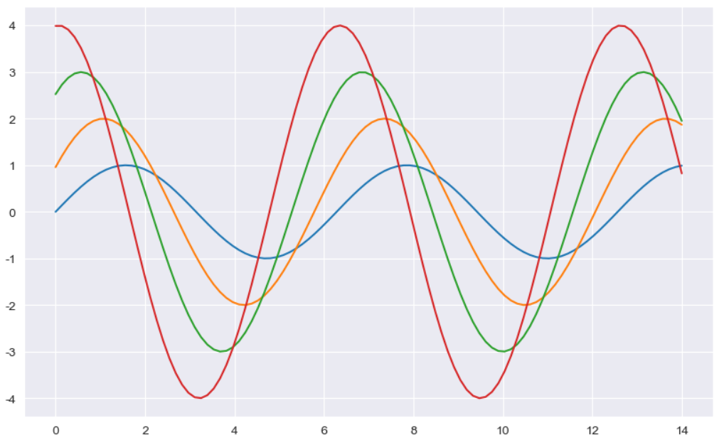
- dark 스타일
sns.set_style("dark")
plt.figure(figsize=(10, 6))
plt.plot(x, y1, x, y2, x, y3, x, y4)
plt.show()
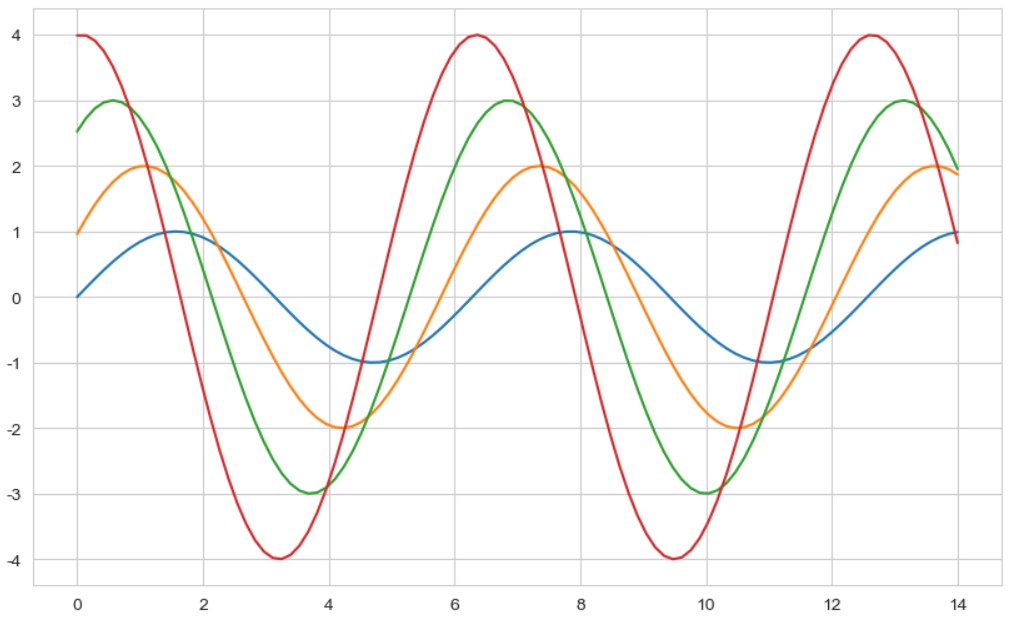
- whitegrid 스타일
sns.set_style("whitegrid")
plt.figure(figsize=(10, 6))
plt.plot(x, y1, x, y2, x, y3, x, y4)
plt.show()
- dakrgrid 스타일
sns.set_style("darkgrid")
plt.figure(figsize=(10, 6))
plt.plot(x, y1, x, y2, x, y3, x, y4)
plt.show()
- despine 적용
plt. figure(figsize=(10, 6))
plt.plot(x, y1, x, y2, x, y3, x, y4)
sns.despine(offset=10)
plt.show()
Seaborn의 실습용 데이터
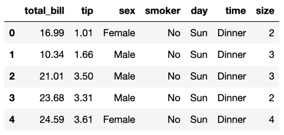
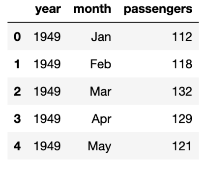
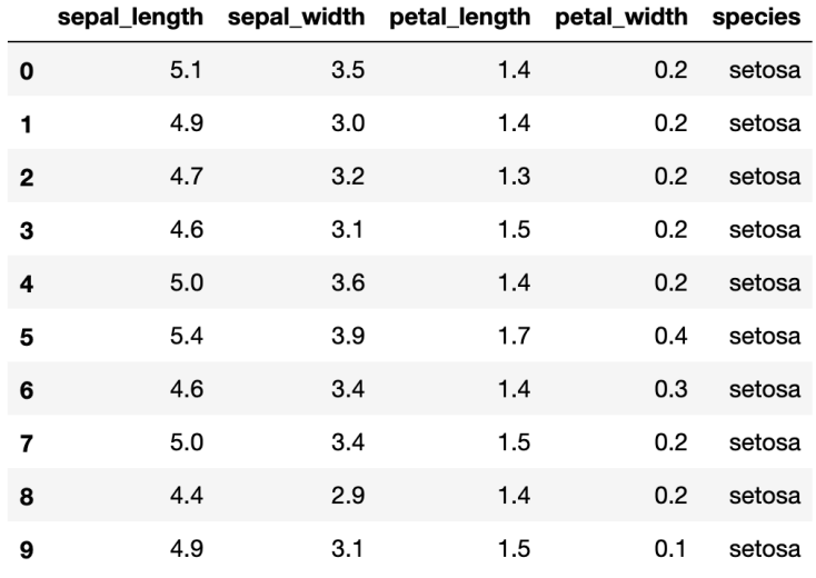
- Seaborn에는 tips, flights, iris, anscombe와 같은 실습용 데이터가 있음
tips = sns.load_dataset("tips")
tips.head(5)
flights = sns.load_dataset("flights")
flights.head(5)
sns.set(style="ticks")
iris = sns.loac_dataset("iris")
iris.head(10)
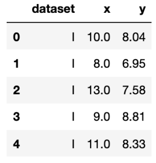
anscombe = sns.load_dataset("anscombe")
anscombe.head(5)
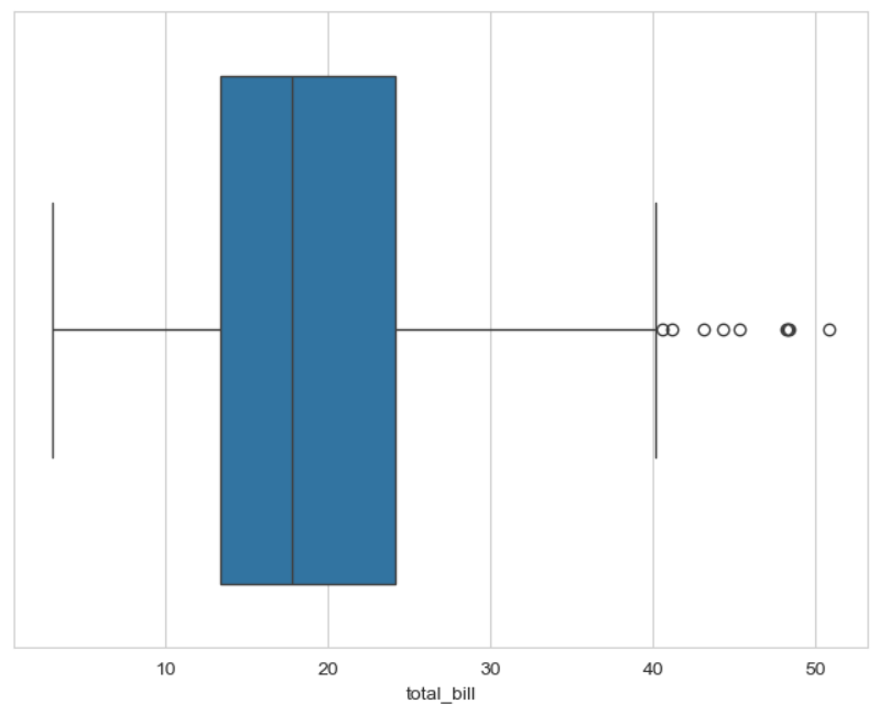
boxplot
- boxplot 그리기
plt.figure(figsize=(8, 6))
sns.boxplot(x=tips["total_bill"])
plt.show()
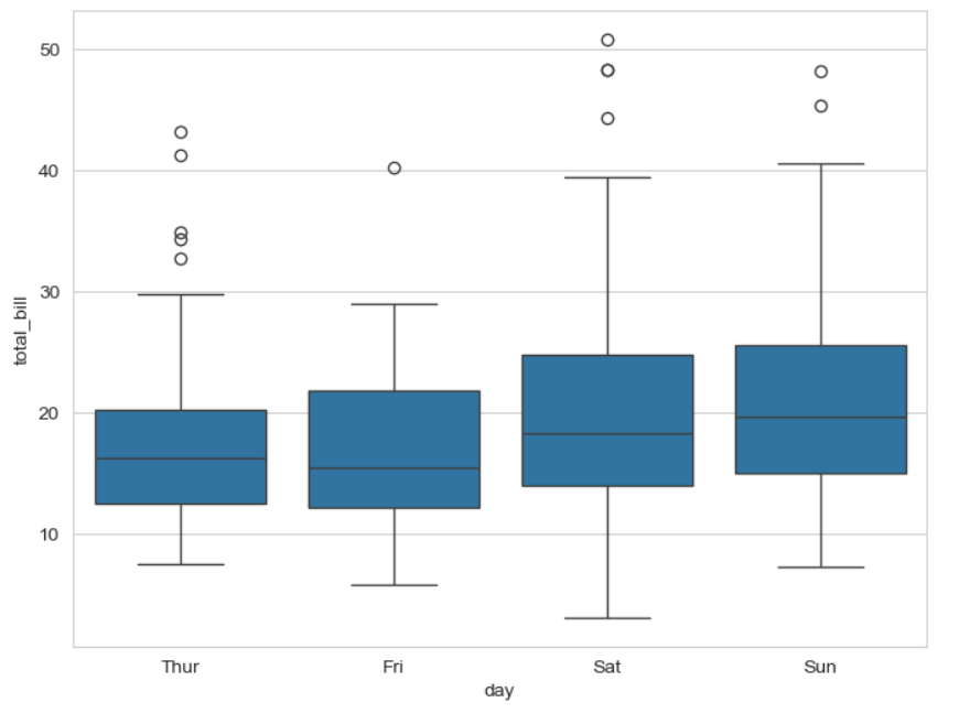
- boxplot 컬럼 지정
plt.figure(figsize=(8, 6))
sns.boxplot(x=tips, y="total_bill", data=tips)
plt.show()
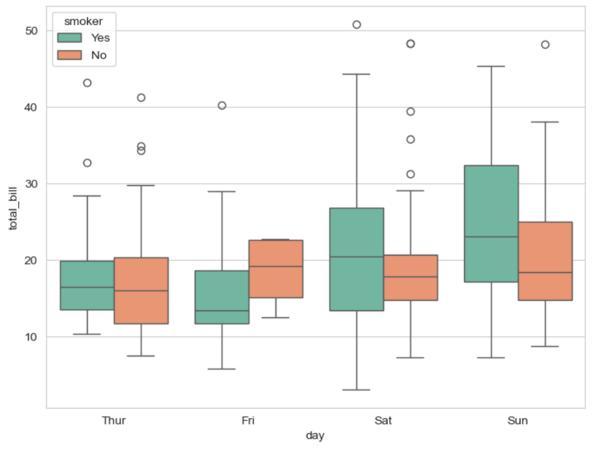
- 컬럼을 지정하고 구분
plt.figure(figsize=(8, 6))
sns.boxplot(x="day", y="total_bill", hue="smoker", data=tips, palette="Set3")
plt.show()
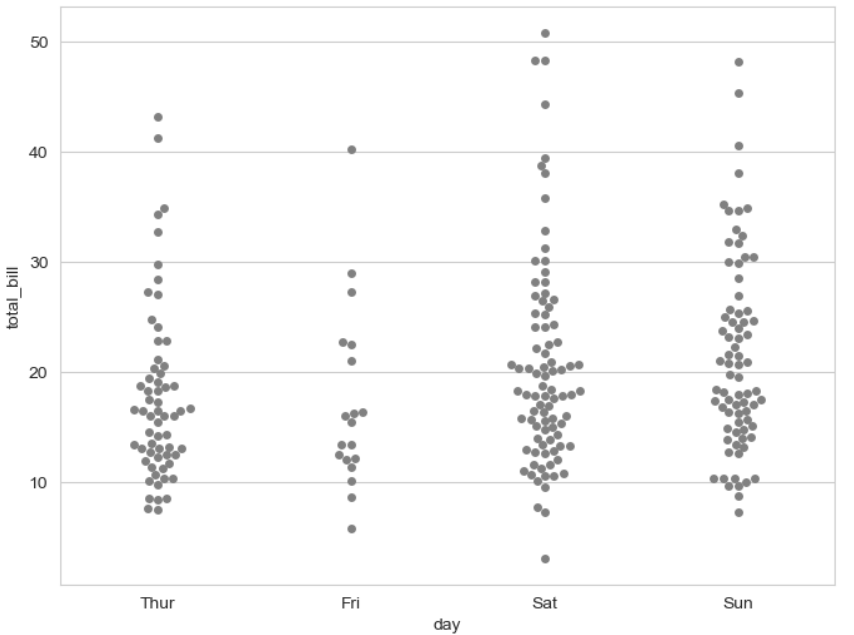
swarmplot
- sarmplot 그리기
plt.figure(figsize=(8, 6))
# 0 ~ 1사이 검은색부터 흰색 사이의 값을 조절
sns.swarmplot(x="day", y="total_bill", data=tips, color="0.5")
plt.show()
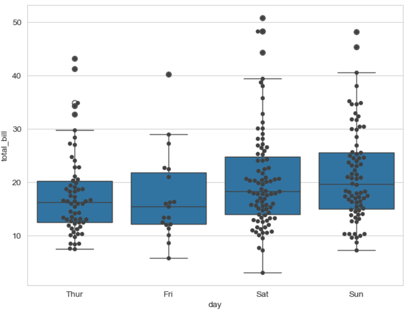
boxplot과 swarmplot의 콜라보
plt.figure(figsize=(8, 6))
sns.boxplot(x="day", y="total_bill", data=tips)
sns.swarmplot(x="day", y="total_bill", data=tips, color="0.25")
plt.show()
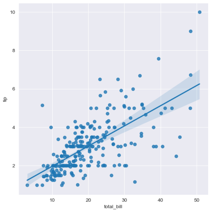
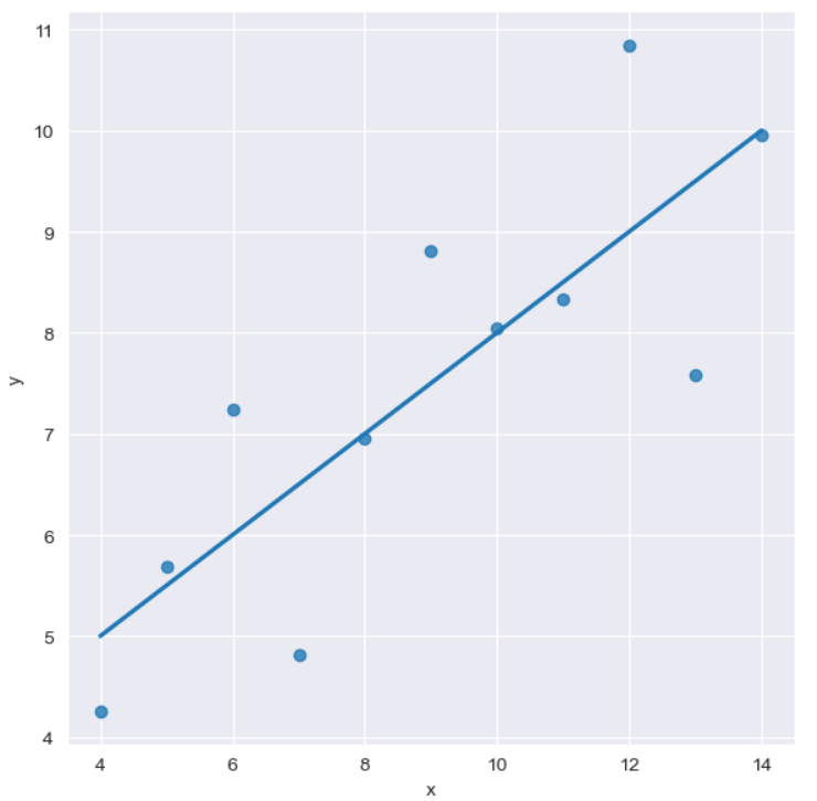
lmplot
- total bill과 tip 사이의 관계 파악
sns.set_style("darkgrid")
sns.lmplot(x="total_bill", y="tip", data=tips, height=6)
plt.show()
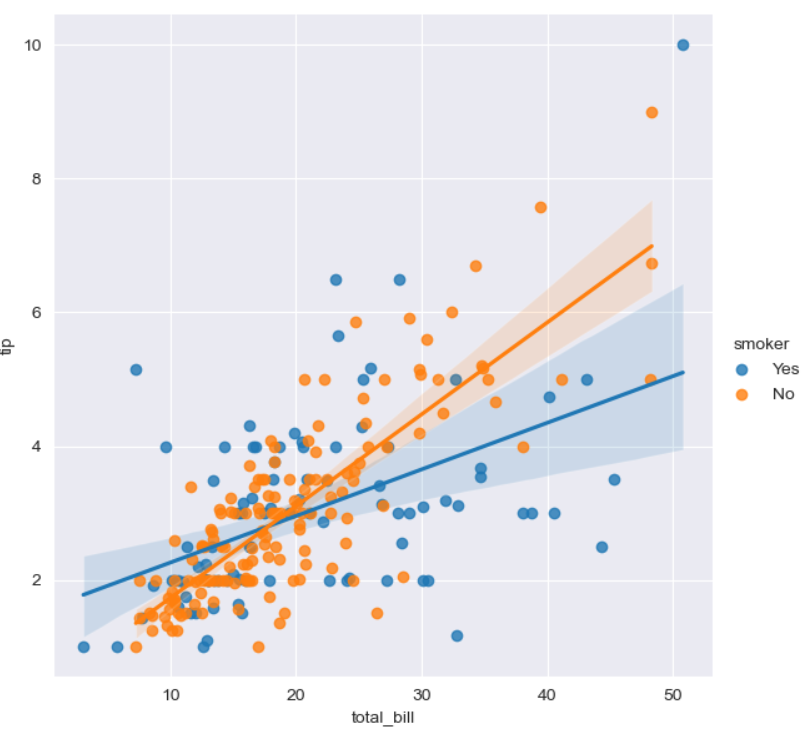
- lmplot에서 hue 옵션 사용
sns.lmplot(x="total_bill", y="tip", hue="smoker", data=tips, size=6)
plt.show()
pivot 옵션 사용 가능
flights = flights.pivot("month", "year", "passengers")
flights.head(5)
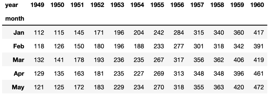
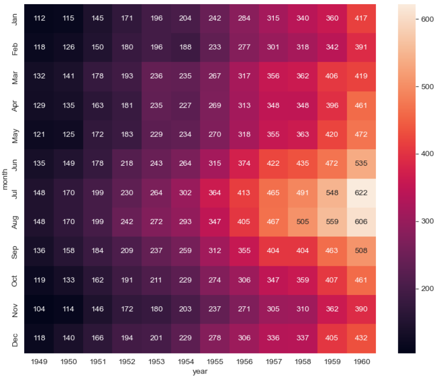
heatmap
- heatmap을 이용하면 전체 경향을 알 수 있음
plt.figure(figsize=(10, 8))
sns.heatmap(flights, annot=True, fmt="d")
plt.show()
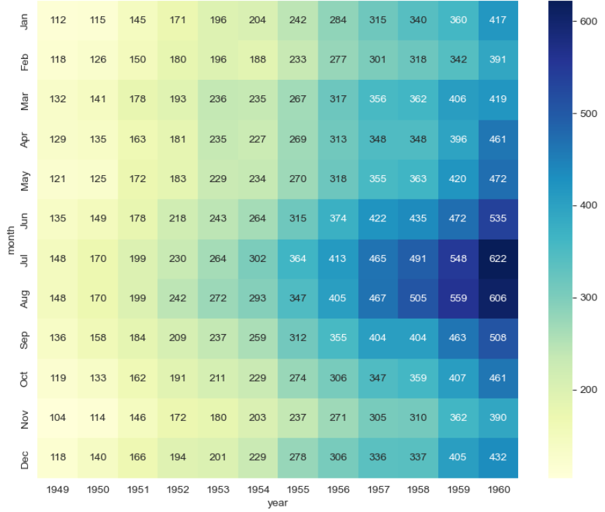
- colormap 바꾸기
plt.figure(figsize=(10, 8))
sns.heatmap(flights, annot=True, fmt="d", cmap="YlGnBu")
plt.show()
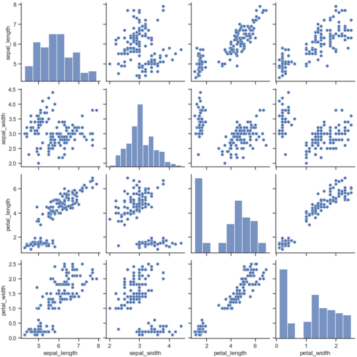
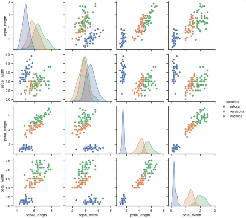
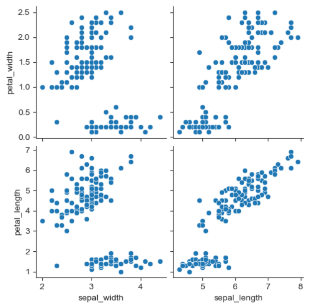
pairplot
- 다수의 컬럼을 비교
sns.pairplot(iris)
plt.show()
- pairplot에서 hue 옵션
sns.pairplot(iris, hue="species")
plt.show()
- 원하는 컬러만 pairplot 적용
sns.pairplot(
	iris, x_vars=["sepal_width", "sepal_length"],
    y_vars=["petal_width", "petal_length"]
)
plt.show()
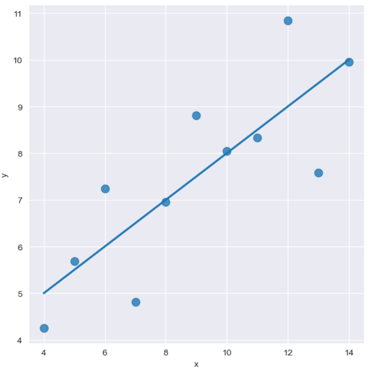
그 외 기타
- lmplot
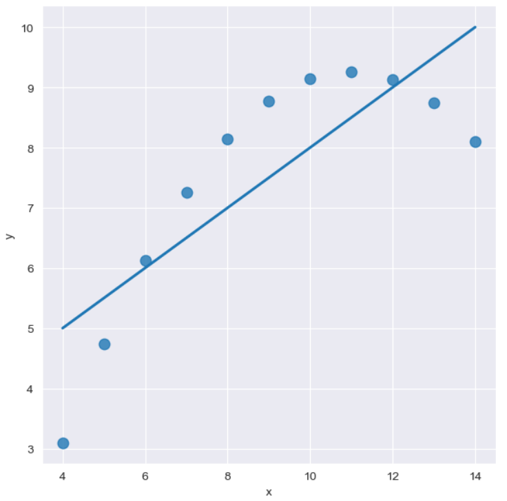
sns.set_style("darkgrid")
sns.lmplot(x="x", y="y", data=anscombe.query("dataset == 'I'"), ci=None, height=6) # ci 신뢰구간 선택
plt.show()
sns.set_style("darkgrid")
sns.lmplot(
    x="x",
    y="y",
    data=anscombe.query("dataset == 'I'"),
    ci=None,
    height=6,
    scatter_kws={"s":80}) # ci 신뢰구간 선택
plt.show()
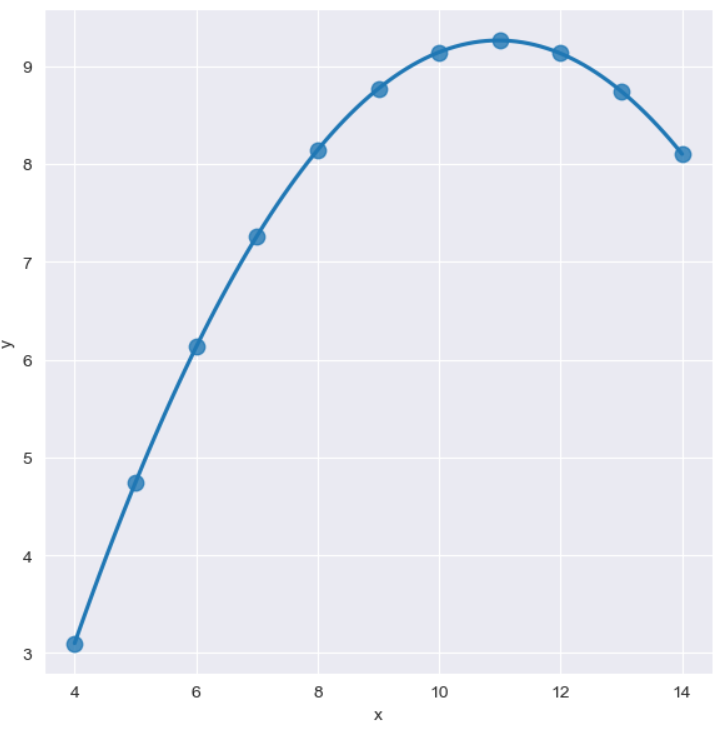
sns.set_style("darkgrid")
sns.lmplot(
    x="x",
    y="y",
    data=anscombe.query("dataset == 'II'"),
    order=1,
    ci=None,
    height=6,
    scatter_kws={"s":80}) # ci 신뢰구간 선택
plt.show()
sns.set_style("darkgrid")
sns.lmplot(
    x="x",
    y="y",
    data=anscombe.query("dataset == 'II'"),
    order=2,
    ci=None,
    height=6,
    scatter_kws={"s":80}) # ci 신뢰구간 선택
plt.show()
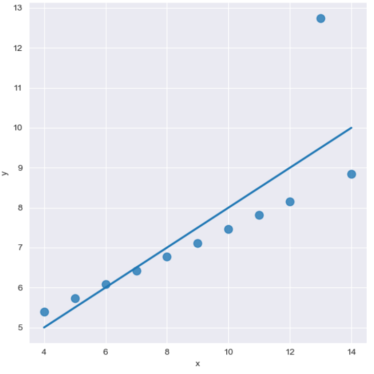
sns.set_style("darkgrid")
sns.lmplot(
    x="x",
    y="y",
    data=anscombe.query("dataset == 'III'"),
    ci=None,
    height=6,
    scatter_kws={"s":80}) # ci 신뢰구간 선택
plt.show()
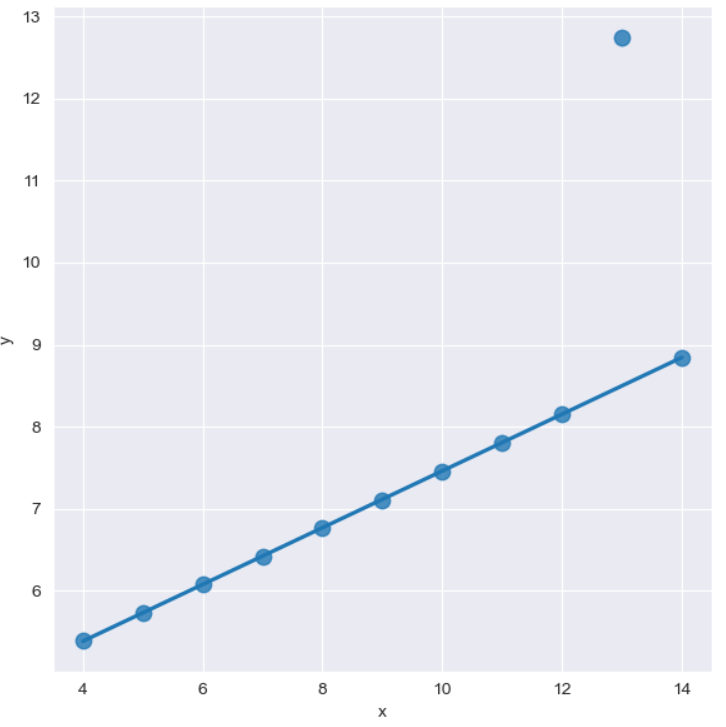
sns.set_style("darkgrid")
sns.lmplot(
    x="x",
    y="y",
    data=anscombe.query("dataset == 'III'"),
    robust=True,
    ci=None,
    height=6,
    scatter_kws={"s":80}) # ci 신뢰구간 선택
plt.show()
* 이 글은 제로베이스 데이터 스쿨의 강의 자료 일부를 발췌하여 작성되었습니다.

I believe there is no best, only better