TIL 24/07/04
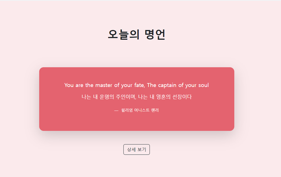
1. 오늘의 명언을 구현하시오
<!doctype html>
<html lang="en">
<head>
<!-- Required meta tags -->
<meta charset="utf-8">
<meta name="viewport" content="width=device-width, initial-scale=1">
<!-- Bootstrap CSS -->
<link href="https://cdn.jsdelivr.net/npm/bootstrap@5.3.3/dist/css/bootstrap.min.css" rel="stylesheet">
<script src="https://cdn.jsdelivr.net/npm/bootstrap@5.3.3/dist/js/bootstrap.bundle.min.js"></script>
<title>Hello, world!</title>
</head>
<title>Hello world!</title>
<body class="bg-danger bg-opacity-25">
<header class="container mt-5 py-5 text-center"><h1 class="fw-bold">오늘의명언</h1></header>
<section class="container text-center">
<div class="bg-danger bg-opacity-75 text-white w-75 m-auto p-5 my-5 rounded-4">
<blockquote class="blockquote">
<p>You are the master of your fate, The captain of your soul</p>
<p>나는 내 운명의 주인이며 내 영혼의 선장이다.</p>
<footer class="blockquote-footer text-white mt-3"><small>윌리엄 어니스트 헨리</small></footer>
</blockquote>
</div>
<a href="#" class="btn btn-outline-dark">상세보기</a>
</section>
</body>
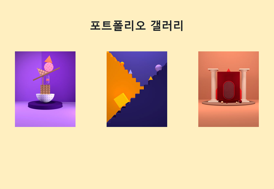
</html>2. 포트폴리오 갤러리를 구현하시오
<!doctype html>
<html lang="en">

<head>
    <!-- Required meta tags -->
    <meta charset="utf-8">
    <meta name="viewport" content="width=device-width, initial-scale=1">

    <!-- Bootstrap CSS -->
    <link href="https://cdn.jsdelivr.net/npm/bootstrap@5.3.3/dist/css/bootstrap.min.css" rel="stylesheet">
    <script src="https://cdn.jsdelivr.net/npm/bootstrap@5.3.3/dist/js/bootstrap.bundle.min.js"></script>

    <title>Hello, world!</title>
</head>


<body class="bg-warning bg-opacity-25">
 <section>
    <h1 class="display-4 fw-bold text-center my-5 py-5">포트폴리오 갤러리</h1>
    <div class="d-flex justify-content-around">
     <div class="mx-1">
        <img src="http://192.168.1.69:5500/bootstrap-example-master/3.%EA%B0%A4%EB%9F%AC%EB%A6%AC%20%EC%84%B9%EC%85%98%20%EB%A7%8C%EB%93%A4%EA%B8%B0/images/img1.jpg" alt="이미지1" class="img-fluid">
     </div>

     <div class="mx-1">
        <img src="http://192.168.1.69:5500/bootstrap-example-master/3.%EA%B0%A4%EB%9F%AC%EB%A6%AC%20%EC%84%B9%EC%85%98%20%EB%A7%8C%EB%93%A4%EA%B8%B0/images/img2.jpg" alt="이미지2" class="img-fluid">
     </div>

     <div class="mx-1">
        <img src="http://192.168.1.69:5500/bootstrap-example-master/3.%EA%B0%A4%EB%9F%AC%EB%A6%AC%20%EC%84%B9%EC%85%98%20%EB%A7%8C%EB%93%A4%EA%B8%B0/images/img3.jpg" alt="이미지3" class="img-fluid">


     </div>


    </div>
 </section>
</body>

</html>
3. 아래 구현하기(flex, float사용)
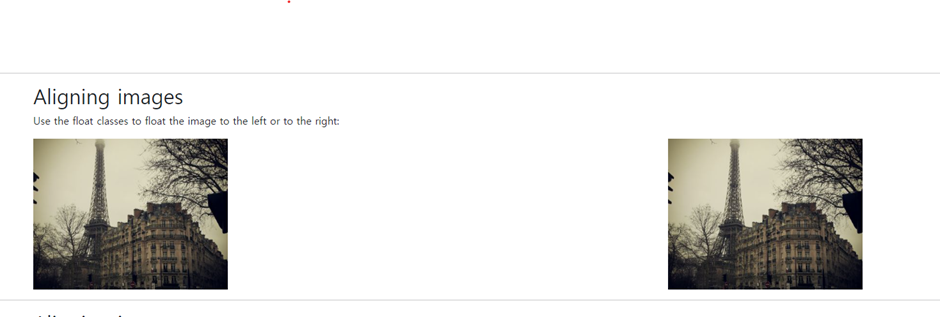
- float 사용
<!doctype html>
<html lang="en">
<head>
<!-- Required meta tags -->
<meta charset="utf-8">
<meta name="viewport" content="width=device-width, initial-scale=1">
<!-- Bootstrap CSS -->
<link href="https://cdn.jsdelivr.net/npm/bootstrap@5.0.2/dist/css/bootstrap.min.css" rel="stylesheet"
integrity="sha384-EVSTQN3/azprG1Anm3QDgpJLIm9Nao0Yz1ztcQTwFspd3yD65VohhpuuCOmLASjC" crossorigin="anonymous">
<title>Hello, world!</title>
</head>
<body>
<div class="container mt-3 overflow-hidden">
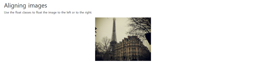
<h2>Aligning images</h2>
<p>Use the float classes to float the image to the left or to the right:</p>
<img src="https://www.w3schools.com/bootstrap5/paris.jpg" class="float-start" alt="Paris" width="304" height="236">
<img src="https://www.w3schools.com/bootstrap5/paris.jpg" class="float-end" alt="Paris" width="304" height="236">
</div>
</body>
</html>- flex 사용
<html lang="en">
<head>
    <!-- Required meta tags -->
    <meta charset="utf-8">
    <meta name="viewport" content="width=device-width, initial-scale=1">

    <!-- Bootstrap CSS -->
    <link href="https://cdn.jsdelivr.net/npm/bootstrap@5.0.2/dist/css/bootstrap.min.css" rel="stylesheet"
        integrity="sha384-EVSTQN3/azprG1Anm3QDgpJLIm9Nao0Yz1ztcQTwFspd3yD65VohhpuuCOmLASjC" crossorigin="anonymous">

    <title>Hello, world!</title>
</head>
<body>
	<div class="container mt-3">
        <h2>Aligning images</h2>
        <p>Use the float classes to float the image to the left or to the right:</p>
        <div  class="d-flex justify-content-between">
            <img src="https://www.w3schools.com/bootstrap5/paris.jpg" alt="Paris"
            width="304" height="236">
            <img src="https://www.w3schools.com/bootstrap5/paris.jpg" alt="Paris"
            width="304" height="236">
        </div>
    </div>
</body>
</html>
4. 아래 구현하기(flex, block사용)
- block사용
<html lang="en">
<head>
    <!-- Required meta tags -->
    <meta charset="utf-8">
    <meta name="viewport" content="width=device-width, initial-scale=1">

    <!-- Bootstrap CSS -->
    <link href="https://cdn.jsdelivr.net/npm/bootstrap@5.0.2/dist/css/bootstrap.min.css" rel="stylesheet"
        integrity="sha384-EVSTQN3/azprG1Anm3QDgpJLIm9Nao0Yz1ztcQTwFspd3yD65VohhpuuCOmLASjC" crossorigin="anonymous">

    <title>Hello, world!</title>
</head>
<body>
    <div class="container mt-3">
        <h2>Aligning images</h2>
        <p>Use the float classes to float the image to the left or to the right:</p>
        <img src="https://www.w3schools.com/bootstrap5/paris.jpg" class="d-block mx-auto" alt="Paris" width="304" height="236">
    </div>
</body>
</html>- flex사용
<html lang="en">
<head>
    <!-- Required meta tags -->
    <meta charset="utf-8">
    <meta name="viewport" content="width=device-width, initial-scale=1">

    <!-- Bootstrap CSS -->
    <link href="https://cdn.jsdelivr.net/npm/bootstrap@5.0.2/dist/css/bootstrap.min.css" rel="stylesheet"
        integrity="sha384-EVSTQN3/azprG1Anm3QDgpJLIm9Nao0Yz1ztcQTwFspd3yD65VohhpuuCOmLASjC" crossorigin="anonymous">

    <title>Hello, world!</title>
</head>
<body>
    <div class="container mt-3">
        <h2>Aligning images</h2>
        <p>Use the float classes to float the image to the left or to the right:</p>
        <div class="d-flex justify-content-center">
            <img src="https://www.w3schools.com/bootstrap5/paris.jpg" alt="Paris" width="304" height="236">
        </div>
    </div>
</body>
</html>
5. 아래 구현하기(modal팝업, 캐라셀)
<!doctype html>
<html lang="en">
<head>
<!-- Required meta tags -->
<meta charset="utf-8">
<meta name="viewport" content="width=device-width, initial-scale=1">
<!-- Bootstrap CSS -->
<link href="https://cdn.jsdelivr.net/npm/bootstrap@5.0.2/dist/css/bootstrap.min.css" rel="stylesheet">
<script src="https://cdn.jsdelivr.net/npm/bootstrap@5.3.3/dist/js/bootstrap.bundle.min.js"></script>
<title>Hello, world!</title>
</head>
<body>
<div class="container mt-3">
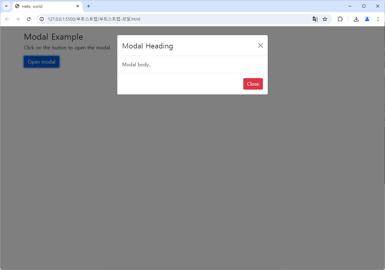
<h3>Modal Example</h3>
<p>Click on the button to open the modal.</p>
<button type="button" class="btn btn-primary" data-bs-toggle="modal" data-bs-target="#myModal">
Open modal
</button>
</div>
<!-- The Modal -->
<div class="modal" id="myModal">
<div class="modal-dialog">
<div class="modal-content">
<!-- Modal Header -->
<div class="modal-header">
<h4 class="modal-title">Modal Heading</h4>
<button type="button" class="btn-close" data-bs-dismiss="modal"></button>
</div>
<!-- Modal body -->
<div class="modal-body">
Modal body..
</div>
<!-- Modal footer -->
<div class="modal-footer">
<button type="button" class="btn btn-danger" data-bs-dismiss="modal">Close</button>
</div>
</div>
</div>
</div>
</body>
</html>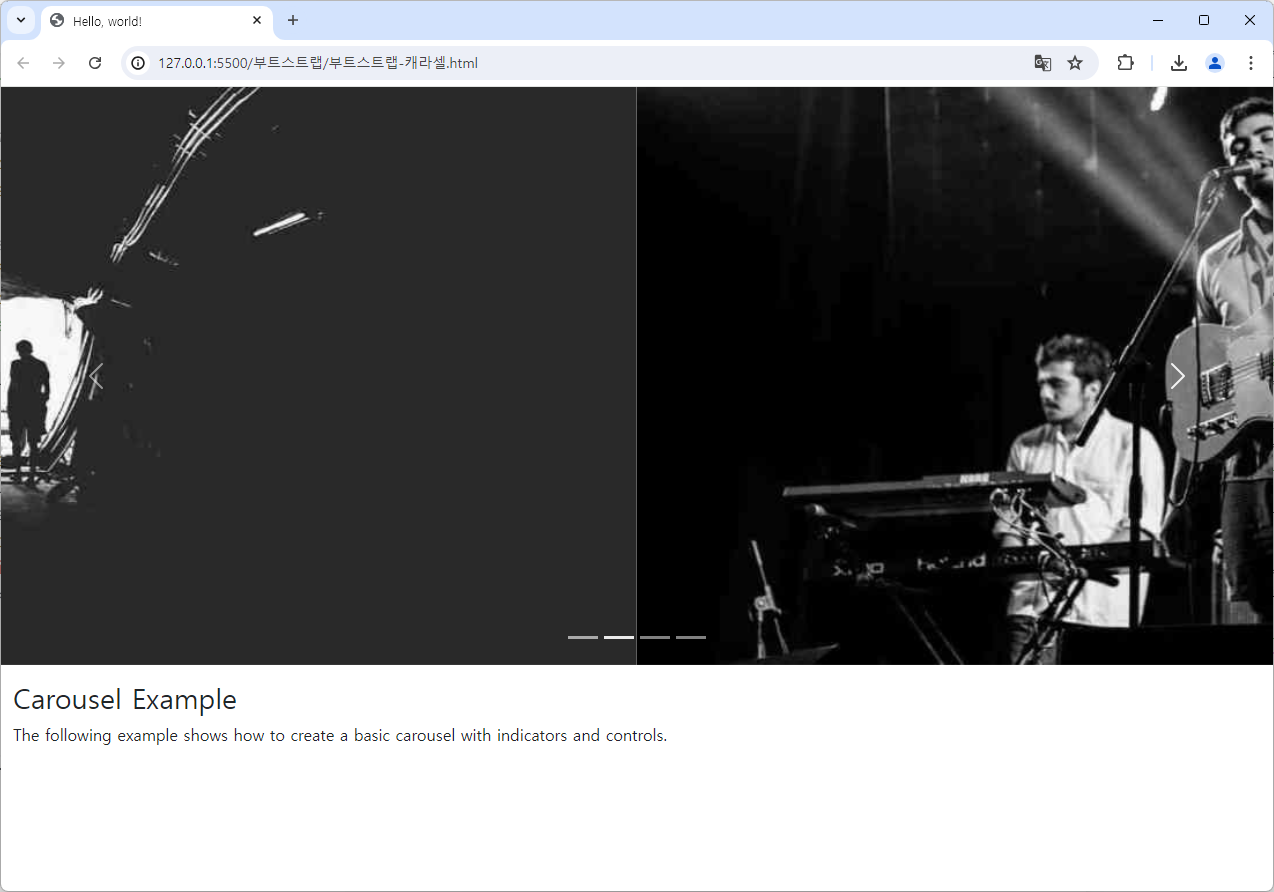
<!doctype html>
<html lang="en">

<head>
    <!-- Required meta tags -->
    <meta charset="utf-8">
    <meta name="viewport" content="width=device-width, initial-scale=1">

    <!-- Bootstrap CSS -->
    <link href="https://cdn.jsdelivr.net/npm/bootstrap@5.3.3/dist/css/bootstrap.min.css" rel="stylesheet">
    <script src="https://cdn.jsdelivr.net/npm/bootstrap@5.3.3/dist/js/bootstrap.bundle.min.js"></script>
    <title>Hello, world!</title>
</head>

<body>
    <!-- Carousel -->
    <div id="demo" class="carousel slide" data-bs-ride="carousel">

        <!-- Indicators/dots -->
        <div class="carousel-indicators">
            <button type="button" data-bs-target="#demo" data-bs-slide-to="0" class="active"></button>
            <button type="button" data-bs-target="#demo" data-bs-slide-to="1"></button>
            <button type="button" data-bs-target="#demo" data-bs-slide-to="2"></button>
        </div>

        <!-- The slideshow/carousel -->
        <div class="carousel-inner">
            <div class="carousel-item active">
                <img src="https://www.w3schools.com/bootstrap5/la.jpg" alt="Los Angeles" class="d-block" style="width:100%">
            </div>
            <div class="carousel-item">
                <img src="https://www.w3schools.com/bootstrap5/chicago.jpg" alt="Chicago" class="d-block" style="width:100%">
            </div>
            <div class="carousel-item">
                <img src="https://www.w3schools.com/bootstrap5/ny.jpg" alt="New York" class="d-block" style="width:100%">
            </div>
        </div>

        <!-- Left and right controls/icons -->
        <button class="carousel-control-prev" type="button" data-bs-target="#demo" data-bs-slide="prev">
            <span class="carousel-control-prev-icon"></span>
        </button>
        <button class="carousel-control-next" type="button" data-bs-target="#demo" data-bs-slide="next">
            <span class="carousel-control-next-icon"></span>
        </button>
    </div>

    <div class="container-fluid mt-3">
        <h3>Carousel Example</h3>
        <p>The following example shows how to create a basic carousel with indicators and controls.</p>
    </div>
</body>
</html>
공부중