7월 14일(키즈가오)
학습내용
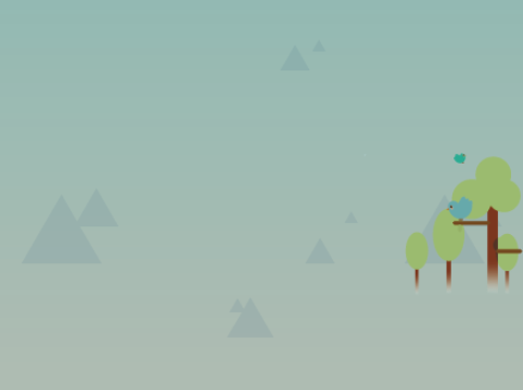
forest1, forest2, forest3, science, night1
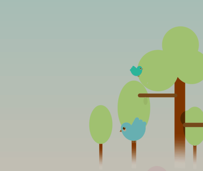
forest 1
- position : relative; - 자기 자신이 주체적으로 움직임, 3차원이기 때문에 레이어가 겹칠 수 있음
#forest1 .treeWrap .rightTree {
	position: absolute;

	width: 304px;
	height: 572px;
	background-image: url(../img/forest/forest1/righttree.png);

	z-index: 10;
}
- 토끼가 오른쪽 나무 뒤로 가야하기 때문에 오른쪽 나무에 z-index: 10;을 주었다.
forest 2
#forest2 .machineWrap2 .machineLeft {
	position: absolute;

	width: 123px;
	height: 228px;
	background-image: url(../img/forest/forest2/machineleft.png);

	margin-top: 30px;

	z-index: 200;

}

#forest2 .machineWrap2 .machineRight {
	position: absolute;

	width: 123px;
	height: 248px;
	background-image: url(../img/forest/forest2/machineright.png);

	margin: 10px 0 0 260px;

	z-index: 200;
}
- 같은 3차원이고 z-index값이 같다면 나중에 작성된 영역의 z축이 위로 배치가 됨
- html에 작성된 순서대로 배치작업을 하는게 수월하다.
 @keyframes moveLeft {
 	from{left: 30px;}
 	to{left: 0;}
 }
from left 35 to left 0 (최초위치로 돌아가는효과)
forest 3
- margin은 포지션의 영향을 받지 않는다.
mobile
#forest3 .forest3Wrap .smallBird,
#forest3 .forest3Wrap .bigBird {
	display: none;
}
모바일 화면에서는 움직이는 새들이 보이면 안되기 때문에 display: none; 처리를 해준다.
(모바일에서는 나무이미지에 새가 그려져있음)
science
#science .scienceWrap .scienceCenterWrap .funnelBack {
	✔position: absolute;

	width: 488px;
	height: 438px;
	background-image: url(../img/science/funnelback.png);
}
#science .scienceWrap .scienceCenterWrap .funnelFront {
	✔position: relative;

	width: 485px;
	height: 390px;
	background-image: url(../img/science/funnelfront.png);

	margin-top: 48px;
} -
둘 다 3차원이지만 funnelFront가 나중에 작성됐기 때문에 더 앞에 배치가 된다.
-
float 사용 시에는 감싸고 있는 영역의 크기가 같거나 커야 레이어 틀어짐 현상이 없다.
-
자식이 float를 사용하면 일부가 3차원이기 때문에 부모에게 높이값이 없어도 높이값을 줄 수 없음 but, overflow: hidden;을 사용하면 부모에게 높이값을 줄 수 있음.
(자식 중 가장 큰 값을 부모가 가져감, 여기에서는 scienceCenterWrap이 자식 중 가장 크기 때문에 scienceCenterWrap과 부모의 높이(scienceWrap)가 동일하다)

night 1
- 앞에 나오는 형제가 3차원이면 뒤에 나오는 형제가 2차원이든 3차원이든 레이어가 겹치게 되어있다. 앞이 absolute이고 뒤가 relative이면 뒤는 앞의 형제가 좌표기준점이 된다.
#night1 .starWrap .star1,
#night1 .starWrap .star2,
#night1 .starWrap .star3 {
	animation: pulseStar 1s linear infinite alternate ;
}

@keyframes pulseStar {
	from { transform: scale(1); }
	to { transform: scale(0.8); }
}
지금까지는 계속 transform : rotate(deg)로 애니메이션 효과를 주었지만 night1에서는 scale이란 효과를 주었다.
transform: scale(1) -> transform: scale(0.8)
원래크기 (1)에서 원래크기의 (0.8)로 변화
- 부모가 3차원이면 자식이 absolute일 때 부모가 좌표기준점이된다.

어려웠던 점
어제는 이해됐던게 오늘은 또 헷갈리고 총체적난국이다.
역시나 position이 문제다.
absolute와 relative가 또 너무 헷갈린다.
해결방법
레이아웃 관련 강의를 다시 한번 들어야겠다.
학습소감
어제와 별반 다를게 없지만 2시간이 넘는 분량이다 보니 집중력도 떨어지고 복습하려고 하니 막막하다.