css로 간단한 애니메이션을 만들 때 좋은 animation, @keyframes를 익혀보자!
animation
속성
- animation-name : 이름 정의
- @keyframes 속성에서 사용할 이름
- animation-duration : 지속시간
- animation-delay : 시작지연시간
- animation-direction : 애니메이션 종료 후, 처음으로 돌아갈지 역방향으로 돌아갈지 결정
- normal
- alternate(역방향-순방향 반복)
- reverse(역방향)
- alternate-reverse
- animation-iteration-count : 반복횟수
- infinite(무한반복)
- animation-play-state : 멈추거나 다시 시작할 수 있음
- running(기본값)
- paused(정지)
- ex) 자바스크립트에서 css 속성을 적용하여 버튼을 클릭하면 정지하도록 설정
- animation-timing-function : 중간 상태의 전환 시간간격
- animation-fill-mode : 시작 전이나 끝난 후 어떤 값이 적용될지 지정
- both
- forwards
@keyframes
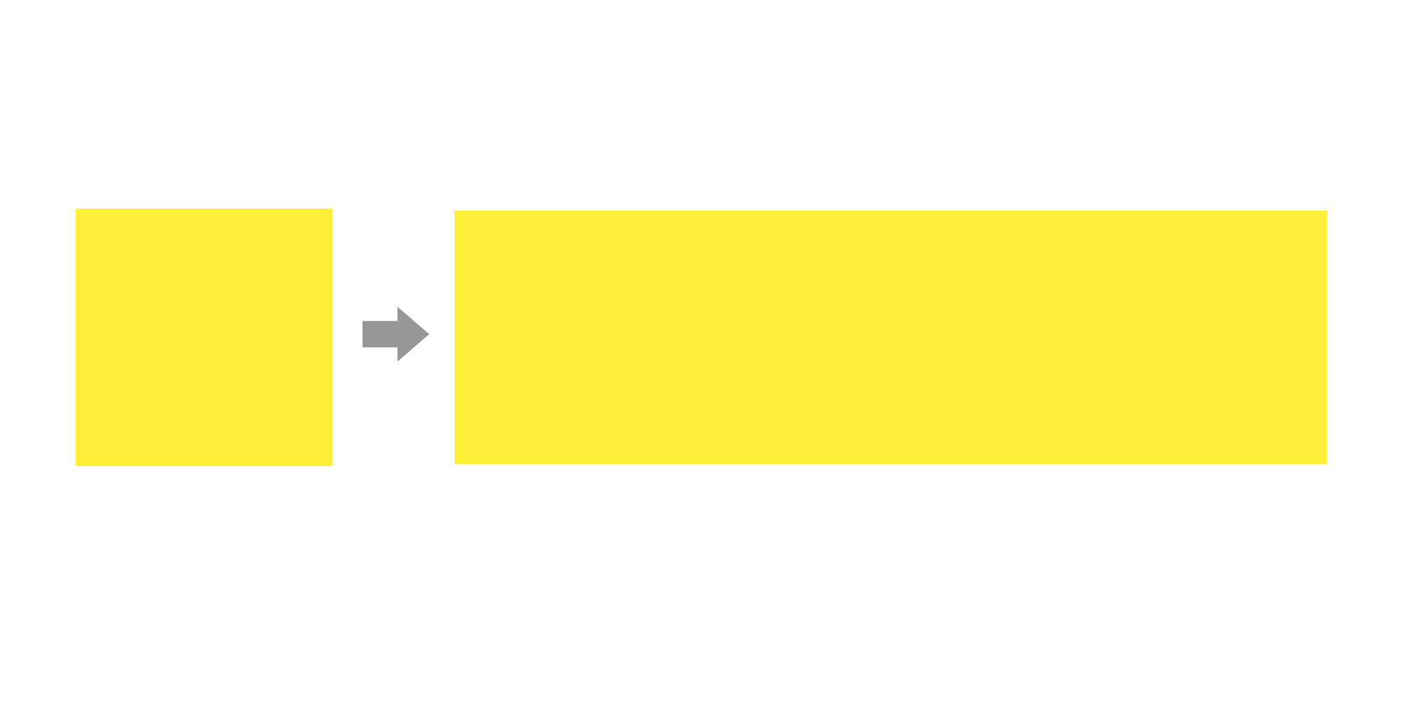
애니메이션을 재생할 프레임의 스타일을 정의하는 것으로, from(0%)속성에서 to(100%)속성으로 점차 스타일이 변화되며 애니메이션이 재생된다. from / to로 작성하거나, 0% / 50% / 100% 이런 식으로 중간 값을 설정해 작성할 수도 있다.
<style>
	@keyframes mybox{
             from{ width:100px; } /*너비100부터*/
             to{ width:500px; }  /*너비 500까지*/
        }

	.box{
 	    width: 100px;
            height: 100px;
            background-color:yellow;

            animation-name: mybox;
            animation-duration: 1s;
            animation-direction: alternate; /*반대방향으로*/
            animation-iteration-count: infinite; /*무한반복*/
            animation-delay: 1s;
            animation-timing-function: ease-in-out;
         }
</style>

<body>
	<p class="box"><p>
</body>- 너비가 자연스럽게 길어지며 무한반복하는 애니메이션

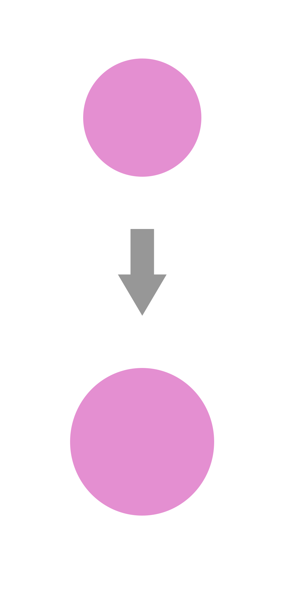
<style>
	@keyframes mycircle{
            0%{
            	transform:translate(0,0)
                rotate(0);
            }
            100%{
                transform:translate(0,500px) /*위치치정*/
                rotate(360deg); /*회전각도*/
                width : 120px;
                height : 120px;
            }
        }

	.circle{
    	    width: 100px;
            height: 100px;
            background-color: pink;
            border-radius: 50%;

            animation: mycircle 1s infinite alternate 0s; /*요약형*/
         }
</style>
<body>
	<p class="circle"><p>
</body>- 원이 360도 회전하며, 커지면서 아래방향으로 이동하는 애니메이션

의미와 가치를 쫓는 개발자 ✨