
1. 데이터 프레임 샘플링
df1 = df.sample(n=20, random_state=42)
df2 = df.sample(n=200, random_state=42)
s2.head()
n = 뽑을 표본의 수
random_state = 난수의 초기값
2. 신뢰구간 구하기
# numpy 연산을 위해서 numpy array로 변수 생성
s1_data = np.array(s1['col'])
s1_data[:5]

#
# out
# array([0.021, 0.02 , 0.002, 0.009, 0.044])
표준오차(standard error mean) =
표준편차 / 표본의 루트# s1의 standard error mean std_err = np.std(s1_data, ddof=1) / math.sqrt(len(s1_data)) # s1의 신뢰구간 # CI1 = st.t.interval(alpha=0.95, df=len(s1_data)-1, loc=s1_data.mean(), scale=std_err) print(CI1) # # out # (0.015060460813957321, 0.028439539186042674)stats.t.interval() 신뢰구간 추출함수
alpha = 신뢰도
df = 자유도
loc = 중심점
scale = 표준오차CI2 = st.t.interval(alpha=.95, df=len(s2_data)-1, loc=s2_data.mean(), scale=st.sem(s2_data, ddof=1))st.sem() 함수를 이용해서 표준오차를 바로 구할 수도 있음
ddof = delta degrees of freedom
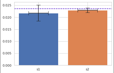
3. plt.bar() xerr, yerr
plt.bar(x='s1', height=s1_data.mean(),
        xerr=0.2,
        yerr=(s1_data.mean()-CI1[0]) / 2, capsize=7)
# s2 플로팅
plt.bar(x='s2', height=s2_data.mean(),
        xerr=0.2,
        yerr=(s2_data.mean()-CI2[0]) / 2, capsize=7)
# 가로선 표현하기
plt.axhline(pop_mean, linestyle='--', color='#4000c7')
plt.show()
out:
xerr, yerr 파라미터에 길이 할당하여 신뢰구간 표현
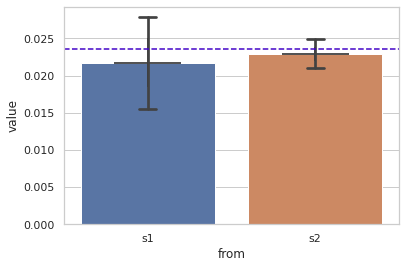
4. seaborn barplot 위의 표와 같이 시각화 하기
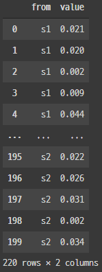
# s1, s2 데이터프레임화 하기
temp_s1 = []
temp_s2 = []
# s1, s2 나누기 위한 리스트
for i in range(len(s1_data)):
    temp_s1.append('s1')
for i in range(len(s2_data)):
    temp_s2.append('s2')
# s1, s2 데이터프레임화 후 concat으로 합치기
s1_df = pd.DataFrame(data={'from' : temp_s1, 'value' : s1_data})
s2_df = pd.DataFrame(data={'from' : temp_s2, 'value' : s2_data})
plot_df = pd.concat([s1_df, s2_df])
plot_df
out:
# seaborm barplot 사용하여 플로팅
sns.barplot(x='from', y='value', data=plot_df, xerr=.2, capsize=.1)
plt.axhline(pop_mean, linestyle='--', color='#4000c7')
plt.show()
out:
데이터 프레임으로 만들어 모든 값을 넘겨주어 테스트 겸 해봤는데 yerr를 할당해주지 않아도 알아서 출력되었다. 하지만 내가 원하는 errorbar가 출력되지 않는 현상이 있었다. yerr에 값을 주어도 변화하지 않았고, plt.errorbar()를 통해 따로 표현하려 해봤지만 s1과 s2의 데이터가 이어져 있는 형태로 출력 되었다. Document를 참고해서 해봤지만 실패... 여러 방법을 다시 시도해 봐야겠다.
5. 큰수의 법칙
1.표본 데이터 numpy array로 만들기
population = np.array(df['col'])
population[:5]

#
# out
# array([0.02 , 0.021, 0.025, 0.032, 0.034])
2.표본 데이터의 분산계산
#
population.var()

#
# out
# 0.00019540879725979884
3. 추출 표본수를 루프마다 증가시키고, 추출한 표본에 대한 분산을 계산하여 리스트에 넣기
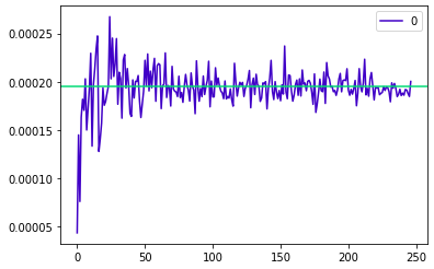
dat = []

for i in np.arange(3, len(population), 3):
    s = np.random.choice(population, i)
    dat.append(s.var())
dat[:5]

#
# out
# [0.00025025000000000004,
# 9.168750000000001e-05,
# 0.00010972222222222225,
# 0.00022256250000000002,
# 0.0001937475]
4. 추출된 표본 그래프 보기
pd.DataFrame(dat).plot.line(color = '#4000c7').
axhline(y = np.array(population.var()), color = '#00da75');
out :
표본의 수가 많아짐에 따라 점점 모수의 분산에 근사하는 것을 볼 수 있다.
6. 중심극한가설
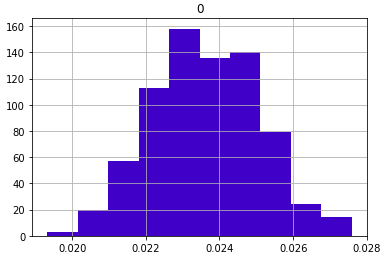
1.표본 평균의 히스토그램
sample_means = []
for x in range(0, len(population)):
    sample = np.random.choice(population, 100)
    sample_means.append(sample.mean())

# 표본평균 데이터에 대한 분포확인
pd.DataFrame(sample_means).hist(color = '#4000c7');
out :
2. 표본의 크기별 분포도 확인
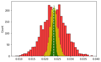
# 샘플을 10, 100, 700 으로 표본을 뽑아 표본에 대한 평균값 리스트에 쌓기
sample_means_small = []
sample_means_medium = []
sample_means_large = []

for x in range(0, 3000):
  small = np.random.choice(population, 10)
  medium = np.random.choice(population, 100)
  large = np.random.choice(population, 700)
  sample_means_small.append(small.mean())
  sample_means_medium.append(medium.mean())
  sample_means_large.append(large.mean())
  ax = plt.subplots()

ax = plt.subplots()
# 표본을 적게 뽑은 평균 데이터의 히스토그램(빨강)
sns.histplot(sample_means_small, color = 'red')
# 표본을 중간 정도 뽑은 평균 데이터의 히스토그램(노랑)
sns.histplot(sample_means_medium, color = 'yellow')
# 표본을 많이 뽑은 평균 데이터의 히스토그램(초록)
sns.histplot(sample_means_large, color = 'green');
# 모집단의 평균 선 그리기
plt.axvline(x=population.mean(), color='white', linestyle='--', linewidth=2)
plt.show()

# sample_means_small -> red
# sample_means_medium -> yellow
# sample_means_large -> green
# population mean -> white
out :
샘플의 사이즈가 커지면 커질수록 샘플의 평균은 정규분포에 근사한 데이터를 형성한다. 결국 샘플이 많을수록 우리가 원하는 데이터(모평균)에 근사할 수 있다.

조금씩 천천히