1. Animation
적용되는 CSS 스타일을 다른 CSS 스타일로 부드럽게 전환시켜 주는 것입니다.
Animation 이 transition 보다 더 규모가 크고 복잡 => 정밀한 효과 가능
🧐 @keyframes : 애니메이션의 중간 상태
2. keyframes 정의
-
from(시작) ~ to(끝)이용한 애니메이션 생성 -
from ~ {percent} ~ to이용한 애니메이션 생성
3. Animation 속성
-
animation-name-
애니메이션의 중간 상태를 지정하기 위한 이름을 정의합니다.
-
중간 상태는
@keyframes규칙 사용합니다.
✍ 코드
@animation-name: shape; @keyframes shape { ... -
-
animation-duration한 사이클의 애니메이션이 몇 초 지속될 지 지정합니다.
-
animation-delay언제 애니메이션이 시작될 지 지정합니다.
-
animation-iteration-count-
애니메이션이 몇 번 반복될 지 지정합니다.
-
infinite로 지정하면 무한히 반복
-
-
animation-play-state애니메이션을 멈추거나 다시 시작 가능합니다.
-
animation-timing-function중간 상태들의 전환을 어떤 시간 간격으로 진행할 지 지정합니다.
-
animation-fill-mode애니메이션 시작 전이나 끝난 이후 어떤 값이 적용될 지 지정합니다.
-
animation단축 속성으로 한번에 작성 가능합니다.
✍ 코드
<head>
<style>
.shape {
margin: 0 auto;
margin-top: 80px;
width: 100px;
height: 100px;
background-color: red;
}
</style>
</head>
<body>
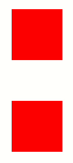
<main class="container">
<div class="shape animation1"></div>
<div class="shape animation2"></div>
</main>
</body>👉 결과
🧐 margin: 0 auto; 는 위, 아래는 margin 이 0이고 양 옆은 margin 이 auto
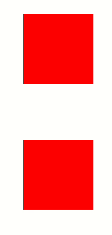
Animation-name
-
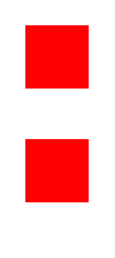
빨간색 사각형 -> 파란색 사각형으로 변하는 애니메이션 정의
✍ 코드
<head>
  <style>
    .shape {
      margin: 0 auto;
      margin-top: 80px;
      width: 100px;
      height: 100px;
      background-color: red;
    }
    .animation1 {
      animation-name: shape-color;
      animation-duration: 5s;
    }
    @keyframes shape-color {
      from {
        background-color: red;
      }
      to {
        background-color: blue;
      }
    }
  </style>
</head>
<body>
  <main class="container">
    <div class="shape animation1"></div>
    <div class="shape animation2"></div>
  </main>
</body>
👉 결과
🧐
animation-name: 애니메이션 명과@keyframes 애니메이션 명이 동일해야 합니다.🧐
animation-duration통해 애니메이션 지속 시간이5초로 지정하였습니다. -
빨간색 사각형 -> 노란색 사각형 -> 파란색 사각형으로 변하는 애니메이션 정의
✍ 코드
<head>
  <style>
    .shape {
      margin: 0 auto;
      margin-top: 80px;
      width: 100px;
      height: 100px;
      background-color: red;
    }
    .animation1 {
      animation-name: shape-color;
      animation-duration: 5s;
    }
    @keyframes shape-color {
      0% {
        background-color: red;
      }
      50% {
        background-color: yellow;
      }
      100% {
        background-color: blue;
      }
    }
  </style>
</head>
<body>
  <main class="container">
    <div class="shape animation1"></div>
    <div class="shape animation2"></div>
  </main>
</body>
👉 결과
🧐
from {} ~ percent {} ~ to {}도 가능
Animation-iteration-count
반복을 의미
✍ 코드
<head>
  <style>
    .shape {
      margin: 0 auto;
      margin-top: 80px;
      width: 100px;
      height: 100px;
      background-color: red;
    }
    .animation1 {
      animation-name: shape-color;
      animation-duration: 5s;
      animation-iteration-count: 3;
    }
    @keyframes shape-color {
      0% {
        background-color: red;
      }
      50% {
        background-color: yellow;
      }
      100% {
        background-color: blue;
      }
    }
  </style>
</head>
<body>
  <main class="container">
    <div class="shape animation1"></div>
    <div class="shape animation2"></div>
  </main>
</body>
👉 결과
🧐 animation-iteration-count 통해 애니메이션을 3번 반복하였습니다.
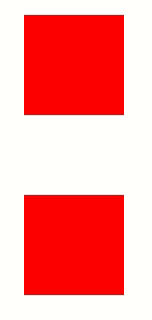
Animation 단축 속성
두 번째 사각형의 모양 변경합니다.
✍ 코드
<head>
  <style>
    .shape {
      margin: 0 auto;
      margin-top: 80px;
      width: 100px;
      height: 100px;
      background-color: red;
    }
    .animation2 {
      animation: circle 2s infinite;
    }
    @keyframes circle {
      0% {
        border-radius: 0;
      }
      50% {
        border-radius: 50%;
      }
      100% {
        border-radius: 0;
      }
    }
  </style>
</head>
<body>
  <main class="container">
    <div class="shape animation1"></div>
    <div class="shape animation2"></div>
  </main>
</body>
👉 결과
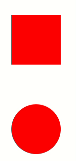
🧐 animation 의 단축 속성은 animation: name duration timing-function delay iteration-count direction fill-mode; 입니다.
🧐 위 코드의 animation: circle 2s infinite; 통해 animation 의 name 은 circle 이고 duration 은 2초 이고 interation-count 는 infinite 로 무한대입니다.
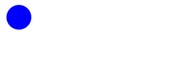
4. 로딩바 만들기
원형 여러 개에 animation 적용하여 로딩바를 만듭니다.
원형 하나 생성하기
✍ 코드
<head>
  <style>
    body {
      margin: 0;
      padding: 0;
    }
    .circle {
      width: 20px;
      height: 20px;
      margin-left: 10px;
      margin-top: 10px;
      background-color: blue;
      border-radius: 50%;
      position: absolute;
    }
  </style>
</head>
<body>
  <div class="animation-wrapper">
    <div class="circle"></div>
  </div>
</body>
👉 결과
생성한 원형 위아래로 animation
무한히 움직이도록 설정합니다.
✍ 코드
<head>
  <style>
    body {
      margin: 0;
      padding: 0;
    }
    .circle {
      width: 20px;
      height: 20px;
      margin-left: 10px;
      margin-top: 10px;
      background-color: blue;
      border-radius: 50%;
      position: absolute;
      animation: move-the-circle 1s infinite;
    }

    @keyframes move-the-circle {
      0% {
        transform: translate(0, 0);
      }
      50% {
        transform: translate(0, 50px);
      }
      100% {
        transform: translate(0, 0);
      }
    }
  </style>
</head>
<body>
  <div class="animation-wrapper">
    <div class="circle"></div>
  </div>
</body>
👉 결과

🧐 keyframes 이름을 move-the-circle 로 지정
🧐 위아래 움직이는 시간을 1초 로 지정 -> 무한히 설정
원형 하나 더 생성하기
✍ 코드
<head>
  <style>
    body {
      margin: 0;
      padding: 0;
    }
    .circle {
      width: 20px;
      height: 20px;
      margin-left: 10px;
      margin-top: 10px;
      background-color: blue;
      border-radius: 50%;
      position: absolute;
      animation: move-the-circle 1.5s infinite;
    }

    .circle:nth-child(2) {
      left: 30px;
      animation-delay: 0.1s;
    }

    @keyframes move-the-circle {
      0% {
        transform: translate(0, 0);
      }
      50% {
        transform: translate(0, 50px);
      }
      100% {
        transform: translate(0, 0);
      }
    }
  </style>
</head>
<body>
  <div class="animation-wrapper">
    <div class="circle"></div>
    <div class="circle"></div>
  </div>
</body>
👉 결과
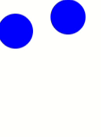
🧐 nth-child() : 형제 사이에서 순서에 따라서 요소를 선택
🧐 animation-delay 를 통해 0.1초 지연됨을 표현
원형 여러개 생성하여 로딩바 만들기
✍ 코드
<head>
  <style>
    body {
      margin: 0;
      padding: 0;
    }
    .circle {
      width: 20px;
      height: 20px;
      margin-left: 10px;
      margin-top: 10px;
      background-color: blue;
      border-radius: 50%;
      position: absolute;
      animation: move-the-circle 1.5s infinite;
    }

    .circle:nth-child(2) {
      left: 30px;
      animation-delay: 0.1s;
    }
    .circle:nth-child(3) {
      left: 60px;
      animation-delay: 0.2s;
    }
    .circle:nth-child(4) {
      left: 90px;
      animation-delay: 0.3s;
    }
    .circle:nth-child(5) {
      left: 120px;
      animation-delay: 0.4s;
    }
    .circle:nth-child(6) {
      left: 150px;
      animation-delay: 0.5s;
    }
    .circle:nth-child(7) {
      left: 180px;
      animation-delay: 0.6s;
    }
    .circle:nth-child(8) {
      left: 210px;
      animation-delay: 0.7s;
    }

    @keyframes move-the-circle {
      0% {
        transform: translate(0, 0);
      }
      50% {
        transform: translate(0, 50px);
      }
      100% {
        transform: translate(0, 0);
      }
    }
  </style>
</head>
<body>
  <div class="animation-wrapper">
    <div class="circle"></div>
    <div class="circle"></div>
    <div class="circle"></div>
    <div class="circle"></div>
    <div class="circle"></div>
    <div class="circle"></div>
    <div class="circle"></div>
    <div class="circle"></div>
  </div>
</body>
👉 결과
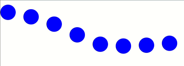
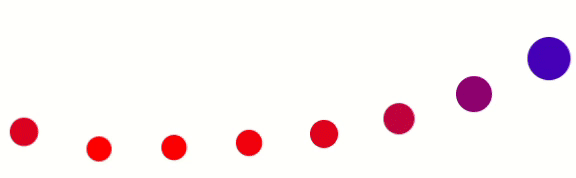
🧐 왼쪽으로 30px 거리를 두고 animation-delay 를 0.1초 씩 시간 차를 두었습니다.
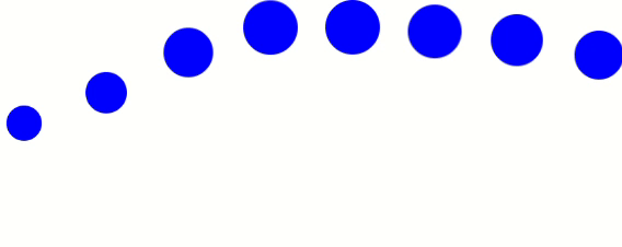
scale() 추가
✍ 코드
<head>
  <style>
    body {
      margin: 0;
      padding: 0;
    }
    .circle {
      width: 20px;
      height: 20px;
      margin-left: 10px;
      margin-top: 10px;
      background-color: blue;
      border-radius: 50%;
      position: absolute;
      animation: move-the-circle 1.5s infinite;
    }

    .circle:nth-child(2) {
      left: 30px;
      animation-delay: 0.1s;
    }
    .circle:nth-child(3) {
      left: 60px;
      animation-delay: 0.2s;
    }
    .circle:nth-child(4) {
      left: 90px;
      animation-delay: 0.3s;
    }
    .circle:nth-child(5) {
      left: 120px;
      animation-delay: 0.4s;
    }
    .circle:nth-child(6) {
      left: 150px;
      animation-delay: 0.5s;
    }
    .circle:nth-child(7) {
      left: 180px;
      animation-delay: 0.6s;
    }
    .circle:nth-child(8) {
      left: 210px;
      animation-delay: 0.7s;
    }

    @keyframes move-the-circle {
      0% {
        transform: translate(0, 0) scale(1);
      }
      50% {
        transform: translate(0, 50px) scale(0.5);
      }
      100% {
        transform: translate(0, 0) scale(1);
      }
    }
  </style>
</head>
<body>
  <div class="animation-wrapper">
    <div class="circle"></div>
    <div class="circle"></div>
    <div class="circle"></div>
    <div class="circle"></div>
    <div class="circle"></div>
    <div class="circle"></div>
    <div class="circle"></div>
    <div class="circle"></div>
  </div>
</body>
👉 결과
색상 변경
✍ 코드
<head>
  <style>
    body {
      margin: 0;
      padding: 0;
    }
    .circle {
      width: 20px;
      height: 20px;
      margin-left: 10px;
      margin-top: 10px;
      background-color: blue;
      border-radius: 50%;
      position: absolute;
      animation: move-the-circle 1.5s infinite;
    }

    .circle:nth-child(2) {
      left: 30px;
      animation-delay: 0.1s;
    }
    .circle:nth-child(3) {
      left: 60px;
      animation-delay: 0.2s;
    }
    .circle:nth-child(4) {
      left: 90px;
      animation-delay: 0.3s;
    }
    .circle:nth-child(5) {
      left: 120px;
      animation-delay: 0.4s;
    }
    .circle:nth-child(6) {
      left: 150px;
      animation-delay: 0.5s;
    }
    .circle:nth-child(7) {
      left: 180px;
      animation-delay: 0.6s;
    }
    .circle:nth-child(8) {
      left: 210px;
      animation-delay: 0.7s;
    }

    @keyframes move-the-circle {
      0% {
        transform: translate(0, 0) scale(1);
        background-color: blue;
      }
      50% {
        transform: translate(0, 50px) scale(0.5);
        background-color: red;
      }
      100% {
        transform: translate(0, 0) scale(1);
        background-color: blue;
      }
    }
  </style>
</head>
<body>
  <div class="animation-wrapper">
    <div class="circle"></div>
    <div class="circle"></div>
    <div class="circle"></div>
    <div class="circle"></div>
    <div class="circle"></div>
    <div class="circle"></div>
    <div class="circle"></div>
    <div class="circle"></div>
  </div>
</body>
👉 결과