박스 테두리 그라데이션 애니메이션
개인프로젝트할 때 이렇게 그라데이션이 움직이는 테두리를 만들어봤다.
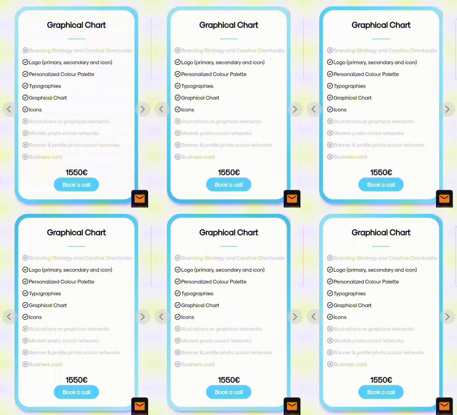
작동원리
그라데이션이 회전하는 요소를 만들고 그 위에 내용이 들어가는 요소를 만들면 된다.
1. container 요소에 크기를 지정해준다.
2. container::before 가상요소에 그라데이션이 움직이는 배경을 만든다.
3.inner요소에 내용 입력 요소를 만든다.<!-- html 코드 --> <body> <div class="container"> <div class="inner">hello</div> </div> </body>/* css 코드 */ body{ display: flex; justify-content: center; align-items: center; } .container { position: relative; display: flex; justify-content: center; align-items: center; border-radius: 20px; overflow: hidden; width: 200px; height: 300px; position: relative; z-index: -1; } .container:after { position: absolute; content: ""; z-index: -1; width: 200%; height: 200%; background: linear-gradient(132deg, #cbeef7, #4bc8fe 60%, #34a2d1); animation: spin 1s linear infinite; } @keyframes spin { 0% { transform: rotate(0deg); } 100% { transform: rotate(360deg); } } .container .inner{ width:90%; height:94%; background:white; border-radius: 20px; display: flex; justify-content: center; align-items: center; }

개발블로그입니다.