이 글을 지난 10월 9일부터 10월 27일까지 진행된 미니 프로젝트의 과정을 아카이빙하기 위해 작성되었습니다.
1. 프로젝트 인트로
1.1. 목표와 선택
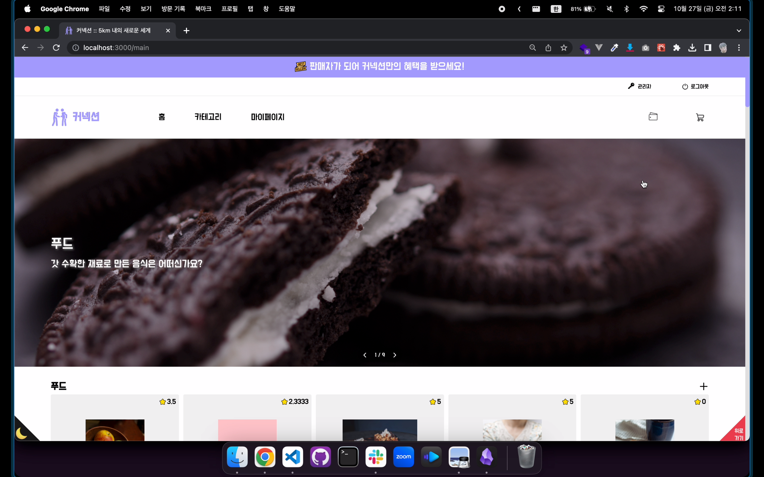
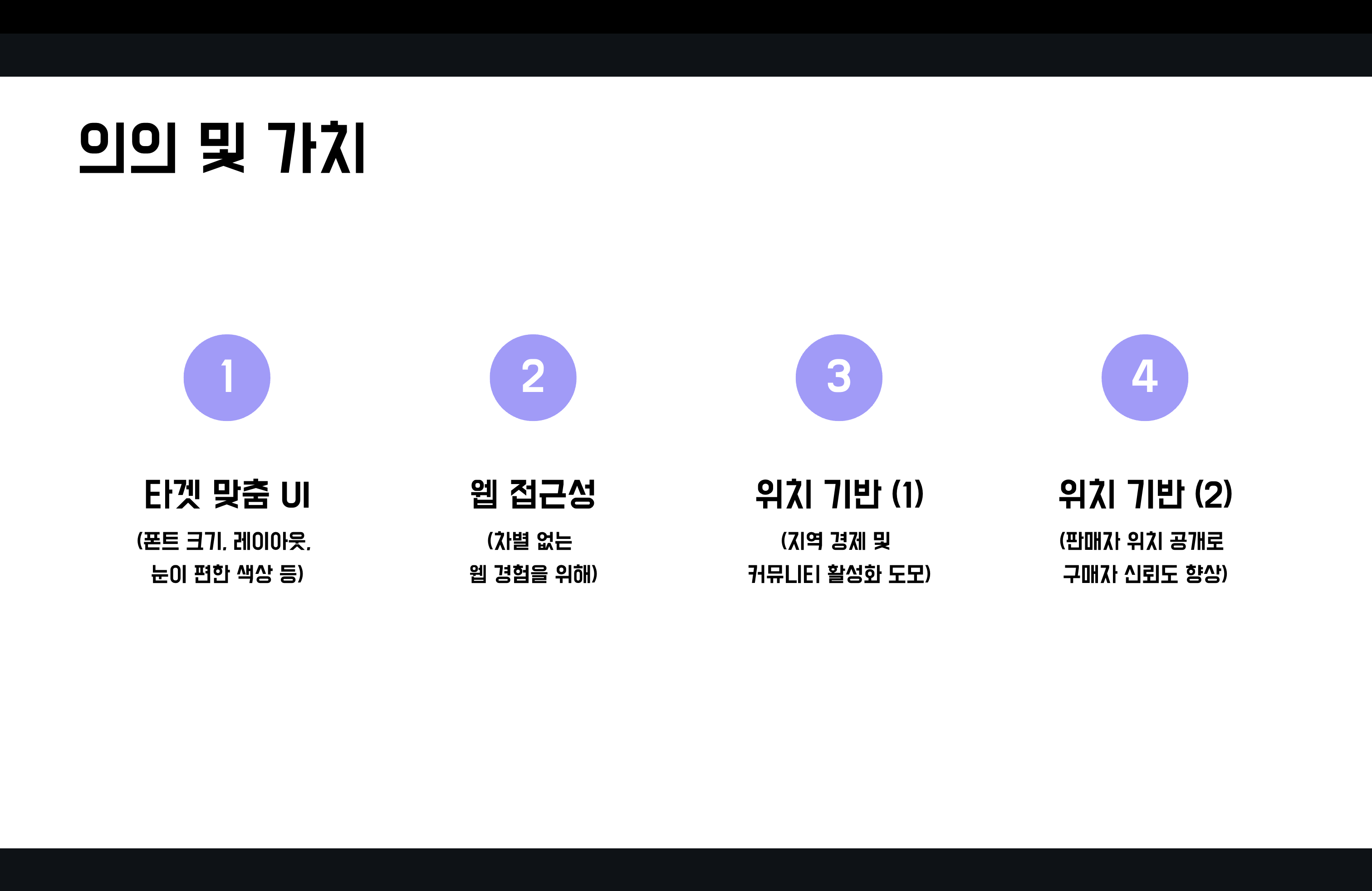
- 이번 프로젝트의 목표는 제로 베이스에서 새로운 서비스를 기획 단계부터 개발 단계까지 진행시켜 웹 사이트로 구축하는 것이었습니다.
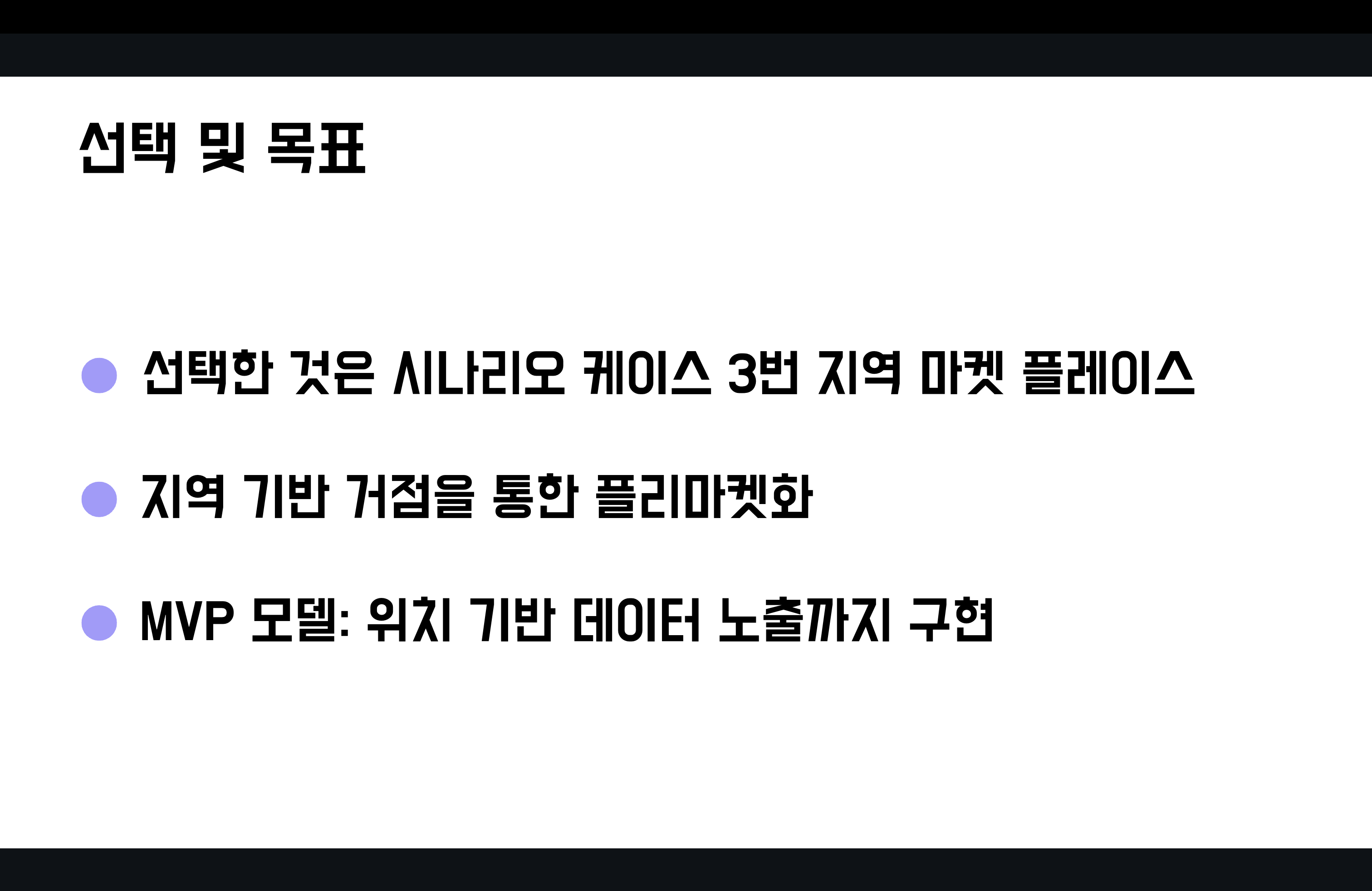
- 지역 경제 활성화와 커뮤니티 강화를 주요 안건으로 삼아 위치 기반 서비스를 하는 것이 우리의 궁극적 목표였고, 그에 따라 반드시 지도 API의 사용이 필요했습니다.
- 이 뿐만 아니라, 지방의 고령화된 상황을 고려해 타겟 유저 연령층을 높게 설정함에 따라 레이아웃 규모와 폰트 크기, 눈이 편한 색상을 선택하는 것에 심혈을 기울였습니다.
1.2. 협업과 발표
-
지난 프로젝트와 마찬가지로
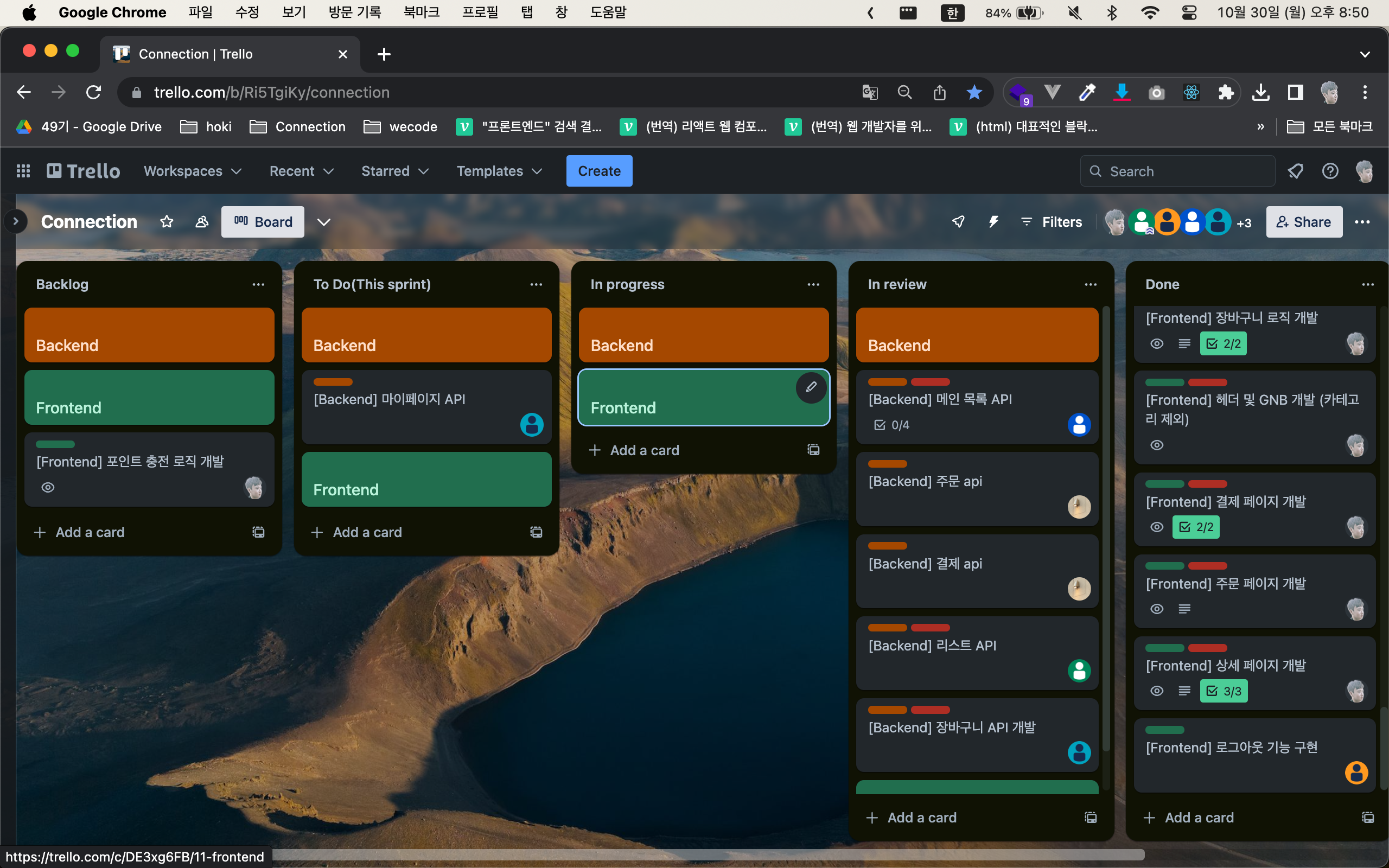
데일리 스탠드업 미팅(Daily Standup Meeting)을 매일 진행했습니다. -
이슈 트랙커로는
트렐로(Trello)를 사용했습니다.
-
페어 프로그래밍(pair programming)을 시도해봤던 프로젝트입니다. 다만, 기존 3인의 프론트엔드 개발자 체제에서 1인이 이탈함에 따라 인력 부족으로 더 이상 진행되지 못했습니다. -
이번 프로젝트에서는
프로덕트 매니저(Product Manager)역할을 수행하여 프로젝트 전반에서 의사 결정에 큰 목소리를 냈습니다. 그리고 3주 간의 개발 기간 후 진행되는데모데이에서 팀을 대표해 발표를 맡게 되었습니다. 발표 자료는 아래에서 확인하실 수 있습니다.


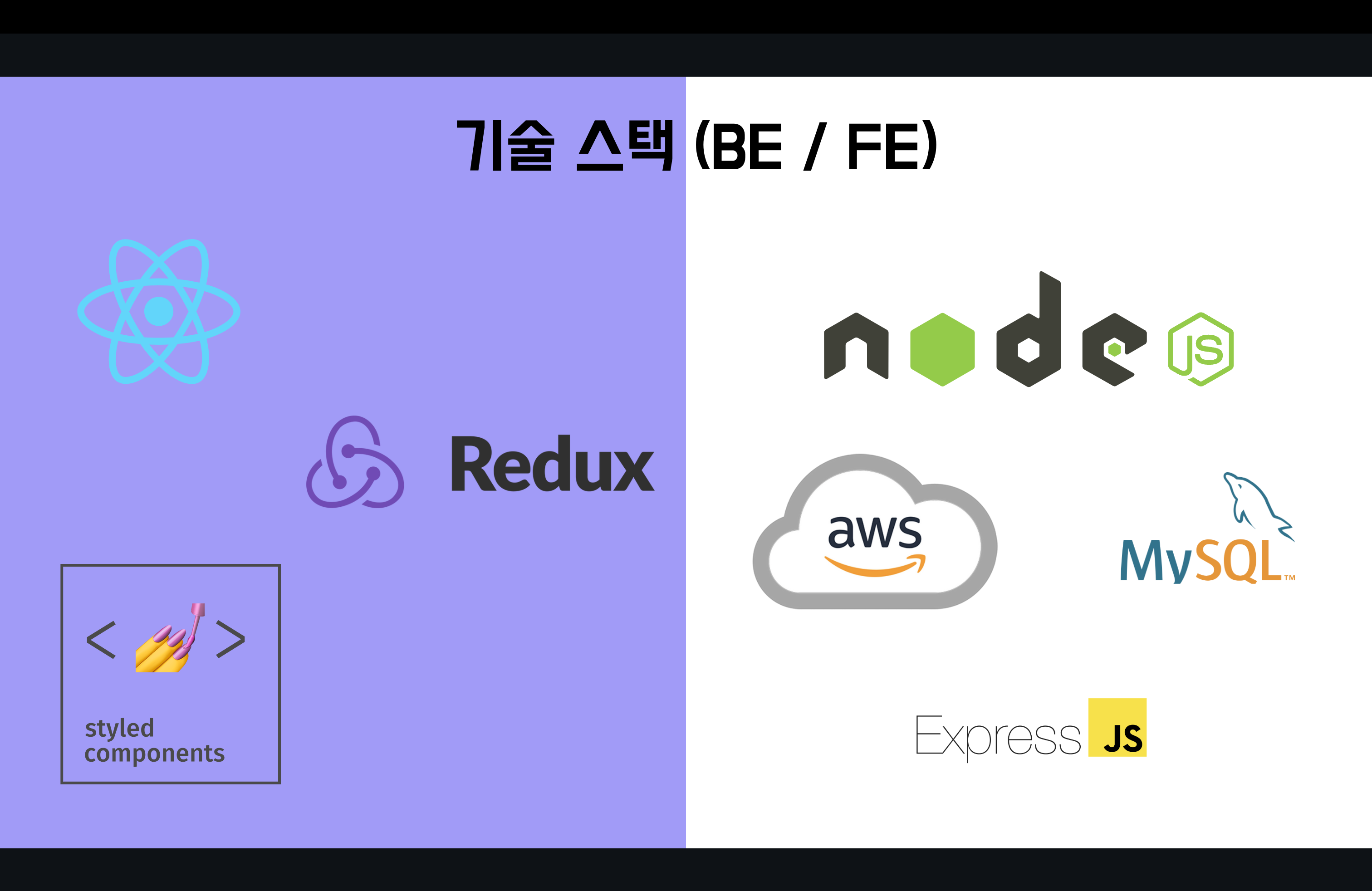
2. 기술 스택 및 사용기
2.1. React
- React는 사용자 정의 태그를 만들고, 이를 활용하는 자바스크립트 라이브러리이므로 이번 프로젝트에서도 컴포넌트 중심으로 UI를 개발하는 방법론인
컴포넌트 주도 개발(Component Driven Development)로 프로젝트 기반을 구축했습니다.
2.1.1. Modal & Portal
Modal Popup은 웹 개발에서 빠질 수 없는 컴포넌트입니다. 따라서 이 글에서는 이 컴포넌트에 대해 언급하고자 합니다.
// Modal.js
function Modal({ data, onClose, ...props }) {
  return (
    <ModalPopup>
      <Backdrop onClick={onClose} />
      <Content {...props}>
        <ModalCloseButton
          type="button"
          aria-label="모달 팝업 닫기"
          onClick={onClose}
        >
          <MoreIcon />
        </ModalCloseButton>
        {data}
      </Content>
    </ModalPopup>
  );
}- Modal 컴포넌트는 여러 props을 받을 수 있지만, 중요한 props는 추리면 둘 정도입니다.
- 첫째,
data입니다. 실제 Modal 안의 컨텐츠를 의미하며, 각 컨텐츠를 컴포넌트 파일로 만들어 주입하는 방식을 선택했습니다. 아래가 그 예시입니다.
<CartButton onClick={modalHandler} />
<Portal>
  {modalOpen && (
    <Modal
      data={
        <Purchase
          productId={productId}
          productName={productName}
          totalPrice={totalPrice}
          onClose={modalHandler}
          />
      }
      onClose={modalHandler}
      />
  )}
</Portal>- 둘째,
onClose는 이 Modal 컴포넌트를 닫기 위한 함수가 담긴 props입니다. Modal 컴포넌트에서는 Modal 영역이 아닌 영역을 클릭해도, 닫기 버튼을 클릭해도 닫혀야 하므로, 아래 컴포넌트에 주입합니다. - 그러나 Modal 컴포넌트만으로는 완벽하지 않습니다. 부모 컨텐츠의
z-index레벨에 따라 z축으로의 위치가 결정되는만큼, Modal은 root와 동격으로 존재해야 합니다. 이를 위해Portal을 사용해야 합니다. - Portal을 만들기 위해서는 먼저 SPA의 유일한 html인
index.html로 접근합니다.
// index.html
<div id="root"></div>
<div id="modal"></div>- root는 React 세팅 시에 자동적으로 생성되는 태그입니다. 이 태그와 형제 레벨로 modal을 만들어 놓습니다. 다음 단계는 Portal.js를 생성하는 것입니다.
// Portal.js
import reactDom from 'react-dom';

const Portal = ({ children }) => {
  const el = document.getElementById('modal');
  return reactDom.createPortal(children, el);
};

export default Portal;
- index.html에 생성한 id 값이 modal인 엘리먼트를 선택자로 지정합니다.
createPortal 메서드로 DOM 계층 최상위에 렌더링 준비를 마칩니다.
2.2. styled components
styled components는 CSS를 컴포넌트화하는 라이브러리입니다.- 가장 원시적인 형태의 웹 개발은 HTML / CSS / JavaScript로 나눠 개발하는 것입니다. 이 형태에서 벗어나 보다 편한 방법을 찾기 시작했고, 셋을 이리저리 합쳐보기도 합니다.
- 여기서 다룰
styled components는HTML + CSS + JavaScript라는 방식으로 셋을 묶어 JS 파일 하나에서 컴포넌트 단위로 개발할 수 있게 합니다. - 아래의 Button 컴포넌트는 이 프로젝트에서 최초로 개발된 컴포넌트입니다.
// Button.js
import styled from 'styled-components';

const Button = ({
  type = 'button',
  content = 'button',
  onClick,
  disabled = false,
  ...props
}) => {
  return (
    <DefaultButton
      type={type}
      aria-label={content}
      onClick={onClick}
      disabled={disabled}
      {...props}
    >
      {content}
    </DefaultButton>
  );
};

/**
 * Button props list
 * @property {string} type: button, submit, reset           - 버튼 타입을 정의합니다.
 * @property {string} shape: solid, outline                 - 버튼 형태를 정의합니다.
 * @property {string} color: primary, secondary, neutral    - 버튼 색상을 정의합니다.
 * @property {string} size: small, medium, large            - 버튼 크기를 정의합니다.
 * @property {string} content                               - 버튼 내부 텍스트와 웹 접근성 처리에 사용합니다.
 * @property {function} onClick                             - 버튼 클릭 시 실행할 함수를 위해 미리 정의합니다.
 * @property {boolean} disabled                             - 버튼의 비활성화 상태를 정의합니다.
 */

const SIZE_STYLES = {
  small: {
    padding: '11px 10px',
    fontSize: '16px',
  },
  medium: {
    padding: '12px 10px',
    fontSize: '20px',
  },
  large: {
    padding: '13px 10px',
    fontSize: '24px',
  },
};

const DefaultButton = styled.button`
  display: flex;
  justify-content: center;
  align-items: center;
  width: 100%;
  border: 1px transparent solid;
  border-radius: 4px;
  opacity: 0.9;
  cursor: pointer;

  padding: ${({ size }) => SIZE_STYLES[size]?.padding || '13px 10px'};

  font-size: ${({ size }) => SIZE_STYLES[size]?.fontSize || '20px'};

  border-color: ${props =>
    (props.color === 'primary' && props.theme.primaryColor) ||
    (props.color === 'secondary' && props.theme.secondaryColor) ||
    props.theme.grayscaleD};

  &:hover,
  &:active {
    opacity: 1;
  }

  &[disabled] {
    opacity: 0.2;
    cursor: not-allowed;
  }

  ${props => {
    if (props.shape === 'solid') {
      return `
        background-color: ${
          (props.color === 'primary' && props.theme.primaryColor) ||
          (props.color === 'secondary' && props.theme.secondaryColor) ||
          props.theme.grayscaleD
        };

        color: ${props.theme.grayscaleA};
        `;
    } else {
      return `
      background-color: ${props.theme.grayscaleB};
      color: ${props.theme.grayscaleC};
    `;
    }
  }}
`;

export default Button;- 먼저
styled components를 import하고, Button 컴포넌트의 필수적인 props를 가려냅니다.type,content,onClick,disabled까지 추린 이후에 형태나 색상, 크기와 같은 디자인적 부분은spread operator props로 전달받도록 합니다. styled components의 syntax는 그리 어렵지 않습니다. 사용자 정의 태그를 변수로 지정하고, styled.tag라는 문법이 뒤따르며, CSS properties와 values에서 props를 통해 스타일링을 하든가, 분기를 하는 식으로 처리하는 것이 전부입니다.
2.3. Theme Provider
- 2.2절에 언급할 styled components의
Theme Provider로 테마 전환 기능을 구현했습니다. - 우선, theme를 지정하면서 회색조 컬러는 짝수로 설정합니다.
// theme.js
export const lightTheme = {
  primaryColor: '#a29bfe',
  secondaryColor: '#e71d36',
  grayscaleA: '#fff',
  grayscaleB: '#efefef',
  grayscaleC: '#dfdfdf',
  grayscaleD: '#c8c8c8',
  grayscaleE: '#b7b7b7',
  grayscaleF: '#000',
};

export const darkTheme = {
  primaryColor: '#a29bfe',
  secondaryColor: '#e71d36',
  grayscaleA: '#000',
  grayscaleB: '#b7b7b7',
  grayscaleC: '#c8c8c8',
  grayscaleD: '#dfdfdf',
  grayscaleE: '#efefef',
  grayscaleF: '#fff',
};

export const theme = {
  lightTheme,
  darkTheme,
};- 이어서 글로벌로 테마 전환을 허용해야 하기 때문에 최상위 Root.js에 아래와 같이
Theme Provider와테마 스위치 기능을 적용합니다.
// Root.js
import React, { useState } from 'react';
import { ThemeProvider } from 'styled-components';
import { lightTheme, darkTheme } from './styles/theme';
import ThemeSwitcher from './modules/themeSwitcher';
import GlobalStyle from './styles/GlobalStyle';

const Root = () => {
  const [isLightTheme, setIsLightTheme] = useState(true);

  const switchTheme = () => {
    setIsLightTheme(prev => !prev);
  };

  return (
    <ThemeProvider theme={isLightTheme ? lightTheme : darkTheme}>
      <GlobalStyle />
      <Router />
      <ThemeSwitcher
        switchTheme={switchTheme}
        isLightTheme={isLightTheme}
        />
    </ThemeProvider>
  );
}

export default Root;- 끝으로 CSS value를 아래의 예시처럼 작성하면 완료입니다.
  body {
    background-color : ${props => props.theme.grayscaleA};
    color : ${props => props.theme.grayscaleF};
  }
2.4. Redux
- Redux가 무엇인지 말씀드리기 전에 이 링크를 따라갔다가 오셨으면 좋겠습니다.
- 링크는 제가 작성한 2차 회고록으로 이동합니다. 2.1.4절만 봐주시면 됩니다. 당시에
state 끌어올리기, 즉Lifting State Up으로 Router.js부터 Detail.js까지 함수를 끌고 다니면서 호출했습니다. 그리고 이러한 불필요한 행위가 반복됨에 따라전역 상태 관리라는 것에 대한 갈증이 심해졌습니다. - Redux을 위해 익혀야할 중요한 개념 몇 가지가 있습니다.
store,reducer,action,dispatch,useSelector hook이 바로 그것들입니다. store는 상태가 저장되는 공간입니다.createStore 메서드로 생성하고 상태를 꺼내쓸 수 있게 해줍니다.reducer함수는 변화를 일으키는 함수로 상태(state)와 액션(action) 파라미터를 받습니다. 그리고 상태와 액션을 참조하여 새로운 상태를 반환합니다.action은 상태 변화를 위한 것으로, 미리 등록하고 type을 적습니다.- 전역 상태를 변경하는 유일한 방법은 액션을 발생시키는 겁니다.
store의 내장 함수인dispatch를 통해action은 물론이고, 데이터까지 보낼 수 있습니다. 데이터는 payload 안에 담아야 합니다.dispatch를 사용하려면useDispatch hook이 필요합니다. useSelector hook으로store에 저장된 상태를 꺼낼 수 있습니다.- 개발된 소스 코드에 주석([Redux]~)까지 얹으면 아래와 같습니다.
// Root.js
import React, { useState } from 'react';
import Router from './Router';
import { createStore } from 'redux';
import { Provider } from 'react-redux';
import { ThemeProvider } from 'styled-components';
import { lightTheme, darkTheme } from './styles/theme';
import ThemeSwitcher from './modules/themeSwitcher';
import GlobalStyle from './styles/GlobalStyle';

const Root = () => {
  // [Redux] 초기값을 빈 배열로 설정합니다. 여러 객체가 들어가야 하므로 배열 타입이 적절합니다.
  let initialValue = [];

  // [Redux] reducer 함수는 변화를 일으키는 함수로 상태(state)와 상태 변화를 위한 액션(action) 파라미터를 받습니다. 그리고 상태와 액션을 참조하여 새로운 상태를 반환합니다.
  function reducer(state = initialValue, action) {
    // 아래 두 콘솔은 풀어서 직접 확인하시는 것을 추천합니다.
    // console.log(action);
    // console.log(action.payload);

    // [Redux] initialValue는 불변성(Immutability)을 가져야 하므로, 이것을 복사할 변수가 필요합니다. 여기서는 직관적으로 copyValue라 하겠습니다. spread operator로 초기 상태값을 가져옵니다.
    let copyValue = [...state];

    // [Redux] 액션(action)을 등록하고, type을 적습니다. type은 대문자로 적는 것이 컨벤션이라고 합니다.
    if (action.type === 'ADD') {
      // [Redux] ADD 액션이 실행되면 copyValue에 payload를 push합니다. payload 안에는 여러 데이터를 담을 수 있습니다.
      copyValue.push(action.payload);
      return copyValue;
    } else if (action.type === 'UPDATE') {
      copyValue.push(action.payload);
      return copyValue;
    }
  }

  // [Redux] 전역 상태 관리 도구인 Redux에서 실제 상태가 저장되는 공간인 store를 생성합니다. 이제는 store에서 데이터를 꺼내 사용할 수 있게 되었습니다.
  const store = createStore(reducer);

  const [isLightTheme, setIsLightTheme] = useState(true);
  const switchTheme = () => {
    setIsLightTheme(prev => !prev);
  };

  return (
    // [Redux] 전역 상태이므로 최상위 Provider에 주입합니다.
    <Provider store={store}>
      <ThemeProvider theme={isLightTheme ? lightTheme : darkTheme}>
        <GlobalStyle />
        <Router />
        <ThemeSwitcher
          switchTheme={switchTheme}
          isLightTheme={isLightTheme}
          />
      </ThemeProvider>
    </Provider>
  );
};

export default Root;
// Purchase.js
import { useDispatch } from 'react-redux';

const Purchase = ({ productId, productName, totalPrice, onClose }) => {
  const dispatch = useDispatch();

  const putInCart = () => {
    // [Redux] 전역 상태를 변경하는 유일한 방법은 액션을 발생시키는 겁니다. store의 내장 함수인 dispatch를 통해 액션은 물론이고, 데이터까지 보낼 수 있습니다. 데이터는 payload 안에 담아야 합니다
    dispatch({
      type: 'ADD',
      payload: { productId: productId, quantity: quantity },
    });
    onClose();
  };

  return (
    ...
  )
};

export default Purchase;
// GnbCartButton.js
import { useSelector } from 'react-redux';
const GnbCartButton = () => {
// [Redux] useSelector hook으로 store에 저장된 데이터(productId, quantity)를 꺼내옵니다.
let state = useSelector(state => {
return state;
});
// store에서 꺼내온 데이터를 배열 순회하면서 총 수량을 구합니다. 그리고 이 수량을 GNB의 장바구니 버튼 옆에 표시합니다.
const sumQuantity = state => {
if (Array.isArray(state)) {
return state.reduce((prev, current) => prev + current.quantity, 0);
}
};
return (
...
)
}
export default GnbCartButton;3. 프로젝트 아웃트로
부트캠프 wecode에서의 마지막 프로젝트가 종료되었습니다.
- Portal로 모달 팝업 생성, 테마 스위치, Redux로 장바구니 카운트 처리, 외부 결제 모듈(포트원)로 카카오페이 결제, 카카오 소셜 로그인, 다음 포스트코드로 주소 저장, 카카오 맵 API의 위도와 경도로 지도 표시, 라우터 이동 시 스크롤 초기화, 로티 로딩, 쿼리스트링으로 페이지네이션 및 필터 구현 등 2인의 프론트엔드 개발자로 3주 동안 꽤 많은 기능을 구현했습니다.
- 3주 간 동고동락한 프론트엔드 개발자 박요진 동기님과 세 백엔드 개발자들이 없었다면 프로젝트를 성공하기 어려웠을 겁니다. 다시금 감사함을 표합니다.
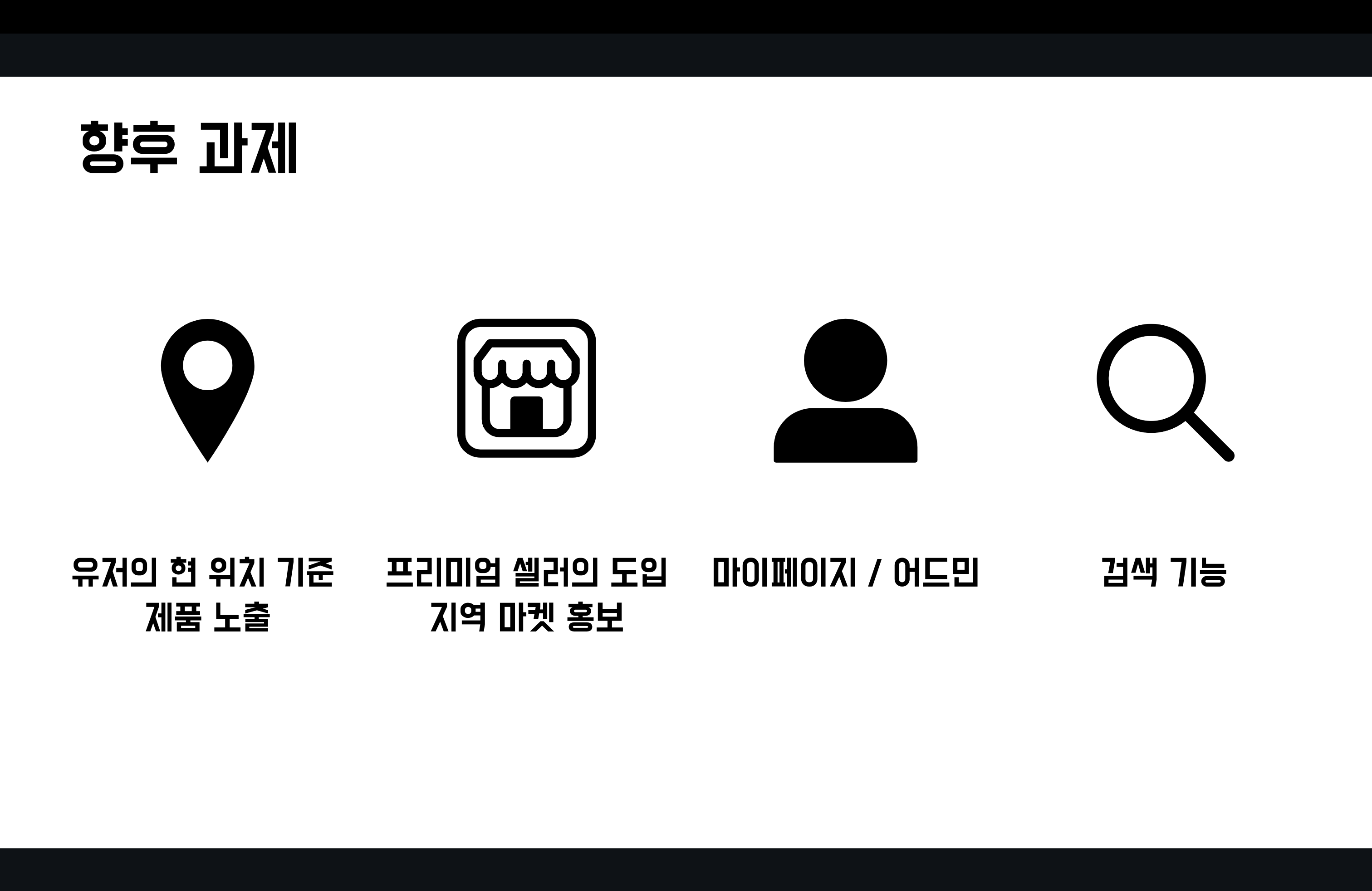
- 2차 회고에서 향후 과제로 남겼던 기술 과제 중
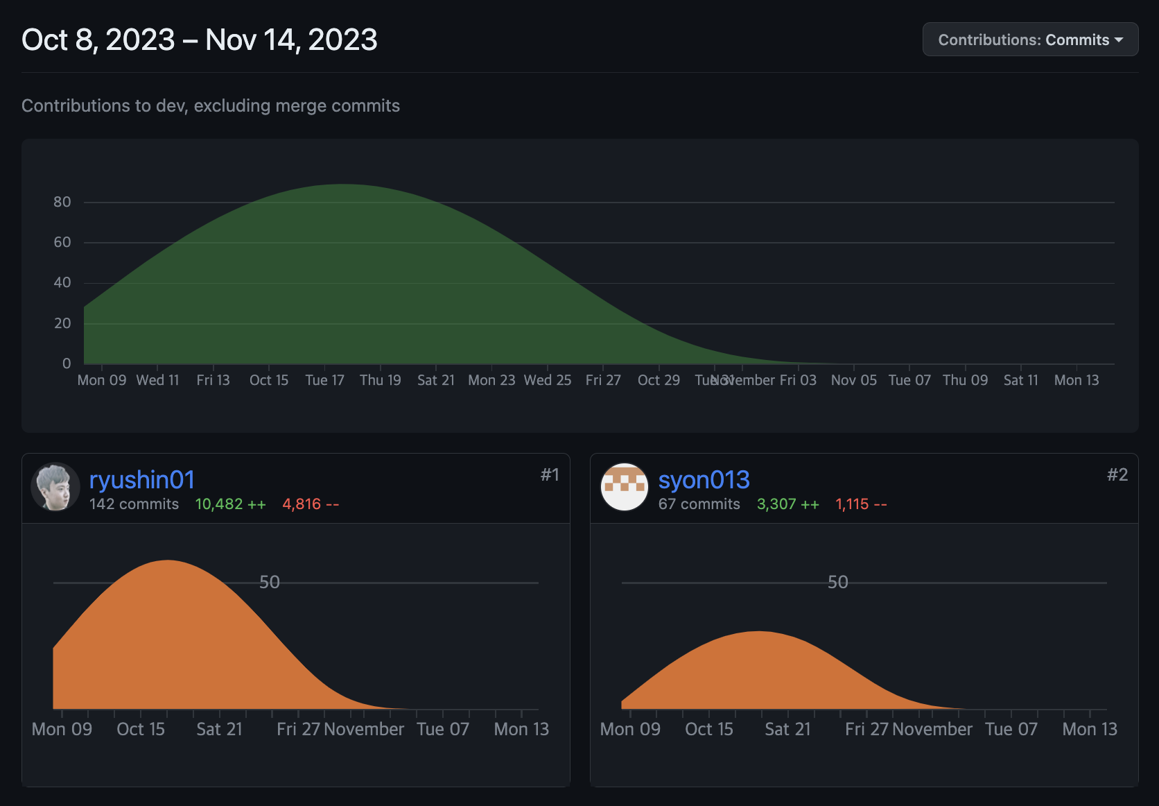
Vite로 React 초기 세팅하기와infinite scroll를 제외하면 어설프게나마 구현했습니다. 개인 포트폴리오 작업을 통해 미구현한 것들을 구현하고자 합니다. - 마지막으로 3주 간의 커밋 갯수를 스샷으로 남기면서 회고를 마무리합니다.

Front-End Developer