학습한 내용
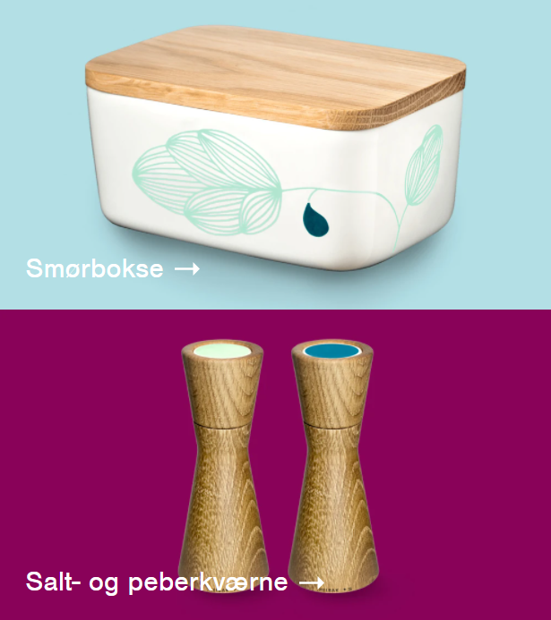
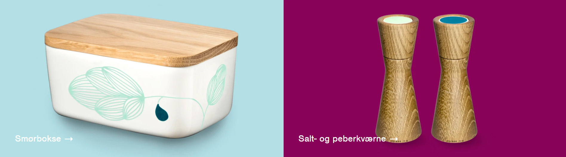
Helbak 실습
- Kids Gao : 적응형 웹 사이트
- helbak 쇼핑몰 : 반응형 웹 사이트
- 모바일 버전으로 먼저 작성한 후 미디어 쿼리를 사용하여 PC 버전 작성
0. Default
[html]
<head>

	<meta charset="utf-8">
	<meta name="viewport" content="width=device-width, initial-scale=1.0">

	<meta name="description" content="덴마크 쇼핑몰 카피캣 연습">
	<meta name="author" content="류영서">
	<meta name="keywords" content="html, css, tutorial">

	<link rel="stylesheet" type="text/css" href="css/style.css">

	<title>Helbak</title>

</head>- viewport : 미디어 쿼리 사용
- meta – name – content : 구글 검색 엔진에 걸리게 함
[css]
* {
	margin: 0;
	padding: 0;

	box-sizing: border-box;
}

html, body {
	width: 100%;
	height: 100%;
} -> 디폴트로 넣어주면 좋다

body {
	overflow-x: hidden;
	/*가로스크롤 발생 방지*/

	font-family: sans-serif;
	color: #585858;
	/*body 안에 적용하면 내부의 모든 텍스트들에게 상속된다.*/
}

h1, h2, h3, h4, h5, h6, p {
	font-weight: 400;
}

li {
	list-style: none; -> list의 점 제거
}

a {
	text-decoration: none; -> a의 언더바 제거
}

img {
	vertical-align: middle;
}

span {
	display: block;
}*: 모든 html 태그에 대한 설정box-sizing: border-box;: padding 때문에 기존 영역의 크기가 변화하는 것을 방지font-weight: 400;: 폰트의 굵기, 100 단위로 100부터 900까지 올라간다.vertical-align: middle;: 이미지 하단의 공백 제거- span 태그의 기본 속성 : inline 속성
1. Header
-
mobile 버전
-
pc 버전

로고(logo)
메뉴 버튼(menu-button) x 3
[html]
	<header id="header">

		<h1>
			<a href="#" class="logo">
				<img src="https://via.placeholder.com/186x18">
			</a>
		</h1>


		<nav class="buttons">
			<ul>
				<li>
					<a href="#" class="menu-button">
						<img src="https://via.placeholder.com/22x20">
					</a>
				</li>
				<li>
					<a href="#" class="menu-button">
						<img src="https://via.placeholder.com/22x20">
					</a>
				</li>
				<li>
					<a href="#" class="menu-button">
						<img src="https://via.placeholder.com/22x20">
					</a>
				</li>
			</ul>
		</nav>

</header>- img 태그의 src의 속성값으로 svg를 사용할 수 있다.
[css]
#header h1 {
	background-color: yellow;
}

#header h1 .logo {
	position: relative;
	display: block;

	width: 100%;
	height: 65px;
}

#header h1 .logo img {
	position: absolute;

	top: 0;
	margin-top: 23px;

	left: 50%;
	margin-left: -93px;
}

#header .buttons ul {
	overflow: hidden;
}

#header .buttons li {
	position: relative;
	float: left;

	width: 33.3333%; -> 소수점 뒷자리 개수 원하는 만큼
	height: 65px;

	font-size: 0; -> 이미지 상단 공백 제거
}

#header .buttons li .menu-button {
	display: block;

	width: 100%;
	height: 100%;
	/*클릭 범위를 li 태그를 꽉 채우게 설정*/

	text-align: center;
}

#header .buttons li:nth-child(1) .menu-button {
	background-color: blue;
}

#header .buttons li:nth-child(2) .menu-button {
	background-color: skyblue;
}

#header .buttons li:nth-child(3) .menu-button {
	background-color: lightblue;
}

#header .buttons li .menu-button img {
	position: relative;

	height: 20px;

	/*y축 중앙 정렬 공식*/
	top: 50%;
	transform: translateY(-50%);
}-
#header h1 : 2차원 속성(기본값), 자식 태그(#header h1 .logo)의 position이 relative이기 때문에 자식 태그의 높이값이 부모 태그의 높이값h1에 영향을 준다.
-
a 태그는 기본값으로 inline 성격을 가진다.
-
overflow: hidden;
: 자식 태그(#header .buttons li)에 float(3차원 특징) 속성이 있을 때 자식의 높이값이 부모 태그(#header .buttons ul)에 영향을 줄 수 없다.
: 이런 경우에 부모 태그가 자식 태그의 높이값 영향을 받을 수 있게 하는 속성 -
#header .buttons ul {
overflow: hidden;}
: li의 height 값-> ul(2차원) -> nav(buttons, 2차원) 에 차례대로 영향
: nav(buttons)의 height=65px
: header의 height= 65px(h1) + 65px(nav) = 130px -
text-align: center;: 내부의 inline, inline-block(img) 요소에 적용되는 x축 중앙 정렬 -
y축 중앙 정렬 공식
:top: 50%;
:transform: translateY(-50%);

[미디어쿼리]
@media (min-width: 47em) {
	#header {
		position: fixed;

		width: 100%;
		height: 80px;

		top: 0;
		left: 0;

		z-index: 999999; -> 최상단에 위치
	}

	#header h1 {
		width: 50%;
	}

	#header h1 .logo {
		width: 280px;
		height: 80px;
	}  -> 클릭 가능 범위 재 설정

	#header h1 .logo img {
		margin-top: 30px;
	}

	#header	.buttons {
		position: absolute;
		width: 50%;

		left: 50%;
		top: 0;
	}

	#header .buttons li {
		height: 80px;
	}  -> 버튼의 높이 재설정
}-
1em = 16px
-
position: fixed;: 스크롤 시 고정 -
#header .buttons
: 공간에 absolute를 사용할 때는 width 값을 정수값 or 비율값으로 명시해줘야한다. -
두 줄 정렬을 한 줄 정렬로 좌우배치하는 공식
:left: 50%;
:top: 0;

2. Main
-
mobile 버전
-
pc 버전
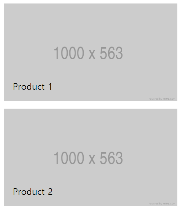
클릭 영역(product-group-link) : 사진(img 태그), 텍스트(link-text)
[html]
	<main role="main" class="main-content">

		<ul class="product-group">
			<li>
				<a href="#" class="product-group-link">
					<article>
						<h2 class="link-text">Product 1</h2>
						<img src="https://via.placeholder.com/1000x563">
					</article>
				</a>
			</li>
			<li>
				<a href="#" class="product-group-link">
					<article>
						<h2 class="link-text">Product 2</h2>
						<img src="https://via.placeholder.com/1000x563">
					</article>
				</a>
			</li>
			<li>
				<a href="#" class="product-group-link">
					<article>
						<h2 class="link-text">Product 3</h2>
						<img src="https://via.placeholder.com/1000x563">
					</article>
				</a>
			</li>
			<li>
				<a href="#" class="product-group-link">
					<article>
						<h2 class="link-text">Product 4</h2>
						<img src="https://via.placeholder.com/1000x563">
					</article>
				</a>
			</li>
			<li>
				<a href="#" class="product-group-link">
					<article>
						<h2 class="link-text">Product 5</h2>
						<img src="https://via.placeholder.com/1000x563">
					</article>
				</a>
			</li>
			<li>
				<a href="#" class="product-group-link">
					<article>
						<h2 class="link-text">Product 6</h2>
						<img src="https://via.placeholder.com/1000x563">
					</article>
				</a>
			</li>
		</ul>

</main>role="main": main 태그를 사용할 때 같이 사용
[css]
.main-content .product-group .product-group-link {
	position: relative;
	display: block;

	width: 100%;
	height: 56.25%;
	/*공간에 대한 크기를 삽입되는 이미지의 크기와 근사한 비율로 설정*/

	border: solid 10px white;

	overflow: hidden;
}

.main-content .product-group .product-group-link img {
	width: 100%;
	height: 100%;
	/*부모 태그인 a 태그 내에서 꽉차게 설정*/
}

.main-content .product-group .product-group-link .link-text {
	position: absolute;
	/*3차원 속성, 뒤에 오는 형제 태그 img와 레이어 겹침*/

	left: 25px;
	bottom: 25px;

	color: black;
	font-size: 25px;
}
overflow: hidden;: 부모 요소의 범위를 넘어가는 자식 요소의 부분은 보이지 않도록 처리한다.
[미디어쿼리]
@media (min-width: 47em) {
.main-content {
padding-top: 80px;
}
}
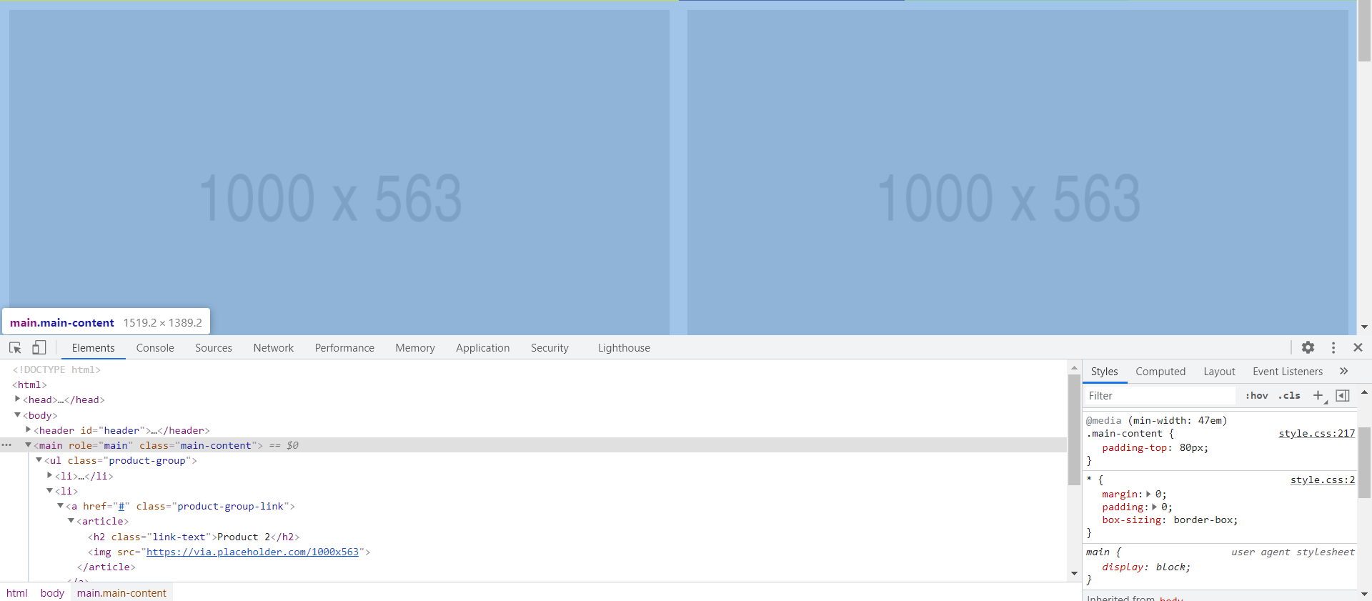
@media (min-width: 60em) {
.main-content {
overflow: hidden;
} -> 자식 태그에 float 속성이 있기 때문에 높이값 영향이 없는 현상을 방지
.main-content .product-group .product-group-link {
float: left; -> 좌우배치
width: 50%;
height: 28.125%;
/*비율을 유지하면서 반값으로 설정*/
}
} - main 태그와 형제 관계인 앞에 나오는 header 태그의 position이 3차원이기 때문에 레이어가 겹친다.
-> main 태그에 pc 버전에서 header 의 height 값인 80px 만큼 padding-top 을 부여하여 레이어를 아래로 내림 (padding-top: 80px;)
3. Footer
-
mobile 버전
-
pc 버전

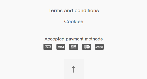
탭1(left-nav) : 버튼 x 2
탭2(right-methods) : 헤드라인(h3), 버튼(payment-icon) x 5
버튼 이미지(to-top-button)
[html]
	<footer id="footer">

		<nav class="left-nav">
			<ul>
				<li>
					<a href="#">Terms and condition</a>
				</li>
				<li>
					<a href="#">Cookies</a>
				</li>
			</ul>
		</nav>


		<nav class="right-methods">
			<h3>Payment Methods</h3>

			<ul>
				<li><span class="payment-icon one"></span></li>
				<li><span class="payment-icon two"></span></li>
				<li><span class="payment-icon three"></span></li>
				<li><span class="payment-icon four"></span></li>
				<li><span class="payment-icon five"></span></li>
			</ul>
		</nav>


		<a href="#" class="to-top-button"></a>

	</footer>
[css]
#footer {
	position: relative;

	padding-bottom: 66px;
	/*to-top-button 자리*/
	/*3차원이기 때문에 자식 높이값 영향 없이 footer의 height 66px로 잡힘*/
}

#footer .left-nav {
	padding-top: 20px;
	text-align: center;
}

#footer .left-nav li {
	padding: 5px 0; -> 상하 padding : 글자 간의 공백
}

#footer .right-methods {
	text-align: center;
	margin-bottom: 20px;
	margin-top: 30px;
}

#footer .right-methods li {
	display: inline-block;

	padding: 7px 4px;
}

#footer .right-methods li .payment-icon {
	display: inline-block;

	width: 30px;
	height: 20px;
}

#footer .right-methods li .payment-icon.one {
	background-color: black;
}

#footer .right-methods li .payment-icon.two {
	background-color: red;
}

#footer .right-methods li .payment-icon.three {
	background-color: yellow;
}

#footer .right-methods li .payment-icon.four {
	background-color: blue;
}

#footer .right-methods li .payment-icon.five {
	background-color: gray;
}

#footer .to-top-button {
	position: absolute;
	display: block;

	width: 66px;
	height: 66px;
	background-color: green;

	bottom: 0;
	left: 50%;
	margin-left: -33px;
}- 하나의 태그에 class를 여러개 기입하여 역할을 구분하는 방법
: .payment-icon.one 과 같이 붙여서 사용한다.
-> payment-icon 중에서 "one"이라는 class를 가진 영역을 선택하라.
[css-미디어쿼리]
@media (min-width: 60em) {
		#footer .left-nav {
		float: left;

		width: 50%;

		text-align: left;

		padding-top: 32px;
		padding-left: 42px;
	}

	#footer .right-methods {
		float: right;

		width: 50%;

		margin: 0;
		padding-top: 32px;
		padding-right: 40px;

		text-align: right;
	}

	#footer ul, #footer li, #footer h3 {
		display: inline-block;

		vertical-align: middle; -> x축 한 줄로 정렬
	}

	#footer .left-nav a {
		font-size: 14px;
		padding: 0 5px;
	}

	#footer .right-methods li {
		padding: 0 4px;
	}

	#footer h3 {
		padding-right: 10px;
	}
}- 실제 연습할 땐 공간(#footer)의 크기를 먼저 잡고 배치작업을 해야 한다.

실무 Tip
(1) id의 속성값
한 태그의 id에 하나의 속성값만 사용할 수 있다.
하나의 문서 안에서 동일한 id를 반복해서 쓸 수 없다.
id가 중복될 시 좌표의 개념을 갖지 못한다.
a 태그의 href의 속성값의 종류
- url 주소
- 다른 html 파일명(파일경로 포함)
- id의 속성값을 넣을 수 있다.
: href=“#three” -> 누르면 #three 영역의 최상단으로 이동
: class는 불가능하다.
(2) 말줄임표 기능
글자는 자신을 감싸는 영역을 벗어났을 때 줄바꿈 현상이 일어난다.
[html]
<p class="text-box">
		동해물과 백두산이 마르고 닳도록 하느님이 보우하사 우리 나라 만세
		동해물과 백두산이 마르고 닳도록 하느님이 보우하사 우리 나라 만세
		동해물과 백두산이 마르고 닳도록 하느님이 보우하사 우리 나라 만세
		동해물과 백두산이 마르고 닳도록 하느님이 보우하사 우리 나라 만세
		동해물과 백두산이 마르고 닳도록 하느님이 보우하사 우리 나라 만세
		동해물과 백두산이 마르고 닳도록 하느님이 보우하사 우리 나라 만세
		동해물과 백두산이 마르고 닳도록 하느님이 보우하사 우리 나라 만세
		동해물과 백두산이 마르고 닳도록 하느님이 보우하사 우리 나라 만세
	</p>
[css]
.text-box {
	width: 200px;
	height: 200px;
	background-color: yellow;

	white-space: nowrap;
	overflow: hidden;
	text-overflow: ellipsis;
}
white-space: nowrap; : 줄바꿈 현상을 방지 + 가로 스크롤 발생
overflow: hidden; : 영역 벗어나는 내용 숨김 처리, 가로 스크롤 삭제
text-overflow: ellipsis; : 숨겨진 내용을 말줄임표로 대체
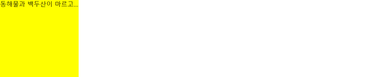
Tip : 말줄임 기능을 적용할 수 있는 class를 따로 만들고 말줄임 기능이 필요한 html 태그에 class를 부여하여 사용한다.
[html]
	<p class="text-box ellipsis">
		동해물과 백두산이 마르고 닳도록 하느님이 보우하사 우리 나라 만세
		동해물과 백두산이 마르고 닳도록 하느님이 보우하사 우리 나라 만세
		동해물과 백두산이 마르고 닳도록 하느님이 보우하사 우리 나라 만세
		동해물과 백두산이 마르고 닳도록 하느님이 보우하사 우리 나라 만세

	</p>


	<h1 class="ellipsis">
		동해물과 백두산이 마르고 닳도록 하느님이 보우하사 우리 나라 만세
		동해물과 백두산이 마르고 닳도록 하느님이 보우하사 우리 나라 만세
		동해물과 백두산이 마르고 닳도록 하느님이 보우하사 우리 나라 만세
		동해물과 백두산이 마르고 닳도록 하느님이 보우하사 우리 나라 만세

	</h1>

	<h2 class="ellipsis">
		동해물과 백두산이 마르고 닳도록 하느님이 보우하사 우리 나라 만세
		동해물과 백두산이 마르고 닳도록 하느님이 보우하사 우리 나라 만세
		동해물과 백두산이 마르고 닳도록 하느님이 보우하사 우리 나라 만세
		동해물과 백두산이 마르고 닳도록 하느님이 보우하사 우리 나라 만세

	</h2>
[css]
.text-box {
	width: 200px;
	height: 200px;
	background-color: yellow;
}

h1 {
	background-color: pink;
}

h2 {
	background-color: gray;
}

.ellipsis {
	white-space: nowrap;
	overflow: hidden;
	text-overflow: ellipsis;
}
반복되는 기능을 적용할 class를 만드는 예시
.m-b-10 {
	margin-bottom: 10px;
}

.m-b-15 {
	margin-bottom: 15px;
}

.m-b-20 {
	margin-bottom: 20px;
}

.m-b-100 {
	margin-bottom: 100px;
}

.p-b-100 {
	padding-bottom: 100px;
}
학습한 내용 중 어려웠던 점 또는 해결 못한 것들
-
header 영역 실습 중에 a 태그 안에 img 태그가 올 때 이미지 하단의 공백은 코드로 제거하였는데 상단의 공백이 강사님과 다르게 계속해서 존재했다.
-
실습을 하면서 margin과 padding을 혼용하며 사용하다보니 차이점이 헷갈렸다.
해결 방법 작성
- Teams의 질의응답 게시판에 다른 분이 먼저 질문을 올리셔서 멘토님의 답을 참고할 수 있었다.
상단에 공백이 생기는 이유는 폰트 문제이고 해결하는 방법은 해당하는 img 태그가 포함된 li 태그의 font-size을 0으로 바꿔주는 것이다.
그러나 전체 li 태그의 font-size을 0으로 바꿨을 때 다른 영역에서 li 태그에 텍스트를 입력했을 때 보이지 않을 수 있기 때문에 꼭 클래스를 지정하여 font-size을 제거해줘야 한다.
#header .buttons li {
	position: relative;
	float: left;

	width: 33.3333%;
	height: 65px;

	font-size: 0; -> 이미지 상단 공백 제거
}- 실무 tip 을 학습할 때 사용했던 코드를 활용하여 차이점을 살펴보았다.
[html]
	<h1 class="ellipsis m-b-100">
		동해물과 백두산이 마르고 닳도록 하느님이 보우하사 우리 나라 만세
		동해물과 백두산이 마르고 닳도록 하느님이 보우하사 우리 나라 만세
		동해물과 백두산이 마르고 닳도록 하느님이 보우하사 우리 나라 만세
		동해물과 백두산이 마르고 닳도록 하느님이 보우하사 우리 나라 만세

	</h1>

	<h2 class="ellipsis p-b-100">
		동해물과 백두산이 마르고 닳도록 하느님이 보우하사 우리 나라 만세
		동해물과 백두산이 마르고 닳도록 하느님이 보우하사 우리 나라 만세
		동해물과 백두산이 마르고 닳도록 하느님이 보우하사 우리 나라 만세
		동해물과 백두산이 마르고 닳도록 하느님이 보우하사 우리 나라 만세

	</h2>
[css]
h1 {
	background-color: pink;
}

h2 {
	background-color: gray;
}

.ellipsis {
	white-space: nowrap;
	overflow: hidden;
	text-overflow: ellipsis;
}


.m-b-100 {
	margin-bottom: 100px;
}

.p-b-100 {
	padding-bottom: 100px;
}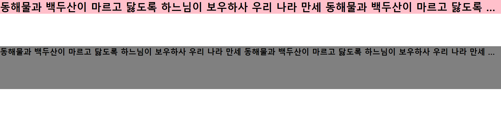
Margin은 Object와 화면과의 여백(외부여백)을 말하며 Padding은 Object내의 내부여백을 의미한다.
학습 소감
실습을 하면서 개념을 확실히 알지 못하고 넘어갔던 것들을 다시 확인할 수 있는 계기가 되어서 너무 좋았다. font 때문에 공백이 생겼으리라곤 생각도 하지 못했다. 그 부분은 좀 많이 골치 아팠다.