학습한 내용
네이버쇼핑 실습
0. Default
[html]
<!DOCTYPE html>
<html>
<head>

	<meta charset="utf-8">

	<link rel="stylesheet" type="text/css" href="css/style.css">

	<title>네이버쇼핑</title>

</head>
<body id="shop_body">


</body>
</html>
[css]
#shop_body {
	background-color: #e9ecef;
}

.shop_container {
	width: 1300px;
	margin: 0 auto;
}

.shop_border {
	border: solid 1px #ced2d7;
}

.w_100 {
	width: 100%;
}

.h_100 {
	height: 100%;
}- shop.html 새로 생성
- style.css 그대로 사용
- index.html의 header의 navbar의 a 태그 링크 수정
-><li><a href="shop.html">쇼핑</a></li>
1. Header

상단(shop_header_top)
중단(shop_header_middle)
네비게이션(nav)
[html]
	<header id="shop_header">

		<div id="shop_header_top"></div>

		<div id="shop_header_middle"></div>

		<nav>
			<div class="shop_container">
				<ul>
					<li><a href="">홈</a></li>
					<li><a href="">백화점</a></li>
					<li><a href="">아울렛</a></li>
					<li><a href="">스타일</a></li>
				</ul>
			</div>
		</nav>

</header>- 네비게이션 컨텐츠가 중앙 정렬이기 때문에 shop_container로 잡아준다.
- header_top과 header_middle에 컨텐츠를 넣을 때에도 shop_container을 사용해서 중앙 정렬을 적용한다.
[css]
#shop_header #shop_header_top {
	width: 100%;
	height: 36px;
	background-color: #03c75a;

	border-bottom: solid 1px #e8e8e8;
}

#shop_header #shop_header_middle {
	width: 100%;
	height: 66px;
	background-color: #03c75a;
}

#shop_header nav {
	width: 100%;
	background-color: #ffffff;

	border-top: solid 1px #e8e8e8;
	border-bottom: solid 1px #e8e8e8;
}

#shop_header nav ul {
	display: flex;
	flex-wrap: wrap;
	justify-content: flex-start;
	align-items: center;

	padding: 13px 0 8px; -> 상단 좌우 하단
}
#shop_header nav ul li {
	margin-right: 16px;
}- #shop_header nav ul:
: flex 사용해서 자식 요소인 li 태그 일렬로 정렬
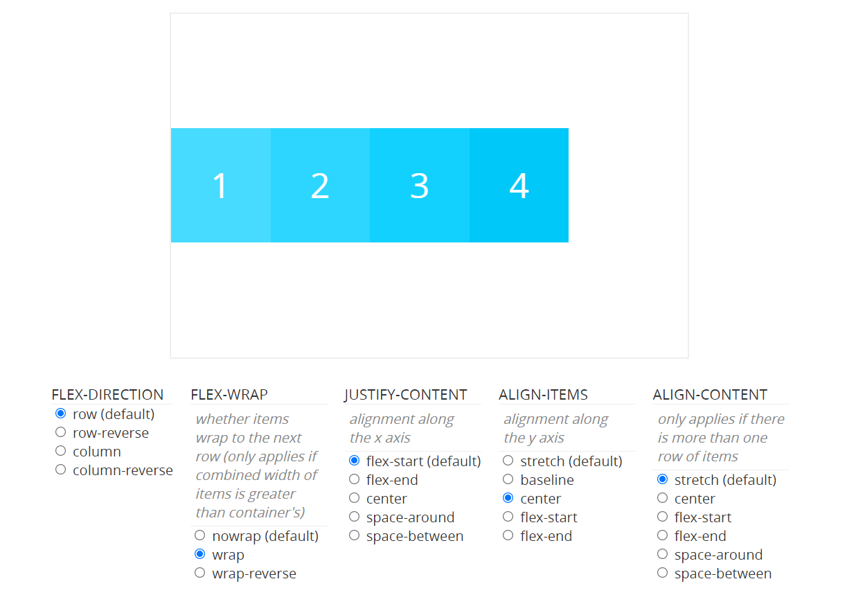
- #shop_header nav ul li
:margin-right: 16px;-> li 간의 공백
2. Main
[html]
	<main role="main" id="shop_main">
		<div class="shop_container">

			<div class="list_wrap">
				<div class="list_item"></div>
				<div class="list_item"></div>
				<div class="list_item"></div>
				<div class="list_item"></div>
				<div class="list_item"></div>
				<div class="list_item"></div>
				<div class="list_item"></div>
				<div class="list_item"></div>
			</div>

		</div>
</main>- main 컨텐츠들은 중앙 정렬이므로 shop_container로 감싸준다.
[css]
#shop_main .list_wrap {
	display: flex;
	flex-wrap: wrap;
	justify-content: space-between;
}

#shop_main .list_item {
	width: 308px;
	height: 496px;
	background-color: yellow;

	margin-bottom: 20px;
}

#shop_main .list_item.banner img {
	width: 100%;
	height: 100%;
} -> 붙어있는 class는 같은 태그 안에 있는 class-
#shop_main .list_wrap
: flex 적용해서 list_item 태그 정렬
-
index.html의 css에서 main 태그에 padding-top을 줬기 때문에 shop.html에서도 상단의 공백이 나타난다.
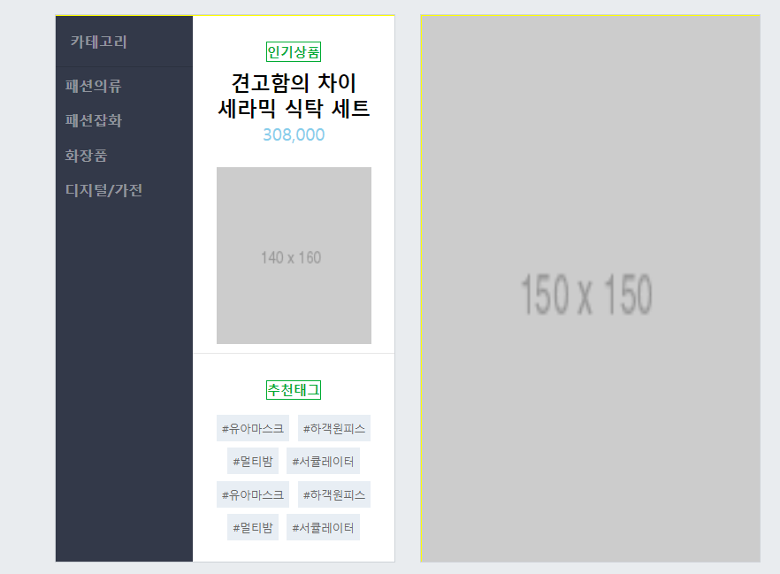
3. List Item 1 - Category
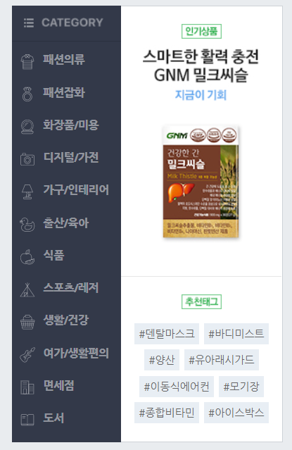
왼쪽(category_left)
오른쪽(category_right) - 위(category_right_top)/아래(category_right_bottom)
[html]
				<div class="list_item">
					<div class="category_wrap w_100 h_100 shop_border">
						<div class="category_left">
							<h3>카테고리</h3>
							<ul>
								<li><a href="#">패션의류</a></li>
								<li><a href="#">패션잡화</a></li>
								<li><a href="#">화장품</a></li>
								<li><a href="#">디지털/가전</a></li>
							</ul>
						</div>

						<div class="category_right">
							<div class="category_right_top">
								<div class="category_info">
									<span class="headline"><strong>인기상품</strong></span>
									<h3>견고함의 차이<br>세라믹 식탁 세트</h3>
									<span class="price">308,000</span>
								</div>
								<img src="https://via.placeholder.com/140x160">
							</div>

							<div class="category_right_bottom">
								<span class="headline"><strong>추천태그</strong></span>

								<div class="tag_wrap">
									<span class="tag">#유아마스크</span>
									<span class="tag">#하객원피스</span>
									<span class="tag">#멀티밤</span>
									<span class="tag">#서큘레이터</span>
									<span class="tag">#유아마스크</span>
									<span class="tag">#하객원피스</span>
									<span class="tag">#멀티밤</span>
									<span class="tag">#서큘레이터</span>
								</div>
							</div>
						</div>
					</div>
</div>- shop_border의 css는 default로 적용된다.
[css]
#shop_main .list_item .category_wrap {
	overflow: hidden;
}

#shop_main .list_item .category_wrap .category_left {
	float: left;

	width: 124px;
	height: 100%;
	background-color: #333949;
}

#shop_main .list_item .category_wrap .category_left h3 {
	padding: 14px 0 14px 13px;
	border-bottom: solid 1px #2b313f;

	font-size: 13px;
	color: rgba(255, 255, 255, 0.46);
}

#shop_main .list_item .category_wrap .category_left ul li a{
	display: block;
	padding: 7px 8px;
	/*위 코드 둘 다 글씨가 아닌 여백 부분에서도 클릭 마우스 활성화하기 위함*/

	font-size: 13px;
	color: rgba(255, 255, 255, 0.46);
	font-weight: 700;
}

#shop_main .list_item .category_wrap .category_right {
	float: right;

	width: 182px;
	height: 100%;
	background-color: #ffffff;
}

#shop_main .list_item .category_wrap .category_right .category_right_top {
	width: 100%;
	height: 306px;

	border-bottom: solid 1px #e7e7e7;

	text-align: center; -> 내부 컨텐츠 중앙 배치: 텍스트, 이미지
}

#shop_main .list_item .category_wrap  .category_right_top .category_info {
	padding: 20px 0;
}

#shop_main .list_item .category_wrap  .category_right_top .headline,
#shop_main .list_item .category_wrap  .category_right_bottom .headline {
	display: inline-block;

	font-size: 12px;
	border: solid 1px #00ab33;
	color: #00ab33;

	margin-bottom: 7px;
}

#shop_main .list_item .category_wrap  .category_right_top .category_info h3 {
	font-size: 18px;
}

#shop_main .list_item .category_wrap  .category_right_top .category_info .price {
	font-size: 16px;
	color: skyblue;
}

#shop_main .list_item .category_wrap .category_right_bottom {
	padding-top: 20px;

	text-align: center;
}

#shop_main .list_item .category_wrap .category_right_bottom .tag_wrap .tag {
	display: inline-block;

	width: auto;
	max-width: 75px;
	height: 24px;
	background-color: #e8eef4;

	padding: 0 5px;
	margin: 6px 1px 0 1px;

	line-height: 26px; -> 텍스트 줄높이
	font-size: 10px;
	color: #666;
	vertical-align: top;
}-
color: rgba(255, 255, 255, 0.46);
: (255, 255, 255) = 검은색
: 0.46 = alpha값 = 투명도 -
#shop_main .list_item .category_wrap .category_right_top .headline,
#shop_main .list_item .category_wrap .category_right_bottom .headline
:display: inline-block;
-> span 태그는 inline 요소이기 때문에 margin 적용되지 않는다. -
#shop_main .list_item .category_wrap .category_right_bottom .tag_wrap .tag
:display: inline-block;
-> 개별 width 값의 합이 부모 요소의 width 값보다 클 때 자동으로 줄바꿈이 일어난다.
:width: auto;+max-width: 75px;
-> 글자수에 따라 width 값이 바뀐다. 제한값 지정한다.

4. List Item 2 - Banner
[html]
				<div class="list_item banner">
					<div class="w_100 h_100 shop_border">
						<img src="https://via.placeholder.com/150">
					</div>
</div>- w_100, h_100, shop_border : 디폴트로 지정한 css
[css]
#shop_main .list_item.banner img {
	width: 100%;
	height: 100%;
} - main 내에서 default로 적용된다.
학습한 내용 중 어려웠던 점 또는 해결 못한 것들
tag 레이아웃을 만들 때 텍스트의 줄바꿈이 일어났다.
해결 방법 작성
강사님과 폰트가 달라서 결과가 다르게 나왔다.
폰트 크기를 줄여서 해결하였다.
학습 소감
메인페이지보다는 조금 수월하다고 느꼈다. 상단 부분에 아이콘을 입력하는 연습을 해야겠다.