아직 1주차인데 이거 이렇게 복잡해도 되는건가...? 싶을 때마다
튜터님이 외우지 않아도 돼요!! 라고 소리쳐 주신다
덕분에 재미있게 할 수 있는 것 같다😞
부트스트랩 활용
예쁜 CSS를 모아둔 사이트
class를 걸어서style에서 효과 주기max-width는 창 크기 변화와 관계 없는 최대 크기width%를 설정하면 모바일 창에서도 잘리지 않고 보인다
<style>
        * {
    font-family: 'Noto Serif KR', serif;
}
        .mytitle {

      width: 100%;
      height: 250px;

      background-image: linear-gradient(0deg, rgba(0, 0, 0, 0.3), rgba(0, 0, 0, 0.5)), url("https://image.bugsm.co.kr/album/images/200/40773/4077389.jpg?version=20220706005646.0");
      background-position: center;
      background-size: cover;

      color: white;

      display: flex;
      flex-direction: column;
      justify-content: center;
      align-items: center;
    }
        .mypost {
            max-width: 500px;
            width: 95%;

            margin: 20px auto 0px auto;

            box-shadow: 0px 0px 3px 0px gray;
            padding: 20px;
        }
        .mybtns {
        margin-top: 20px;
    }
        .mycards {
            max-width: 500px;
            width: 95%;

            margin: auto;
    }
        .mycards > .card {
            margin-top: 10px;
            margin-bottom: 10px;
        }
</style>- 부트스트랩에서 가져온 "card"들은
class를 "mycards"로 묶어주고 간격 설정
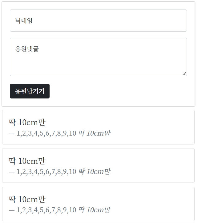
<div class="mypost">
            <div class="form-floating mb-3">
      <input type="email" class="form-control" id="floatingInput" placeholder="name@example.com">
      <label for="floatingInput">닉네임</label>
    </div>
    <div class="form-floating">
        <textarea class="form-control" placeholder="Leave a comment here" id="floatingTextarea2"
                  style="height: 100px"></textarea>
        <label for="floatingTextarea2">응원댓글</label>
    </div>
    <div class="mybtns">
        <button type="button" class="btn btn-dark">응원남기기</button>
    </div>
    </div>
    <div class="mycards">
    <div class="card">
        <div class="card-body">
            <blockquote class="blockquote mb-0">
                <p>딱 10cm만</p>
                <footer class="blockquote-footer">1,2,3,4,5,6,7,8,9,10 <cite title="Source Title">딱 10cm만</cite>
                </footer>
            </blockquote>
        </div>
    </div>
   <div class="card">
        <div class="card-body">
            <blockquote class="blockquote mb-0">
                <p>딱 10cm만</p>
                <footer class="blockquote-footer">1,2,3,4,5,6,7,8,9,10 <cite title="Source Title">딱 10cm만</cite>
                </footer>
            </blockquote>
        </div>
    </div>
자바스크립트
프로그래밍 언어 중 하나로, 브라우저가 알아들을 수 있는 언어

할 수 있으니까 하고 있지!