Summary of
1. https://www.theodinproject.com/lessons/node-path-intermediate-html-and-css-creating-a-grid
2. https://www.theodinproject.com/lessons/node-path-intermediate-html-and-css-positioning-grid-elements
❗ Note that only the direct child elements will become grid items
Defining columns / rows
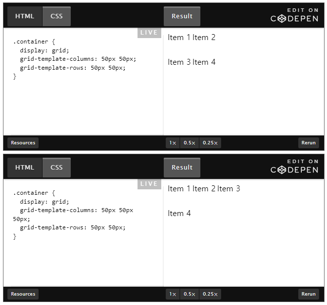
Shorthanded definition
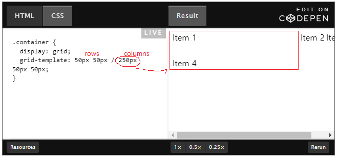
Explicit track
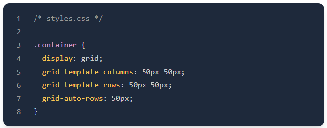
- CSS Grid automatically place grid items even when we haven't explicitly defined the layout. But the size properties we set before are not carried into these new tracks.
- We can use
grid-auto-rowsandgrid-auto-columnsproperties for new tracks in advance. - Extra content being added horizentally is not commonly wanted, so use
grid-auto-flow: columnandgrid-auto-columns.
Gap
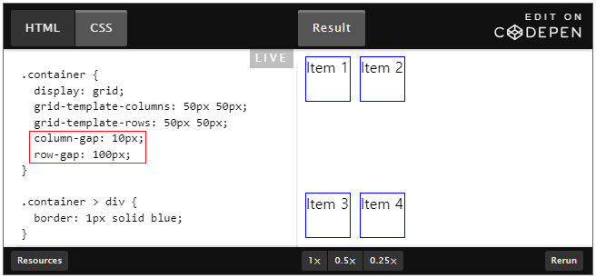
= gap: 100px 10px (row first)
Positioning
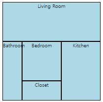
.container {
  display: inline-grid;
}

#living-room {
  grid-column-start: 1;
  grid-column-end: 6;
  grid-row-start: 1;
  grid-row-end: 3;
}

/* SHORTHANDED */
#kitchen {
  grid-column: 4 / 6;
  grid-row: 3 / 6;
}

#bedroom {
  grid-column-start: 2;
  grid-column-end: 4;
  grid-row-start: 3;
  grid-row-end: 5;
}

#bathroom {
  grid-column-start: 1;
  grid-column-end: 2;
  grid-row-start: 3;
  grid-row-end: 6;
}

#closet {
  grid-column-start: 2;
  grid-column-end: 4;
  grid-row-start: 5;
  grid-row-end: 6;
}
Grid Area
#living-room {
  grid-area: 1 / 1 / 3 / 6;
  /* row-start, column-start. row-end, column-end*/
}
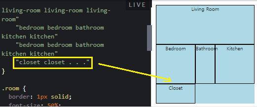
Or, we can use grid-area for giving each item a name.
#living-room {
  grid-area: living-room;
}
/* giving other areas their names too */
/*                ↓                   */

.container {
  grid-template-areas:
    "living-room living-room living-room living-room living-room"
    "living-room living-room living-room living-room living-room"
    "bedroom bedroom bathroom kitchen kitchen"
    "bedroom bedroom bathroom kitchen kitchen"
    "closet closet bathroom kitchen kitchen"
}
We can even use . to indicate empty cells.
