1. 학습내용
오늘은 텍스트 정렬과 배경화면 설정에 대한 것을 배웠다.
   <style>
      .rtl{direction: rtl;}
      .ltr{direction: ltr;}
      .a{text-align: left;}
      .b{text-align: right;}
      .c{text-align: center;}
      .d{text-align:justify;}
      p{border: 1px solid black;
      padding: 10px;
      margin: 10px;}
      .indent1{text-indent: 15px;}
      .indent2{text-indent: 5%;}

      .small-line{line-height:0.7;}
      .big-line{line-height: 2;}

      .content{
         border: 1px solid #ccc;
         width: 300px;
         white-space: nowrap; /*줄바꿈 없음*/
         overflow: hidden; /*넘치는 부분 감춤*/
         text-overflow: ellipsis; /*넘치는 부분 말줄임표 생김*/
      }

      .content2{
         text-overflow: clip; /*넘치는 부분 그냥 자르는 것*/
      }

      .content:hover{
         overflow: visible;
      }
   </style>
</head>
<body>
   <p class="rtl">direction : 글자 쓰기 방향 지정</p>
   <p class="ltr">direction : 글자 쓰기 방향 지정</p>
   <div class="a">
      <p>direction : 글자 쓰기 방향 지정 direction : 글자 쓰기 방향 지정
         direction : 글자 쓰기 방향 지정 direction : 글자 쓰기 방향 지정
         direction : 글자 쓰기 방향 지정 direction : 글자 쓰기 방향 지정
         direction : 글자 쓰기 방향 지정 direction : 글자 쓰기 방향 지정
         direction : 글자 쓰기 방향 지정 direction : 글자 쓰기 방향 지정
      </p>
   </div>

   <div class="b">
      <p>direction : 글자 쓰기 방향 지정 direction : 글자 쓰기 방향 지정
         direction : 글자 쓰기 방향 지정 direction : 글자 쓰기 방향 지정
         direction : 글자 쓰기 방향 지정 direction : 글자 쓰기 방향 지정
         direction : 글자 쓰기 방향 지정 direction : 글자 쓰기 방향 지정
         direction : 글자 쓰기 방향 지정 direction : 글자 쓰기 방향 지정
      </p>
   </div>

   <div class="c">
      <p>direction : 글자 쓰기 방향 지정 direction : 글자 쓰기 방향 지정
         direction : 글자 쓰기 방향 지정 direction : 글자 쓰기 방향 지정
         direction : 글자 쓰기 방향 지정 direction : 글자 쓰기 방향 지정
         direction : 글자 쓰기 방향 지정 direction : 글자 쓰기 방향 지정
         direction : 글자 쓰기 방향 지정 direction : 글자 쓰기 방향 지정
      </p>
   </div>

   <div class="d">
      <p>direction : 글자 쓰기 방향 지정 direction : 글자 쓰기 방향 지정
         direction : 글자 쓰기 방향 지정 direction : 글자 쓰기 방향 지정
         direction : 글자 쓰기 방향 지정 direction : 글자 쓰기 방향 지정
         direction : 글자 쓰기 방향 지정 direction : 글자 쓰기 방향 지정
         direction : 글자 쓰기 방향 지정 direction : 글자 쓰기 방향 지정
      </p>
   </div>

   <div class="e">
      <p>direction : 글자 쓰기 방향 지정direction : </p>
      <p class="indent1">direction : 글자 쓰기 방향 지정direction : </p>
      <p class="indent2">direction : 글자 쓰기 방향 지정direction : </p>
  </div>

  <div class="f">
   <p>direction : 글자 쓰기 방향 지정direction : </p>
   <p class="small-line">direction : 글자 쓰기 방향 지정direction : </p>
   <p class="big-line">direction : 글자 쓰기 방향 지정direction : </p>
</div>

<div class="g">
   <p>direction : 글자 쓰기 방향 지정direction : </p>
   <p class="content">direction : 글자 쓰기 방향 지정direction : 글자 쓰기 방향 지정direction :글자 쓰기 방향 지정direction :</p>
   <p class="content content2">direction : 글자 쓰기 방향 지정direction : </p>
</div>
</body>
direction: rtl 은 right to left 즉 오른쪽에서 왼쪽으로 콘텐츠가 나열된다는 뜻이고,
direction: ltr 은 left to right 즉 왼쪽에서 오른쪽으로 나열된다는 뜻이다.
text-indent는 아래와 같다.
들여쓰기와 내어쓰기는 text-indent 속성으로 만든다.
값이 양수이면 들여쓰기, 값이 음수이면 내어쓰기가 된다.
기본값은 0.
내어쓰기를 할 때는 왼쪽에 여백을 적절히 준다.
참고자료 : codingfactory.net/10459
만들어진 공간에 그라디언트 효과를 넣는것도 배웠다.
 <!--선형 : 색상이 수직, 수평, 대각선 방향으로 일정하게 변하는것
   linear-gradient(<각도> to <방향>, color-stop[, color-stop,..])
   to top: 아래 -> 위
   to left: 오른쪽 - > 오른쪽
   to right: 왼쪽 - > 오른쪽
   to bottom: 위 - > 아래
-->
<style>
   div{width: 500px; height: 300px; border-radius: 10px;}
   .grad{background: linear-gradient(to right bottom, blue, white);}
   .grad2{background: linear-gradient(45deg, blue, white);}
   .grad3{background: linear-gradient(to bottom, blue, white 30%, blue,rgba(100, 100, 100, 0.5) 90%);}
   /*%는 색을 넣는 위치를 지정해 주는것*/

   /*radial-gradient(<최종모양> <크기> at <위치>, color-stop[, color-stop,...])
      circle | ellipse 10% 10%
   */
   .grad4{background: radial-gradient(circle, white, yellow, blue);}
   /*circle을 지정하지 않으면 타원형으로 나옴*/

   /*closest-side, closest-corner, farthest-side, farthest-corner*/
   .grad5{background: radial-gradient(circle closest-side at 30% 40%, white, blue);}
</style>
</head>
<body>
   <div class="grad"></div>
   <div class="grad2"></div>
   <div class="grad3"></div>
   <div class="grad4"></div>
   <div class="grad5"></div>
</body>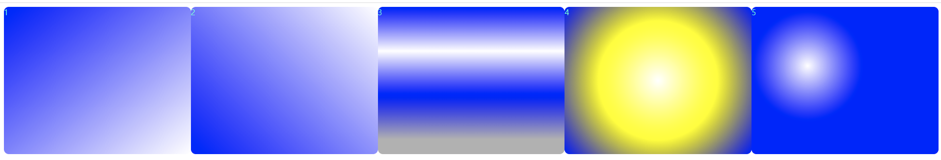
2. 어려웠던 점 및 해결방안
background-origin이랑 background-clip이 헷갈려서 구글링해보았다.
background-origin:
HTML 요소는 박스로 이루어져 있고, 바깥 여백 영역(Margin Area), 테두리 영역(Border Area), 안쪽 여백 영역(Padding Area), 내용 영역(Content Area)으로 구분.
background-origin으로 배경 이미지를 어느 영역부터 채워나갈지를 정한다.
border-box : 테두리 영역 왼쪽 위부터 채움.
padding-box : 안쪽 여백 영역 왼쪽 위부터 채움.
content-box : 내용 영역 왼쪽 위부터 채움.
initial : 기본값.
inherit : 부모 요소의 속성값을 상속받음.
background-clip:
배경 이미지나 배경색을 그 박스 중 어디에 넣을 지 정하는 속성.
차이점은
배경을 16진수 컬러를 사용한다면 clip을, 이미지를 사용하신다면 origin을 써서 적용시킨다는 차이점
출처: https://rgy0409.tistory.com/2996 [친절한효자손 취미생활]
https://www.codingfactory.net/10582 [CODING FACTORY]
3. 학습 소감
background에 관한 선언문들을 다양하게 알수 있었고, 몰랐던 그래서 여지껏 이미지로 적용시켰던 그라디언트 효과를 주는 것도 배울수 있어 좋았다.