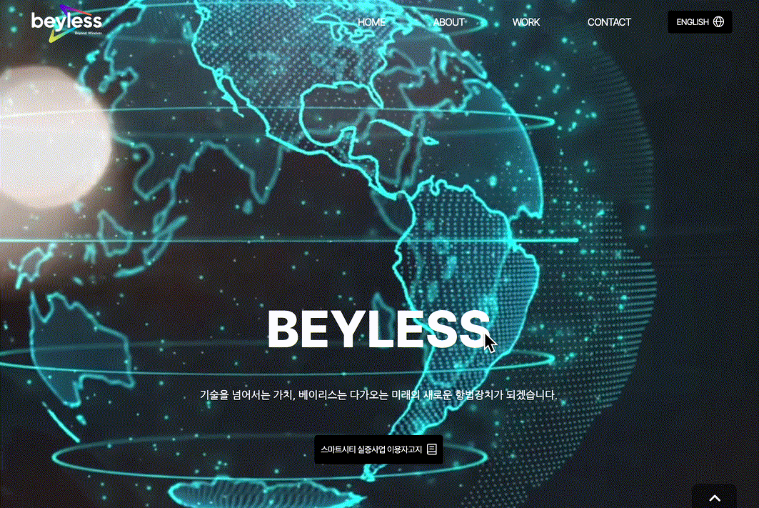
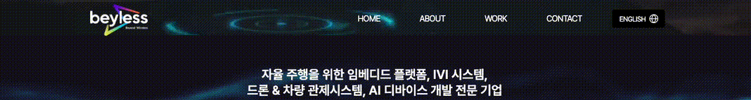
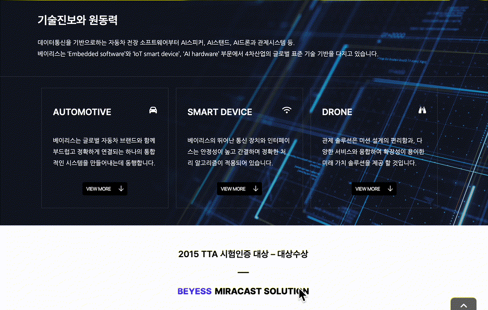
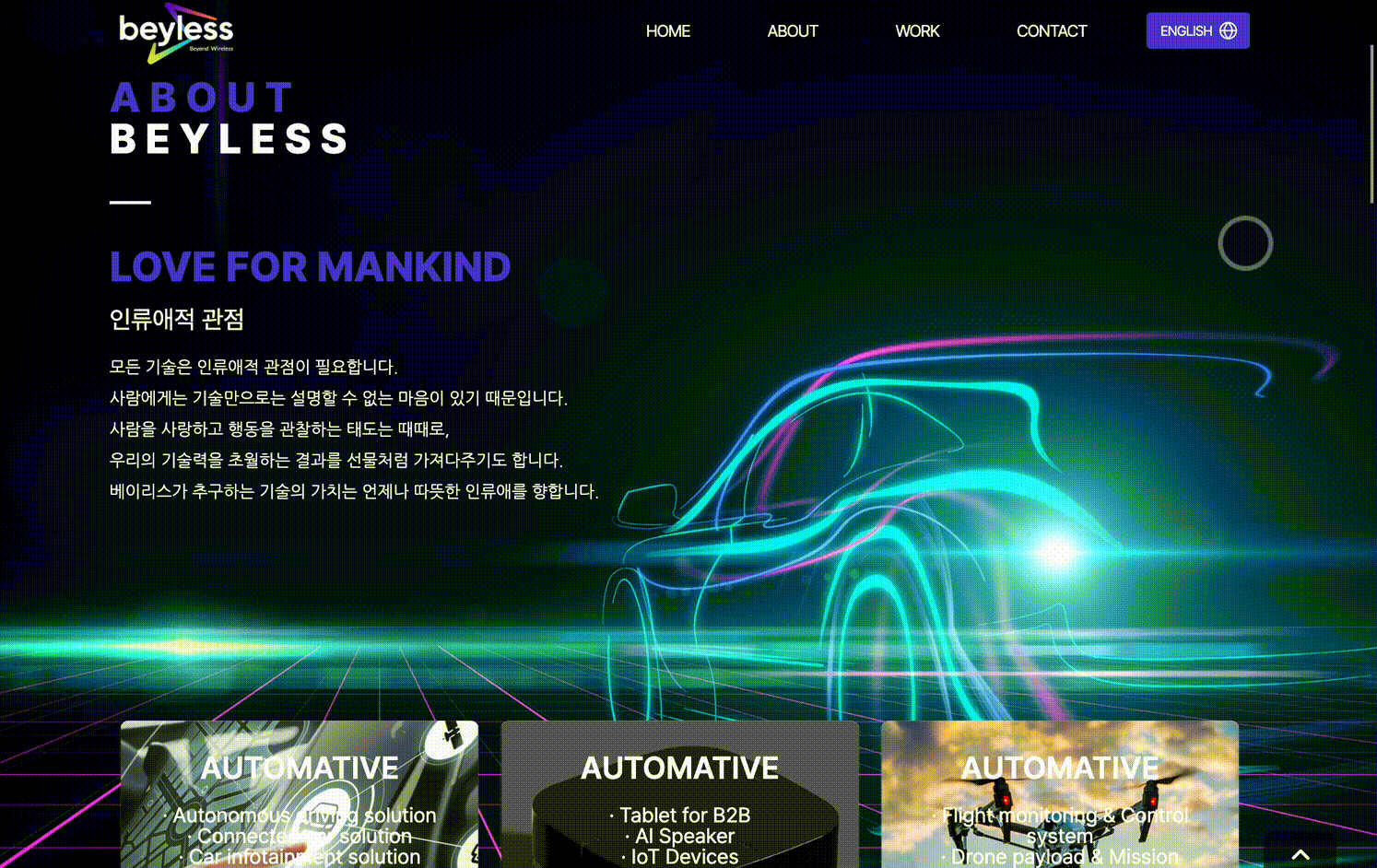
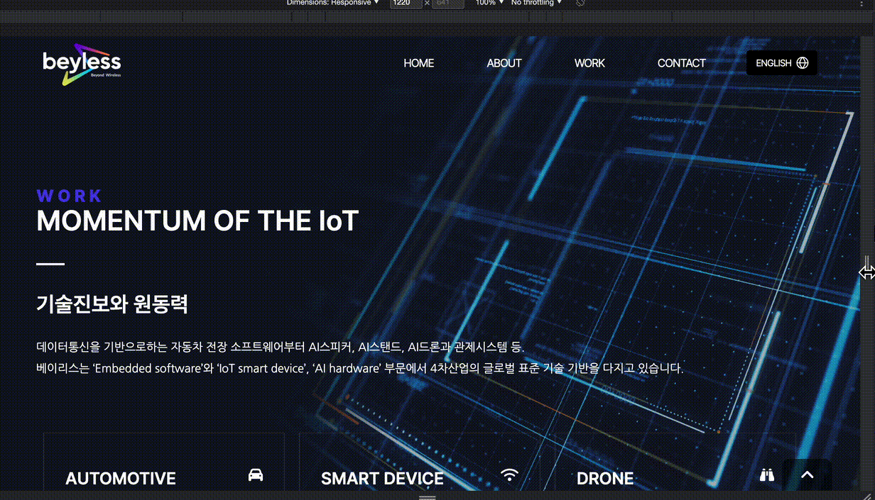
Vue3로 회사 소개 웹 페이지 제작
⭐️ 배포 페이지 링크
스택
Vue3, TypeScript, Sass
그 외
i18n, fontawesome
디렉토리 구조
.
├── App.vue
├── assets
│   ├── imgs
├── components
│   ├── Button.vue
│   ├── Card.vue
│   ├── Content.vue
│   ├── Icon.vue
│   ├── Seperator.vue
│   ├── Typography.vue
│   └── layout
│       ├── Footer.vue
│       └── GNB.vue
├── i18n
│   └── locale
│       ├── en.json
│       └── ko.json
├── main.ts
├── router
│   └── index.ts
├── styles
│   ├── base
│   │   ├── _fonts.scss
│   │   ├── _more.scss
│   │   └── _reset.scss
│   ├── constants
│   │   ├── _colors.scss
│   │   └── _sizes.scss
│   ├── index.scss
│   └── mixins
│       ├── _animation.scss
│       └── _responsive.scss
├── utils
│   ├── goToPage.ts
│   └── scorllToContent.ts
└── views
    ├── About
    │   ├── CEO.vue
    │   ├── History.vue
    │   └── index.vue
    ├── Contact.vue
    ├── Home.vue
    ├── Notice.vue
    └── Work
        ├── Content10.vue
        ├── Content2.vue
        └── index.vue
시현 영상
소개 및 주요 기능
공통 요소 컴포넌트화
- 버튼, 카드, 타이포그래피 등 여러 곳에서 재사용되며 공통적으로 쓰이는 것들을 따로 컴포넌트로 생성하였다.
버튼 컴포넌트
src/components/Button.vue
- props로 커스텀해줄 속성들을 전달받는다.
interface ButtonProps{...}로 props의 타입을 정의해두었다.- props의 기본 타입을 설정하는 방법은
withDefaults()함수를 사용한다.
- 방법을 잘 모를 경우 공식문서를 참조
<script setup lang="ts">

interface ButtonProps {
  onClick?: ((payload: MouseEvent) => void) | undefined;
  text?: string;
  type?: 'md' | 'lg' | 'none';
}

withDefaults(defineProps<ButtonProps>(), { // props의 defatult type 설정
  type: 'md',
});

</script>

<template>
  <div>
    <button :class="type" @click="onClick">{{ text }}<slot /></button>
  </div>
</template>

<style scoped lang="scss">
button {
  padding: 10px;
  display: flex;
  align-items: center;
  justify-content: space-around;
  border-radius: 4px;
  @include changeColor($BLACK);

  &:hover {
    @include changeColor($PRIMARY);
  }
}
.md {
  width: 100px;
  height: 35px;
}

.lg {
  width: auto;
  height: 45px;
}
</style>- Button 외에도 Card.vue 와 Content.vue 등의 컴포넌트를 정의하여 사용하였다.
- 해당 코드는 여기서 볼 수 있다.
반응형 헤더
src/components/layout/GNB.vue
-
스크롤 위치에 따라 헤더가 보이거나 가려지도록 설정했다.
-
모바일과 데스크탑에서 각각 다른 엘리먼트가 보이도록 했다. 처음에 같은 코드를 사용하면서 화면 크기에 따라 CSS만 다르게 적용해주려고 했으나 CSS코드가 복잡해지고 깔끔한 동작을 만들기가 어려웠다. 그래서 각각 엘리먼트를 만들어 화면 크기에 따라 달리 렌더링 하도록 하였다.
- 주석으로<!-- Mobile -->,<!-- Desktop -->표시해두었다. -
해당 코드는 여기서 볼 수 있다.
스크롤 버튼
스크롤 업, 다운 버튼 만들기는 어렵지 않게 만들 수 있다.
다만 특정 컨텐츠가 있는 곳으로 스크롤을 해야 하는 경우가 있었다. 이 때는 id속성을 주어 해당 id의 요소가 있는 곳으로 이동하도록 해주었다. id를 매개변수로 받아 해당 요소가 있는 곳으로 이동할 수 있는 함수를 만들었다.
// utils/scrollToContent.ts

const scrollToContent = (id: string) => {
  const content = document.getElementById(id);

  content?.scrollIntoView({
    behavior: 'smooth',
    block: 'start',
    inline: 'end',
  });
};

export default scrollToContent;
같은 함수가 여러 곳에서 사용되어 utils폴더에 따로 모듈화를 해주었다.
사용 예
// views/Work/Content2.vue

<script setup lang="ts">

import Button from '@/components/Button.vue';
import scrollToContent from '@/utils/scorllToContent';

...
</script><template>
...
<Button text="VIEW MORE" @click="scrollToContent('automotive')">
...
</template>다국어 지원
- i18n 라이브러리를 사용하였다.
- 영, 한에 해당하는 js파일을 json파일로 변환하여 i18n/locale 폴더 내에 두었다.
- 언어 전환 함수와 버튼은 GNB.vue 파일에서 관리한다.
- 다국어는 $t(키) 형식으로 사용한다.
모바일 대응
- styles/mixins/_responsive.scss 파일에 미디어쿼리를 정의해두어 사용하였다.
- 모바일 화면의 css를 기본으로 두고 mixin을 사용하여 데스크탑을 위한 css를 따로 정의하였다.
예)
<style lang="scss" scoped>

// 모바일 및 공통 속성
.contact {
  &__content1 {
    margin: 80px 0 0;
    background-color: #eff0f0;

    :deep(.content__slot-wrapper) {
      .content1__text-container {
        height: 450px;
        display: flex;
        flex-direction: column;
        justify-content: space-around;
      }
      img {
        width: 100%;
      }
    }
  }


  // 데스크탑
  @include after(1024px) {
    &__content1 {
      :deep(.content__slot-wrapper) {
        max-width: 1200px;
        margin: 0 auto;
        flex-direction: row;
        .content1__text-container {
          flex-basis: 50%;
          padding-right: 40px;
          > * {
            line-height: 45px;
          }
        }
        img {
          flex-basis: 50%;
        }
      }
    }
    &__content2 {
      height: 300px;
      :deep(.content__slot-wrapper) {
        max-width: 1200px;
        margin: 0 auto;
      }
    }
  }
}
</style>
There is no reason for not trying.
안녕하세요, 해당 페이지를 만들면서 참고했던 레퍼런스가 있으실까요? 너무예뻐서요.