이번엔 토글 버튼을 만들어 보려고 한다. 토글 버튼이라고 해야할진 모르겠지만 머.. 둘 중 하나의 상태를 왔다갔다 하는 거니까 ^___^
초기 버전
const SwitchButtonGroup = styled.div`
background-color: rgba(255, 255, 255, 0.1);
border-radius: 1000px;
width: fit-content;
margin: 0 auto;
`;
const SwitchButton = styled.button`
align-items: center;
appearance: none;
background: none;
border: none;
color: white;
cursor: pointer;
display: inline-flex;
font-size: 1rem;
font-weight: 500;
height: 38px;
justify-content: center;
outline: none;
padding: 8px 18px;
position: relative;
width: fit-content;
`;
const SwitchButtonText = styled.p`
line-height: normal;
mix-blend-mode: exclusion;
z-index: 20;
user-select: none;
`;
const SelectedIndicator = styled(motion.div)`
background: white;
height: 100%;
left: 0;
pointer-events: none;
position: absolute;
top: 0;
width: 100%;
`;
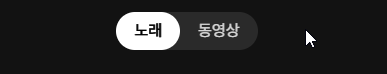
const switchButtons = ['노래', '동영상'];
const [selectedSwitchId, setSelectedSwitchId] = useState(0);
<SwitchButtonGroup>
{switchButtons.map((switchButton, i) => (
<SwitchButton key={i} onClick={() => setSelectedSwitchId(i)}>
{i === selectedSwitchId && (
<SelectedIndicator style={{ borderRadius: 9999 }} layoutId="switch" />
)}
<SwitchButtonText>{switchButton}</SwitchButtonText>
</SwitchButton>
))}
</SwitchButtonGroup>;Framer Motion LayoutId
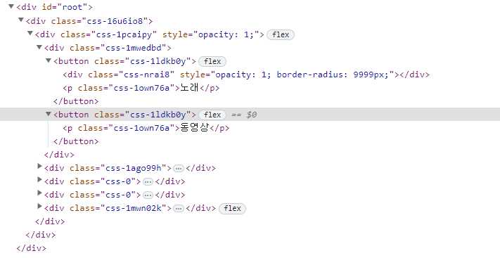
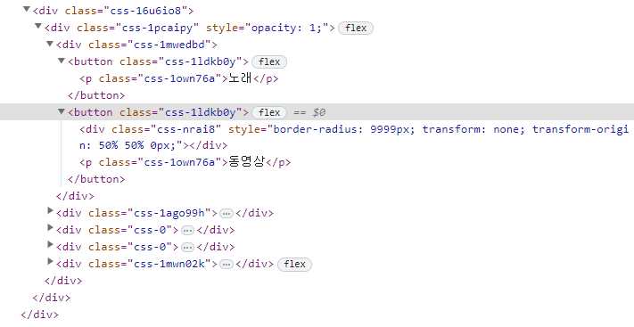
버튼을 클릭하면 뒷 배경이 왔다갔다 하는 효과를 볼 수 있다. 이것은 framer motion의 layoutId 속성을 활용한 것인데 ...
이 LayoutId에 대한 개념이 나한테는 모호한 개념이었다. 그 이유는,, 아니 어떻게 이름 하나만 붙여줬다고 자동으로 애니메이션이 된다는 거지? 하는 의문이 있었으니(ㅋㅋ)
이번에 알게된 것은 이 layoutId를 활용하는 것은 다음과 같은 조건이 있어야 한다는 것.
- 다른 객체들에게도 공통적으로 들어가는 객체일 것.
- 한 번에 하나만 렌더링이 되어야 할 것.
예를 들어 이번 SwitchButton 뿐만이 아니라 카드들이 여러개 있고, 그 카드들을 누르면 그 카드들에서 커지면서 화면을 채우는 효과가 있다고 하면 다음과 같은 형식이겠다.
<button onClick={() => setCardId(0)}>
  1번째 카드
  {cardId === 0 && <Card id={0} layoutId="card" />}
</button>

<button onClick={() => setCardId(2)}>
  2번째 카드
  {cardId === 1 && <Card id={1} layoutId="card" />}
</button>

<button onClick={() => setCardId(3)}>
  2번째 카드
  {cardId === 2 && <Card id={2} layoutId="card" />}
</button>
그리고 이 Card 컴포넌트는 렌더 초기에 화면을 채우는 애니메이션에만 신경쓰면 된다.
이런 식으로 뭔가 콘텐츠는 달라지는데 적용되는 레이아웃/화면? 이런 건 똑같은 경우에 잘 써먹을 수 있는 속성이었다. 그래서 이름 자체도 layoutId인가 싶기도 하고 ....
머 아무튼 이 SwitchButton에서는 다음과 같이 쓰였다. 핵심만 가져왔다.
const SwitchButton = styled.button`
  display: inline-flex;
  height: 38px;
  position: relative;
`;

const SelectedIndicator = styled(motion.div)`
  height: 100%;
  width: 100%;
  position: absolute;
  top: 0;
  left: 0;
`;


<SwitchButton>
  {i === selectedSwitchId && <SelectedIndicator layoutId="switch" />}
</SwitchButton>;
SelectedIndicator가 뒤에서 날라댕기는 배경이다. 여기에 layoutId를 switch로 주게 되면 이리저리 움직이게 된다. 여기에서, 왜 움직이는지 잠깐 더 생각해보면 다음과 같다.
현재 부모는 SwitchButton으로 position이 relative인 상태. SelectedIndicator는 absolute이다. top과 left로 0을 지정해줬기 때문에, 만약 부모가 바뀐다면 그 부모의 위치로 이동하게 될 것이다. (부모가 바뀐다는 상상을 쉽게 할 수 없었기에 이 개념에 대해서 좀 더 이해가 안 갔을지도...)
DOM상으로는 해당 객체가 사라지는 것이라, 사라진 객체에 애니메이션을 어떻게 넣는다는 거지? 했는데 이런 식으로 같은 layoutId를 가진 녀석이 그 이전 객체의 위치를 기억했다가 자기쪽으로 애니메이팅하는 형식이다.
멋진 framer motion...
배경 Inverted
그리고 자세히 보면 텍스트의 색이 배경에 지나감에 따라 반전되는 것을 확인할 수 있다.
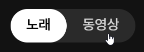
요게 디테일의 차이 아닙니까~(ㅋㅋ)
만약 이런 효과가 없이 단순히 배경과 폰트의 색깔만 바뀐다면, 클릭했을 당시에 배경이 오지도 않았는데 검은색으로 변해서 잠깐의 미묘한 정적..이라고 해야하나 그게 있을 것이다.
나는 그런 모먼트가 싫어서 mix-blend-mode를 사용했다. 이 속성은 이 객체와 겹치는 모든 레이어에서 자신의 색을 blending하는 녀석이다. 포토샵이나 프리미어를 해봤다면, 그 blending 모드가 맞다.
요걸 어디에 넣어야 하냐도 조금 고민했었는데(배경에 넣어도 어쨌든 반전은 되니까), 텍스트에 지정해주는 것이 맞다는 판단이 들었다. 배경보다는 글자 자체에 목적을 가졌기 때문.
const SwitchButtonText = styled.p`
  mix-blend-mode: exclusion;
  z-index: 20;
`;
z-index는 안 넣어줘도 되는데, 그래도 직관상 텍스트가 더 앞에 있는 거니깐(ㅋㅋ) 배경 노드가 바뀌면서 옮겨다니는 거라 z-index order는 A 버튼에 있을 때와 B버튼에 있을 때가 다르다.그래서 옮겨갔을 때 텍스트가 배경보다 아래 있을 수도 있어서 따로 처리해준 것.
리팩토링: Compounded Design
그래서 이렇게 구현을 얼추 해놨으나~ 큰 문제가 있었다.
const switchButtons = ['노래', '동영상'];

const [selectedSwitchId, setSelectedSwitchId] = useState(0);

<SwitchButtonGroup>
  {switchButtons.map((switchButton, i) => (
    <SwitchButton key={i} onClick={() => setSelectedSwitchId(i)}>
      {i === selectedSwitchId && (
        <SelectedIndicator style={{ borderRadius: 9999 }} layoutId="switch" />
      )}
      <SwitchButtonText>{switchButton}</SwitchButtonText>
    </SwitchButton>
  ))}
</SwitchButtonGroup>;
넘 보기 싫고 알아보기도 힘들어! 난잡해!
재사용성을 생각해서 버튼도 여러개 둘 수 있고, 그에 따라 자동으로 선택도 할 수 있게 만들고 싶어서 저런 식으로 만들었는데 좀 문제가 있어보였다. key도 index로 하고,,
그으래서 조금 아이디어를 낸게, 컴파운드 방식으로 만들면 명확하게 되지 않을까~? 싶어서 시도해봤다.
const [selectedSwitchId, setSelectedSwitchId] = useState(0);

<SwitchButton selectedKey={selectedSwitchKey} onSelect={setSelectedSwitchKey}>
  <SwitchButton.Item itemKey="sing">노래</SwitchButton.Item>
  <SwitchButton.Item itemKey="movie">동영상</SwitchButton.Item>
</SwitchButton>;
깔-끔
코드
type SwitchButtonContextProp = {
  selectedKey: string;
  onSelect: (key: string) => void;
};

const SwitchButtonContext = createContext<SwitchButtonContextProp>({} as SwitchButtonContextProp);

type SwitchButtonProp = {
  selectedKey: string;
  onSelect: (key: string) => void;
  children: React.ReactNode;
};

const SwitchButton = ({ selectedKey, onSelect, children }: SwitchButtonProp) => {
  return (
    <SwitchButtonContext.Provider value={{ selectedKey, onSelect }}>
      <SwitchButtonGroup>{children}</SwitchButtonGroup>
    </SwitchButtonContext.Provider>
  );
};
먼저 맥락을 공유할 Context를 생성해주었다. 또한 이건 controlled component로 만들고 싶었기에 컴포넌트 외부에서 selectedKey와 onSelect를 받아오고, 이 두개를 공유해준다.
type ItemProp = {
  itemKey: string;
  children: React.ReactNode;
};

const Item = ({ itemKey, children }: ItemProp) => {
  const { selectedKey, onSelect } = useContext(SwitchButtonContext);

  return (
    <SwitchButtonInner key={`switch-${itemKey}`} onClick={() => onSelect(itemKey)}>
      {selectedKey === itemKey && (
        <SelectedIndicator style={{ borderRadius: 9999 }} layoutId="switch" />
      )}
      <SwitchButtonText>{children}</SwitchButtonText>
    </SwitchButtonInner>
  );
};

SwitchButton.Item = Item;
그 다음 Item에서는 두 개를 가져와서 써먹어 준다. SwitchButton의 Item에 Item을 등록해준다.
후기
이 Compounded 방식 그대로 MusicProgressbar에도 써먹을 수 있을 것 같은데 ... 아이디어를 정리해봐야겠다.
- 코드: 코드샌드박스