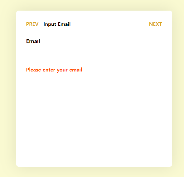
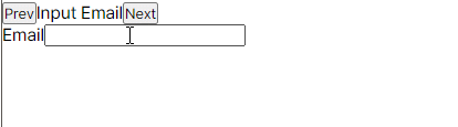
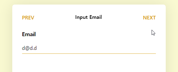
Multi-step Form을 구현할 일이 생겨서 정리해보는 포스팅! 다음과 같은 형태를 만드려고 한다.
이런 페이지를 어떻게 부르는지는 잘 모르겠지만,, 내가 아는 것 중에 Multi-step Form이랑 제일 유사해서 그렇게 부르고 있다. 모바일에선 흔한 디자인이고, 아마도 이걸 제공하는 기본 Native UI Component가 따로 있겠지만, PWA는 그런 거 없이 그냥 구현해야 한다 이말이야...
원하는 것
기능
- 각 단계마다 데이터를 입력받게 하고 싶다.
- 각 단계마다 데이터를 입력하고 다음을 누르면 유효성 검사가 진행되게 하고 싶다.
- 처음 단계에서 Prev를 누르면 이전 페이지로 가게 하고 싶다.
- 마지막 단계에서 Next를 누르면 Form 제출이 완료돼서 서버로 데이터를 보내고 싶다.
- 단계 리스트를 정의해놓고 리스트를 넘기면 렌더만 하게 할 수 있는 컴포넌트로 만들고 싶다.
UX
- 단계가 다음으로 넘어갈 때 헤더 제목이 위로 올라가게 Animate
- 단계가 다음으로 넘어갈 때 Content가 왼쪽으로 Animate
- 단계가 이전으로 넘어갈 때 헤더 제목이 아래로 내려가게 Animate
- 단계가 이전으로 넘어갈 때 Content가 오른쪽으로 Animate
- 각 단계로 넘어가면 첫 번째 Input으로 Auto-focus
- 단계를 넘어가고 이전으로 가도 데이터가 살아있게 하고 싶다.
구현
useMultiStepForm
먼저 각 단계를 받고 이를 관리해주는 Hook이 필요할 것 같아서 만들어 주었다. 해당 훅에서 관리하는 데이터는 다음과 같다.
- 현재 단계 Index
- 현재 보여줄 단계 제목
- 현재 보여줄 단계 Element
- 이전 함수
- 다음 함수
그리고 상태를 알려주는 변수로 다음과 같이 만들어준다.
- 현재 단계가 처음 단계인가?
- 현재 단계가 마지막 단계인가?
Expected Usage
그래서 이런 식으로 사용하면 편할 것 같았다.
const { currentTitle, currentStep, prev, next, isFirstStep, isLastStep } = useMultiStepForm([
  {
    title: 'Input Email',
    element: <EmailForm />,
  },

  {
    title: 'Input Password',
    element: <PasswordForm />,
  },
  {
    title: 'Input Nickname',
    element: <NicknameForm />,
  },
]);
코드
복잡한 건 없어서 한번에 쓱 보면 될 듯!
import { useState, ReactElement } from 'react';

type StepProp = {
  title: string;
  element: ReactElement;
};

const useMultiStepForm = (steps: StepProp[]) => {
  const [currentStepIndex, setCurrentStepIndex] = useState(0);

  const prev = () => {
    setCurrentStepIndex((index) => (index <= 0 ? 0 : index - 1));
  };

  const next = () => {
    setCurrentStepIndex((index) => (index >= steps.length - 1 ? index : index + 1));
  };

  return {
    currentStepIndex,
    currentTitle: steps[currentStepIndex].title,
    currentStep: steps[currentStepIndex].element,
    isFirstStep: currentStepIndex === 0,
    isLastStep: currentStepIndex === steps.length - 1,
    prev,
    next,
  };
};

export default useMultiStepForm;
구조
간략히 큰 구조만 가져오면 이런 식이 되겠다.
<form>
  <!-- Header Section -->
  <header>
    <button>Prev</button>
    <span>Title</span>
    <button>Next</button>
  </header>

  <!-- Content Section -->
  <section>
    <div>
      <label>Email</label>
      <input />
    </div>
  </section>
</form>
전체 페이지를 감싸주는 form 녀석이 있고, 위쪽 헤더를 담당하는 녀석, 그리고 콘텐츠를 담는 녀석이 있다. 헤더에선 이전 버튼, 제목, 다음 버튼이 있다. 콘텐츠 영역에선 한 입력 영역에 해당하는 컨테이너가 존재하고, 그 안엔 라벨과 인풋이 존재한다.
form이 전체를 감싸고 있는 이유는 Next 버튼이 Header에 있기 때문이다. 폼 데이터를 제출하려면 form 안에 있어야 하니까.
기본 뼈대
useMultiStepForm Hook을 이용해서 기본 뼈대를 만들어보자.
const RegisterPage = () => {
  const { currentTitle, currentStep, prev, next, isFirstStep, isLastStep } = useMultiStepForm([
    {
      title: 'Input Email',
      element: <h4>Email Section</h4>,
    },

    {
      title: 'Input Password',
      element: <h4>Password Section</h4>,
    },
    {
      title: 'Input Nickname',
      element: <h4>Nickname Section</h4>,
    },
  ]);

  return (
    <div>
      <form onSubmit={(e) => e.preventDefault()}>
        <header>
          <button onClick={prev}>Prev</button>
          <span>{currentTitle}</span>
          <button onClick={next}>Next</button>
        </header>

        {currentStep}
      </form>
    </div>
  );
};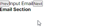
각 단계마다 Title과 Content를 잘 보여주고 있다.
마지막 단계일 때 Submit으로 변경
현재 사용자가 마지막 단계에 있을 때는 Next가 아닌 Submit으로 바꾸게 해보자.
마지막 단계임을 알려주는 건 isLastStep 변수를 쓰면 되니까~ 조건부 렌더링을 하면 되겠다.
<button onClick={next}>
  {isLastStep ? "Submit" : "next"}
</button>
그런데 이러면 안에 있는 내용만 바뀌지 실제로 제출이 되진 않는다. form의 onSubmit을 수정해서 실제 제출이 되게끔 해보자. (form안에 있는 button은 클릭하면 form에 제출이 된다)
const handleSubmit = (e: FormEvent<HTMLFormElement>) => {
  e.preventDefault();

  if (isLastStep) {
    // TODO: Request form
    return alert("Submitted!");
  }

  next();
};

<form onSubmit={handleSubmit}>
  <header>
    <button type="button" onClick={prev}>
      Prev
    </button>
    <span>{currentTitle}</span>
    <button>{isLastStep ? 'Submit' : 'Next'}</button>
  </header>

  {currentStep}
</form>
onSubmit을 바꾸면서 Prev 버튼도 바꿔야 한다. 안 그러면 제출이 되니까, 제출이 안 되게끔 type을 button으로 바꿔주었다.
굿~
각 Step Form 만들기
이제 Step Form을 만들어보자. 뼈대만 만드는 거니 그냥 코드만!
const EmailForm = () => {
  return (
    <>
      <label>Email</label>
      <input />
    </>
  );
};

const PasswordForm = () => {
  return (
    <>
      <label>Password</label>
      <input />
      <label>Password Confirm</label>
      <input />
    </>
  );
};

const NicknameForm = () => {
  return (
    <>
      <label>Nickname</label>
      <input />
    </>
  );
};
그 다음 useMultiStepForm에 넘겨준다.
const { currentTitle, currentStep, prev, next, isFirstStep, isLastStep } = useMultiStepForm([
  {
    title: 'Input Email',
    element: <EmailForm />,
  },

  {
    title: 'Input Password',
    element: <PasswordForm />,
  },
  {
    title: 'Input Nickname',
    element: <NicknameForm />,
  },
]);
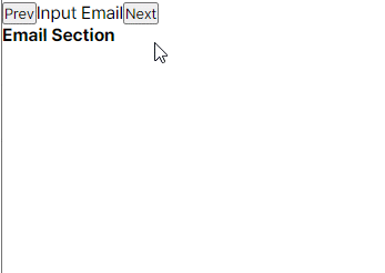
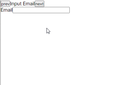
머 당연히 잘 나온다. 스타일을 안 먹였으니 당연히 개못생기게 나온다. 신경쓰지 말자. 원래 안 꾸미면 다 저런 거다. 그니까 좀 꾸며라
폼 데이터 저장
지금까진 객체를 생성만 했지 실제로 데이터를 저장하고 있진 않다. 데이터를 상태에 연결시켜보자.
연결시킬 때 포인트는 메인 페이지가 각 폼의 모든 데이터를 저장하고 있다는 점! 값이 수정 되면 메인에 올려주고, 메인은 다시 내려준다.
type FormDataProps = {
  email: string;
  password: string;
  passwordConfirm: string;
  nickname: string;
};

const INITIAL_FORMDATA = {
  email: '',
  password: '',
  passwordConfirm: '',
  nickname: '',
};

const RegisterPage = () => {
  const [formData, setFormData] = useState(INITIAL_FORMDATA);

  const updateFields = (fields: Partial<FormDataProps>) => {
    setFormData((prev) => ({ ...prev, ...fields }));
  };

  const { currentTitle, currentStep, prev, next, isFirstStep, isLastStep } = useMultiStepForm([
    {
      title: 'Input Email',
      element: <EmailForm {...formData} updateFields={updateFields} />,
    },

    {
      title: 'Input Password',
      element: <PasswordForm {...formData} updateFields={updateFields} />,
    },
    {
      title: 'Input Nickname',
      element: <NicknameForm {...formData} updateFields={updateFields} />,
    },
  ]);
}
formData라는 상태를 지정해주고, 초기값으로 빈값들을 넣어주고 있다. 그리고 그 상태를 각 콘텐츠 폼으로 넘겨주고 있고, 업데이트가 발생할 때마다 updateFields를 호출하여 formData를 갱신하고 있다. 각 콘텐츠폼은 다음과 같이 바뀌었다.
type EmailFormProps = {
  updateFields: (field: Partial<FormDataProps>) => void;
} & Partial<FormDataProps>;

const EmailForm = ({ email, updateFields }: EmailFormProps) => {
  const handleChange = (e: ChangeEvent<HTMLInputElement>) => {
    updateFields({ email: e.target.value });
  };

  return (
    <>
      <label htmlFor="email">Email</label>
      <input id="email" value={email} onChange={handleChange} />
    </>
  );
};

type PasswordFormProps = {
  updateFields: (field: Partial<FormDataProps>) => void;
} & Partial<FormDataProps>;

const PasswordForm = ({ password, passwordConfirm, updateFields }: PasswordFormProps) => {
  const handleChange = (e: ChangeEvent<HTMLInputElement>) => {
    updateFields({ [e.target.id]: e.target.value });
  };

  return (
    <>
      <label htmlFor="password">Password</label>
      <input id="password" value={password} onChange={handleChange} />
      <label htmlFor="passwordConfirm">Password Confirm</label>
      <input id="passwordConfirm" value={passwordConfirm} onChange={handleChange} />
    </>
  );
};

type NicknameFormProps = {
  updateFields: (field: Partial<FormDataProps>) => void;
} & Partial<FormDataProps>;

const NicknameForm = ({ nickname, updateFields }: NicknameFormProps) => {
  const handleChange = (e: ChangeEvent<HTMLInputElement>) => {
    updateFields({ nickname: e.target.value });
  };

  return (
    <>
      <label htmlFor="nickname">Nickname</label>
      <input id="nickname" value={nickname} onChange={handleChange} />
    </>
  );
};
뭐가 막 복잡하게 바뀐 것 같지만 그냥 말한 그대로다. 각 input들에 필요한 데이터를 넣어서 반응하게 반들고, 수정이 일어날 때마다 updateFields를 호출하고 있다.
우왕! 그러면 다음 스탭으로 넘어가서도 이전 스탭에 입력했던 것들이 살아있는 것을 볼 수 있다. 이제 얼른 개못생긴 거 치워버리자.
스타일링
Radix Primitive로 변경
일단 Radix UI의 Form을 이용해서 현재 코드를 바꿔보자. 그냥 있는 객체를 바꾸기만 하면 된다. 쫄지 말자(본인은 쫄았음)
import * as Form from '@radix-ui/react-form';
return (
<Form.Root onSubmit={handleSubmit}>
<header>
<button type="button" onClick={handlePrevClick}>
prev
</button>
<span>{currentTitle}</span>
<Form.Submit>{isLastStep ? 'submit' : 'next'}</Form.Submit>
</header>
{currentStep}
</Form.Root>
);
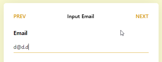
return (
<Form.Field name="email">
<Form.Label htmlFor="email">Email</Form.Label>
<Form.Control id="email" type="email" value={email} onChange={handleChange} required />
<Form.Message match="valueMissing">Please enter your email</Form.Message>
<Form.Message match="typeMismatch">Please provide a valid email</Form.Message>
</Form.Field>
);
return (
<>
<Form.Field name="password">
<Form.Label htmlFor="password">Password</Form.Label>
<Form.Control
type="password"
id="password"
value={password}
onChange={handleChange}
required
/>
<Form.Message match="valueMissing">Please enter your password</Form.Message>
</Form.Field>
<Form.Field name="passwordConfirm">
<Form.Label htmlFor="passwordConfirm">Password Confirm</Form.Label>
<Form.Control
type="password"
id="passwordConfirm"
value={passwordConfirm}
onChange={handleChange}
required
/>
<Form.Message match="valueMissing">Please enter your password confirm</Form.Message>
</Form.Field>
</>
);
return (
<Form.Field name="nickname">
<Form.Label htmlFor="nickname">Nickname</Form.Label>
<Form.Control type="text" id="nickname" value={nickname} onChange={handleChange} required />
<Form.Message match="valueMissing">Please enter your nickname</Form.Message>
</Form.Field>
);Stitches CSS로 스타일링
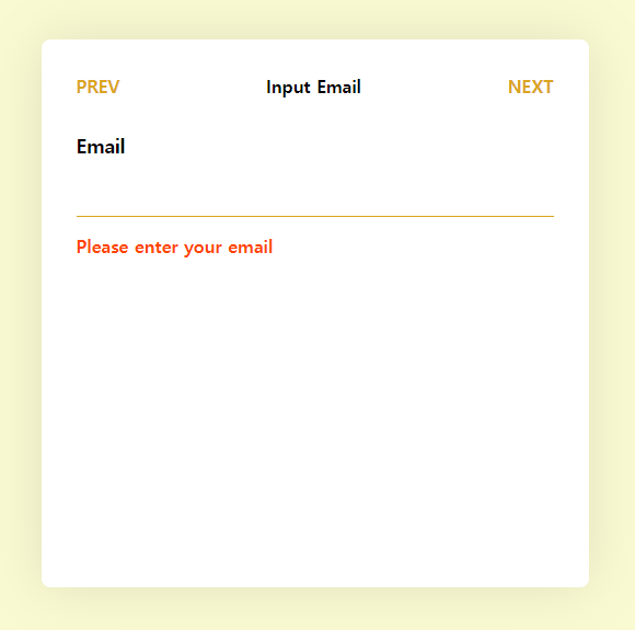
이제 진짜 예쁘게 바꿔보자. Stitches에서는 만들어진 컴포넌트를 확장할 수도 있어서 일반적으로 해주면 된다.
Header쪽
- Note: CodeSandbox에서 작성한 거라 Token같은 건 패스했다.
const Header = styled("header", {
  display: "flex",
  flexDirection: "row",
  justifyContent: "space-between",
  alignItems: "center",
  width: "100%",
  padding: "1rem",

  button: {
    all: "unset",
    fontWeight: "bold",
    padding: "1rem",
    color: "GoldenRod",
    textTransform: "uppercase",
  },

  span: {
    flex: 1,
    fontWeight: "bold",
  },
});
Form쪽
const FormField = styled(Form.Field, {
  display: "flex",
  flexDirection: "column",
  gap: "1rem",

  label: {
    fontSize: "1.1rem",
    fontWeight: "bolder",
  },

  input: {
    all: "unset",
    fontSize: "1rem",
    padding: ".5rem 0",
    borderBottom: "1px solid GoldenRod",
  },

  span: {
    color: "OrangeRed",
    fontWeight: "bolder",
  },
});
그 외 좀 더 보기 좋게 외부적으로 바꾸면 다음과 같은 화면이 나온다.
후후...
애니메이션
이제 페이지를 넘길 때 좀 더 부드러운 UX를 선사하기 위해 애니메이션을 줘보자. 크게 두 개를 줄 건데, 하나는 제목에 줄 거고, 하나는 Content에 줄 거다. 처음에 보여준 예시를 봐보자.
다음 폼으로 넘어갈 땐 제목이 위로 넘어가고, 이전 폼으로 넘어갈 땐 제목이 아래로 넘어간다. Content도 마찬가지로 다음으로 갈 땐 오->왼으로 가고, 이전으로 갈 땐 왼->오로 간다.
제목부터 구현해보자.
- Note: 여기서부턴 Framer Motion에 대한 기본적인 지식이 좀 있어야 이해가 쉬울 듯!
제목 애니메이션
현재 Element가 위아래로 움직이기 때문에 y값을 조정해야 한다는 걸 추측할 수 있다. 그런데 이때 그냥 올라가는 게 아니고 올라가면서 잘린다. 이 말은~ Wrapper가 있고 그 안에 콘텐츠들이 overflow로 짤린다는 거다. 하지만 Wrapper는 콘텐츠의 크기에 따라 변하는 게 아니고 고정값이기 때문에, 콘텐츠들의 position은 absolute로 주는 게 맘 편할 것이다.
일단 Wrapper와 AnimatePresce를 주자.
<div>
  <AnimatePresence>
    <motion.div>
      <span>{currentTitle}</span>
    </motion.div>
  </AnimatePresence>
</div>
div가 Wrapper고, span자체를 motion객체로 바꾸지 않고 그 위에 motion객체로 감쌌다. 이래야 원래 객체 스타일과 애니메이션 스타일을 나눌 수 있다. (걍 내 취향임!)
그 다음은~ variants와 애니메이션 라벨을 주자. 먼저 아래에서 위로 올라가는 것부터 구현해보자.
<motion.div
  variants={{
    initial: { y: "100%" },
    normal: { y: 0 },
    exit: { y: "-100%" },
  }}
  initial="initial"
  animate="normal"
  exit="exit"
>
  <span>{currentTitle}</span>
</motion.div>
이건 진짜 꿀팁인데, framer motion은 %를 지원한다. 이 말은 직접 크기를 구하지 않아도 된다는 말이다. 100%라고하면 현재 객체의 크기를 뜻한다. 그래서~ 처음엔 100%만큼 y를 옮기면, 아래에 위치해있게 되고, animate에 의해 0으로 온다. 그러면 아래에서 위로 올라오는 모션이 되고, dom에서 제거될 때 -100%가 되니 위로 올라가게 된다. 실행해보면~ 될까?
안 된다(ㅋㅋ) 왜냐면~ exit에서 제일 중요한 것 key다. 변경이 감지가 되어야 framer motion이 동작을 하는데, 지금은 span안의 textContent만 바뀔 뿐이지 component 자체가 바뀌는 건 아니기 때문이다. 그래서 key를 주어서 감지하게 해주어야 한다. 여기에서 바뀌는 건 currentTitle이니까, key로 currentTtitle을 주자. 그러면~
요상하게 작동하지만 되긴 한다. 왜 이렇게 동작하는 걸까? 그것은 바로~ framer motion의 특성때문이다. 특성이라고 하긴 좀 그렇고... 여튼 framer motion이 exit 때도 동작할 수 있는 이유는 객체를 복사한 뒤에 애니메이팅을 하기 때문이다. 그 말은? 애니메이션이 시작하고 끝날 때까진 자식이 두 개가 된다는 것이다.
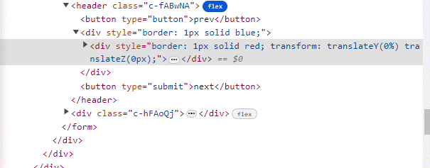
div가 순간 두 개가 되는 걸 확인할 수 있다. 좀 더 시각적으로 확인해보면 다음과 같다.
그러니까~ wrapper의 크기가 변하게 되면서 동작이 이상해지는 것. 이제 Wrapper의 크기를 고정시키고 머시기머시기 해보자.
<div
  style={{
    border: "1px solid blue",
    position: "relative",
    height: "1.5rem",
    overflow: "hidden",
    flex: 1,
  }}
>
  <AnimatePresence>
    <motion.div
      key={currentTitle}
      variants={{
        initial: { y: "100%" },
        normal: { y: 0 },
        exit: { y: "-100%" },
      }}
      initial="initial"
      animate="normal"
      exit="exit"
      style={{
        position: "absolute",
        width: "100%",
        textAlign: "center",
        border: "1px solid red",
      }}
    >
      <span>{currentTitle}</span>
    </motion.div>
  </AnimatePresence>
</div>
포인트는 Wrapper의 position을 relative로 바꿔주었다. 그후 motion.div의 position을 absolute로 바꿔주었다. 그런데 이러면~ CSS 특성상 자식의 position이 absolute이니까 크기를 가지지 않는다. 그래서 Wrapper height를 1.5rem으로, flex: 1을 주어 고정시켜주었다. 그러면~ Wrapper는 헤더의 비어있는 부분을 다 차지하게 되므로 motion.div는 왼쪽에 붙어버리게 된다.
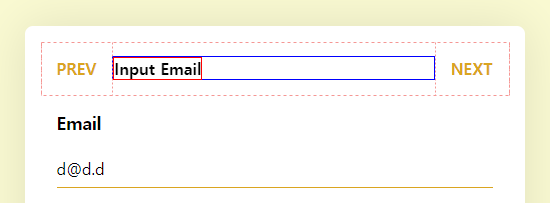
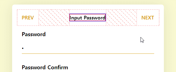
요로코롬. 내 원래 디자인은 이거여서 뭐 상관은 없다만, 이왕 가운데로 시작한 거 가운데로 주기 위해 width: "100%"과, textAlign을 center로 주었다. 그러면~! 원하는 애니메이션이 나오게 된다.
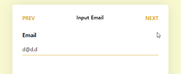
마지막에 submit으로 바뀌면서 차지하는 공간이 바뀌어 옆으로 밀리는 게 좀 열받긴 한데, 이거 해결하자고 버튼 absolute로 바꾸고 할 생각하니 걍 넘어가겠다.
이제 왼쪽 눌렀을 땐 위에서 아래로 가게 해보자. 생각보다 간단하다. 바로 진행 방향을 알려주는 state를 두면 된다.
const [progressDirection, setProgressDirection] = useState(1);

const handleSubmit = (e: FormEvent<HTMLFormElement>) => {
  // ...

  setProgressDirection(1);
  next();
};

const handlePrevClick = () => {
  // ...

  setProgressDirection(-1);
  prev();
};

<motion.div
  key={currentTitle}
  custom={progressDirection}
  variants={{
    initial: (progressDirection: number) => ({
      y: `${100 * progressDirection}%`,
    }),
    normal: { y: 0 },
    exit: (progressDirection: number) => ({
      y: `${-100 * progressDirection}%`,
    }),
  }}
  initial="initial"
  animate="normal"
  exit="exit"
  style={{
    position: "absolute",
    width: "100%",
    textAlign: "center",
  }}
>
이전버튼을 누를 땐, 그러니까 위에서 아래로 넘어오려면 반대로 -100%에서 0이 되어야 하고, 나갈 땐 100%가 되어야 한다. 부호만 반대로 바꿔주면 되니까~ 이전 버튼을 눌렀을 땐 -1이, 다음 버튼을 눌렀을 땐 1이 되게 한다. 이때, framer motion은 react의 생명주기를 벗어나서 작동하기 때문에 동적으로 값을 넘겨주려면 custom 속성을 이용해서 넘겨주어야 한다. 그러면~ 다음과 같이 동작한다.
잘 되는 듯 안 되는 것 같은 이유는.. exit animate가 이전 진행방향을 따르고 있기 때문이다. 새로운 값은 진행방향이 갱신된 상태로 variants가 생성되기 때문에 애니메이션이 먹히는데, 이전에 생성된 객체는 이전 진행방향을 가진 variants를 가지고 있기 때문에 저렇게 작동하는 거다. 사실 코딩상 정상적으로 동작하는 중이다(ㅋㅋ)
이를 해결하기 위해 AnimatePresence가 존재한다. 요놈의 속성 중에 custom이라는 게 있는데, 방금과 같은 케이스를 위해 존재한다. custom에 진행방향을 넣어주면 exit variants가 갱신된 후에 애니메이션이 먹힌다.
<AnimatePresence custom={progressDirection}>
굿~
콘텐츠 애니메이션
제목 애니메이션을 구현한 것처럼 콘텐츠 애니메이션도 만들면 된다. 다른 건 방향뿐이다. 코드는.. 아래 코드 샌드박스에서(ㅋㅋ)
바운싱이 열받긴 한데~ 중요한 건 애니메이팅을 줬다는 거니까!
리팩토링
머 여튼 여기까지 하면 원하는 기능은 다 구현한 것. 그런데 이거 작성 하고 한 3일 뒤에 다시 보는 건데, 좀 비효율적인 부분이 있어서 고쳐보려고 한다. 이에 관한 건 다음 포스팅에서 이어서! 넘 길어지는 것 같아서리.
- Radix UI의 Form Control는 asChild를 써서 아래로 위임해주기
- Form Control 그대로 쓰니까 스타일링과 기능 구분이 안 되는 것 같다. - useMultistepForm 구조 및 변수 이름 변경
- 변수 이름이 의미적으로 와닿지 않는 것들이 많아서 변경해야겠다.- Form Component 구조 변경으로 인한 수정
- Form Component들의 이벤트 처리 방식이 지금 중복이 많다. 상위로 보내서 하나로 관리해주기
- 애니메이션은 Motion Component으로 빼주기
- 바로 붙여버리니까 코드가 상당히.... (생략) - Style 관리하기
- 코드: 코드 샌드박스