GEE(Generalized Estimating Equations) 모델과 세그먼트 회귀 개념과 시계열 데이터에서 충격 데이터 인터벤션 기법으로 활용
시계열 데이터 보정
사용한 데이터는 제주관광공사의 입도객 데이터 입니다. (대학교 캡스톤 project)
- 시계열 차트 확인
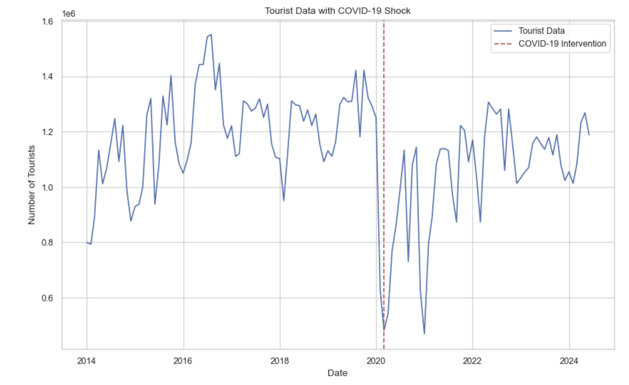
데이터의 시계열 plot을 살펴보면 2020년 2월지점에(빨간점선) 데이터가 코로나로 인한 충격을 받아 입도객이 확 줄어든게 보인다. 실제로 데이터에 시계열 모델 ARIMA나 SARIMA를 적용해보면 입도객 total의 단위가 매우 크고 코로나로 인한 충격 때문에 mse의 오차가 매우 큰 것을 살펴 볼 수 있다.
그리고 시계열을 살펴보면 정상 시계열로 보이지만 ADF검정 같은 검정력이 약한 검정방법을 사용하면 비정상 시계열이라고 나온다. 하지만 KPSS같은 검정력이 강한 검정방법을 사용하면 정상 시계열이라고 나오는데 예측상 이러한 코로나로 인한 충격이 발생했기 때문으로 생각한다.
from statsmodels.tsa.stattools import kpss

total_series = df['total'].dropna()

kpss_stat, p_value, lags, critical_values = kpss(total_series, regression='c')

kpss_result = {
    'KPSS Statistic': kpss_stat,
    'p-value': p_value,
    'Lags Used': lags,
    'Critical Values': critical_values
}

kpss_result
귀무가설: 정상시계열이다.
대립가설: 비정상시계열이다.
충격후 구간을 세분화 하는 방법 세그먼트 회귀
1. 세그먼트 회귀(Segmented Regression)
세그먼트 회귀(Segmented Regression) 는 Interrupted Time Series (ITS) 분석의 한 기법으로, 시간에 따른 데이터 경향이 특정 시점에서 충격이나 정책 변화로 인해 변화할 때, 그 전후의 데이터를 각각 별도로 분석하는 방법이다. 이 기법은 주로 정책 변화나 외부 이벤트가 변수(종속 변수)에 미치는 영향을 정량적으로 분석할 때 사용된다.
1. 세그먼트 회귀의 주요 개념
(1)세그먼트(구간)의 구분
- 충격 전 구간: 외부 충격이 발생하기 이전의 데이터 경향을 나타낸다.
- 충격 후 구간: 충격 이후 새로운 경향이 나타나는 구간이다.
- 충격 전후의 데이터를 구분하여, 각 구간별로 기울기(slope)와 절편(intercept)의 변화를 분석한다.
(2) 회귀 모델의 구성 요소
- 절편의 변화: 충격 시점에서 데이터의 수준(level)이 얼마나 바뀌는지를 평가한다.
- 기울기의 변화: 충격 전후의 추세 변화(slope difference)를 비교한다. 예를 들어, 정책 도입으로 매출 증가율이 가속화되었는지, 감소했는지를 파악한다. (데이터의 충격)
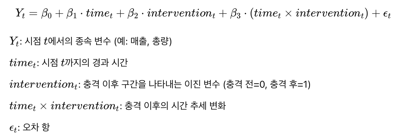
2. 세그먼트 회귀의 수학적 모델
세그먼트 회귀는 다중 회귀 모델의 확장이다. 충격 시점을 기준으로 두 개의 회귀선을 사용해 각 구간의 경향을 추정한다. 모델의 일반적인 형태는 다음과 같다.
3. 세그먼트 회귀의 활용 사례
- 정책 평가: 새로운 정책이 시행된 전후의 영향을 측정할 때 사용된다. 예를 들어, 담배 규제 정책 도입 전후 흡연율 변화를 분석.
- 보건 분야: 의료 개입(예: 백신 도입) 이 환자의 건강 지표에 미친 영향을 평가.
- 경제 분석: 금융위기나 규제 완화 등의 충격이 주식시장이나 경제 지표에 미친 영향을 분석.
4. 세그먼트 회귀의 한계
- 충격 시점의 불확실성: 충격이 명확한 시점에 발생하지 않거나 점진적으로 나타나는 경우 분석이 어려워질 수 있다..
- 비선형 추세: 세그먼트 회귀는 각 구간을 선형으로 가정하므로, 비선형적인 추세를 포착하기 어렵다.
- 잔차의 자기상관 문제: 시계열 데이터에서 잔차의 자기상관이 있을 경우 결과의 신뢰도가 떨어질 수 있는데 이때 GEE와 같은 기법을 함께 사용해 보완할 수 있다.
import pandas as pd
import numpy as np
import statsmodels.api as sm
import matplotlib.pyplot as plt

df = pd.read_csv('/Users/jinsehyeon/Desktop/big1_data/jejuco.csv', encoding='cp949')
df['dateym'] = pd.to_datetime(df['dateym'])
df.set_index('dateym', inplace=True)

# 충격 변수 생성 (2020년 2월 기준)
df['intervention'] = (df.index >= '2020-02-01').astype(int)
df['time'] = np.arange(len(df))
df['time_after_intervention'] = df['time'] * df['intervention']

x = df[['time', 'intervention', 'time_after_intervention']]
x = sm.add_constant(x)  # 상수항 추가
y = df['total']

# 세그먼트 회귀 모델 정의 및 학습
segment_model = sm.OLS(y, x).fit()
print(segment_model.summary())

plt.figure(figsize=(14, 7))
plt.plot(df.index, y, label='Actual Values', color='skyblue')
plt.plot(df.index, segment_model.predict(x), label='Segmented Regression Predictions', color='red', linestyle='--')
plt.axvline(pd.to_datetime('2020-02-01'), color='black', linestyle='--', label='COVID-19 Intervention')
plt.title('Segmented Regression Analysis: COVID-19 Impact')
plt.xlabel('Date')
plt.ylabel('Total')
plt.legend(loc='best')
plt.grid(True)
plt.show()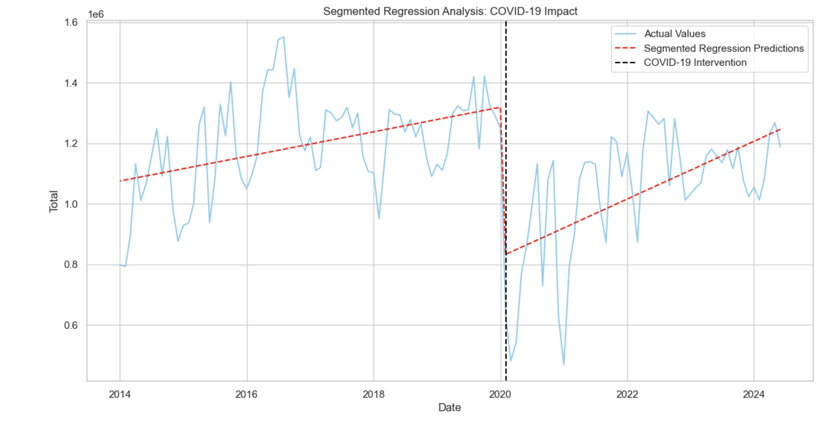
모든 변수의 p-값이 0.05 이하로 모델의 각 변수는 통계적으로 유의하다.
특히 충격 후 추세 변화(time_after_intervention)의 유의성이 확인된다(p = 0.007). 이는 COVID-19 이후 시간이 지남에 따라 추가적인 감소가 있음을 나타낸다.
하지만 더븐 왓슨의 결과에 따라 잔차에 자기상관이 존재할 가능성을 시사하고 있다.
ACF 그래프 확인
from statsmodels.graphics.tsaplots import plot_acf
plt.figure(figsize=(10, 6))
plot_acf(segment_model.resid, lags=30, alpha=0.05)  # 30 lags까지 ACF 플롯
plt.title('ACF of Residuals')
plt.show()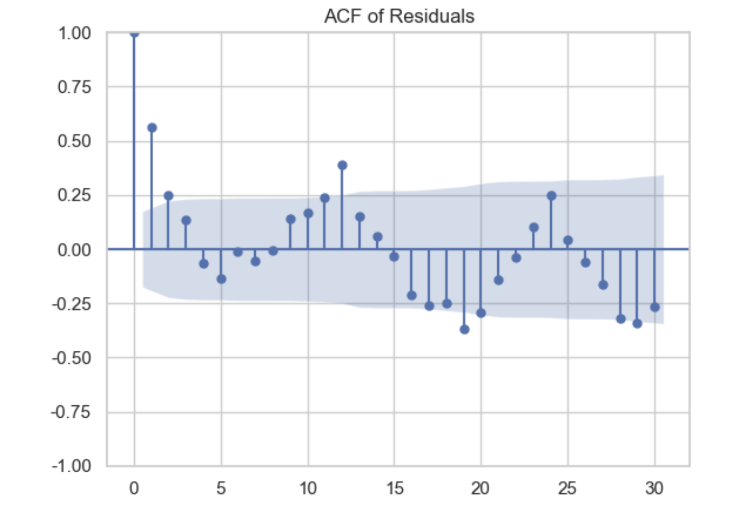
ACF 그래프의 결과 자기상관이 존재한다. 플랏을 확인해보면 시차 1에서 신뢰구간을 벗어나는것을 확인 할 수 있는데 따라서 GEE모델에 AR(1)을 파라미터로 주고 세그먼트 회귀를 같이 사용하여 이를 보완하는 방법이 있다.
2.GEE(Generalized Estimating Equations)
GEE(Generalized Estimating Equations): 반복 측정 데이터나 패널 데이터의 분석에 사용되는 강력한 회귀 기법이다. 여러 시점에 걸쳐 같은 개체(환자, 기관 등)에서 수집된 데이터에 내재된 상관관계를 처리하는 데 유용하고. GEE 모델은 주로 시계열 분석이나 반복 측정 설계에서 데이터의 시간적 의존성을 반영하는 데 활용된다.
1. GEE 모델의 특징
- 반복된 관측 간 상관관계 처리: 일반 선형 회귀에서는 독립적 샘플을 가정한다. 그러나 GEE는 개별 관측치가 상관되어 있을 때도 정확한 추정을 제공한다.
- 다양한 상관 구조 지원: GEE는 AR(1) 구조나 교환 가능 상관 구조를 통해 시간적 의존성을 다룸.
- 일반화된 선형 모델 확장: GEE는 이항, 포아송, 가우시안 분포 등 다양한 데이터 분포를 다룰 수 있다.
- 최소 편향 추정: GEE는 모델이 상관관계를 잘못 추정해도, 회귀 계수에 최소한의 편향을 보장한다.
2. GEE의 시계열 데이터에서 활용
GEE는 시계열 데이터 분석에서 반복 측정된 시간 시리즈나 복잡한 상관구조를 다루는 데 적합하다. 특히 장기적인 상관성을 갖는 데이터, 예를 들어 환자의 치료 과정 또는 정책 도입 전후의 경제 지표를 분석할 때 유용하다.
시계열 데이터에서 GEE를 활용하는 경우:
- 충격 전후의 데이터 분석: 정책이나 이벤트(예: COVID-19, 정책변환)의 영향을 분석할 때 유용하다.
- AR(1) 상관구조 적용: 시간적으로 인접한 관측치 간 상관성을 모델링한다.
- 그룹화된 시계열 데이터 처리: 예를 들어 12개월 단위로 데이터를 그룹화하여 분석한다.
실제 적용
import pandas as pd
import numpy as np
import statsmodels.api as sm
from statsmodels.genmod.generalized_estimating_equations import GEE
from statsmodels.genmod.families import Gaussian
from statsmodels.genmod.cov_struct import Autoregressive
df = pd.read_csv('/Users/jinsehyeon/Desktop/big1_data/jejuco.csv', encoding='cp949')
df['dateym'] = pd.to_datetime(df['dateym'])
df.set_index('dateym', inplace=True)
# 2. 충격 변수 생성 (2020년 2월 기준)
df['intervention'] = (df.index >= '2020-02-01').astype(int)
# 3. 시간 변수 및 상호작용 변수 추가
df['time'] = np.arange(len(df))
df['time_after_intervention'] = df['time'] * df['intervention']
x = df[['time', 'intervention', 'time_after_intervention']]
x = sm.add_constant(x) # 상수항 추가
y = df['total']
df['block'] = np.floor(np.arange(len(df)) / 12) # 매 12개월을 한 그룹으로 설정
gee_model = GEE(
y, x, groups=df['block'], family=Gaussian(), cov_struct=Autoregressive()
) #자기회귀 사용
gee_result = gee_model.fit()
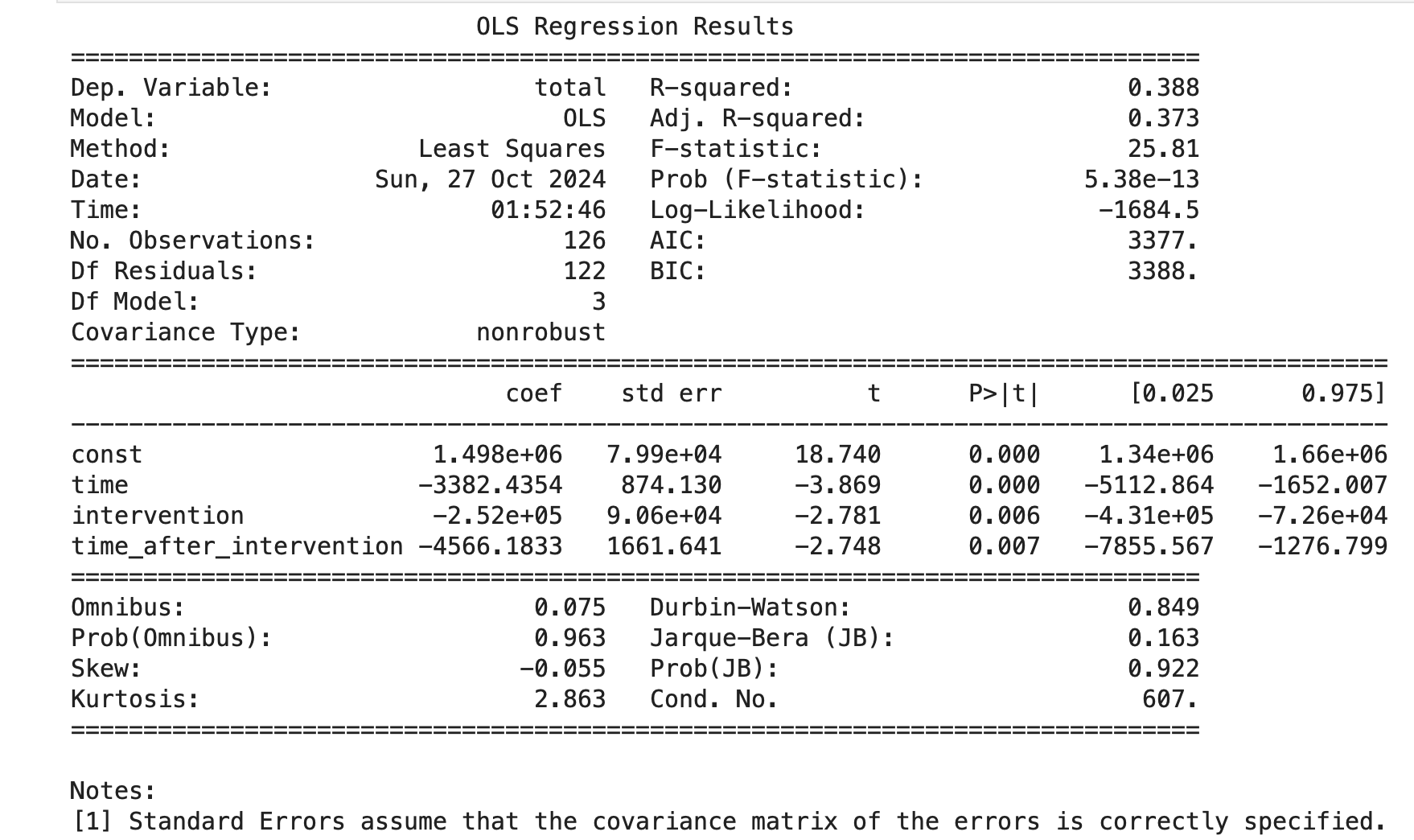
print(gee_result.summary())충격 시점(intervention)을 2020년 2월(한국에서 코로나 확진 시작)로 설정.
시간 변수(time, time_after_intervention)를 생성해 충격 전후의 경향을 분석.
- 결과
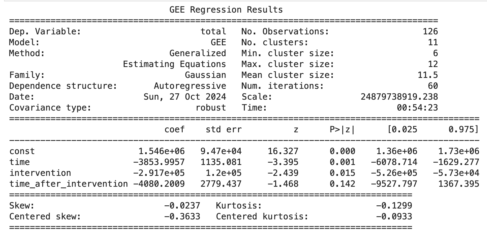
- 초기 상태(const): 충격 전 총량의 수준이 약 1,546,000으로 확인할 수 있다.
- 충격 이전(time): 충격이 발생하기 전에는 시간이 지남에 따라 총량이 감소하는 경향이 있었다. 매 단위 시간당 3,854 감소가 통계적으로 유의하게 나타났다.
- 충격(intervention): COVID-19 충격 이후 총량이 291,700 감소했다. 이는 p-값 0.015로 통계적으로 유의미하다는 것을 보여준다. 이 결과는 COVID-19가 데이터에 부정적인 영향을 미쳤음을 시사한다.
- 충격 후 추세(time_after_intervention): 충격 이후 시간이 지남에 따라 추가적인 감소(-4,080) 경향이 있었으나, p-값이 0.142로 통계적으로 유의미하지 않다. 이는 충격 후 일정 기간 동안 추세 변화가 뚜렷하지 않음을 의미할 수 있다.
GEE선형 모델로 분석후 결론
COVID-19 충격의 부정적 영향: 충격 이후 총량의 감소가 명확하게 나타남
시간 경과에 따른 회복 여부 불명확: 충격 이후 시간이 지남에 따라 총량이 추가적으로 감소하는 경향은 보였지만, 통계적으로 유의하지 않아 확신할 수 없다.
최종 plot
y_pred = gee_result.predict(X)

# 시각화
plt.figure(figsize=(12, 6))
plt.plot(df.index, df['total'], label='Actual Values', color='blue')
plt.plot(df.index, y_pred, label='GEE + Segmented Predictions', color='red', linestyle='--')
plt.axvline(pd.to_datetime('2020-02-01'), color='green', linestyle='--', label='Intervention Point')

# 그래프 레이아웃 설정
plt.title('GEE + Segmented Regression Predictions')
plt.xlabel('Date')
plt.ylabel('Total')
plt.legend(loc='best')
plt.grid(True)
plt.show()
- 기법출처
Segmented Regression in Interrupted Time Series 링크텍스트
Using GEE for Healthcare Data Analysis: 의료 서비스 개선 효과를 평가하기 위해 ITS-CG 설계와 GEE를 활용한 연구.
CaPSAI 프로젝트: 사회적 책임 프로젝트의 개입 효과를 ITS-CG(Interrupted Time Series with Control Group) 설계를 사용해 평가한 연구.