1. 정렬 레이아웃
1) 수평 정렬
"자손에게 float 속성 지정 & 부모의 overflow-hidden 적용"
  <head>
    <title>Float with Overflow</title>
    <style>
      div.container {
        overflow: hidden;
      }
      div.item {
        float: left;
        margin: 0 3px;
        padding: 10px;
        border: solid black 1px;
      }
    </style>
  </head>
  <body>
    <p>
      Lorem ipsum dolor sit amet consectetur adipisicing elit. Fugit vero id
      itaque. Facilis, maxime nemo iusto illum eligendi deserunt voluptas?
    </p>
    <div class="container">
      <div class="item">메뉴-1</div>
      <div class="item">메뉴-2</div>
      <div class="item">메뉴-3</div>
      <div class="item">메뉴-4</div>
    </div>
    <p>
      Lorem ipsum dolor sit amet consectetur adipisicing elit. Magni mollitia
      aspernatur at repellat quo, dicta nam eveniet iusto doloribus atque!
    </p>
  </body>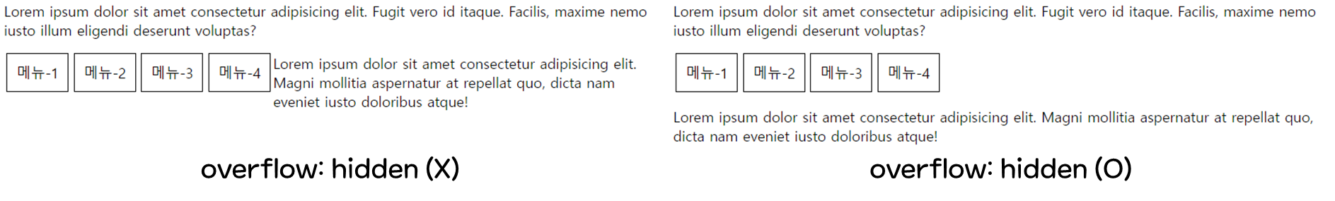
* clear:both- 더 세밀한 작업
- 최근 overflow:hidden 보다 많이 사용
- float 속성(left, right, both) 적용 제거
- 수평 정렬 하고 싶은 대상의 양쪽 아래에 div 태그 배치 → div 태그 clear:both
  <head>
    <title>Float with Overflow</title>
    <style>
      div.item {
        float: left;
        margin: 0 3px;
        padding: 10px;
        border: solid black 1px;
      }
      div.clear {
        clear: both;
      }
    </style>
  </head>
  <body>
    <p>Lorem</p>
    <div class="clear"></div>
    <div>
      <div class="item">메뉴-1</div>
      <div class="item">메뉴-2</div>
      <div class="item">메뉴-3</div>
      <div class="item">메뉴-4</div>
    </div>
    <!-- 수평 정렬하고 싶은 대상 아래에 div 태그 배치 -->
    <div class="clear"></div>
    <p>Lorem atque!</p>
  </body>
2) 중앙 정렬
"width 배정 ⇨ margin 0 auto"
    <style>
      * {
        margin: 0;
        padding: 0;
      }
      body {
        width: 700px;
        margin: 0 auto;
      }
    </style>
- 그리드 시스템
: 화면을 쪼개서 레이아웃 구성 (880px, 960px, 980px 많이 사용)
3) One True 레이아웃
"행을 독립적으로 생각해서 공간을 나눔"
국내 모든 포털 사이트의 메인 페이지는 One True 레이아웃 사용
- 행 구성
  <body>
    <div id="top"></div>
    <div id="middle"></div>
    <div id="bottom"></div>
  </body>
2.열 구성
  <body>
    <div id="top"></div>
    <div id="middle">
        <div id="left"></div>
        <div id="right"></div>
    </div>
    <div id="bottom"></div>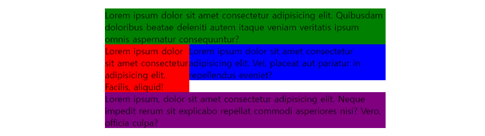
</body>- 레이아웃 구성
① 부모 태그의 고정된 너비 지정
② 수평 정렬하는 부모 태그의 overflow 속성에 hidden 적용
③ 자손 태그에 적당한 너비 입력, float 속성 적용<style> body { width: 500px; margin: 10px auto; } #top { background-color: green; } /* 수평정렬 */ #middle { overflow: hidden; } #left { float: left; width: 150px; background-color: red; } #right { float: left; width: 350px; background-color: blue; } #bottom { background-color: purple; } </style>
* display: flex
- 부모에 지정 (알아서 자식들을 수평으로 배치)
- 자식은 너비만 신경쓰면 됨
- 부모 태그에 고정된 너비 지정
- 수평 정렬하는 부모 태그의 display 속성에 flex 적용
- 자손 태그에 적당한 너비 입력
    <style>
      body {
        width: 500px;
        margin: 10px auto;
      }
      #top {
        background-color: green;
      }
      /* 부모 태그에 display:flex */
      #middle {
        display: flex;
      }
      #left {
        width: 150px;
        background-color: red;
      }
      #right {
        width: 350px;
        background-color: blue;
      }
      #bottom {
        background-color: purple;
      }
    </style>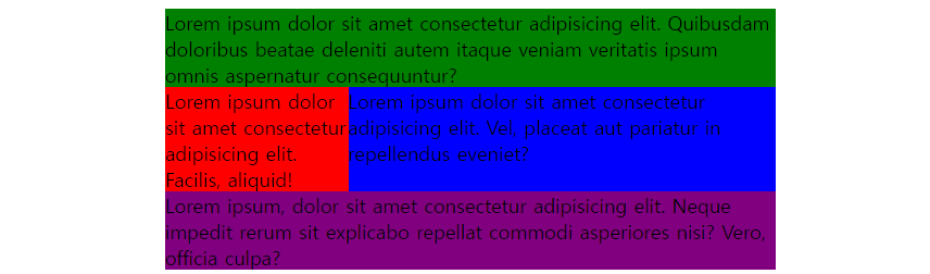
2. 요소 배치
1) 절대 위치를 사용한 요소 배치
- 자손 absolte
- 부모 relative
- 부모 height
  <head>
    <title>Absolute Position</title>
    <style>
      div.container {
        border: solid black 5px;
        width: 500px;
        height: 300px;
        overflow: hidden;
        position: relative;
      }
      .circle {
        width: 100px;
        height: 100px;
        border-radius: 50%;
        position: absolute;
      }
      #red {
        background-color: red;
        left: 20px;
        top: 20px;
      }
      #green {
        background-color: green;
        right: 20px;
        top: 20px;
      }
      #blue {
        background-color: blue;
        right: 20px;
        bottom: 20px;
      }
      #yellow {
        background-color: yellow;
        left: 20px;
        bottom: 20px;
      }
    </style>
  </head>
  <body>
    <h1>Dummy Text</h1>
    <div class="container">
      <div id="red" class="circle"></div>
      <div id="green" class="circle"></div>
      <div id="blue" class="circle"></div>
      <div id="yellow" class="circle"></div>
    </div>
    <h1>Dummy Text</h1>
  </body>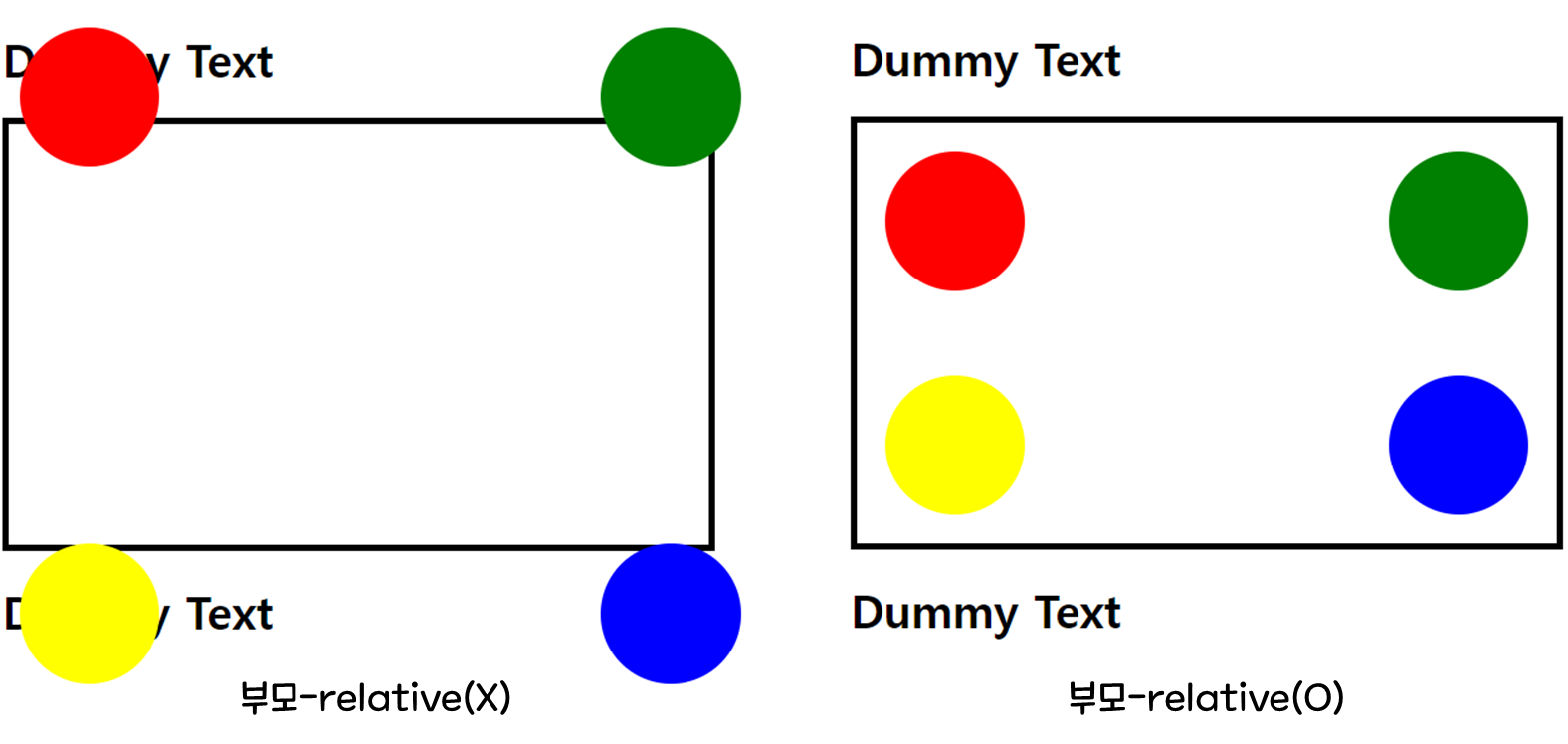
2) 요소 중앙 배치
- 중앙 정렬하려는 div 태그의 position 속성을 absolute로 지정
- left 속성과 top 속성 모두 50% 지정
- 중앙 정렬하려는 div 태그의 margin-left와 margin-top 속성에 음수 입력 (div 태그 너비와 높이의 정확히 절반)
  <head>
    <title>Absolute Align</title>
    <style>
      * {
        margin: 0;
        padding: 0;
      }
      body {
        background-color: red;
      }
      #container {
        width: 500px;
        height: 250px;
        background-color: orange;

        position: absolute;
        left: 50%;
        top: 50%;
        margin-left: -250px;
        margin-top: -125px;
      }
    </style>
  </head>
  <body>
    <div id="container">
      <h1>요소의 중앙 배치</h1>
    </div>
  </body>
3) 요소 고정 위치 배치
ex) 고정 바 (: 웹 페이지의 상하좌우에 붙어서 사용자를 따라다니는 요소)
position: fixed
  <head>
    <title>Fixed Bar</title>
    <style>
      .container {
        margin-top: 50px;
        margin-left: 50px;
      }
      .top_bar {
        background-color: red;
        height: 50px;
        position: fixed;
        left: 0;
        top: 0;
        right: 0;
      }
      .left_bar {
        background-color: blue;
        width: 50px;
        top: 50px;
        left: 0;
        bottom: 0;
        position: fixed;
      }
    </style>
  </head>
  <body>
    <div class="top_bar"></div>
    <div class="left_bar"></div>
    <div class="container">
      <p>
        Lorem
      </p>
      <p>
        Lorem
      </p>
      <p>
        Lorem
      </p>
    </div>
  </body>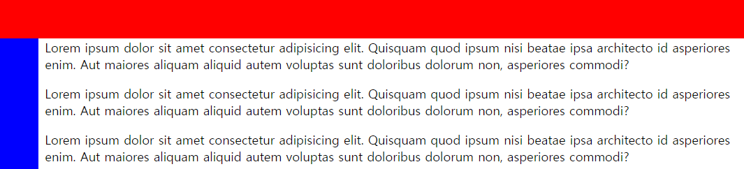
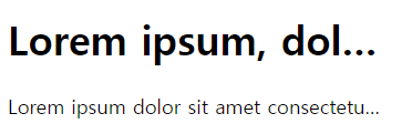
3. 글자 생략
: 스마트폰에서 많이 쓰는 기법 중 하나
어쩌구저쩌구긴글...
wrap: 문장이 길면 다음 줄로 넘어감
white-space: nowrap : 줄바꿈X, 부모 영역 벗어남
overflow: hidden : 벗어나는 부분 안 보이게
text-overflow: ellipsis : 생략 표시
  <head>
    <title>Ellipsis</title>
    <style>
      body {
        width: 300px;
      }
      .ellipsis {
        white-space: nowrap;
        overflow: hidden;
        text-overflow: ellipsis;
      }
    </style>
  </head>
  <body>
    <h1 class="ellipsis">
      Lorem ipsum, dolor sit amet consectetur adipisicing elit. Dolorem,
      dignissimos.
    </h1>
    <p class="ellipsis">
      Lorem ipsum dolor sit amet consectetur adipisicing elit. Qui, saepe!
    </p>
  </body>